Camden Town Brewery packaging
Camden Town Brewery is a London-based craft beer producer recognized for its vibrant branding and diverse product lineup. Their packaging strategy leverages visually distinctive cartons and cans to reinforce their brand identity and enhance the customer experience.
Packaging Portfolio
Camden Town Brewery’s packaging solutions utilize single-layer folding carton boxes for multipacks and 440ml aluminum cans for individual and mixed sets. The cartons feature glossy finishes, sharp printing, and structural rigidity suitable for both retail display and e-commerce logistics. The design approach integrates vibrant color blocking, bold typography, and precise die-cut windows to enhance visual differentiation. The use of recyclable materials aligns with industry sustainability trends, while packaging formats are engineered for efficient stacking, shipping, and in-store merchandising.

The packaging consists of multiple cans grouped together in a retail carton format. The carton is made of smooth, flat paperboard with clean edges and folds. It features a colorful design with a glossy finish, showcasing various beer can designs prominently. The front of the carton displays the product name and branding elements clearly, while the sides may include additional information or graphics related to the products.

The packaging is a folding carton box made of smooth, single-layer paperboard. It features a vibrant red background with white polka dots and bold graphics. The front displays the product name 'CAMDEN HELLS LAGER' in large, white lettering, with additional text indicating a donation initiative. The edges are clean and precise, with no visible fluted layers. The box has a glossy finish, enhancing its visual appeal. The overall shape is rectangular, designed to hold multiple cans.

The packaging consists of multiple folding cartons designed to hold cans of lager. Each carton features a smooth, flat construction without fluted layers, indicative of single-layer paperboard. The cartons are predominantly red and black, with bold white text and graphics. The edges are clean and precise, and the overall appearance is lightweight yet sturdy, suitable for retail display. The cartons are designed to be visually appealing with distinct branding elements.
The packaging is a folding carton designed to hold multiple beverage cans. It features a smooth, flat construction without any visible fluted layers, indicating it is made from single-layer paperboard. The exterior is predominantly black with vibrant colors on the can labels visible through a cut-out window. The edges are clean and precise, and the carton has a tuck-top closure for easy access. The interior is organized to securely hold the cans in place.

The image displays a set of three beverage cans, each with distinct colors and designs. The cans are arranged in a row, showcasing a vibrant color palette including turquoise, red, and orange. Each can features bold typography with the brand name 'CAMDEN' prominently displayed at the top. The overall design is modern and appealing, with a clean layout and contrasting colors. The cans are cylindrical in shape, typical for beverage packaging, and are likely made of aluminum.

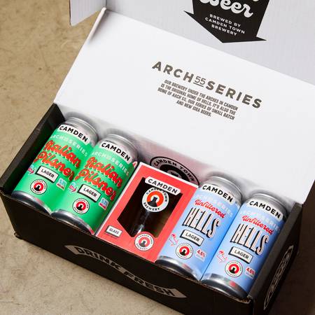
The image features a set of eight 440ml aluminum cans, arranged in two groups of four. Each can has a distinct color scheme and design. The left group showcases a green can labeled 'Italian Pilsner' with a white logo and red accents, while the right group displays a blue can labeled 'Unfiltered Hells Lager' with similar branding elements. The cans are presented in a compact arrangement, emphasizing the product variety.
About the Brand
Camden Town Brewery operates in the craft beer segment, offering a wide range of beers and branded merchandise through a direct-to-consumer model. The company’s packaging approach emphasizes strong visual identity and product differentiation within a competitive market.
Leveraging folding carton boxes and aluminum cans, Camden Town Brewery uses bold color palettes, clean typography, and consistent branding to communicate product quality and brand values. Their packaging formats are designed for both retail appeal and e-commerce durability, supporting logistics while delivering a distinct unboxing experience.
Key Differentiator: Camden Town Brewery differentiates itself through visually striking packaging aligned with contemporary, community-focused branding and innovative beer offerings.
Design System
Visual Style
Bold sans-serif typography paired with high-contrast color palettes—primarily red, black, white, turquoise, green, and orange—define the visual system. The aesthetic is modern, playful, and instantly recognizable.
Brand Identity
Logo usage is consistent and prominent across all packaging, with the Camden Town Brewery name and iconography always foregrounded. Visual consistency is maintained via uniform color schemes, graphic motifs, and clear product naming conventions.
Packaging Design
Material selection prioritizes recyclable aluminum for cans and single-layer, high-quality paperboard for cartons. Structural design focuses on clean edges, precise folds, and formats that balance shelf appeal with shipping durability.
User Experience
The design enhances the customer journey by providing an engaging unboxing process, intuitive product identification, and clear messaging. The combination of visual impact and functional design supports both brand storytelling and convenience.
Company Metrics
Business insights for Camden Town Brewery based on available data
Market Positioning
Brand Values & Focus
Key Competitors
Target Market: Urban craft beer enthusiasts, retail customers, and online D2C consumers across the UK seeking innovative and visually engaging alcoholic beverages.
Packaging Assessment
Overall Grade
Visual appeal and presentation quality
Packaging durability and protection
Eco-friendliness and recyclable materials
Cost efficiency and value for money
Packaging assessment for Camden Town Brewery based on industry standards and best practices
Frequently Asked Questions
What types of packaging does Camden Town Brewery use for its beers?
Camden Town Brewery primarily uses folding carton boxes and aluminum cans, emphasizing single-layer paperboard for retail cartons and 440ml cans for individual beverages. These formats are chosen for visual impact, product protection, and logistical efficiency.
How does the packaging design reinforce Camden Town Brewery’s brand?
The packaging design employs bold colors, playful graphics, and prominent logos to create strong shelf presence and brand recall. Consistent use of signature elements ensures immediate recognition and supports the brewery's community-driven marketing.
What sustainability considerations are present in Camden Town Brewery’s packaging?
The brewery utilizes recyclable materials such as aluminum cans and paperboard cartons, with an emphasis on minimizing environmental impact. However, further data on sourcing and lifecycle management would be required for a comprehensive sustainability assessment.
Discover other Food & Drink companies
Explore more companies in the food & drink industry and their packaging strategies
kerex - terre exotique
Food & Drink
Kerex - Terre Exotique specializes in the international trade of gourmet food and drink products, offering a unique selection of spices and culinary ingredients.
ruf lebensmittelwerk kg
Food & Drink
RUF Lebensmittelwerk KG is a German food production company specializing in a variety of baking mixes and drink products. Founded in 1920, the company is known for its high-quality ingredients and innovative food solutions.
Teegschwendner GmbH
Food & Drink
Teegschwendner GmbH is a specialty tea company based in Germany, offering a wide selection of high-quality teas and tea-related accessories. They focus on providing unique tea experiences through carefully sourced and curated products.