Burn Lab Pro packaging
Burn Lab Pro specializes in scientifically formulated nutritional supplements targeting fat loss and muscle preservation. Their packaging strategy utilizes bold, fitness-oriented design and protective structures to support product integrity, brand differentiation, and consumer trust.
Packaging Portfolio
Burn Lab Pro’s packaging portfolio centers on rigid folding cartons constructed from single-layer paperboard and opaque HDPE or PET plastic bottles, both tailored for dietary supplement applications. The cartons feature high-resolution print with bold, fitness-inspired graphics and a matte or semi-gloss finish, while the bottles provide moisture and light protection for capsule integrity. Tuck flap closures and precise folding enhance both the consumer unboxing experience and product security during shipment. The overall approach balances visual shelf appeal, structural durability, and regulatory compliance specific to the supplement sector.

The packaging consists of a folding carton made from a single layer of paperboard. The exterior features a smooth, flat construction with clean edges and precise folds. The box is predominantly white with vibrant colors used for branding and product information. The front displays the product name 'BURN LAB PRO' prominently, along with descriptors like 'Fat Burning Support' and '100% Natural Fat Burning Support.' The design includes a combination of bold fonts and graphics that convey a sense of energy and health. The sides contain additional product details and usage instructions, printed in a clear, legible format.

The packaging features a smooth, flat construction typical of folding cartons. It is predominantly black with bold white and orange text. The edges are clean, and the folds are precise, indicating a well-constructed retail box. The front displays the product name 'BURN LAB PRO' prominently, with additional information about fat burning support. The overall design is sleek and modern, appealing to a fitness-oriented audience.
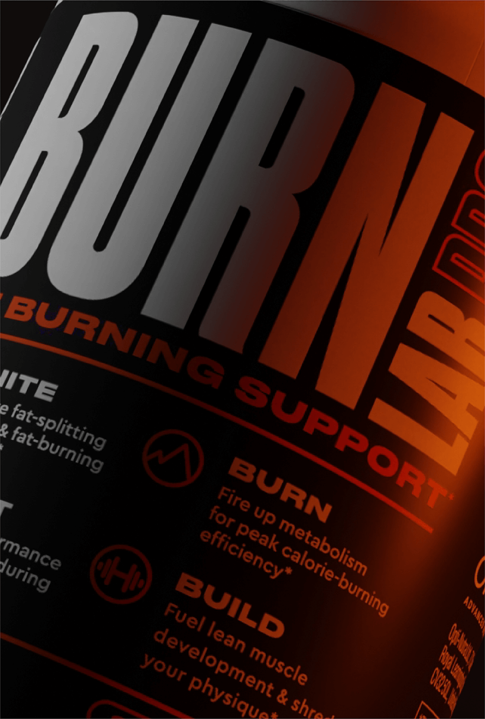
The packaging is a sleek, smooth, flat construction with a predominantly black background. The front features bold, large typography that reads 'BURN' in white and 'LAB PRO' in orange, creating a striking contrast. The edges are clean and precise, indicative of a well-constructed folding carton. There are no visible fluted layers, confirming it is made from single-layer paperboard. The surface has a matte finish with some areas possibly having a slight gloss due to the printing.

The packaging is a folding carton made from a single layer of paperboard, featuring a smooth, flat construction without any visible fluted layers. The exterior is predominantly black with bold, contrasting orange text and graphics. The edges and folds are clean and precise, indicative of high-quality manufacturing. The carton is designed to hold dietary supplement capsules, and it includes a tuck flap closure at the top. The overall shape is rectangular, suitable for retail display.

The packaging is a cylindrical bottle with a screw-on cap, primarily made of opaque plastic. The bottle has a matte finish with a smooth surface and features a prominent label that wraps around the body. The label is predominantly black with white and orange text, showcasing the product name 'BURN' in large, bold letters. Additional product information is displayed in smaller fonts, including descriptors like 'Fat Burning Support' and various benefits. The overall design is sleek and modern, appealing to fitness enthusiasts.
About the Brand
Burn Lab Pro operates within the beauty and fitness sector, offering a single flagship supplement focused on fat burning and muscle retention. The brand’s packaging approach emphasizes both visual impact and product protection, leveraging robust carton boxes and branded bottles to enhance shelf presence and safeguard nutritional integrity.
The company’s packaging strategy is anchored in single-layer paperboard folding cartons and cylindrical plastic bottles, both of which are optimized for retail display and direct-to-consumer logistics. The use of bold, high-contrast color palettes and clear typographic hierarchies ensures immediate brand recognition. Product information is presented with clarity, supporting informed consumer decisions and regulatory compliance.
Key Differentiator: Burn Lab Pro’s packaging is distinguished by its consistent use of contemporary fitness branding elements, strong structural integrity tailored for supplement protection, and a balance between premium aesthetics and functional performance.
Design System
Visual Style
Typography is characterized by bold, sans-serif fonts with high legibility and strong visual hierarchy; primary colors include black, white, and vibrant orange, creating a high-contrast, energetic palette. The aesthetic is modern, clean, and optimized for the fitness supplement market.
Brand Identity
Branding relies on prominent logo placement, consistent use of the 'Burn Lab Pro' name, and health-focused iconography. Visual consistency is maintained through a uniform color scheme and repeatable design elements across all SKUs.
Packaging Design
Material selections include single-layer paperboard for cartons and opaque plastic for bottles, prioritizing print quality, product safety, and retail display. Structural design emphasizes precise folds, robust closures, and a tactile, matte finish to convey a premium feel.
User Experience
Packaging supports the consumer journey through clear information layout, easy-open constructions, and a visually impactful unboxing moment. The design reinforces the brand’s scientific and performance-oriented positioning while ensuring product integrity from warehouse to end user.
Company Metrics
Business insights for Burn Lab Pro based on available data
Market Positioning
Brand Values & Focus
Key Competitors
Target Market: Fitness enthusiasts, competitive athletes, and health-conscious consumers seeking effective fat-burning and muscle-preserving supplements.
Packaging Assessment
Overall Grade
Visual appeal and presentation quality
Packaging durability and protection
Eco-friendliness and recyclable materials
Cost efficiency and value for money
Packaging assessment for Burn Lab Pro based on industry standards and best practices
Frequently Asked Questions
What packaging materials does Burn Lab Pro use for its supplements?
Burn Lab Pro utilizes single-layer paperboard folding cartons for external packaging and opaque plastic bottles with branded labels for direct product containment. These materials are selected for their durability, print quality, and suitability for retail and e-commerce distribution.
How does Burn Lab Pro’s packaging support brand recognition?
The packaging features bold logos, energetic color schemes, and clear product information, all of which reinforce the brand’s identity and appeal to fitness-conscious consumers.
Is the packaging recyclable or eco-friendly?
While the carton components are typically recyclable, the plastic bottles may have limited recyclability depending on local facilities. There is no evidence of advanced sustainability features such as compostability or use of post-consumer recycled content.
Discover other Beauty & Fitness companies
Explore more companies in the beauty & fitness industry and their packaging strategies
Pure Altitude
Beauty & Fitness
Pure Altitude specializes in high-quality beauty and skincare products that leverage the expertise of spa treatments to enhance daily routines. The brand offers a diverse range of products tailored for both facial and body care.
Orris Paris
Beauty & Fitness
Orris Paris specializes in creating artisanal skincare products that combine potent botanical ingredients with modern cleansing rituals. The company emphasizes natural, holistic practices in its formulations.
Institut Karité Paris
Beauty & Fitness
Institut Karité Paris specializes in luxury beauty products made with natural Shea Butter, offering a wide range of skincare and body care solutions. The brand combines Parisian heritage with a commitment to quality and creativity in its offerings.