Bullfrog Barbershop packaging
Bullfrog Barbershop delivers specialized grooming services and premium men’s grooming products, with a focus on quality and brand cohesion. Their packaging strategy leverages a blend of modern structural formats and cohesive branding to enhance both retail and e-commerce experiences.
Packaging Portfolio
Bullfrog Barbershop’s packaging portfolio features a strategic mix of stand-up pouches with kraft exteriors, amber glass bottles, rigid jars, and paperboard cartons. The use of resealable closures and transparent windows enhances product visibility and usability, while robust materials support product integrity during transit. Design elements reflect a minimalist and modern visual identity, with consistent logo placement and cohesive labeling across all formats. The selection of materials suggests a moderate commitment to sustainability, with recyclable paper and glass balanced by some plastic components.

The image features three amber glass bottles with black pump dispensers, arranged on a wooden countertop. Each bottle has a distinct label with varying colors and text, indicating different product types. The labels are designed with a modern aesthetic, featuring a combination of bold fonts and smaller text for product details. The bottles have a sleek, cylindrical shape, and the overall presentation is clean and professional.

The packaging consists of a stand-up pouch made from a kraft paper exterior with a smooth finish. It features a clear plastic window that allows visibility of the contents inside. The pouch is designed to stand upright, indicating a gusseted bottom. The top of the pouch has a resealable closure, likely a zipper or similar mechanism, which allows for easy access and resealing. The overall shape is rectangular, with a slightly tapered top.
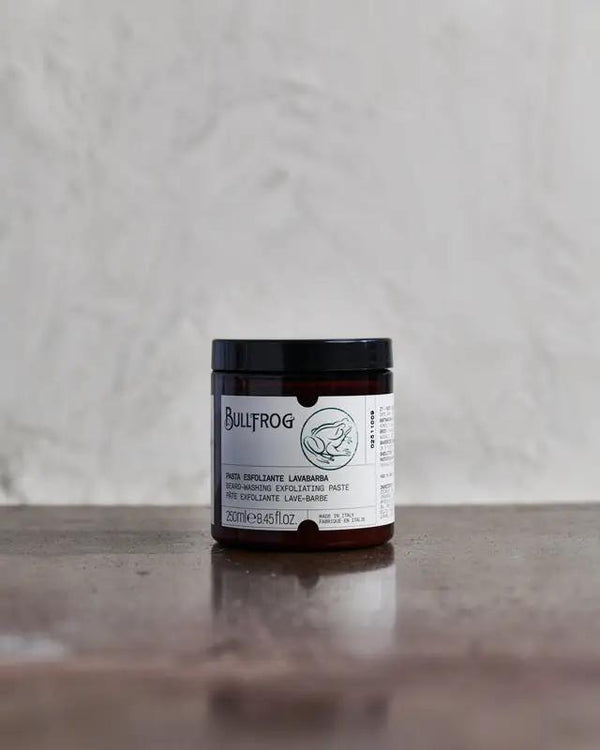
The packaging is a small, round jar made of thick, sturdy material with a black lid. The jar has a smooth surface with a glossy finish, and the body is a dark brown color. The label features a white background with black text and a simple graphic of a bullfrog. The edges of the jar are clean and precise, indicating high-quality construction. The lid is tightly fitted, suggesting a secure closure.
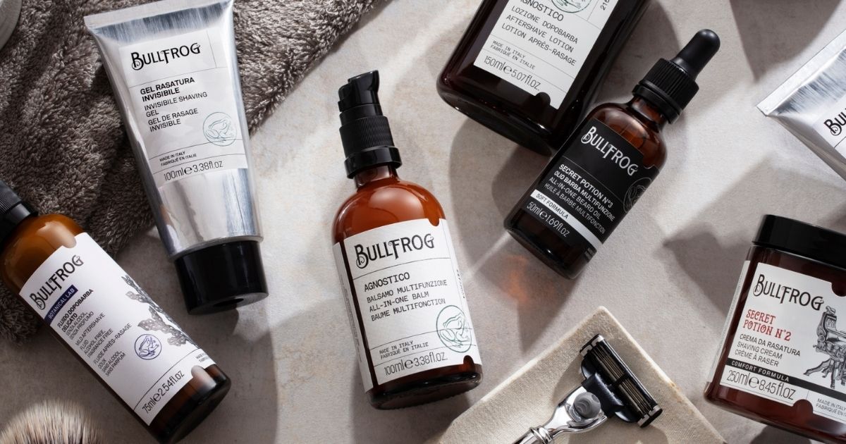
The packaging consists of various cosmetic containers and tubes, primarily made of smooth paperboard and glass. The products are neatly arranged on a neutral surface, showcasing a clean and modern aesthetic. The tubes and bottles have a sleek design with precise edges and folds, indicating a high-quality finish. The colors are predominantly black and white with some amber glass elements, creating a sophisticated look.

The packaging consists of a stand-up pouch featuring a vibrant, illustrated design with a dragon and tiger motif. The pouch is made from a flexible material that allows it to stand upright. It has a glossy finish that enhances the colors and graphics. The top of the pouch is sealed and has a tear notch for easy opening. Inside the pouch, there are four small vials with black spray caps, each containing a liquid product. The vials are arranged neatly and are visible through the transparent section of the pouch.
About the Brand
Bullfrog Barbershop operates at the intersection of traditional barbering and contemporary men’s grooming retail, serving customers both in-store and online. The company’s packaging approach is aligned with its brand ethos, using materials and formats that reinforce quality and a premium customer experience.
Packaging across Bullfrog’s product portfolio demonstrates a consistent use of materials such as kraft paper, glass, and rigid cartons, all while maintaining a minimalist yet distinctive aesthetic. The integration of stand-up pouches, amber glass bottles, and rigid jars indicates an emphasis on product protection, brand visibility, and shelf appeal. The brand’s packaging choices are designed to facilitate product differentiation in a competitive market while ensuring efficient logistics and positive customer interaction.
Key Differentiator: The integration of custom packaging formats tailored for both retail and e-commerce, coupled with consistent branding and a focus on tactile, high-quality materials, sets Bullfrog Barbershop apart in the male grooming sector.
Design System
Visual Style
Typography is modern and bold, with clear sans-serif or display fonts for product names and smaller, readable text for details. The color palette centers on natural tones—black, white, amber, kraft brown, and occasional vibrant accent graphics—supporting a masculine, premium image. The overall aesthetic is minimalist and functional, emphasizing clarity and shelf impact.
Brand Identity
Logo usage is prominent on all primary and secondary packaging, often accompanied by clean iconography or subtle illustrations. Visual consistency is maintained through uniform label layouts, color schemes, and branded elements, ensuring immediate brand recognition across product lines.
Packaging Design
Material selection prioritizes glass, rigid plastic, kraft paper, and paperboard, chosen for durability and perceived quality. Structural design favors stand-up pouches, rigid jars, and protective cartons, balancing product protection with user-friendly access and retail display considerations.
User Experience
Packaging is crafted to support a high-quality, tactile unboxing experience, using resealable closures and clear labeling to guide the consumer. Visual hierarchy and material choices reinforce the brand’s premium positioning, while structural integrity ensures product safety throughout the purchase journey.
Company Metrics
Business insights for Bullfrog Barbershop based on available data
Market Positioning
Brand Values & Focus
Key Competitors
Target Market: Male grooming consumers seeking premium products and services, primarily aged 25-45, with a focus on urban professionals and style-conscious individuals in Italy and broader European markets.
Packaging Assessment
Overall Grade
Visual appeal and presentation quality
Packaging durability and protection
Eco-friendliness and recyclable materials
Cost efficiency and value for money
Packaging assessment for Bullfrog Barbershop based on industry standards and best practices
Frequently Asked Questions
How does Bullfrog Barbershop ensure packaging consistency across product lines?
Bullfrog Barbershop employs a unified visual identity and standardized material selection, utilizing consistent color palettes, branded labeling, and modern minimalist design to achieve packaging cohesion across diverse product types.
What sustainability measures are present in Bullfrog Barbershop’s packaging?
The company incorporates recyclable materials such as kraft paper and glass in its packaging portfolio, though the presence of plastic windows and glossy finishes suggests a need for further sustainability optimization.
How does packaging support Bullfrog Barbershop’s e-commerce operations?
Structural features like resealable pouches, protective cartons, and secure dispensers are selected to withstand shipping demands, reduce product damage, and enhance the unboxing experience for online customers.
Discover other Beauty & Fitness companies
Explore more companies in the beauty & fitness industry and their packaging strategies
Owari
Beauty & Fitness
Owari specializes in 100% natural beauty and fitness products, designed to enhance health and wellness. The company proudly offers its products made in France, emphasizing quick delivery and customer support.
Big Moustache
Beauty & Fitness
Big Moustache specializes in shaving and grooming products tailored for men, providing a hassle-free subscription service for razor blades and skincare essentials.
Cultiv Cosmetique
Beauty & Fitness
Cultiv Cosmetique is a French skincare brand that provides organic and eco-friendly beauty products inspired by nature. They focus on effective skincare solutions for various skin concerns.