Brightland packaging
Brightland specializes in premium olive oils and vinegars, emphasizing California-grown quality and distinctive flavor profiles. Their packaging strategy leverages custom rigid boxes and vibrant carton solutions to enhance shelf presence and elevate the gifting experience.
Packaging Portfolio
Brightland employs a multi-format packaging portfolio, including rigid chipboard boxes for high-value gift sets and single-piece paperboard cartons for retail units. These structures are engineered for both durability and presentation, with custom inserts ensuring product stability. Visual branding is consistently applied through digital print, matte and gloss finishes, and unique color blocking. Materials are primarily recyclable, though there is minimal evidence of advanced eco-friendly substrates or compostable solutions.
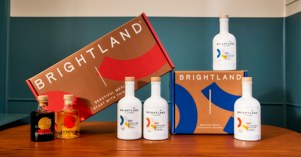
The packaging consists of two distinct folding cartons, one in a brown kraft color with a smooth finish and another in a white color. Both boxes feature clean, precise edges and folds, typical of retail packaging. The brown box has a vibrant design with red and orange circular graphics and the brand name 'BRIGHTLAND' prominently displayed in a bold font. The white box showcases a similar design with blue and orange elements. The overall appearance is modern and appealing, suitable for retail display.

The packaging is a folding carton designed to hold three bottles. It features a smooth, flat construction without any visible fluted layers, indicating it is made from single-layer paperboard. The exterior is adorned with a bright yellow color, with a matte finish that gives it a premium feel. The interior has a printed design with floral elements, enhancing its visual appeal. The carton opens from the top, revealing the bottles inside, which are securely held in place by a custom insert.

The packaging features a sturdy construction with thick chipboard walls, providing a premium feel. The exterior is adorned with a vibrant orange color and intricate graphics, including playful illustrations that suggest a whimsical and artistic design. The box opens from the top and has a hinged lid, revealing four bottles inside, each with its own unique design. The interior is clean and well-finished, enhancing the overall luxury appearance.

The packaging is a folding carton with a vibrant, colorful design featuring floral and fruit motifs. The box has a smooth, flat construction with clean edges and folds. The interior is bright orange, contrasting with the exterior's yellow and green graphics. It holds four bottles of body oils, each securely placed in individual cutouts. The box opens from the top with a tuck flap closure.
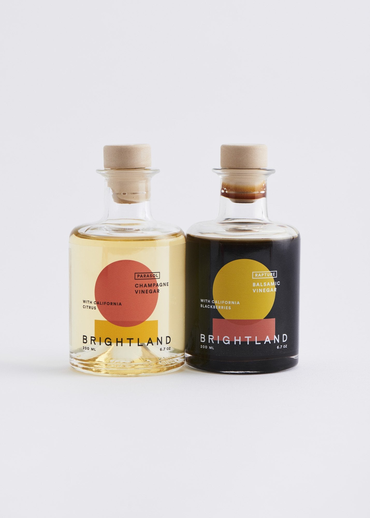
The packaging consists of two glass bottles of vinegar, each with a cork stopper. The bottles are labeled with a minimalist design featuring bold colors and simple typography. The labels include a circular graphic in yellow for the champagne vinegar and red for the balsamic vinegar, with the brand name 'BRIGHTLAND' prominently displayed at the bottom. The overall appearance is clean and modern, aligning with contemporary retail aesthetics.

The packaging is a folding carton with a smooth, flat construction. It features a vibrant orange background with a glossy finish, housing three bottles of oil. The edges are clean and precise, indicating high-quality manufacturing. The carton has a rectangular shape, designed to hold the bottles securely.
About the Brand
Brightland operates in the gourmet food segment, delivering curated olive oils and vinegars through a D2C model. The company’s packaging is integral to its premium positioning, utilizing rigid and carton boxes with high-impact visual design to reinforce both quality and brand storytelling.
Brightland’s packaging portfolio showcases a disciplined approach to brand consistency and shelf appeal, integrating vibrant color palettes and custom illustrations across all formats. Attention to material quality and structural integrity is evident, particularly in gift sets where rigid boxes ensure both protection and visual impact. The brand’s direct-to-consumer strategy is closely aligned with packaging choices that support e-commerce logistics and memorable unboxing experiences.
Key Differentiator: Brightland differentiates through cohesive, artistic packaging design that doubles as a branding vehicle, reinforcing premium positioning and enhancing the perceived value of both everyday and gift-oriented SKUs.
Design System
Visual Style
Brightland uses bold, sans-serif typography combined with a saturated color palette—featuring oranges, yellows, blues, and greens—for maximum shelf impact. Playful illustrations and geometric motifs reinforce a modern, artistic aesthetic.
Brand Identity
The Brightland logo is prominently featured on all packaging, supported by clean iconography and consistent placement of product names. Design elements maintain strong visual unity across SKUs, with each product line differentiated by unique color and illustration themes.
Packaging Design
Material selections focus on rigid chipboard for premium sets and single-layer paperboard for retail cartons, prioritizing tactile quality and structural integrity. Packaging formats are engineered for both product protection and display, with custom-fit inserts and hinged or tuck-flap closures.
User Experience
Design choices are calibrated to enhance the customer journey, from initial visual engagement online to tactile unboxing and gifting. High-impact graphics, secure product nesting, and premium finishes collectively support a memorable, shareable brand experience.
Company Metrics
Business insights for Brightland based on available data
Market Positioning
Brand Values & Focus
Key Competitors
Target Market: Affluent culinary enthusiasts and gift buyers seeking premium, visually distinctive olive oils and vinegars, primarily in the US D2C and specialty retail segments.
Packaging Assessment
Overall Grade
Visual appeal and presentation quality
Packaging durability and protection
Eco-friendliness and recyclable materials
Cost efficiency and value for money
Packaging assessment for Brightland based on industry standards and best practices
Frequently Asked Questions
What types of packaging materials does Brightland use?
Brightland primarily uses rigid chipboard boxes for gift sets and single-layer paperboard carton boxes for retail and e-commerce distribution. All formats emphasize structural strength and premium print finishes.
How does Brightland ensure packaging aligns with its brand identity?
Packaging consistently features the Brightland logo, custom illustrations, and a vibrant, modern color palette, maintaining visual alignment across all product lines.
Is Brightland packaging recyclable or sustainable?
Brightland’s packaging utilizes recyclable paperboard and chipboard materials, but there is limited public information on the use of post-consumer content or other advanced sustainability initiatives.
How does Brightland’s packaging impact the unboxing experience?
The use of premium materials, custom inserts, and striking visual design fosters a positive emotional response and elevates the unboxing experience, particularly for gift sets.
Discover other Food & Drink companies
Explore more companies in the food & drink industry and their packaging strategies
Teegschwendner GmbH
Food & Drink
Teegschwendner GmbH is a specialty tea company based in Germany, offering a wide selection of high-quality teas and tea-related accessories. They focus on providing unique tea experiences through carefully sourced and curated products.
ruf lebensmittelwerk kg
Food & Drink
RUF Lebensmittelwerk KG is a German food production company specializing in a variety of baking mixes and drink products. Founded in 1920, the company is known for its high-quality ingredients and innovative food solutions.
Thés de la Pagode
Food & Drink
Thés de la Pagode is a French company specializing in organic teas and infusions, focusing on health and well-being. Established in 1987, they prioritize sustainable practices and high-quality ingredients sourced through fair trade.