Bread & Boxers packaging
Bread & Boxers is an e-commerce apparel retailer specializing in minimalist clothing essentials and loungewear. Their packaging strategy emphasizes clean, modern carton boxes with a strong focus on brand consistency and sustainability, optimizing both aesthetics and functionality for the direct-to-consumer market.
Packaging Portfolio
Bread & Boxers employs predominantly single-layer, matte-finished carton boxes and retail pouches for their apparel packaging. These structures are engineered for efficient stacking, protection, and retail display while minimizing material usage. The packaging features monochromatic color schemes, minimalist typography, and occasional product imagery, resulting in a high degree of brand consistency. Material selection favors recyclable paperboard, balancing protection with environmental considerations and cost efficiency—an approach optimized for e-commerce operations and direct shipping.
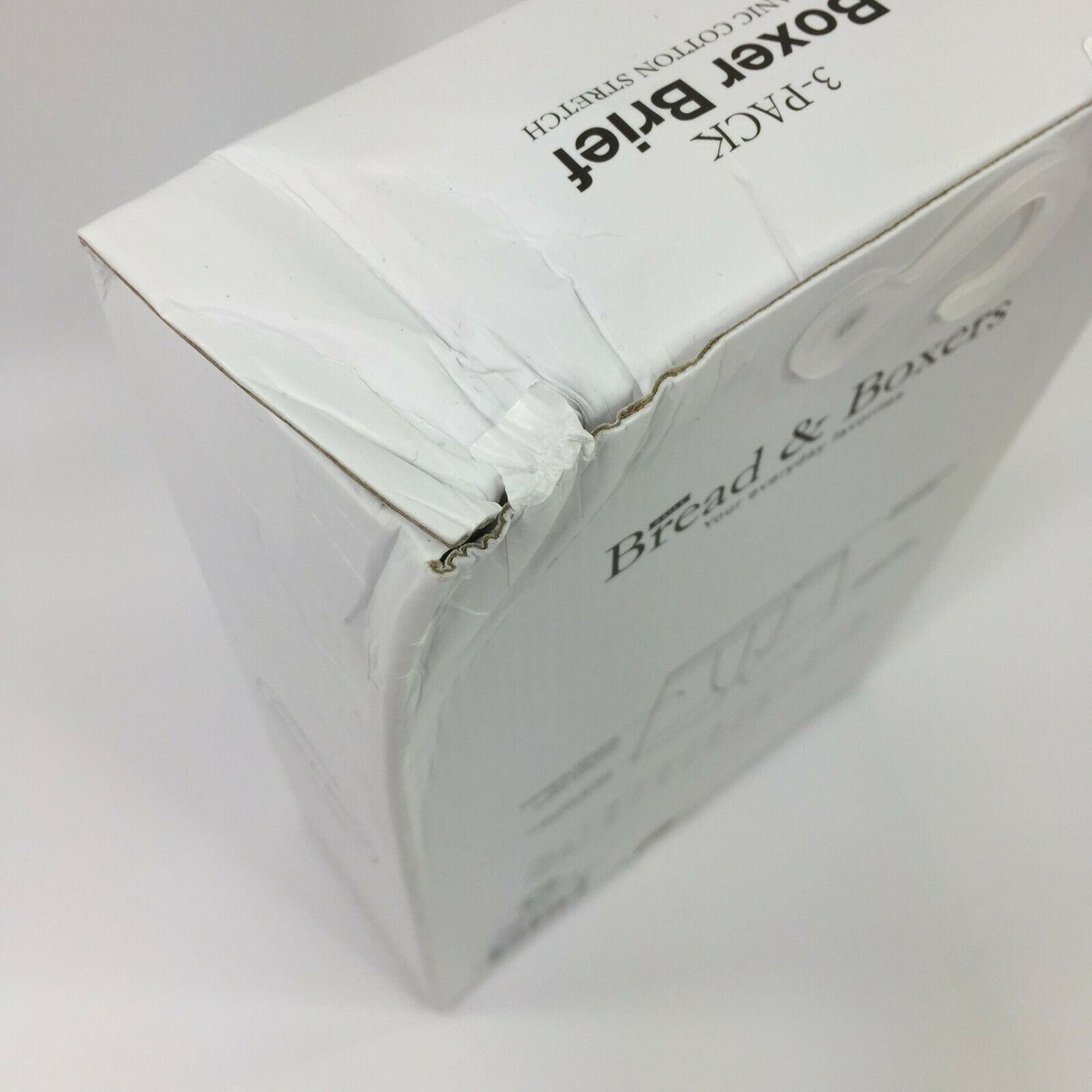
The packaging is a white folding carton with a smooth, flat construction. It features clean edges and precise folds, indicating it is made from a single layer of paperboard. The box has a slight crush on one corner, showing signs of handling. The surface is matte with a simple design, primarily in white, with minimal graphics. The front displays the product name 'Bread & Boxes' prominently, along with a description of the contents. The overall shape is rectangular, typical for retail packaging.
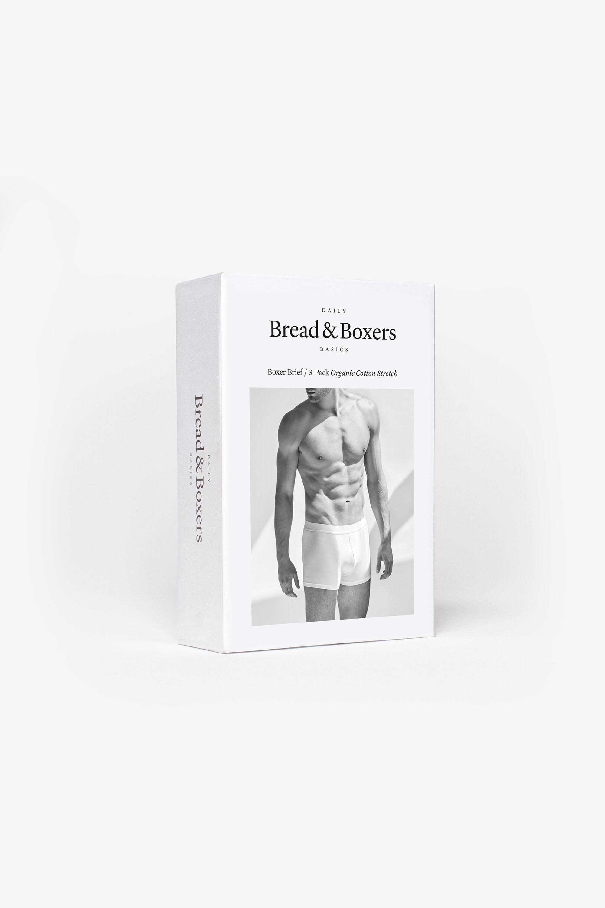
The packaging is a folding carton made from a single layer of paperboard. It has a smooth, flat construction with clean edges and folds. The exterior is predominantly white with a matte finish, featuring a large monochromatic image of a model wearing the product. The front displays the brand name 'Bread & Boxers' prominently in a modern font, along with product details. The overall design is minimalistic and elegant, indicative of retail packaging for clothing items.

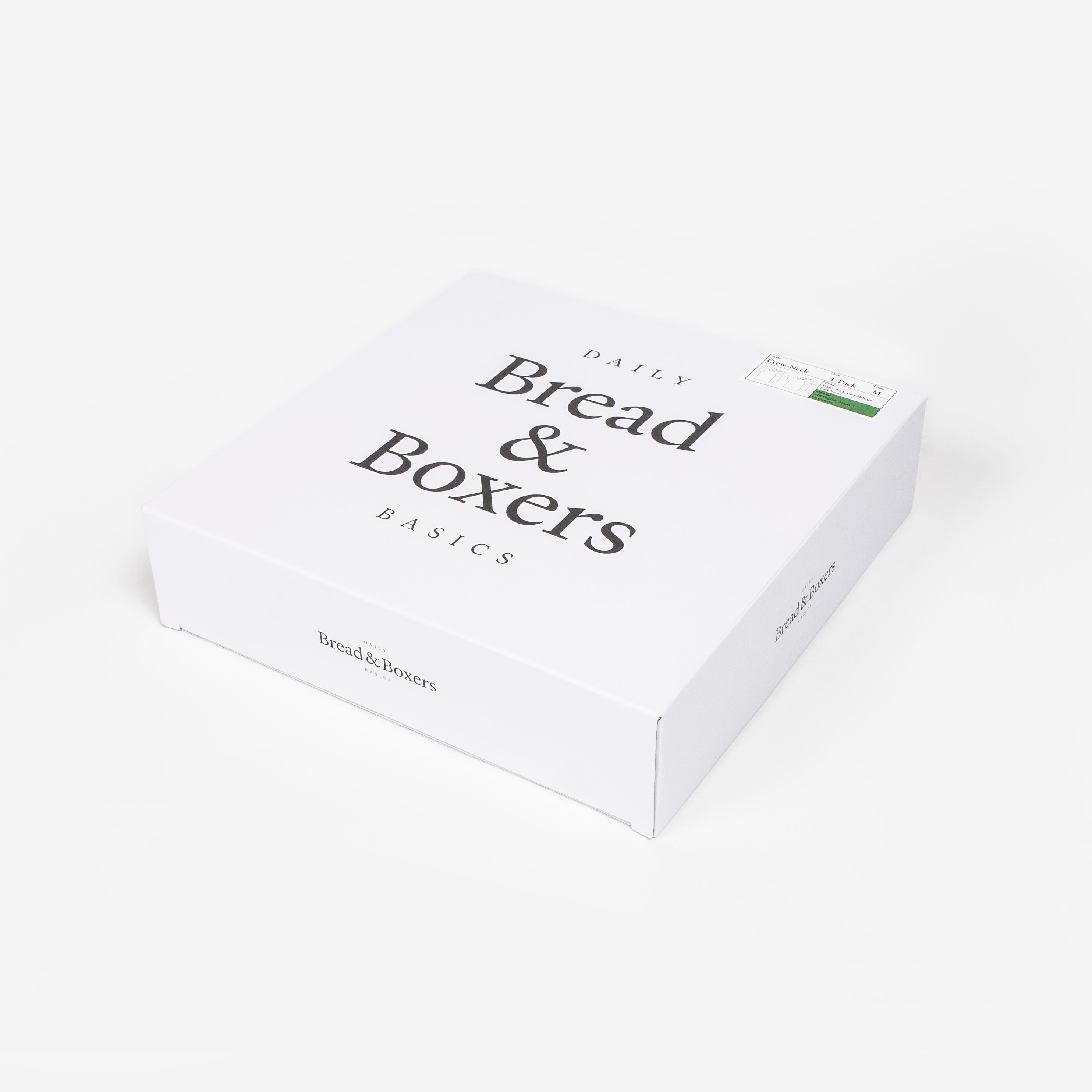
The packaging is a flat, rectangular box made of smooth, single-layer paperboard. It features clean, precise edges and folds, with a predominantly white exterior. The surface is free of fluted layers, indicating it is not corrugated. The front displays a large, bold text that reads 'Bread & Boxers' in a modern serif font, with 'DAILY' and 'BASICS' in smaller text above and below. The top has a label indicating the product style and pack size, which is printed in a contrasting green color.
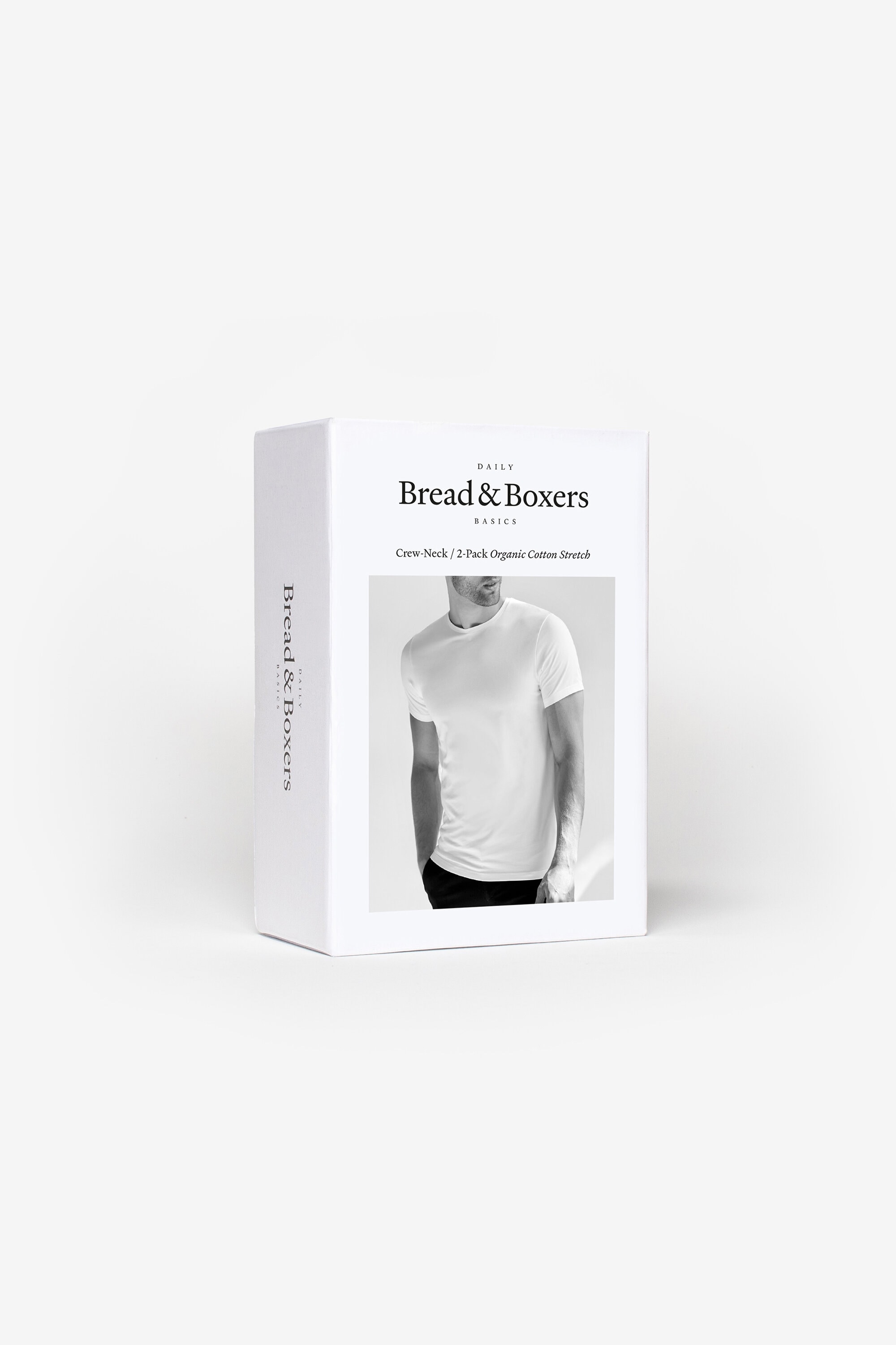
The packaging is a flat, rectangular folding carton made from single-layer paperboard. It features smooth, clean edges and precise folds, indicative of a retail carton. The exterior is predominantly white with a matte finish, providing a modern and sleek appearance. The front displays a large black-and-white image of a t-shirt, which is the product being packaged. The text is printed in a clear, sans-serif font, with 'Bread & Boxers' prominently featured. The overall design is minimalistic, emphasizing the product image and brand name.
The packaging is a flat, square box made of single-layer paperboard. It features smooth, clean edges and precise folds, indicating a well-constructed retail carton. The exterior is predominantly white with a matte finish, giving it a sleek appearance. The top surface has a large, centered text that reads 'DAILY Bread & Boxers Basics' in a bold, elegant font, while the sides are unprinted, maintaining a minimalist design. There are no visible flaps or tabs on the top, suggesting it is a tuck-top style.

The packaging consists of several flat pouches made of a smooth, single-layer paperboard material. Each pouch features a clean, white surface with minimalistic black text. The edges are neatly folded, and the overall appearance is lightweight and retail-friendly. The pouches are designed to stand upright, showcasing the brand's name prominently on the front.
About the Brand
Bread & Boxers delivers high-quality apparel essentials through a direct-to-consumer model, targeting consumers who value comfort, durability, and minimalist design. The company’s packaging approach leverages matte white carton boxes and pouches, aligning with its brand’s modern aesthetic and sustainability objectives.
The brand’s packaging portfolio is characterized by the consistent use of single-layer paperboard folding cartons, which are predominantly white and feature minimalistic graphics or monochrome product images. Emphasis is placed on structural integrity and visual simplicity, with packaging serving both as a protective medium and a brand communication tool. Bread & Boxers’ packaging design reflects their commitment to a seamless, branded customer experience, particularly in the context of e-commerce logistics.
Key Differentiator: Bread & Boxers distinguishes itself with an unwavering commitment to minimalist, sustainable packaging that reinforces brand identity while supporting efficient logistics and premium unboxing experiences.
Design System
Visual Style
Typography relies on modern sans-serif and clean serif fonts, with a restrained palette dominated by white, black, and subtle accent colors for product identification. The aesthetic emphasizes minimalism, clarity, and contemporary appeal.
Brand Identity
Logo usage is consistent, with the brand name 'Bread & Boxers' featured prominently across all packaging. Iconography is minimal or absent, ensuring visual focus remains on the brand and product. Visual consistency is achieved through recurring layout structures and color schemes.
Packaging Design
Material choices prioritize single-layer, recyclable paperboard, supporting a lightweight and eco-friendly approach. Structural design favors folding cartons and pouches that balance product protection with efficient use of materials, adhering to a minimalist, no-frills philosophy.
User Experience
Packaging is designed to streamline the unboxing process, delivering a visually coherent and satisfying experience that reinforces the brand’s minimalist ethos. The approach reduces excess packaging while ensuring products arrive intact, contributing to overall customer satisfaction and retention.
Company Metrics
Business insights for Bread & Boxers based on available data
Market Positioning
Brand Values & Focus
Key Competitors
Target Market: Digital-native, style-conscious consumers seeking high-quality, comfortable, and sustainable clothing essentials via a direct-to-consumer online platform.
Packaging Assessment
Overall Grade
Visual appeal and presentation quality
Packaging durability and protection
Eco-friendliness and recyclable materials
Cost efficiency and value for money
Packaging assessment for Bread & Boxers based on industry standards and best practices
Frequently Asked Questions
What types of packaging does Bread & Boxers use for its apparel products?
Bread & Boxers primarily utilizes single-layer paperboard folding cartons and retail pouches, characterized by matte white finishes, minimal graphics, and straightforward structural designs that enhance both brand visibility and product protection.
How does Bread & Boxers address sustainability in its packaging?
The company emphasizes recyclable materials and minimalist designs to reduce excess packaging and environmental impact, aligning with sustainable production practices that appeal to eco-conscious consumers.
Does the packaging design support the brand’s customer experience goals?
Yes, the packaging is designed to deliver a visually appealing and cohesive unboxing experience, reinforcing Bread & Boxers’ modern, minimalist brand identity while ensuring products arrive securely.
Discover other Apparel companies
Explore more companies in the apparel industry and their packaging strategies
Alexander Shorokhoff
Apparel
Alexander Shorokhoff is a luxury watch manufacturer that specializes in creating unique and artistic timepieces. Their products blend traditional craftsmanship with modern designs, appealing to discerning customers worldwide.
ALTI
Apparel
ALTI specializes in unique, handcrafted silver jewelry designed by skilled artisans in Sweden. The company offers a range of customizable options and promotes a tranquil lifestyle through its jewelry collections.
SUICOKE JAPAN
Apparel
SUICOKE specializes in high-quality footwear and apparel, focusing on unique designs and comfort. The brand is recognized for its innovative sandals and commitment to quality craftsmanship.