Brauerei Gold Ochsen GmbH packaging
Brauerei Gold Ochsen GmbH, a historic brewery based in Ulm, Germany, delivers a diverse portfolio of beverages including beer, spirits, and soft drinks. Their packaging strategy emphasizes robust branded carriers, recyclable materials, and design consistency across multiple product types.
Packaging Portfolio
Brauerei Gold Ochsen GmbH employs a robust mix of packaging formats, including glass bottle carriers, aluminum cans, and carton boxes tailored for both multipack and specialty products. Cardboard carriers and cartons are structurally engineered for bottle protection and ease of transport, while printed graphics and die-cut handles enhance usability and brand impact. The use of transparent plastic bags with branded headers for food items allows product visibility, though the primary focus remains on recyclable glass and paper-based solutions. Packaging solutions demonstrate a balance between durability, retail shelf appeal, and operational practicality.

The packaging is a rectangular, smooth, flat construction made from single-layer paperboard. It features a glossy black exterior with a large circular logo prominently displayed on the front. The front also has a clear window that showcases the bottles inside. The edges are clean and precise, indicating a well-constructed folding carton. The top and bottom flaps are neatly folded and secured, with no visible signs of wear or damage.
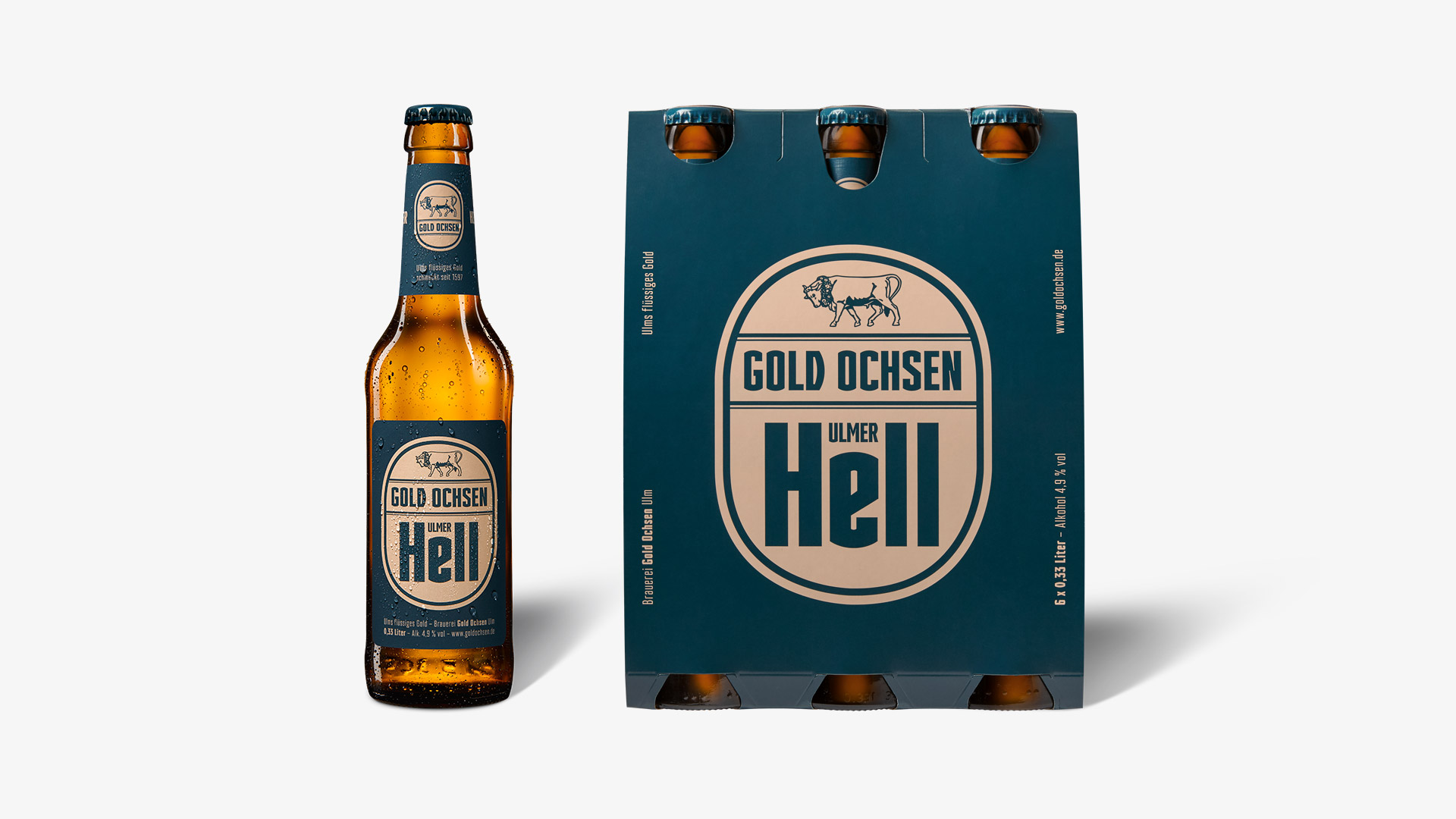
The packaging consists of a six-pack carrier made from a single layer of paperboard. It features a smooth, flat construction with clean edges and folds. The carrier is designed to hold six bottles of beer securely, with cut-out handles for easy carrying. The surface is printed with a dark blue background and contrasting beige elements, including the brand name and product type. The overall appearance is clean and professional, suitable for retail display.

The packaging is a transparent plastic bag with a cardboard header. The bag contains noodle products, showcasing the noodles through the clear plastic. The cardboard header is printed with vibrant colors and graphics, including a logo and product information. The overall design is clean and appealing, with a focus on the product inside.
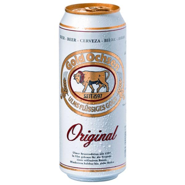
The packaging is a cylindrical aluminum can, typically used for beverages. It features a smooth surface with a metallic sheen, predominantly silver in color. The can has a printed label that wraps around its body, showcasing branding elements and product information. The top of the can has a pull-tab opening mechanism, and the bottom is flat. The can is designed to hold liquid, with a standard size commonly used for beer.

The packaging consists of a cardboard carrier holding four glass bottles of beer. The carrier is designed to securely hold the bottles upright, featuring cut-out handles for easy carrying. The overall structure is flat with a top flap that wraps around the bottles, providing stability and support. The carrier has a smooth surface with printed graphics, including the brand name and product details.
About the Brand
Brauerei Gold Ochsen GmbH leverages over four centuries of brewing heritage to deliver a wide range of beverages with a strong regional identity. The company's packaging approach prioritizes secure transport, shelf appeal, and clear brand communication.
Their packaging solutions reflect a mix of tradition and modernity, utilizing glass bottles, aluminum cans, and custom-designed cardboard carriers. Branding is consistent and prominent, reinforcing heritage and product authenticity. The brewery maintains a balance between durability in logistics and visual differentiation in retail environments, responding to both consumer expectations and operational efficiency.
Key Differentiator: Brauerei Gold Ochsen GmbH's unique value lies in its integration of historical branding with contemporary packaging formats, ensuring high recognizability while adapting to evolving market demands.
Design System
Visual Style
Typography emphasizes bold, legible sans-serif and serif fonts for product names and branding, paired with a classic color palette of gold, black, beige, and deep blue to reflect heritage and premium positioning. Overall aesthetic combines traditional motifs with contemporary clarity.
Brand Identity
Logo usage is prominent on all packaging, with consistent placement of the Gold Ochsen emblem and established year. Iconography is minimal but present for product differentiation. Visual consistency is achieved through repeated color schemes, font usage, and structured layouts.
Packaging Design
Material selection prioritizes glass, aluminum, and paperboard for recyclability and protection. Structural designs focus on stability (reinforced carriers, rigid cartons), ergonomic handling (die-cut handles), and clear branding display. Limited plastic use is reserved for specialty applications.
User Experience
Packaging supports a clear customer journey by providing intuitive opening mechanisms, strong visual cues for brand identification, and protective features for product security. Seasonal and limited-edition variants create engagement and reinforce brand loyalty.
Company Metrics
Business insights for Brauerei Gold Ochsen GmbH based on available data
Market Positioning
Brand Values & Focus
Key Competitors
Target Market: Regional and national consumers of beer, spirits, and soft drinks across retail, hospitality, and direct-to-consumer e-commerce channels.
Packaging Assessment
Overall Grade
Visual appeal and presentation quality
Packaging durability and protection
Eco-friendliness and recyclable materials
Cost efficiency and value for money
Packaging assessment for Brauerei Gold Ochsen GmbH based on industry standards and best practices
Frequently Asked Questions
What types of packaging does Brauerei Gold Ochsen GmbH use for its beverages?
The company utilizes glass bottles with printed cardboard carriers, branded aluminum cans, and transparent plastic bags with cardboard headers for specialty products, all featuring consistent visual branding and protective structures.
How does Gold Ochsen ensure packaging durability during distribution?
Structural packaging elements such as reinforced cardboard carriers and rigid carton boxes are used to secure bottles and cans, minimizing breakage and maintaining product integrity throughout the supply chain.
Is sustainability a focus in Gold Ochsen's packaging choices?
While the primary materials—glass, aluminum, and paperboard—are generally recyclable, the use of some plastic elements and limited visibility into sourcing practices indicate room for further sustainability improvements.
Discover other Food & Drink companies
Explore more companies in the food & drink industry and their packaging strategies
ruf lebensmittelwerk kg
Food & Drink
RUF Lebensmittelwerk KG is a German food production company specializing in a variety of baking mixes and drink products. Founded in 1920, the company is known for its high-quality ingredients and innovative food solutions.
Thés de la Pagode
Food & Drink
Thés de la Pagode is a French company specializing in organic teas and infusions, focusing on health and well-being. Established in 1987, they prioritize sustainable practices and high-quality ingredients sourced through fair trade.
Teegschwendner GmbH
Food & Drink
Teegschwendner GmbH is a specialty tea company based in Germany, offering a wide selection of high-quality teas and tea-related accessories. They focus on providing unique tea experiences through carefully sourced and curated products.