Bottega packaging
Bottega delivers gourmet food products across Mexico City, leveraging a curated selection of packaging solutions to balance product protection and brand presentation. Their approach prioritizes premium aesthetics and robust materials, supporting both product integrity and a luxury unboxing experience.
Packaging Portfolio
Bottega’s packaging portfolio centers on rigid boxes and luxury gift formats, leveraging thick-walled chipboard constructions and premium finishes such as matte surfaces, embossed gold lettering, and subtle textures. This selection prioritizes structural integrity and high-end presentation, with a focus on clean, precise edges and minimalist branding. The use of drawstring pouches and internal compartments further enhances product segmentation and protection, while understated color palettes reinforce the brand’s luxury positioning. Although sustainability considerations are present through occasional use of kraft or recyclable board, the primary emphasis remains on premium aesthetics and robust product security.
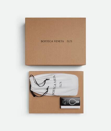
The packaging consists of a sturdy, thick-walled box with a premium appearance. The exterior is a kraft brown color, indicating a high-quality chipboard material. Inside, there is a white drawstring pouch that features the brand name 'BOTTEGA VENETA' printed in a bold, elegant font. The box has clean edges and a smooth finish, suggesting a well-crafted construction. The overall design is minimalistic yet luxurious, aligning with high-end branding.
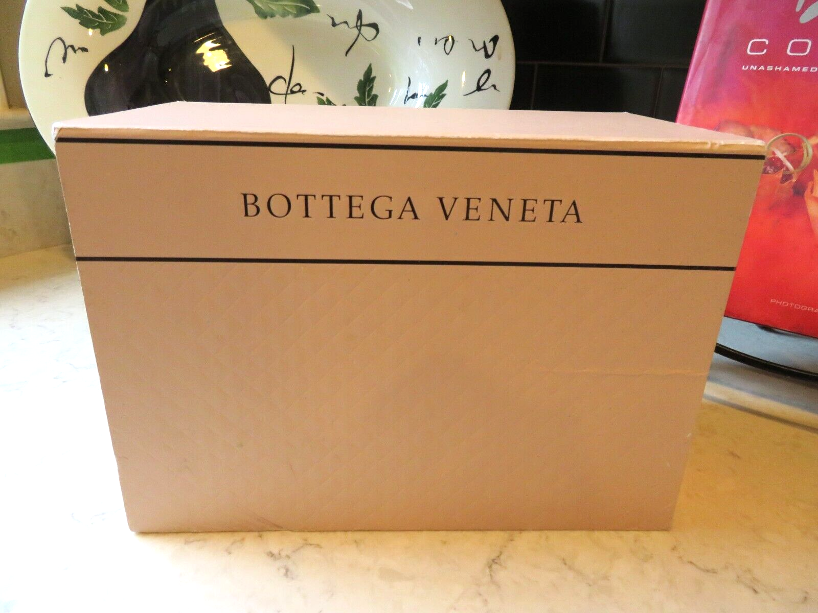
The packaging is a sturdy box with thick walls, giving it a premium feel. It features a smooth, matte finish with a subtle texture. The box is rectangular with clean, precise edges and corners. The top of the box has a simple, elegant design with the brand name 'BOTTEGA VENETA' prominently displayed in a serif font, centered and printed in a contrasting color. The overall color of the box is a soft, muted pink, which adds to its luxury appearance.

The packaging consists of a sturdy, thick-walled box with a premium finish. The exterior is a matte black color, while the interior is a contrasting lighter shade. The box has clean, precise edges and a luxurious appearance, indicative of high-quality construction. The lid is separate from the base, allowing for easy access to the contents. The box is adorned with the brand name 'BOTTEGA VENETA' embossed in gold lettering on the top, adding to its upscale aesthetic.
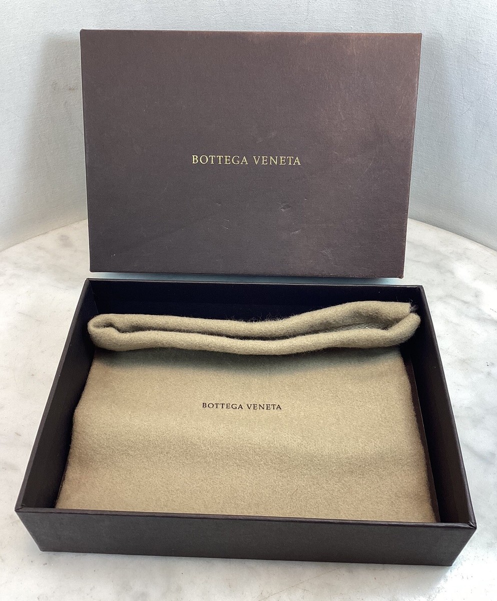
The packaging features a sturdy, thick-walled box with a luxurious appearance. The exterior is a dark brown color with a matte finish, while the interior is lined with a soft, beige fabric. The box opens from the top and contains a soft pouch that holds the product. The edges are clean and precise, indicating high-quality construction.
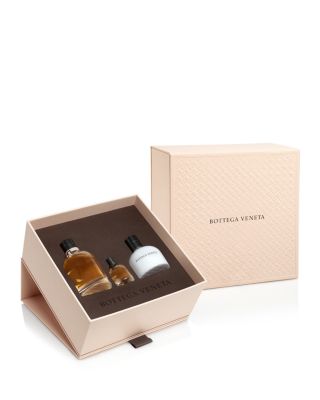
The packaging is a luxury gift box featuring a thick, sturdy chipboard construction with a premium appearance. The box has a soft, textured exterior in a light beige color, complemented by a darker brown interior. The edges are clean and precise, indicating high-quality craftsmanship. The box is designed to open from the top, revealing compartments for three smaller bottles, suggesting it is intended for a fragrance set or similar products.
About the Brand
Bottega specializes in online gourmet grocery delivery, offering an extensive range of high-quality food items to consumers in Mexico City. The brand’s packaging strategy focuses on combining durability with a refined visual identity, using rigid boxes and premium materials to reinforce its commitment to quality.
Packaging at Bottega is characterized by the use of sturdy, thick-walled rigid boxes and luxury gift formats that enhance both protection and presentation. Consistent use of minimalist design and muted color palettes supports the brand's positioning in the premium segment. This approach ensures product safety during transit while providing an elevated customer experience aligned with gourmet expectations.
Key Differentiator: Bottega’s unique value lies in its integration of high-grade packaging materials and minimalist, luxury-focused design, which distinctly aligns with the expectations of gourmet food consumers seeking both product quality and a premium unboxing experience.
Design System
Visual Style
Minimalist typography with serif fonts, muted and neutral color palettes (soft pinks, browns, matte black), and a focus on uncluttered layouts reflect a luxury aesthetic. Clean edges and subtle textures contribute to the premium visual identity.
Brand Identity
Brand name and logo consistently placed in prominent positions, often using gold foil or embossed finishes. Iconography is restrained, with emphasis on textual branding for clarity and cohesion. Visual consistency is maintained through repeated use of minimalist elements and unified color schemes.
Packaging Design
Material selection favors thick chipboard and rigid box formats, prioritizing structural durability and protection for gourmet products. The design philosophy emphasizes minimalism, functional elegance, and compartmentalization to ensure product safety and organized presentation.
User Experience
The packaging design supports the customer journey by delivering a high-impact unboxing experience, reinforcing the premium positioning of the brand, and ensuring all products arrive securely and aesthetically presented. Attention to material quality and structural details enhances both practical usability and emotional engagement.
Company Metrics
Business insights for Bottega based on available data
Market Positioning
Brand Values & Focus
Key Competitors
Target Market: Affluent consumers and culinary enthusiasts in Mexico City seeking premium gourmet food products and exceptional delivery experiences.
Packaging Assessment
Overall Grade
Visual appeal and presentation quality
Packaging durability and protection
Eco-friendliness and recyclable materials
Cost efficiency and value for money
Packaging assessment for Bottega based on industry standards and best practices
Frequently Asked Questions
What types of packaging does Bottega use for their gourmet products?
Bottega primarily utilizes rigid boxes, luxury gift boxes, and carton formats. These structures are selected for their durability and high-end presentation, supporting both product safety and brand image.
How does Bottega’s packaging impact the customer experience?
The premium materials and minimalist design enhance the unboxing experience, creating a sense of luxury and care that resonates with gourmet consumers.
Is Bottega's packaging environmentally friendly?
While rigid boxes offer protection and a premium feel, their sustainability depends on material sourcing. Current practices show some use of recyclable board, but broader adoption of eco-friendly materials could further improve environmental performance.
Discover other Food & Drink companies
Explore more companies in the food & drink industry and their packaging strategies
ruf lebensmittelwerk kg
Food & Drink
RUF Lebensmittelwerk KG is a German food production company specializing in a variety of baking mixes and drink products. Founded in 1920, the company is known for its high-quality ingredients and innovative food solutions.
Teegschwendner GmbH
Food & Drink
Teegschwendner GmbH is a specialty tea company based in Germany, offering a wide selection of high-quality teas and tea-related accessories. They focus on providing unique tea experiences through carefully sourced and curated products.
PrepMyMeal
Food & Drink
PrepMyMeal is a food production company specializing in high-protein meal delivery services. They offer a variety of natural, nutritious meals designed for fitness enthusiasts and those seeking convenience in meal preparation.