Body Attack packaging
Body Attack is a German provider of nutritional supplements for fitness and health, utilizing robust, branded packaging for products ranging from protein powders to workout boosters. Their packaging strategy emphasizes product security, shelf appeal, and consistent branding across a range of rigid containers and supplement bottles.
Packaging Portfolio
Body Attack’s packaging portfolio is characterized by the use of rigid cylindrical plastic containers, supplement bottles, and retail-ready canisters, all featuring secure screw-on lids and vibrant, high-gloss label applications. The materials selected provide superior product protection and tamper resistance, which is critical for powdered and capsule-based supplements. Visual branding is consistent across product lines, with prominent logo placement and distinct color schemes supporting SKU differentiation and strong shelf impact. While the packaging prioritizes logistics safety and visual appeal, the use of primarily plastic substrates indicates moderate progress on sustainability compared to emerging industry standards.

The packaging is a cylindrical bottle made of opaque black plastic. The bottle has a smooth surface with a glossy finish. The cap is a screw-on type, which is also black and has a textured surface for grip. The front label features bold red and white text, prominently displaying the product name 'ZINC BISGLYCINATE' along with dosage information. The back label contains additional product details and nutritional information. The overall design is sleek and modern, with a focus on clarity and readability.
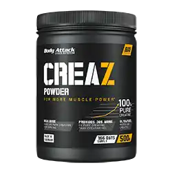
The packaging is a cylindrical container made of black plastic with a screw-on lid. The surface is smooth with a matte finish, giving it a sleek appearance. The container is predominantly black with vibrant yellow and white graphics. The front features the product name 'CREAZ' in bold lettering, along with descriptors like 'POWDER' and 'FOR MORE MUSCLE POWER'. The back likely contains nutritional information and usage instructions, though not visible. The container has a standard size for supplement packaging, typically around 500 grams.
The packaging is a cylindrical container made of thick, sturdy plastic. It features a smooth surface with a matte finish, predominantly black with vibrant red and white graphics. The container has a wide mouth for easy access and a secure screw-on lid. The design includes a prominent label that displays product information and branding elements.

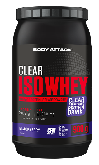
The packaging is a cylindrical container with a black plastic lid and a vibrant orange body. The container features a glossy finish, showcasing a tropical design with illustrations of pineapple and papaya. The product name 'CLEAR ISO WHEY' is prominently displayed in bold white lettering, along with the flavor 'EXOTIC' in a smaller font. The overall design is eye-catching and modern, appealing to fitness enthusiasts.
The packaging is a cylindrical container with a thick, sturdy chipboard construction. It features a glossy finish with vibrant colors, predominantly red with orange and yellow accents. The design includes a clear, bold logo at the top and product information prominently displayed on the front. The container has a screw-on lid, which is typical for supplement packaging, ensuring a secure closure.
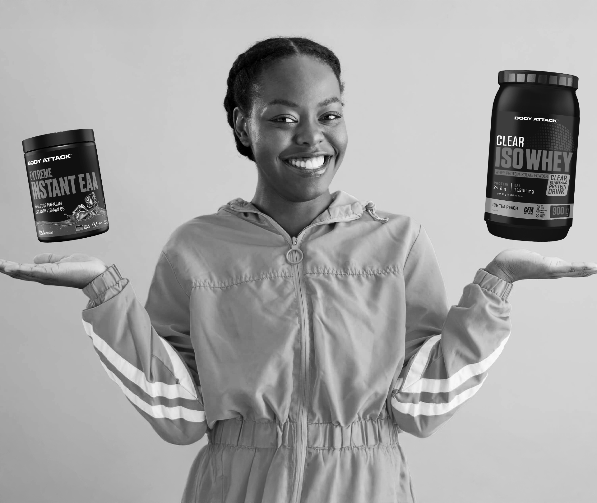
The packaging consists of two cylindrical containers held by a person, both featuring a matte black finish with vibrant colored labels. The containers have a sturdy, thick construction typical of rigid boxes, providing a premium feel. The labels are designed with bold graphics and clear product information, enhancing visibility and appeal.
About the Brand
Body Attack specializes in health and fitness supplements, distributing its products directly to consumers through a strong e-commerce platform. The company leverages visually impactful, functional packaging to reinforce its brand positioning as a trusted source of performance nutrition.
With a diverse portfolio that includes protein powders, amino acids, and sports drinks, Body Attack employs primarily rigid plastic containers and supplement bottles designed for durability and brand consistency. Their packaging approach supports logistics efficiency while maintaining high visibility in both online and retail channels. The company’s visual strategy centers on bold color schemes and prominent logo placement, ensuring immediate brand recognition and alignment with consumer expectations in the fitness sector.
Key Differentiator: Body Attack’s packaging is distinguished by its consistent application of vibrant, branded rigid containers that combine physical robustness with high-impact shelf presence, catering specifically to the needs of active, health-focused consumers.
Design System
Visual Style
Body Attack employs bold sans-serif typography, a high-contrast color palette dominated by reds, blacks, oranges, and yellows, and glossy or matte finishes to enhance on-shelf and digital presentation. The aesthetic is energetic and performance-driven, aligning with fitness industry trends.
Brand Identity
The brand identity is reinforced through large, centrally placed logos, clear product names, and consistent use of iconography and color coding for easy product differentiation. Labels are designed for clarity and rapid recognition, with a focus on fitness-oriented motifs.
Packaging Design
Material choices prioritize rigid plastics for durability and product protection. Structural design emphasizes wide-mouth containers for user convenience, secure closures, and cylindrical forms that are both stackable and visually prominent. The design philosophy balances logistics efficiency with high-impact branding.
User Experience
The packaging design supports the customer journey by offering easy-open containers, clear nutritional labeling, and visually coherent branding that builds trust and repeat engagement. The tactile quality and robust construction contribute to a premium unboxing experience and reinforce perceived product value.
Company Metrics
Business insights for Body Attack based on available data
Market Positioning
Brand Values & Focus
Key Competitors
Target Market: Fitness enthusiasts, athletes, and health-conscious consumers seeking high-quality nutritional supplements in Germany and broader European markets.
Packaging Assessment
Overall Grade
Visual appeal and presentation quality
Packaging durability and protection
Eco-friendliness and recyclable materials
Cost efficiency and value for money
Packaging assessment for Body Attack based on industry standards and best practices
Frequently Asked Questions
What types of packaging does Body Attack primarily use for its supplements?
Body Attack predominantly utilizes rigid cylindrical plastic containers and supplement bottles with screw-on lids, optimized for product protection, user convenience, and strong branding.
How does Body Attack’s packaging support its e-commerce and logistics strategy?
The use of durable, tamper-resistant rigid containers ensures product safety during shipping and storage, which is essential for direct-to-consumer fulfillment and repeat purchases.
Does Body Attack incorporate sustainable materials in its packaging?
While rigid plastics dominate their portfolio, there is limited publicly available evidence of significant use of recycled or biodegradable materials, indicating moderate progress toward sustainability goals.
Discover other Beauty & Fitness companies
Explore more companies in the beauty & fitness industry and their packaging strategies
Orris Paris
Beauty & Fitness
Orris Paris specializes in creating artisanal skincare products that combine potent botanical ingredients with modern cleansing rituals. The company emphasizes natural, holistic practices in its formulations.
Big Moustache
Beauty & Fitness
Big Moustache specializes in shaving and grooming products tailored for men, providing a hassle-free subscription service for razor blades and skincare essentials.
Institut Karité Paris
Beauty & Fitness
Institut Karité Paris specializes in luxury beauty products made with natural Shea Butter, offering a wide range of skincare and body care solutions. The brand combines Parisian heritage with a commitment to quality and creativity in its offerings.