BIOTURM Naturkosmetik packaging
BIOTURM Naturkosmetik specializes in certified natural cosmetics for sensitive skin, leveraging a direct-to-consumer model. Their packaging approach emphasizes sustainability, using recyclable carton boxes and minimalistic flexible sachets tailored for product protection and eco-conscious branding.
Packaging Portfolio
BIOTURM’s packaging portfolio is centered on the use of folding carton boxes manufactured from single-layer paperboard, frequently with a matte or textured finish to reinforce a natural, eco-friendly aesthetic. Packaging formats include rectangular retail cartons, small square boxes for solid products, and flexible sachets for samples. Embossed logos, botanical illustrations, and minimalistic design elements are consistently applied, ensuring high brand recognition. The reliance on recyclable materials and the absence of excessive plastics reflect a deliberate strategy to minimize environmental impact while maintaining product protection and shelf appeal.

The packaging is a folding carton made from a single-layer paperboard. It features a smooth, flat construction with clean edges and folds. The exterior is a soft pink color with a large floral graphic of a hibiscus flower, which occupies a significant portion of the front face. The brand name 'BIOTURM' is prominently displayed at the top in a bold, white font, while the product name 'Feste Dusche' is also in white, slightly larger and centered. The overall design has a matte finish, giving it a premium look. The back of the carton likely contains additional product information, though it is not visible in the image.

The packaging is a single-use sachet designed for containing shampoo. It features a smooth, flat construction with a sealed edge. The front displays a dark green background with the product name 'Repair Shampoo' prominently featured in white text. Below the product name, there are additional descriptions in both English and German, indicating its purpose and benefits. The sachet has a matte finish with a slight sheen, giving it a premium appearance. The bottom corner includes a small graphic of a plant, suggesting natural ingredients.
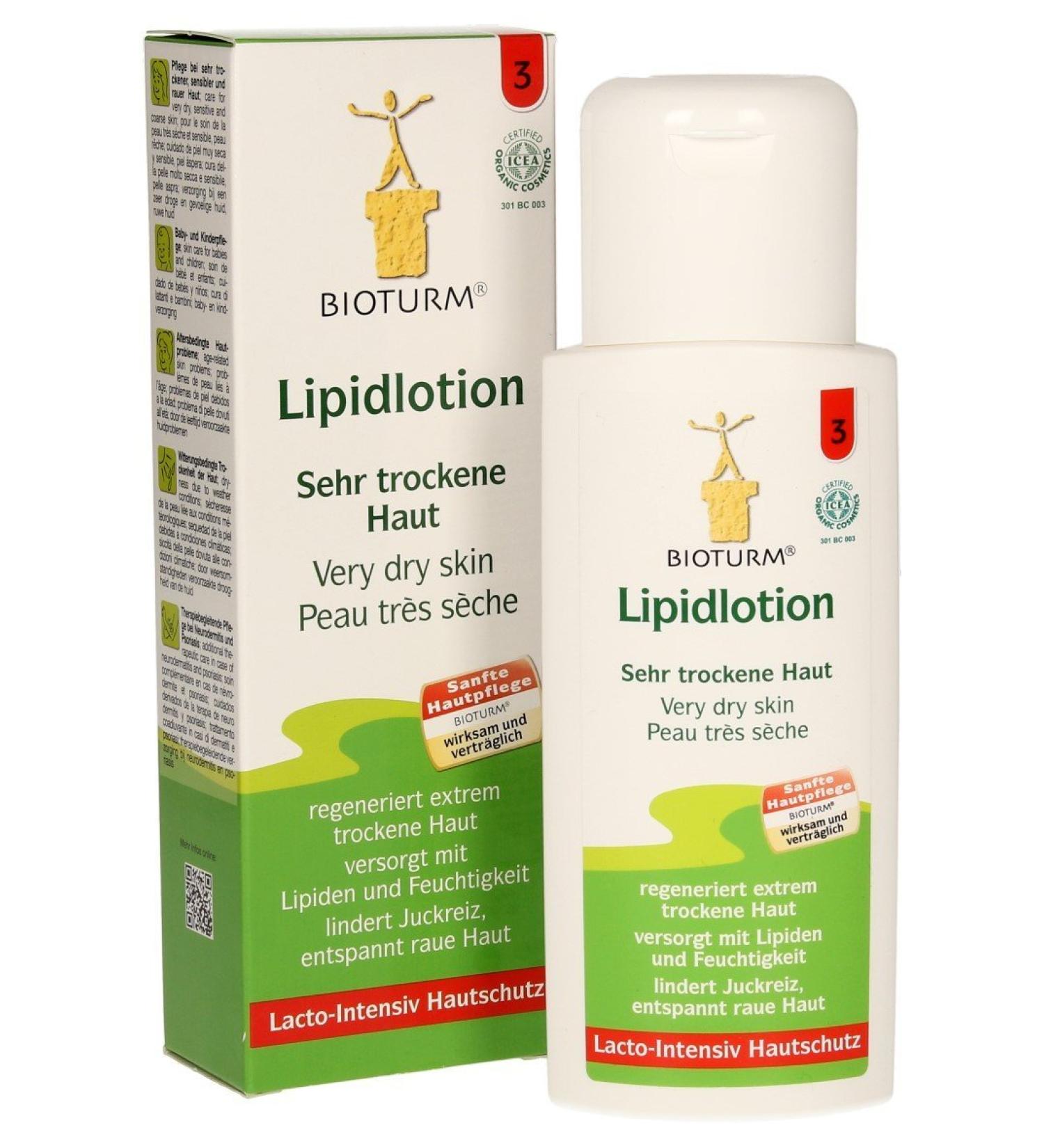
The packaging is a folding carton with a smooth, flat construction. It features clean edges and precise folds, typical of retail packaging. The exterior is predominantly white with colorful graphics and text. The front displays the product name 'Lipidlotion' prominently, along with branding elements. The sides contain additional product information and instructions. The overall shape is rectangular, designed to stand upright on retail shelves.

The packaging is a folding carton made from single-layer paperboard. It features a smooth, flat construction with clean edges and folds. The exterior is primarily a natural kraft color with a matte finish, while the interior is a lighter beige. The carton is designed to hold a round product, which is visible through a circular cut-out in the top flap. The design includes a logo embossed on the product itself, and there are printed instructions or descriptions on the inner flaps.

The packaging is a folding carton made from a single layer of paperboard, featuring a smooth, flat construction with clean edges and folds. The exterior is a light green color with a textured finish, resembling recycled paper. The front displays a simple graphic of hands, emphasizing the product's focus on hand care. The box is designed to hold a tube of cream and a pair of gloves, with a compact rectangular shape. The top flap is designed to tuck securely into place, ensuring the contents are protected.

The packaging consists of several small, square boxes made from single-layer paperboard. Each box has a smooth, flat construction with clean edges and folds. The boxes are presented in various colors, including green, red, and blue, with embossed and printed designs. The surface appears to have a matte finish, enhancing the premium feel. The boxes are arranged in a visually appealing stack, showcasing their decorative elements.
About the Brand
BIOTURM Naturkosmetik is a German natural cosmetics brand focused on solutions for sensitive and irritated skin. The company integrates environmental sustainability and consumer health into both its product formulations and packaging decisions.
Operating from the Westerwald region, BIOTURM offers a comprehensive portfolio spanning facial, body, hair, and intimate care, with a notable commitment to vegan and plastic-free options. Packaging structures primarily consist of single-layer folding cartons and flexible sachets, all designed to reflect the brand’s sustainability priorities. Their approach includes using recyclable materials and a branding strategy that highlights both product efficacy and environmental responsibility.
Key Differentiator: BIOTURM’s unique differentiator lies in its combination of certified natural skincare for sensitive skin and a strong emphasis on eco-friendly, brand-aligned packaging using recyclable materials and minimalistic design.
Design System
Visual Style
Typography is clean and modern, using sans-serif fonts for clarity and accessibility. The color palette consists of earthy tones—greens, beiges, soft pinks, and whites—with botanical accents. The overall aesthetic is minimalist, prioritizing clarity and natural cues.
Brand Identity
The BIOTURM logo is prominently featured on all packaging, often accompanied by eco-certification icons and product names in bold, high-contrast text. Consistent placement of branding elements and use of cohesive graphics ensure strong shelf presence and easy recognition.
Packaging Design
Materials are chosen for recyclability and tactile quality, predominantly paperboard with a matte or lightly textured finish. Structures focus on efficient folding cartons and compact single-use sachets, balancing protection and sustainability.
User Experience
Packaging is designed to support an intuitive unboxing process, with clear labeling and easy-to-open structures. The visual and tactile qualities reinforce the brand’s natural ethos, while the compact formats and sample sizes enhance convenience for D2C customers.
Company Metrics
Business insights for BIOTURM Naturkosmetik based on available data
Market Positioning
Brand Values & Focus
Key Competitors
Target Market: Eco-conscious consumers seeking certified natural skincare, particularly those with sensitive or irritated skin, including vegan and health-oriented segments in Europe.
Packaging Assessment
Overall Grade
Visual appeal and presentation quality
Packaging durability and protection
Eco-friendliness and recyclable materials
Cost efficiency and value for money
Packaging assessment for BIOTURM Naturkosmetik based on industry standards and best practices
Frequently Asked Questions
What types of packaging does BIOTURM Naturkosmetik use?
The company utilizes primarily folding carton boxes made from single-layer paperboard for most products, complemented by flexible single-use sachets for samples and travel sizes. All packaging is designed to be recyclable and reflect the brand's commitment to sustainability.
How does BIOTURM’s packaging support sustainability?
BIOTURM’s packaging strategy incorporates recyclable materials, eco-friendly paperboard, and minimal use of plastics. The design choices are aligned with the brand’s environmental values, aiming to reduce environmental impact across the product lifecycle.
Is BIOTURM’s packaging suitable for e-commerce logistics?
Yes, the folding carton structures offer adequate protection and product stability for direct-to-consumer shipping, while the material choices balance durability with eco-consciousness.
Discover other Beauty & Fitness companies
Explore more companies in the beauty & fitness industry and their packaging strategies
Orris Paris
Beauty & Fitness
Orris Paris specializes in creating artisanal skincare products that combine potent botanical ingredients with modern cleansing rituals. The company emphasizes natural, holistic practices in its formulations.
Owari
Beauty & Fitness
Owari specializes in 100% natural beauty and fitness products, designed to enhance health and wellness. The company proudly offers its products made in France, emphasizing quick delivery and customer support.
Pure Altitude
Beauty & Fitness
Pure Altitude specializes in high-quality beauty and skincare products that leverage the expertise of spa treatments to enhance daily routines. The brand offers a diverse range of products tailored for both facial and body care.