Better Be Bold packaging
Better Be Bold specializes in grooming solutions for bald individuals, leveraging a direct-to-consumer model with a strong emphasis on customer experience and premium packaging. The brand utilizes rigid gift boxes and custom cartons to reinforce its identity and enhance product presentation.
Packaging Portfolio
Better Be Bold’s packaging portfolio centers on rigid chipboard gift boxes and custom folding cartons, both employing matte finishes and deep green colorways for brand consistency. Rigid boxes are designed for premium bundles, using precision-cut interiors and shredded filler for secure product placement. Folding cartons, made from single-layer paperboard, support individual retail products and feature clean structural lines and high-impact visual branding. This hybrid approach ensures durability, shelf presence, and a refined unboxing experience, while maintaining an emphasis on recyclability and minimal excess material.

The packaging is a folding carton box made from single-layer paperboard. It features a smooth, flat construction with clean edges and folds. The box is predominantly dark green with a matte finish, giving it a premium appearance. The front displays the brand name 'BETTER BE BOLD' prominently in white, along with product details. The sides have additional text and graphics that are consistent with the brand's aesthetic.

The packaging is a rigid gift box featuring a sturdy construction with thick chipboard walls. The exterior is primarily a dark green color with a matte finish, while the interior is designed to hold two bottles securely. The box has a hinged lid that opens upwards, revealing a black shredded paper filler inside. The front of the box includes printed text and graphics, highlighting the product's features and brand. The edges are clean and precise, indicating high-quality manufacturing.

The packaging is a folding carton made of smooth, single-layer paperboard. It features a rectangular shape with clean, precise edges and folds. The exterior is predominantly dark green with a matte finish, while the interior is likely a lighter color. The front of the carton displays the brand name 'BETTER BE BOLD' prominently in a bold, white font, along with product details. The sides of the carton have additional text and possibly graphics that align with the brand's identity.
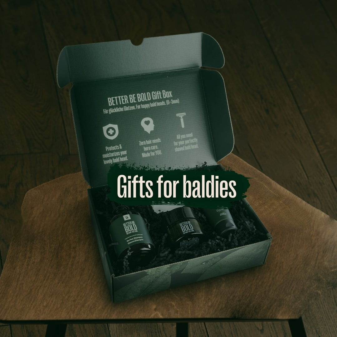
The packaging is a rigid box with a sturdy construction, featuring a thick chipboard material. The box has a premium appearance with a smooth exterior finish. The lid is designed to open upwards, revealing the contents inside. The interior is lined with black filler material, providing cushioning for the products. The exterior has a matte finish with a combination of dark green and white colors, and the text is prominently displayed on the lid.

The packaging consists of a folding carton made from a single layer of paperboard. The exterior features a matte finish with a dark green color, while the interior is likely a lighter shade. The carton has clean, precise edges and folds, indicative of a well-constructed retail package. The front displays a prominent logo and product name, with additional text detailing the product's use. The sides and back contain further product information and branding elements.

The packaging is a tall, rectangular folding carton made of smooth, single-layer paperboard. It features a matte finish with a dark green color scheme and white text. The edges are clean and precise, with a fold-over top and a tuck flap closure. The front displays the product name and SPF information prominently, while the sides contain additional product details and branding elements.
About the Brand
Better Be Bold is a niche beauty brand focused on bald care, offering head shavers, bald creams, and UV protection products. The company differentiates itself through tailored product formulations and a pronounced commitment to packaging design that aligns with its brand ethos.
Operating primarily online, Better Be Bold employs packaging as a strategic tool for both customer engagement and brand reinforcement. Their packaging solutions are characterized by high-quality materials and consistent visual branding, supporting a premium market position. The company’s packaging approach integrates functional protection with aesthetic appeal, directly supporting its community-driven marketing strategy.
Key Differentiator: Better Be Bold's unique focus on the bald care niche, paired with custom, brand-consistent packaging and a strong sustainability narrative, distinguishes it from broader grooming competitors.
Design System
Visual Style
The brand applies a modern, minimalistic aesthetic with sans-serif typography, a dark green primary palette accented by white and subtle metallics, and a matte finish across all touchpoints. Visual hierarchy is maintained through bold type, clear iconography, and consistent layout structure.
Brand Identity
Logo usage is prominent on all packaging, reinforcing brand recognition. Iconography is minimal and purposeful, supporting key product messages. Visual consistency is achieved through uniform color application and repeated use of the 'BETTER BE BOLD' logo and tagline.
Packaging Design
Material selection favors thick chipboard for gift boxes and sturdy paperboard for cartons, prioritizing product protection and tactile quality. Structural designs emphasize clean lines, secure closures, and space-efficient interiors, reflecting a premium retail standard.
User Experience
The packaging design guides users through a seamless unboxing process, from visual cues on the exterior to organized product placement inside. Messaging and graphics are clear, supporting both practical use and emotional engagement, and reinforcing the brand’s promise of care and boldness.
Company Metrics
Business insights for Better Be Bold based on available data
Market Positioning
Brand Values & Focus
Key Competitors
Target Market: Bald individuals seeking premium grooming and skincare solutions, primarily in the European D2C e-commerce market.
Packaging Assessment
Overall Grade
Visual appeal and presentation quality
Packaging durability and protection
Eco-friendliness and recyclable materials
Cost efficiency and value for money
Packaging assessment for Better Be Bold based on industry standards and best practices
Frequently Asked Questions
What types of packaging does Better Be Bold use for its products?
Better Be Bold utilizes a mix of rigid gift boxes for bundles and premium sets, as well as custom-designed folding cartons for individual products. Packaging materials are typically thick chipboard for gift boxes and high-quality paperboard for retail cartons, both featuring brand-consistent matte finishes and bold visual elements.
How does Better Be Bold address sustainability in its packaging?
The brand prioritizes recyclable materials and minimizes excess packaging. Most cartons are made from paperboard, and rigid boxes use chipboard with recyclable filler, reflecting an effort to reduce environmental impact while maintaining high presentation standards.
How does packaging contribute to Better Be Bold’s brand experience?
Packaging plays a central role in the customer journey, with designs that reinforce brand identity through consistent color schemes, typography, and messaging. The unboxing experience is carefully curated to evoke a sense of quality and confidence, aligning with the brand’s mission.
Discover other Beauty & Fitness companies
Explore more companies in the beauty & fitness industry and their packaging strategies
Orris Paris
Beauty & Fitness
Orris Paris specializes in creating artisanal skincare products that combine potent botanical ingredients with modern cleansing rituals. The company emphasizes natural, holistic practices in its formulations.
Big Moustache
Beauty & Fitness
Big Moustache specializes in shaving and grooming products tailored for men, providing a hassle-free subscription service for razor blades and skincare essentials.
Owari
Beauty & Fitness
Owari specializes in 100% natural beauty and fitness products, designed to enhance health and wellness. The company proudly offers its products made in France, emphasizing quick delivery and customer support.