Benriner packaging
Benriner specializes in premium Japanese kitchen tools, supplying culinary enthusiasts with precision-focused products such as mandolins and graters. Their packaging strategy utilizes branded carton boxes designed to balance protection, product visibility, and clear communication, aligning with retail and e-commerce requirements.
Packaging Portfolio
Benriner’s packaging portfolio is dominated by single-layer, glossy-finished carton boxes engineered for both protection and retail display. Structural elements include die-cut windows for product visibility, tuck-tab closures for secure containment, and flat, rectangular forms optimized for shelf presentation. The use of vibrant product imagery, bilingual instructions, and precise folds reflects a focus on product education and visual clarity. Material choice prioritizes lightweight paperboard, balancing cost-efficiency with moderate protective capability and recyclability.

The packaging is a folding carton made from single-layer paperboard. It features a smooth, flat construction with clean edges and precise folds. The exterior is predominantly white with colorful graphics and text, showcasing the product prominently. The front displays images of the mandolin slicer, along with product features and usage instructions. The overall shape is rectangular, designed to stand upright on retail shelves.

The packaging consists of a flat, smooth, single-layer paperboard carton that is primarily white with a glossy finish. It features a die-cut window on the front, allowing visibility of the product inside. The edges are clean and precise, with well-defined folds. The front displays vibrant colors and graphics, including images of the product and usage instructions. The back includes additional product information and branding elements.
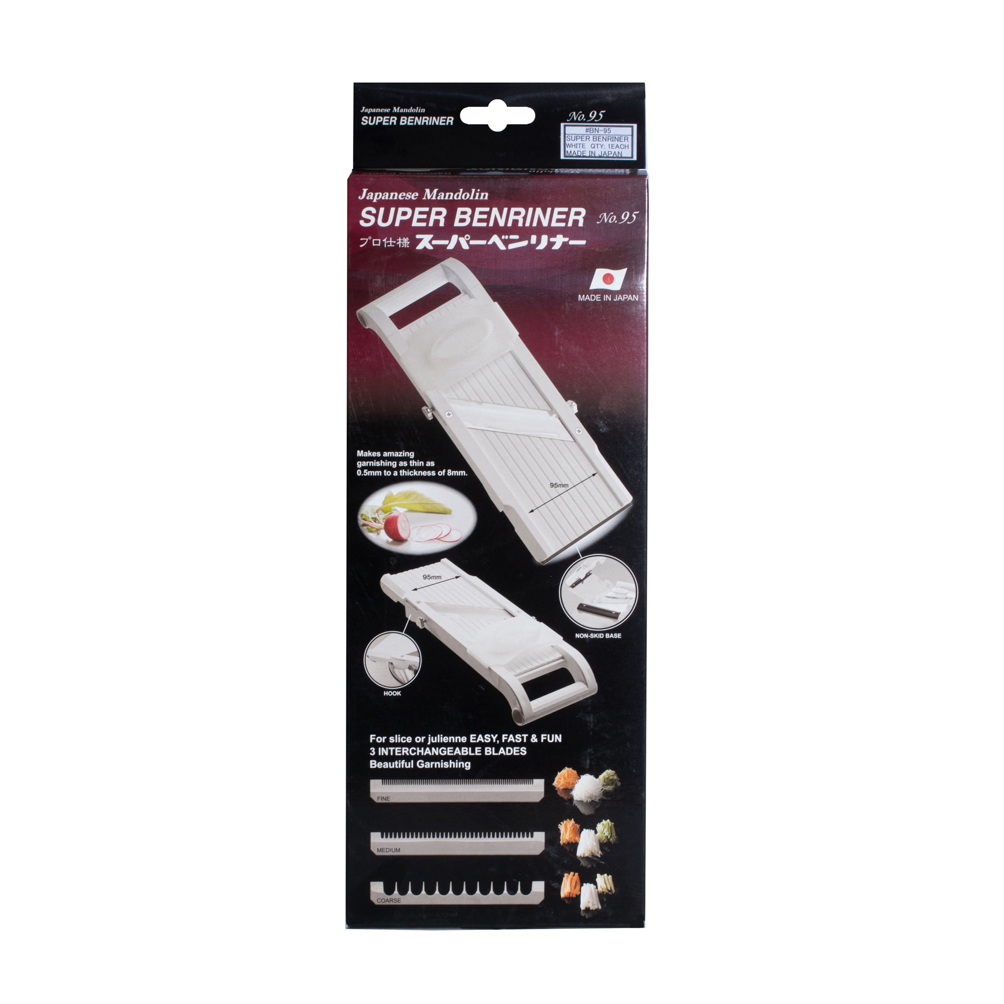
The packaging is a flat, rectangular folding carton made of single-layer paperboard. It features a smooth, white exterior with a glossy finish. The edges are clean and precise, with no visible fluted layers. The front displays vibrant graphics and text, showcasing the product and brand information prominently. The back has additional product details and instructions. The carton is designed to stand upright and has a tuck tab closure at the top.

The packaging is a flat, rectangular folding carton made of single-layer paperboard. It features a smooth, clean surface with precise edges and folds. The exterior is predominantly cream-colored with a glossy finish, enhancing its retail appeal. The front displays vibrant graphics and text, including product information and branding elements. The back has additional details and instructions, maintaining a consistent design throughout.
The packaging is a flat, rectangular folding carton made from single-layer paperboard. It features a smooth surface with clean edges and precise folds. The exterior is predominantly white with colorful graphics and images showcasing the product. The front displays the product name 'BENRINER' prominently, along with illustrations of the product in use. The back includes additional product information and usage instructions. The carton has a glossy finish, enhancing the visual appeal.
About the Brand
Benriner operates in the kitchenware segment, delivering Japanese-designed mandolins, graters, and specialized culinary equipment to both home cooks and professionals. Their approach to packaging is characterized by custom-printed, single-layer carton boxes that emphasize product presentation and instructional clarity.
The brand’s packaging consistently features high visual clarity, structural precision, and product-focused graphics. Each carton is engineered to facilitate shelf display, with die-cut windows or prominent imagery enabling product inspection and consumer engagement. Information density on both front and reverse panels supports consumer education and guides correct product usage.
Key Differentiator: Benriner’s packaging stands out through its integration of detailed product illustrations, bilingual instructions, and adherence to Japanese design principles, creating a distinct market identity that reinforces both quality and usability.
Design System
Visual Style
Typography is clean and legible, often using sans-serif fonts in both English and Japanese scripts. The color palette is typically white or cream with vibrant accent colors highlighting product features and usage. Overall aesthetic is minimalist yet informative, supporting both functional and aspirational brand positioning.
Brand Identity
Consistent deployment of the Benriner logo and product name across all surfaces, with supporting iconography for usage instructions. Visual consistency is maintained through standardized color usage, image placement, and bilingual communication.
Packaging Design
Material selection centers on single-layer, recyclable paperboard with glossy finishes for retail impact. Structural design emphasizes flat, upright cartons with clean folds, secure closures, and occasional die-cut windows to enhance product engagement.
User Experience
Packaging design supports the customer journey by prioritizing fast product recognition, ease of unboxing, and immediate access to clear instructions. The combination of product visibility and instructional clarity reduces user friction and reinforces brand trust.
Company Metrics
Business insights for Benriner based on available data
Market Positioning
Brand Values & Focus
Key Competitors
Target Market: Culinary enthusiasts, home cooks, and professional chefs seeking high-quality Japanese kitchen tools in the European retail and e-commerce sectors.
Packaging Assessment
Overall Grade
Visual appeal and presentation quality
Packaging durability and protection
Eco-friendliness and recyclable materials
Cost efficiency and value for money
Packaging assessment for Benriner based on industry standards and best practices
Frequently Asked Questions
What materials does Benriner use in its packaging?
Benriner primarily utilizes single-layer, glossy-finished paperboard cartons with a focus on durability, retail shelf presence, and recyclability.
How does Benriner’s packaging enhance the user experience?
Packaging design incorporates product visibility through die-cut windows, clear instructional graphics, and a clean, modern aesthetic tailored to both retail and online buyers.
How sustainable are Benriner’s packaging solutions?
The use of recyclable paperboard materials and minimalistic structural formats contribute to moderate sustainability, though opportunities exist for further improvements in material sourcing and reduction of finishes.
Discover other Food & Drink companies
Explore more companies in the food & drink industry and their packaging strategies
Terres de Café
Food & Drink
Terres de Café is a specialty coffee retailer based in Paris, France, known for its commitment to sustainability and high-quality coffee sourcing.
Thés de la Pagode
Food & Drink
Thés de la Pagode is a French company specializing in organic teas and infusions, focusing on health and well-being. Established in 1987, they prioritize sustainable practices and high-quality ingredients sourced through fair trade.
ruf lebensmittelwerk kg
Food & Drink
RUF Lebensmittelwerk KG is a German food production company specializing in a variety of baking mixes and drink products. Founded in 1920, the company is known for its high-quality ingredients and innovative food solutions.