BeeVital packaging
BeeVital specializes in propolis-based health supplements, leveraging over two decades of research to deliver natural health solutions. Their packaging strategy emphasizes clean, modern carton boxes designed for both retail impact and protective function.
Packaging Portfolio
BeeVital utilizes single-layer paperboard folding carton boxes for its entire product range, including capsules, tinctures, creams, and mouthwashes. The packaging features a predominantly white base with either matte or glossy finishes to differentiate SKUs, while precise folds and clean edges enhance retail presentation and stacking efficiency. Graphic layouts prioritize health claims, ingredient transparency, and brand consistency, supporting both consumer trust and regulatory compliance. The paperboard material selection provides a balance between protection, sustainability, and print quality, optimizing for both retail and direct-to-consumer logistics.
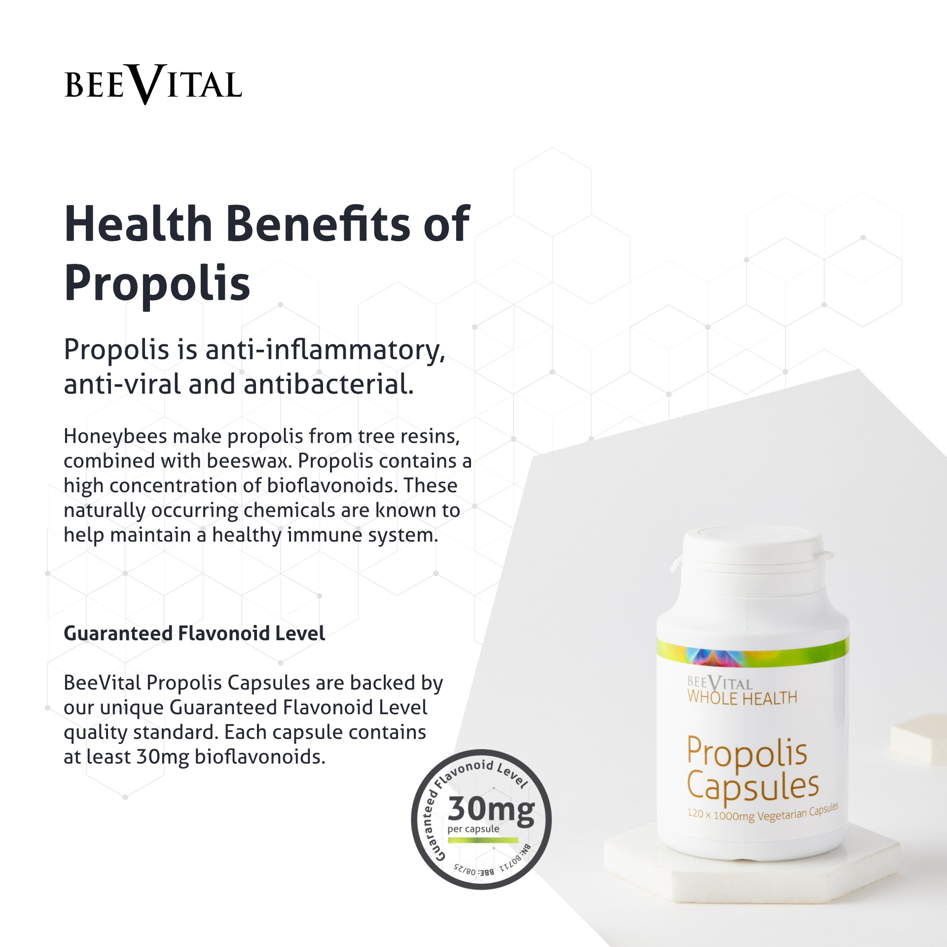
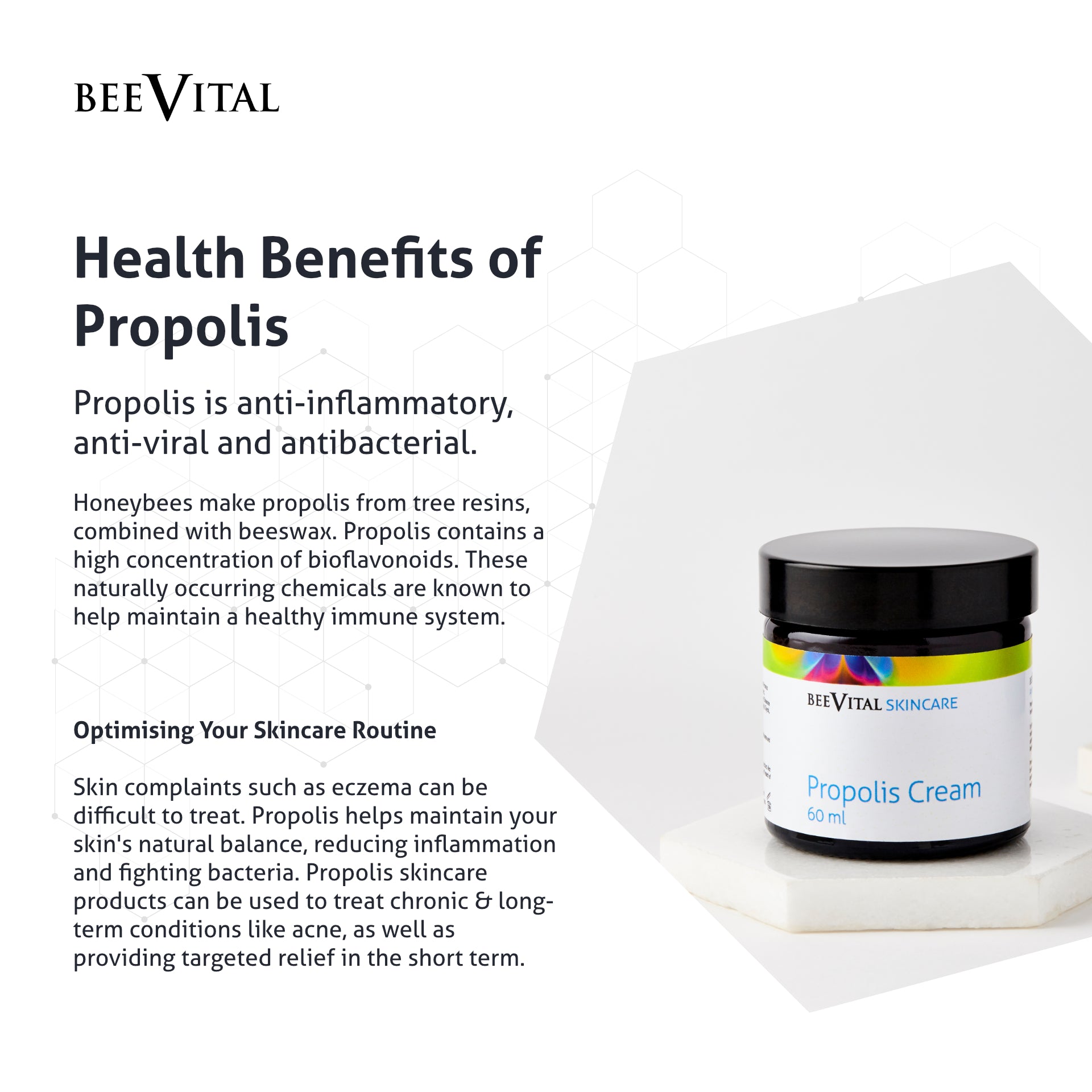
The packaging is a smooth, flat construction made from a single layer of paperboard. It features clean, precise edges and folds, indicative of a folding carton. The exterior is predominantly white with colorful graphics and text that highlight the product's health benefits. The design includes a prominent logo and product name, with additional information about the contents and guaranteed flavonoid levels. The overall appearance is lightweight and retail-friendly.
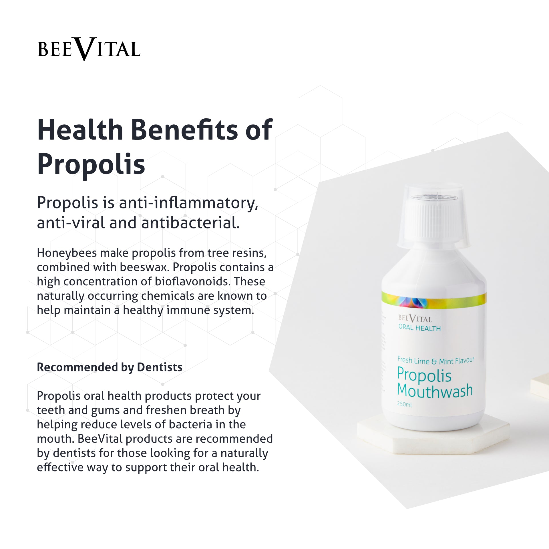
The packaging is a smooth, flat construction made of single-layer paperboard, featuring a clean and precise design. It has a white exterior with a matte finish, showcasing a modern aesthetic. The front displays a prominent label with the product name 'Propolis Mouthwash' in a bold font, accompanied by a description of health benefits. The edges are neatly folded, and the overall shape is rectangular, typical for retail packaging. There are no visible flaps or tabs, indicating it is likely a tuck-top design.
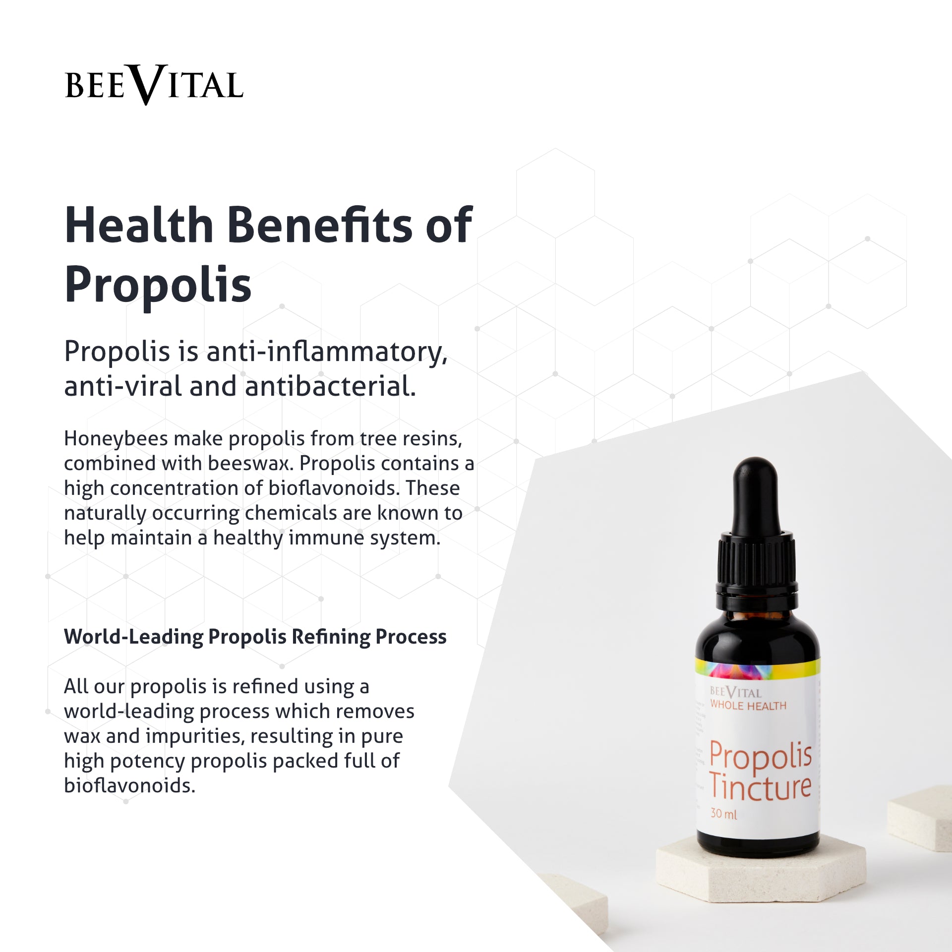
The packaging is a retail carton box made of smooth, single-layer paperboard. It features a clean, flat construction with precise edges and folds. The box has a white exterior with a matte finish, showcasing a modern and minimalist design. The front displays a prominent label with the product name 'Propolis Tincture' in bold, clear typography, accompanied by a graphic of a dropper bottle. The overall shape is rectangular, suitable for retail display.
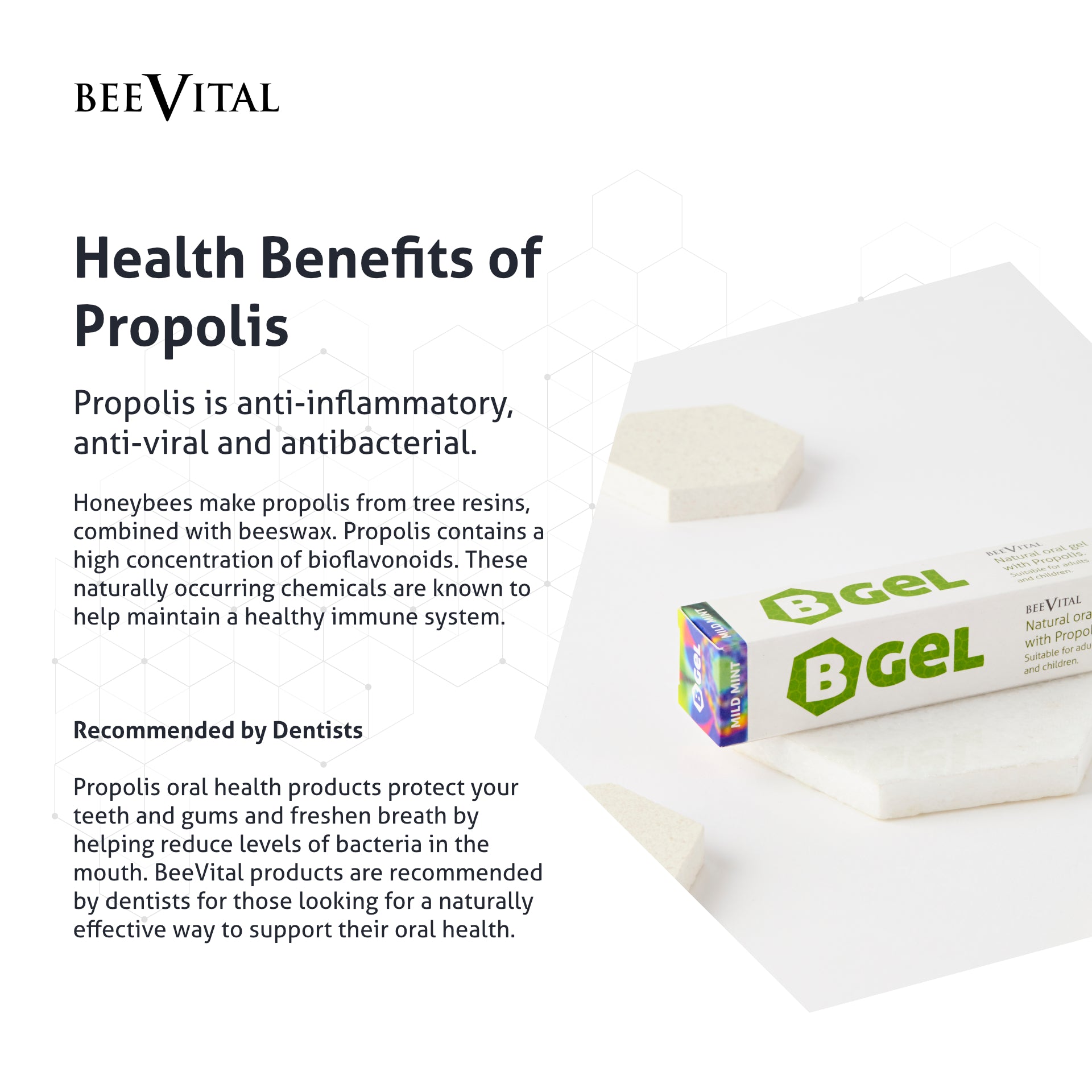
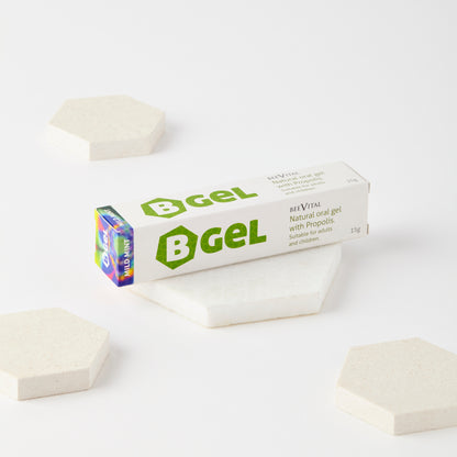
The packaging is a flat, rectangular carton box made of smooth, single-layer paperboard. The box features a clean, white exterior with a matte finish, and the edges are precisely folded with no visible fluted layers. The front of the box prominently displays the brand name 'Bee Vital' in a bold, modern font, accompanied by a graphic representation of the product, which is a tube of gel. The overall design is minimalistic, emphasizing the health benefits of propolis. The back of the box contains additional product information and recommendations from dentists, printed in a smaller font.
The packaging is a folding carton made from a single layer of paperboard. It features a smooth, flat surface with clean edges and precise folds. The primary color is white with a glossy finish, enhancing the visual appeal. The front displays a large logo and product name, while the sides contain additional information about the product's benefits and usage. The overall shape is rectangular, typical for retail packaging.
The packaging is a rectangular, flat, single-layer paperboard box. It features a smooth, clean surface with precise edges and folds. The box is predominantly white with a glossy finish, giving it a modern and appealing look. The front displays the product name 'BGel' prominently, along with a logo that incorporates a green hexagonal shape. The sides and back may contain additional product information and branding elements.
About the Brand
BeeVital is a UK-based leader in propolis supplement development, offering a diverse range of health, oral care, and skincare products. Their focus on scientific rigor extends to packaging, where product presentation, safety, and sustainability are key priorities.
The brand operates a direct-to-consumer model and utilizes folding carton packaging for a unified, professional shelf presence. Consistent branding, clear typography, and a minimalist color palette support product differentiation and consumer trust. BeeVital’s partnership with sustainability initiatives further influences their packaging decisions.
Key Differentiator: BeeVital differentiates itself through science-backed product claims, strong sustainability commitments, and cohesive, data-driven packaging that aligns with both regulatory and consumer expectations in the health sector.
Design System
Visual Style
Typography is clean and modern, typically sans-serif, ensuring legibility and a clinical aesthetic. The color palette centers on white backgrounds with accents of green and muted tones, reinforcing natural and health cues. The overall look is minimalist, with restrained use of graphic elements.
Brand Identity
The BeeVital logo is prominently placed on all packaging, supported by consistent use of product names and iconography related to health and wellness. Visual consistency is maintained across SKUs, with standardized layouts and clear hierarchy for key information.
Packaging Design
Material selection favors recyclable paperboard for lightweight yet protective carton structures, reflecting both cost efficiency and eco-conscious goals. Structural design is straightforward—rectangular folding cartons with secure closures—prioritizing retail display and supply chain compatibility.
User Experience
Packaging is designed for straightforward unboxing, with clear labeling and product information visible upon opening. This approach enhances user confidence and supports the brand’s science-driven promise, while contributing to a positive and trustworthy customer experience.
Company Metrics
Business insights for BeeVital based on available data
Market Positioning
Brand Values & Focus
Key Competitors
Target Market: Health-conscious consumers seeking natural supplements, with significant emphasis on environmentally aware buyers in the UK and broader European markets.
Packaging Assessment
Overall Grade
Visual appeal and presentation quality
Packaging durability and protection
Eco-friendliness and recyclable materials
Cost efficiency and value for money
Packaging assessment for BeeVital based on industry standards and best practices
Frequently Asked Questions
What types of packaging does BeeVital use for its product lines?
BeeVital primarily uses single-layer paperboard carton boxes with clean, modern graphics and a focus on product and health information clarity. This format is standard across their health supplements, oral care, and skincare lines.
How does BeeVital incorporate sustainability into its packaging?
BeeVital’s packaging is primarily paperboard-based, contributing to recyclability. The company highlights eco-friendly initiatives such as partnerships for tree planting, indicating a commitment to reducing environmental impact in both materials and brand ethos.
How does packaging design support BeeVital’s brand positioning?
Packaging design is consistent with BeeVital’s scientific and health-oriented brand, featuring prominent logos, health claims, and professional typography. This approach enhances consumer trust and aligns with regulatory requirements for health products.
Discover other Health companies
Explore more companies in the health industry and their packaging strategies
EVO Nutrition
Health
EVO Nutrition specializes in premium health supplements, providing a wide range of vitamins and nutritional products to support well-being.
Lily & Loaf
Health
Lily & Loaf specializes in high-quality health and nutrition products, offering a range of supplements and vitamins aimed at supporting an active lifestyle. The company focuses on providing natural solutions for health and beauty.
Comvita
Health
Comvita is a New Zealand-based company specializing in high-quality Mānuka honey and natural health products. Established in 1974, it aims to connect people with the healing power of nature.