BeautyCenter packaging
BeautyCenter delivers a wide range of beauty and wellness products through both physical and online channels, emphasizing quality and customer-centric services. Their packaging approach leverages premium materials and visually engaging designs to reinforce brand positioning and enhance the product experience.
Packaging Portfolio
BeautyCenter's packaging portfolio is anchored by a combination of resealable matte-finish pouches, folding carton boxes with glossy or vibrant finishes, and rigid luxury boxes with fitted inserts and soft-touch linings. Material selection emphasizes paperboard and rigid substrates for enhanced product safety, while structural formats range from retail-ready cartons to gift-style boxes. Branding is consistently applied through logos, thematic graphics, and color schemes, supporting both retail display and e-commerce fulfillment requirements.

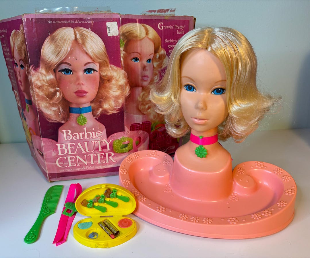
The packaging consists of a folding carton box that features a colorful and vibrant design. The box is primarily pink with images of a doll's head and beauty accessories prominently displayed on the front. The edges are clean and precise, with a smooth finish. The box has a rectangular shape and is designed to stand upright. The top flaps are folded down to secure the contents inside, and the box is lightweight, indicative of a single-layer paperboard construction.

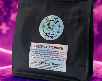
The packaging is a flat, black pouch with a resealable top. It features a circular logo in the center with the text 'Beauty Booster' and decorative elements like flowers. Below the logo, there is a label with the text 'CENTER OF ATTENTION' in bold, white letters. The overall design is sleek and modern, with a matte finish that gives it a premium feel.

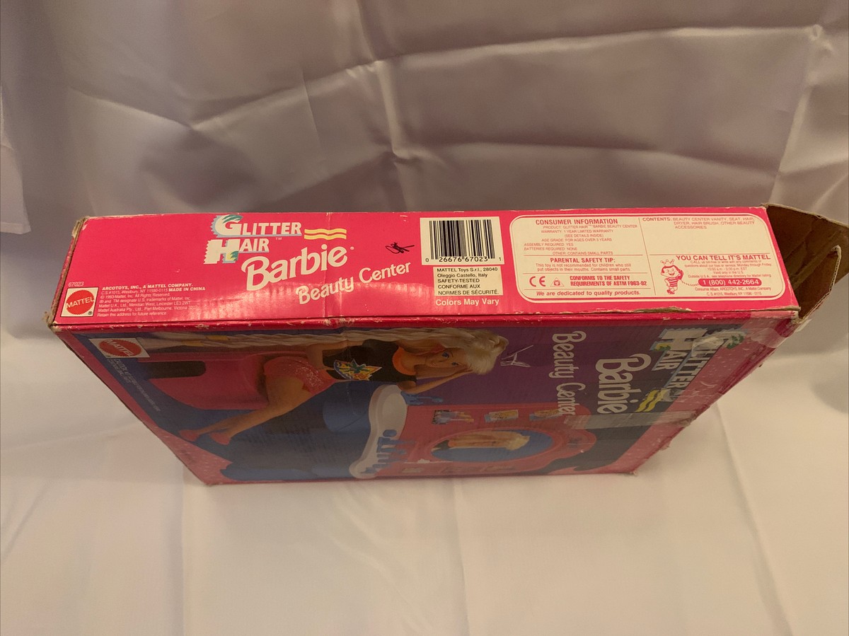
The packaging is a colorful retail carton with a smooth, flat construction. It features a predominantly pink exterior with vibrant graphics. The edges are clean and precise, indicating a well-constructed folding carton. The box has a glossy finish, enhancing the visual appeal. The front displays an image of a Barbie doll, along with product details and branding elements. The sides and back of the box contain additional graphics and information about the product.

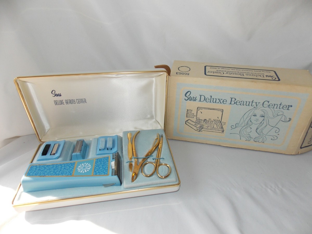
The packaging consists of a rectangular folding carton with a smooth, flat construction. The exterior is primarily a glossy white paperboard, featuring vibrant graphics and text. The front displays the product name 'deluxe beauty center' in bold, stylish font, accompanied by images of beauty tools. The edges are clean and precise, indicating a well-constructed design. The carton has a tuck flap closure at the top, ensuring secure packaging. The interior is lined with a purple velvet-like material, providing a luxurious feel and protecting the contents. The overall shape is rectangular and compact, suitable for retail display.

The packaging consists of a sturdy, thick-walled box with a premium appearance. The exterior features a light blue color with decorative elements, while the interior is lined with a soft, cream-colored satin finish. The box opens to reveal a neatly organized set of beauty tools, secured in place with a fitted insert. The lid has a decorative design that includes a graphic of a woman, enhancing its appeal as a beauty product.
About the Brand
BeautyCenter is a Danish beauty clinic and e-commerce retailer specializing in skincare, makeup, body care, and wellness products. Their packaging strategy is characterized by the use of retail pouches, folding carton boxes, and rigid boxes, each designed for both functional protection and elevated shelf presence.
The company's packaging portfolio reflects a focus on premium presentation and secure product delivery, with a mix of matte-finish pouches, luxury gift boxes, and vibrant retail cartons. Consistent branding—featuring logos, product names, and thematic graphics—ensures a cohesive customer experience across product categories. This approach is aligned with industry trends emphasizing both aesthetics and protection, particularly for beauty and wellness goods.
Key Differentiator: BeautyCenter's integration of personalized branding elements and varied packaging formats positions them to address both high-touch in-clinic and scalable e-commerce needs, differentiating them from single-channel competitors.
Design System
Visual Style
Typography favors bold, modern sans-serifs with high legibility; the color palette incorporates black, white, pink, and pastel accents, supporting a clean yet premium beauty aesthetic.
Brand Identity
Frequent use of circular and wordmark logos, complemented by product-specific iconography. Visual consistency is maintained across packaging with repeated motifs and uniform graphic treatments.
Packaging Design
Primary reliance on recyclable paperboard and rigid box materials, prioritizing structure and surface finish. Design philosophy emphasizes both tactile luxury and shelf appeal, integrating protective inserts and decorative linings where appropriate.
User Experience
Packaging design enhances the customer journey through engaging unboxing moments, intuitive opening mechanisms, and clear product identification. Cohesive branding and premium presentation reinforce trust and perceived value, supporting both in-store and online purchase channels.
Company Metrics
Business insights for BeautyCenter based on available data
Market Positioning
Brand Values & Focus
Key Competitors
Target Market: Danish beauty and wellness consumers seeking high-quality products and services, with a focus on both in-clinic and online retail experiences.
Packaging Assessment
Overall Grade
Visual appeal and presentation quality
Packaging durability and protection
Eco-friendliness and recyclable materials
Cost efficiency and value for money
Packaging assessment for BeautyCenter based on industry standards and best practices
Frequently Asked Questions
What types of packaging does BeautyCenter use for their products?
BeautyCenter utilizes a diverse mix of packaging, including resealable retail pouches, folding carton boxes, and rigid luxury boxes. These formats are selected based on product type, aiming to balance visual impact with functional protection.
How does BeautyCenter's packaging support product safety and presentation?
Packaging structures such as rigid boxes and well-constructed folding cartons are designed to secure items during transit, while premium finishes and branded graphics enhance the unboxing experience and reinforce brand perception.
What sustainability practices are evident in BeautyCenter's packaging?
While many packaging formats use recyclable paperboard and durable materials, there is limited evidence of advanced eco-friendly initiatives such as compostable substrates or minimal plastic use. Overall, the packaging shows some alignment with standard sustainability practices in the beauty sector.
Discover other Beauty & Fitness companies
Explore more companies in the beauty & fitness industry and their packaging strategies
Cultiv Cosmetique
Beauty & Fitness
Cultiv Cosmetique is a French skincare brand that provides organic and eco-friendly beauty products inspired by nature. They focus on effective skincare solutions for various skin concerns.
Pure Altitude
Beauty & Fitness
Pure Altitude specializes in high-quality beauty and skincare products that leverage the expertise of spa treatments to enhance daily routines. The brand offers a diverse range of products tailored for both facial and body care.
Institut Karité Paris
Beauty & Fitness
Institut Karité Paris specializes in luxury beauty products made with natural Shea Butter, offering a wide range of skincare and body care solutions. The brand combines Parisian heritage with a commitment to quality and creativity in its offerings.