be healthy d.o.o. packaging
be healthy d.o.o. delivers a diverse range of health and nutrition products, leveraging both physical and e-commerce channels. Their packaging approach emphasizes brand consistency, shelf appeal, and protection for sensitive supplements, utilizing carton boxes and flexible stand-up pouches for optimal market alignment.
Packaging Portfolio
be healthy d.o.o. employs a packaging portfolio primarily composed of single-layer paperboard carton boxes for liquid and capsule supplements, offering robust product protection and ample surface area for branding and regulatory information. Flexible stand-up pouches with resealable features are used for powders and organic products, balancing shelf presence with consumer convenience. Material selection prioritizes lightweight yet durable substrates, supporting logistics efficiency while maintaining a premium retail appearance. All packaging formats are consistently branded and designed for both visual shelf appeal and secure product containment.
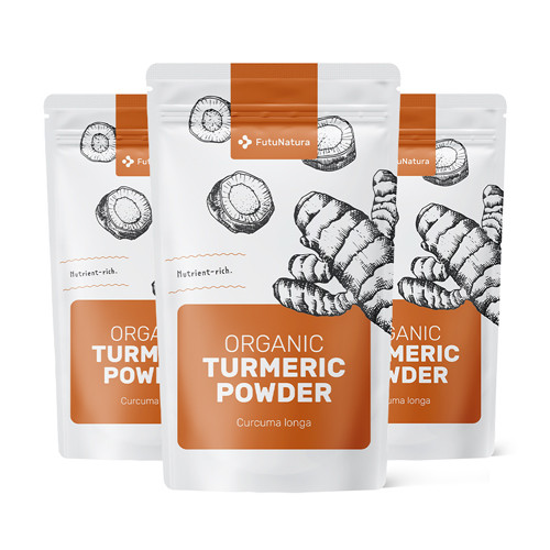
The packaging consists of a stand-up pouch made from a flexible material, likely a combination of plastic and foil. The pouch is designed to hold organic turmeric powder, featuring a resealable top for convenience. The front displays a large, bold label with the product name and key information, while the back likely contains nutritional information and usage instructions. The overall shape is rectangular with a flat base, allowing it to stand upright on shelves.
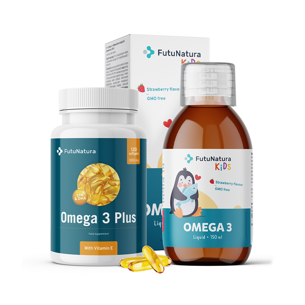
The image features a retail carton box and two bottles. The carton box is designed with a smooth, flat construction and has clean edges and folds. It is primarily white with colorful graphics, including images of the product and branding elements. The two bottles are made of clear plastic, showcasing the liquid inside, with labels that feature vibrant colors and graphics. The overall appearance is clean and modern, appealing to consumers.
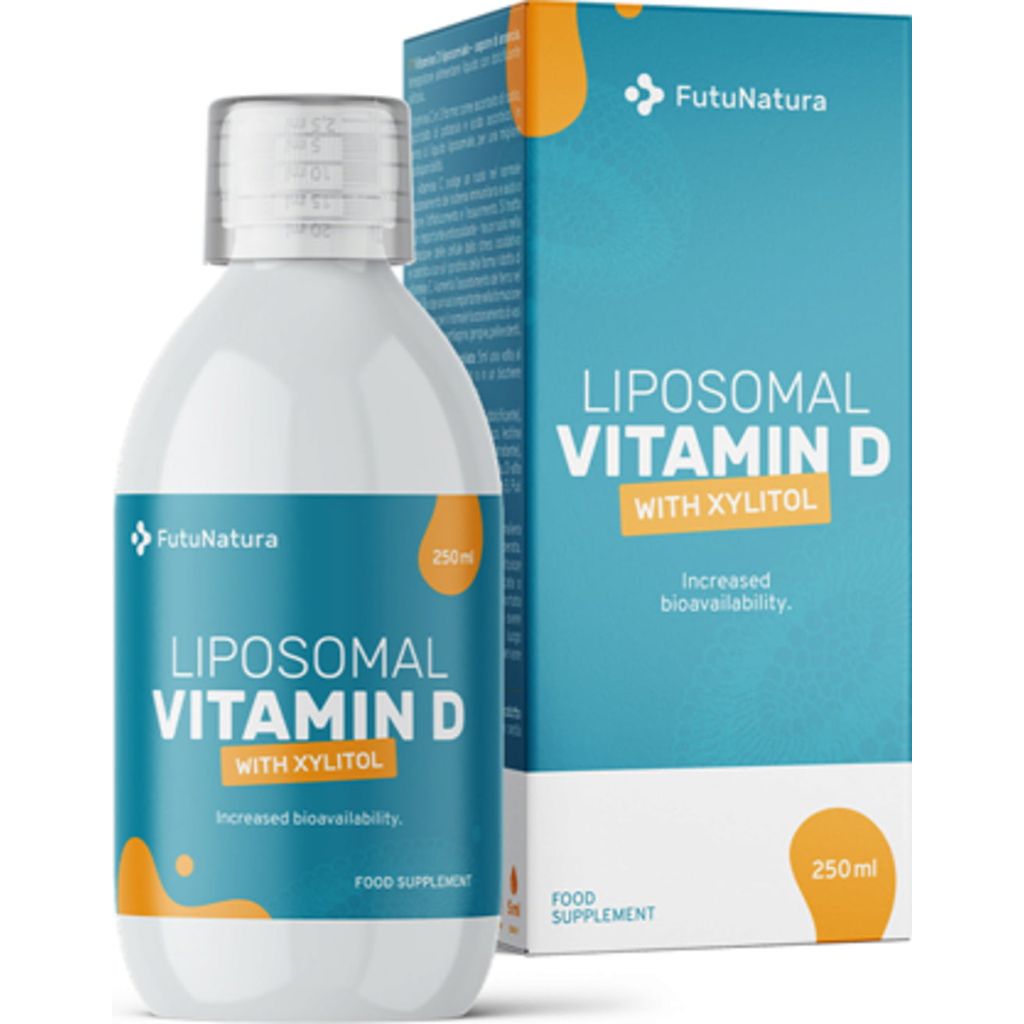
The packaging consists of a retail carton that houses a bottle of liposomal vitamin D. The carton features a smooth, flat construction with clean edges and folds, indicative of single-layer paperboard. The exterior is predominantly white with vibrant blue accents, showcasing a modern design. The front displays the product name 'Liposomal Vitamin D with Xylitol' in bold, clear typography, complemented by additional product information. The carton is designed to be lightweight and visually appealing for retail display.

The packaging consists of a rectangular carton box that houses a bottle of liposomal vitamin C. The box features a smooth, flat construction with clean edges and folds. It is predominantly orange and white, with vibrant graphics and text that highlight the product's benefits. The bottle inside is made of clear plastic with a metallic cap, showcasing the liquid inside. The carton has a glossy finish, enhancing its visual appeal.
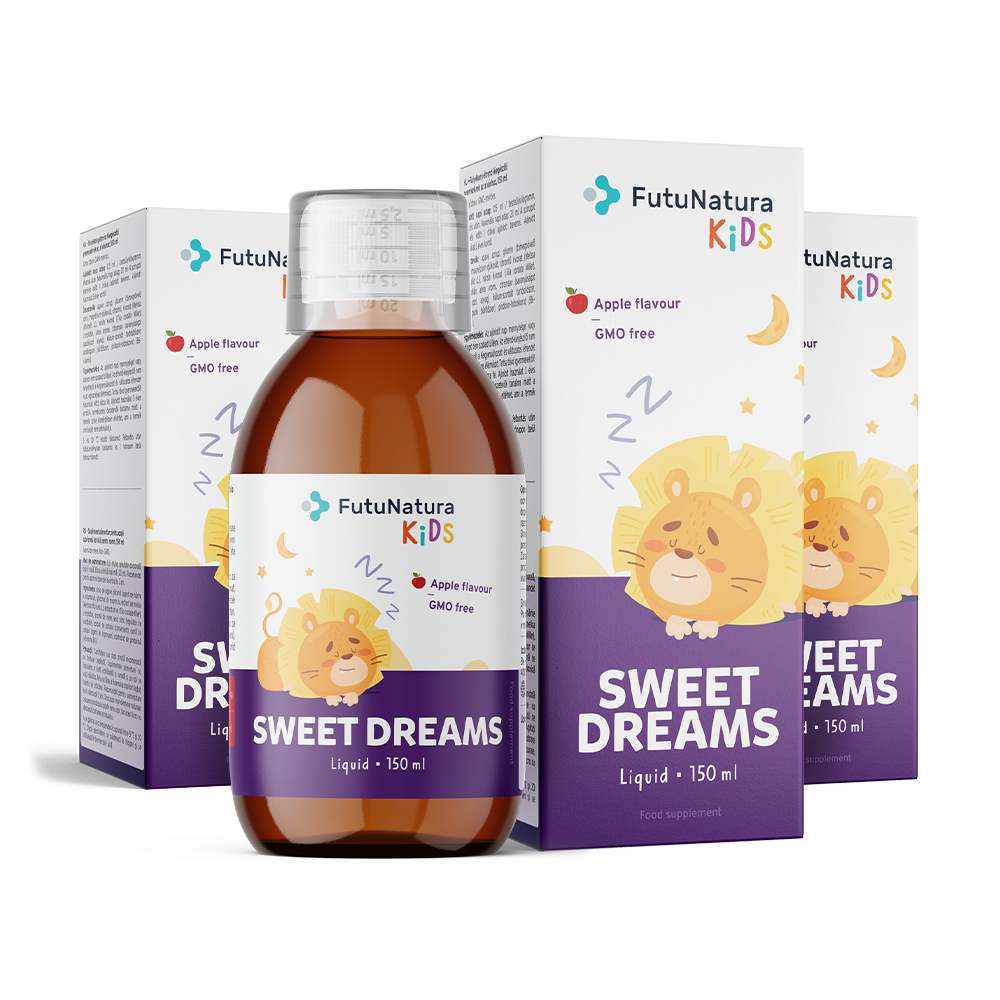
The packaging consists of a series of folding cartons designed to hold a liquid supplement. Each carton has a smooth, flat construction made of single-layer paperboard, featuring a glossy finish. The cartons are predominantly white with vibrant colors, including purple and yellow, showcasing playful graphics of a lion character. The edges are clean and precise, with no visible fluted layers, indicating a carton box structure. The design includes a front-facing label with product information and branding elements.
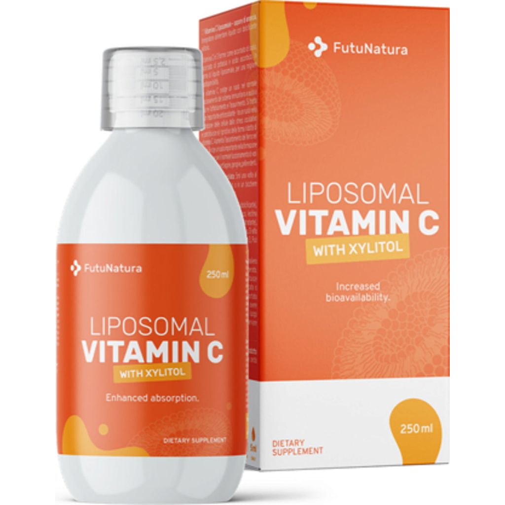
The packaging consists of a rectangular carton box designed to hold a bottle of Liposomal Vitamin C. The carton features a smooth, flat construction without fluted layers, indicating it is made from single-layer paperboard. The exterior is predominantly white with vibrant orange accents, showcasing the product name and details. The edges are clean and precise, with a glossy finish that enhances the visual appeal. The front of the carton displays the product name 'Liposomal Vitamin C' in bold, clear typography, along with additional information such as volume (250ml) and benefits like 'Enhanced absorption'.
About the Brand
be healthy d.o.o. is a Slovenian health retailer specializing in vitamins, supplements, and nutrition products, with a focus on quality and consumer trust. Their packaging strategy centers on consistent visual branding, using high-quality cartons and flexible pouches to support a premium retail experience. This approach is designed to reinforce product integrity, enhance brand perception, and support multichannel distribution.
The company’s packaging portfolio is optimized for the health and wellness sector, with solutions tailored to both retail shelves and direct-to-consumer shipments. Carton boxes are predominantly used for liquid supplements and capsules, offering branding space and robust protection, while flexible stand-up pouches are selected for powders and organic products, balancing shelf visibility with resealability. Packaging design is closely integrated with the FutuNatura brand identity, ensuring uniformity across SKUs and reinforcing consumer recognition. The company’s mid-size structure allows for scalable packaging operations, although there is moderate evidence of custom packaging rather than full-scale bespoke solutions.
Key Differentiator: Strong alignment between packaging design and brand identity, with an emphasis on product safety and consumer trust in the health supplement sector.
Design System
Visual Style
Clean, modern typography with high legibility; color palette dominated by white, orange, blue, and green, reflecting health and freshness; consistent use of bold accent colors for SKU differentiation.
Brand Identity
Prominent FutuNatura logo placement on all packaging; clear, uncluttered iconography; strong visual consistency across product lines through unified layouts, color schemes, and typography.
Packaging Design
Primary use of single-layer paperboard cartons and flexible laminated pouches; focus on lightweight, recyclable materials; structural designs favor rectangular boxes and stand-up pouches for efficient storage, protection, and display.
User Experience
Packaging is designed for ease of use, with resealable pouches and clear labeling for product identification; visual hierarchy and color coding support rapid consumer navigation, while branding reinforces trust throughout the purchase and unboxing journey.
Company Metrics
Business insights for be healthy d.o.o. based on available data
Market Positioning
Brand Values & Focus
Key Competitors
Target Market: Health-conscious consumers in Slovenia and Central Europe seeking quality supplements and nutrition products via both retail and e-commerce channels.
Packaging Assessment
Overall Grade
Visual appeal and presentation quality
Packaging durability and protection
Eco-friendliness and recyclable materials
Cost efficiency and value for money
Packaging assessment for be healthy d.o.o. based on industry standards and best practices
Frequently Asked Questions
What types of packaging does be healthy d.o.o. primarily use?
be healthy d.o.o. primarily utilizes single-layer carton boxes for liquid and capsule supplements, and flexible stand-up pouches for powders and organic products, all featuring consistent branding.
How does be healthy d.o.o.'s packaging support product safety?
Their packaging solutions prioritize durable materials and secure closures, providing effective protection for supplements during storage and shipping, which is vital for sensitive health products.
Is sustainability a focus in be healthy d.o.o.'s packaging choices?
While the company makes use of recyclable paperboard and flexible materials, there is limited evidence of advanced sustainability initiatives, though basic recyclable practices are observed.
How does be healthy d.o.o. differentiate its packaging within the health sector?
Distinctive branding elements, such as the FutuNatura logo, vibrant health-oriented color palettes, and clear product information, set their packaging apart and support consumer trust.
Discover other Health companies
Explore more companies in the health industry and their packaging strategies
EVO Nutrition
Health
EVO Nutrition specializes in premium health supplements, providing a wide range of vitamins and nutritional products to support well-being.
Doctor Seaweed
Health
Doctor Seaweed specializes in natural, plant-based nutritional supplements derived from seaweed, aimed at promoting overall wellness.
Bio-Synergy
Health
Bio-Synergy is a UK-based company specializing in health and fitness products, including nutritional supplements and DNA testing kits. Their mission is to support individuals in achieving their health and fitness goals through innovative products and personalized insights.