Banneke Feinkost Flüssig packaging
Banneke Feinkost Flüssig is a German retailer specializing in premium spirits, wines, and liqueurs, offering both online and brick-and-mortar shopping experiences. Their packaging strategy utilizes a mix of branded folding cartons and rigid boxes designed for product safety, visual appeal, and efficient logistics.
Packaging Portfolio
Banneke Feinkost Flüssig leverages a diverse range of packaging structures, notably rigid boxes for high-value spirits and folding cartons for branded retail SKUs. The rigid boxes employ thick chipboard or paperboard with premium finishes, often featuring inserts for bottle stability and a luxury presentation. Folding cartons are single-layer, digitally printed, and structurally optimized for shelf presence and stacking efficiency. Most packaging emphasizes supplier (brand-owner) identity, with limited Banneke-specific branding, reflecting a focus on product authenticity and original brand experience.
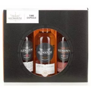
The packaging is a high-quality rigid box designed to hold multiple bottles of whisky. It features a thick, sturdy construction with a premium feel. The exterior is predominantly black with a textured finish that adds a tactile element. A circular window on the front showcases the bottles inside, allowing for visibility while maintaining an elegant appearance. The top flap includes a printed logo and product name, enhancing brand recognition.
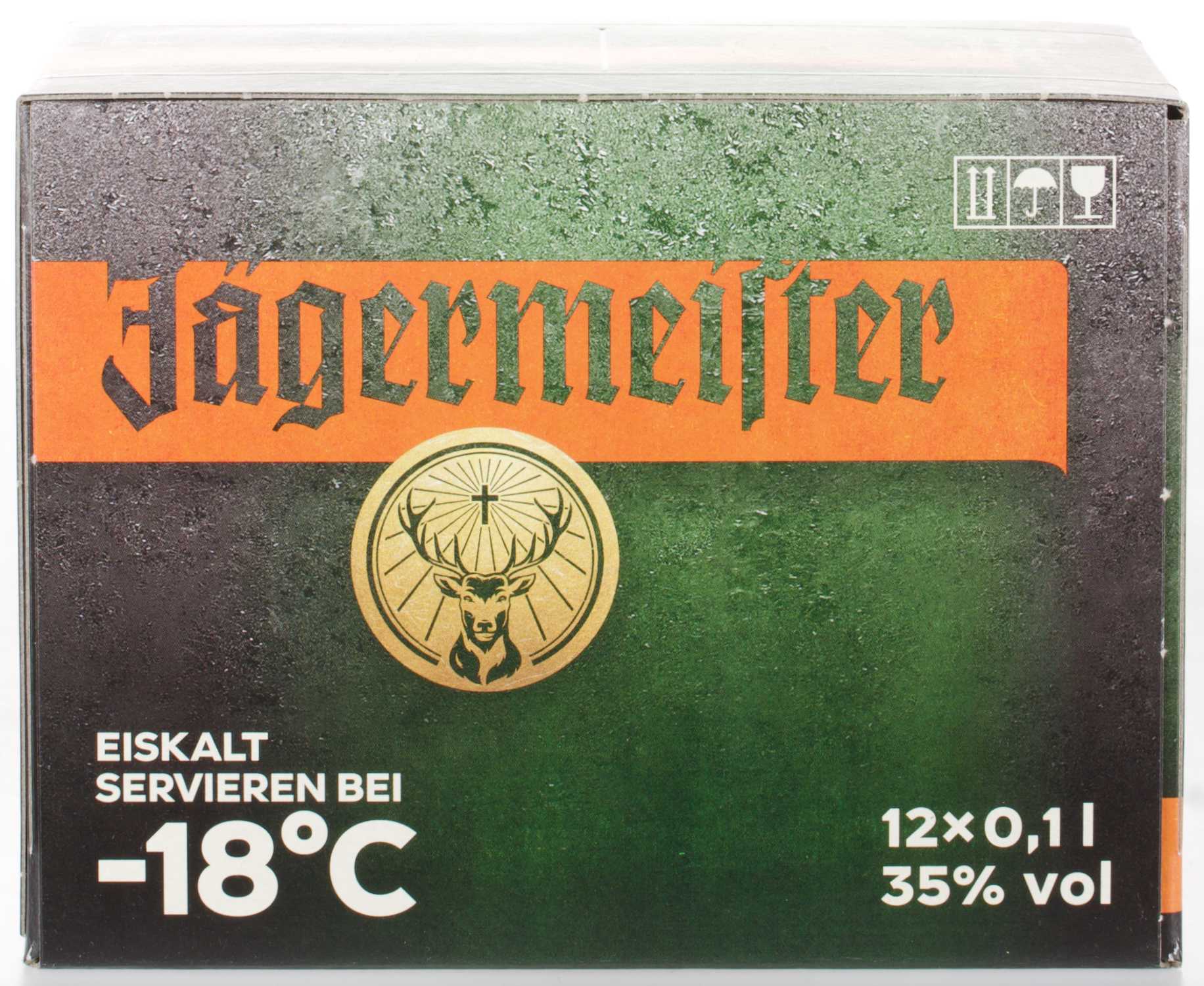
The packaging is a folding carton box with a smooth, flat construction. It features a predominantly green background with an orange band at the top displaying the brand name 'Jägermeister' in bold, stylized font. The box has a glossy finish, enhancing its visual appeal. The front includes a circular logo with a deer emblem, and text indicating serving instructions and product details. The edges are clean and precise, with no visible fluted layers, confirming it is a single-layer paperboard structure.
The packaging consists of a sturdy, thick-walled box designed to hold multiple bottles of spirits. The box has a rectangular shape with a lid that opens from the top. The exterior features a rich, dark color with a smooth finish, while the interior is white, providing a clean contrast. Each bottle is securely held in place by a custom insert, ensuring they do not move during transport. The box has a premium appearance, indicative of a luxury gift item.
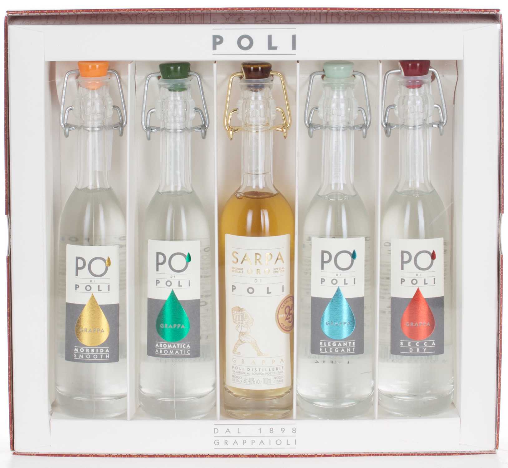
The packaging is a folding carton made of smooth, flat paperboard with a colorful design. The exterior features a mix of bright colors and intricate graphics, including illustrations of various objects and a prominent logo. The edges are clean and precise, indicating a well-constructed box. The overall shape is square, and it appears to be designed for retail display.
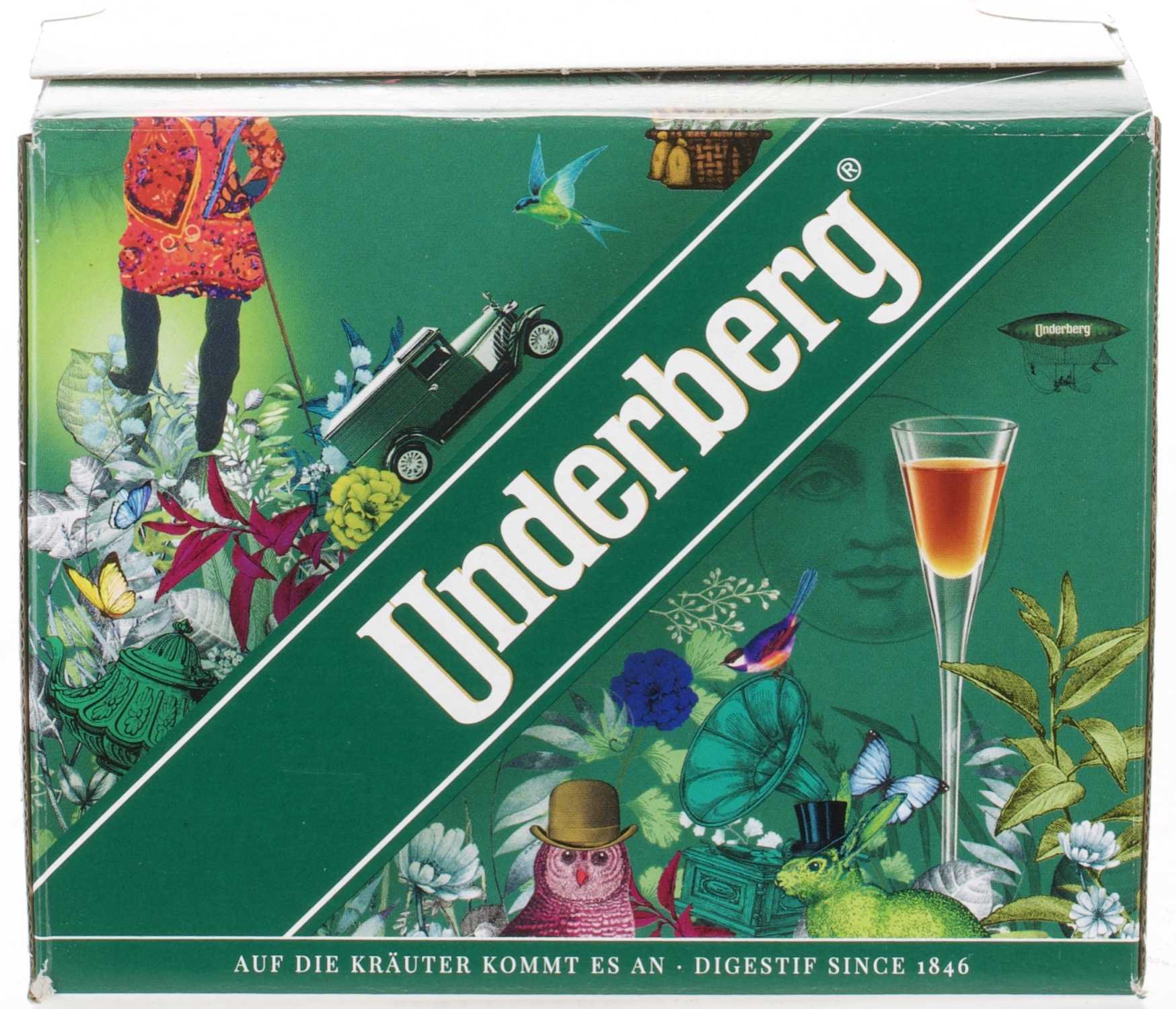
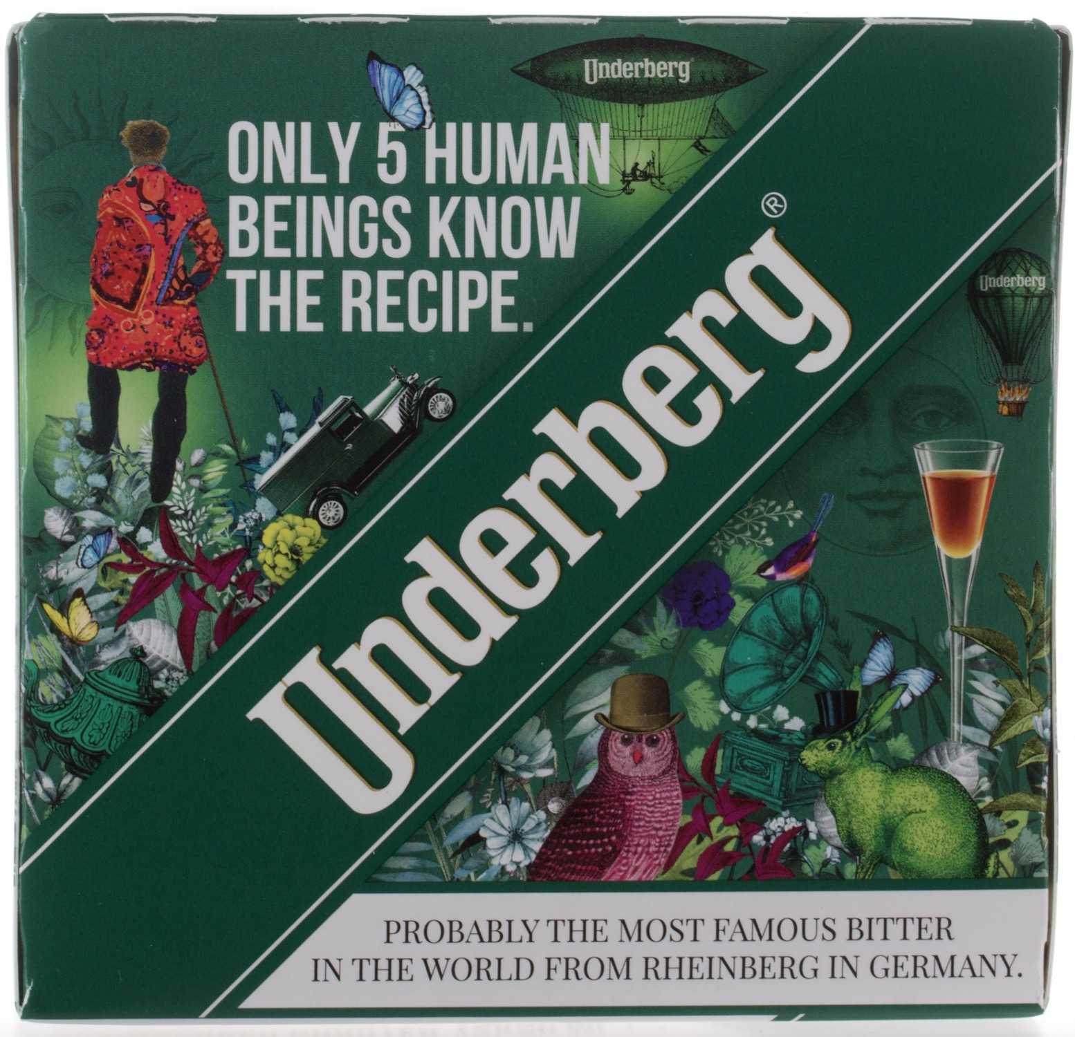
The packaging is a folding carton made of smooth, single-layer paperboard. It features a vibrant green background with various colorful graphics, including illustrations of nature, a vintage car, and whimsical characters. The edges are clean and precise, indicating a well-constructed box. The top flap is slightly raised, suggesting it is designed for easy opening.
About the Brand
Banneke Feinkost Flüssig delivers a comprehensive portfolio of alcoholic beverages, emphasizing quality, selection, and customer engagement through both digital and in-store channels. Their packaging solutions are aligned with the premium nature of their product offerings, focusing on both protection and consumer experience.
The company employs a variety of packaging types, including rigid gift boxes for high-value spirits and folding cartons for retail display of popular brands. This approach addresses both logistical requirements and the visual standards expected in the premium beverage sector. Packaging often highlights supplier branding over in-house identity, reflecting a model centered on brand authenticity and original presentation.
Key Differentiator: Banneke's unique differentiator is its dual-channel retail model blended with expert consultation, supported by a packaging strategy that prioritizes authentic brand presentation and robust product protection.
Design System
Visual Style
Typography typically utilizes bold, serif or script fonts on premium boxes, with color palettes driven by supplier brands—ranging from deep browns and blacks to vibrant greens and oranges. The overall aesthetic is premium, with a balance of modern and heritage cues.
Brand Identity
Brand identity on packaging centers on supplier logos and visual themes, with clear, consistent logo placement and supporting graphics that align with each spirit's heritage. Banneke's own branding is minimal on the packaging itself, prioritizing the authenticity of the producer's brand.
Packaging Design
Material selection favors thick rigid board for gift sets and high-value spirits, while folding cartons are used for standard retail items. Structural integrity and protective inserts are prioritized, with design choices aimed at balancing product safety, retail appeal, and shipping efficiency.
User Experience
Packaging supports the customer journey by offering a premium unboxing experience for gift and luxury items and ensuring clear visibility of product information for retail purchases. This approach enhances perceived value and aligns with customer expectations in the premium spirits segment.
Company Metrics
Business insights for Banneke Feinkost Flüssig based on available data
Market Positioning
Brand Values & Focus
Key Competitors
Target Market: Adult consumers seeking premium spirits, wines, and specialty beverages in Germany and surrounding European markets, including both enthusiasts and casual buyers.
Packaging Assessment
Overall Grade
Visual appeal and presentation quality
Packaging durability and protection
Eco-friendliness and recyclable materials
Cost efficiency and value for money
Packaging assessment for Banneke Feinkost Flüssig based on industry standards and best practices
Frequently Asked Questions
What types of packaging does Banneke Feinkost Flüssig primarily use?
Banneke primarily uses rigid boxes for premium spirits and folding carton boxes for branded retail products, focusing on both protection and visual merchandising.
How does Banneke's packaging support its customer experience?
Packaging is designed to enhance the unboxing experience for gift and specialty items while maintaining product safety and aligning with the branding of well-known spirit producers.
Does Banneke utilize sustainable packaging materials?
While some carton packaging is recyclable, there is limited evidence of a comprehensive sustainability program or significant use of eco-friendly materials in the packaging portfolio.
Discover other Food & Drink companies
Explore more companies in the food & drink industry and their packaging strategies
Terres de Café
Food & Drink
Terres de Café is a specialty coffee retailer based in Paris, France, known for its commitment to sustainability and high-quality coffee sourcing.
Thés de la Pagode
Food & Drink
Thés de la Pagode is a French company specializing in organic teas and infusions, focusing on health and well-being. Established in 1987, they prioritize sustainable practices and high-quality ingredients sourced through fair trade.
ruf lebensmittelwerk kg
Food & Drink
RUF Lebensmittelwerk KG is a German food production company specializing in a variety of baking mixes and drink products. Founded in 1920, the company is known for its high-quality ingredients and innovative food solutions.