BABOR packaging
BABOR is a premium skincare and cosmetics company specializing in scientifically-formulated beauty products for diverse skin types. Their packaging strategy leverages high-quality carton and rigid boxes, emphasizing visual consistency and premium presentation across retail and direct-to-consumer channels.
Packaging Portfolio
BABOR’s packaging solutions center on premium carton boxes and rigid boxes, leveraging high-quality paperboard materials with both glossy and matte finishes. Structural formats include single-layer folding cartons for individual products and two-part rigid boxes for ampoule sets and gifts, often with protective inserts for fragile items. Design consistency is maintained through precise construction, sharp folds, and branded graphic elements, while structural integrity ensures product safety in transit. The focus is on balancing visual impact with functional protection, aligning packaging performance with the brand’s luxury positioning in the beauty sector.
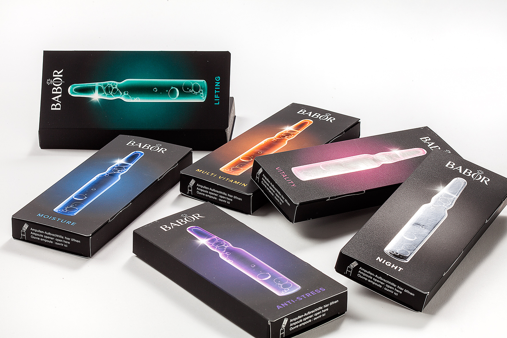
The packaging consists of several folding cartons made of smooth, flat paperboard. Each box has a clean, precise construction with sharp edges and folds, indicative of a single-layer paperboard design. The boxes feature a matte finish with vibrant colors and graphics that highlight the product inside. The overall shape is rectangular, designed to hold individual vials or ampoules, and the boxes are stacked together for display.
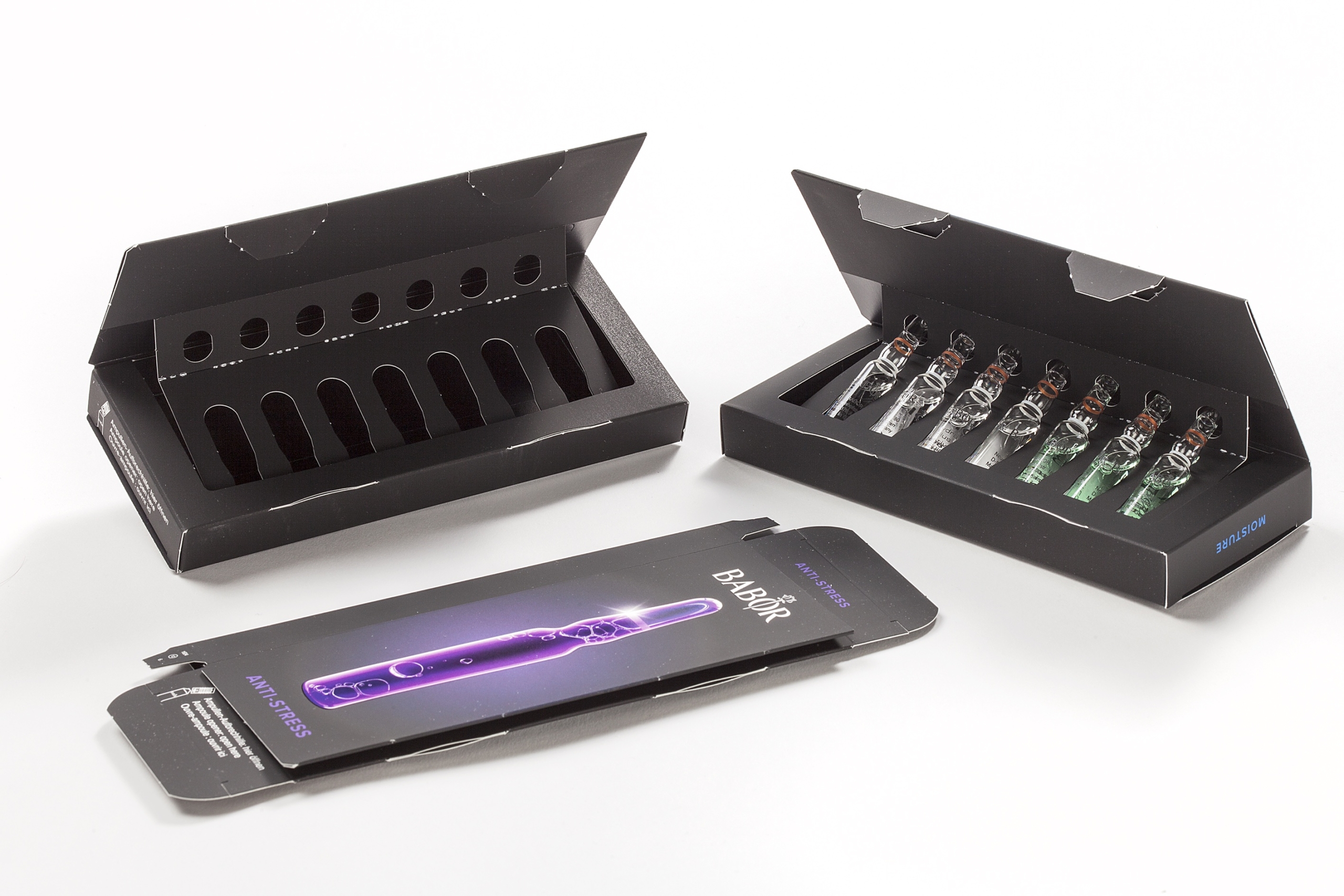
The packaging consists of a two-part folding carton design, featuring a black exterior with a glossy finish. The box is structured to hold multiple glass vials, with a separate insert that securely holds each vial in place. The outer carton has clean, precise edges and folds, indicating a high-quality construction. The front of the packaging displays vibrant graphics and product information, while the interior is designed to provide protection for the vials.

The packaging is a retail carton box with a smooth, flat construction. It features a clean, precise design with a glossy finish. The box is predominantly white with a silver and gray color scheme, showcasing a modern aesthetic. The front displays the product name 'DOCTOR BABOR' prominently, along with the product description 'SKIN SMOOTHING SET' in a clear, bold font. The sides of the box include additional product details and images of the contained items. The edges are neatly folded, and the overall structure appears lightweight yet sturdy, typical of retail packaging.
The packaging is a rigid box designed for retail display, featuring a sturdy construction with thick chipboard walls. The box has a clean, square shape with a lid that fits securely over the base. The surface is smooth with a glossy finish, enhancing its premium appearance. The front displays a large logo and product information, while the sides are adorned with additional branding elements.

The packaging is a retail carton box made of smooth, single-layer paperboard. It features clean, precise edges and folds, with a predominantly white exterior and a glossy finish. The box has a top flap that folds down to close securely. The front displays a large logo and product name in a sleek font, with additional product information printed on the sides. The overall design is minimalistic and elegant, typical of cosmetic packaging.
About the Brand
BABOR operates in the beauty and fitness industry, focusing on high-end skincare, makeup, and body care products. The brand’s packaging employs clean, modern designs with a strong emphasis on branding and user experience, utilizing premium carton and rigid box formats for retail and e-commerce distribution.
BABOR’s packaging is characterized by the use of smooth, glossy finishes, precise folding, and a consistent color palette aligned with its luxury positioning. The use of carton boxes for ampoules and skincare sets, coupled with rigid boxes for gift and specialty products, ensures both product protection and elevated shelf appeal. Their approach integrates branding elements such as prominently displayed logos, product names, and minimalistic graphic treatments, supporting a cohesive customer journey from unboxing through product use.
Key Differentiator: BABOR’s unique differentiator lies in their integration of scientific branding with premium packaging materials, delivering a high-impact unboxing experience that reinforces their luxury positioning while maintaining functional protection and brand consistency.
Design System
Visual Style
Typography is modern and sans-serif, favoring clean lines and legible font weights. The color palette predominantly uses white, silver, black, and muted accents, creating a sophisticated and clinical aesthetic. Overall look is minimalistic, emphasizing clarity and visual cleanliness.
Brand Identity
Logos are prominently placed on the front of packaging, often accompanied by product names and succinct descriptions. Iconography is sparing but consistent, contributing to a unified brand appearance. Visual consistency is reinforced through recurring layout structures and standardized color usage.
Packaging Design
Material choices prioritize high-grade carton and rigid paperboard, with attention to surface finishes (glossy or matte) that enhance tactile and visual quality. Structural designs are engineered for both retail display and protective functionality, often incorporating inserts for ampoule security.
User Experience
Design elements facilitate a premium customer journey, emphasizing a memorable unboxing experience with clear product information, easy opening mechanisms, and a strong first visual impression. Packaging supports brand storytelling and perceived product value from purchase to use.
Company Metrics
Business insights for BABOR based on available data
Market Positioning
Brand Values & Focus
Key Competitors
Target Market: Affluent and quality-focused consumers in the beauty and skincare segment, with a primary focus on the Russian market and direct-to-consumer e-commerce shoppers.
Packaging Assessment
Overall Grade
Visual appeal and presentation quality
Packaging durability and protection
Eco-friendliness and recyclable materials
Cost efficiency and value for money
Packaging assessment for BABOR based on industry standards and best practices
Frequently Asked Questions
What types of packaging does BABOR utilize for their product lines?
BABOR primarily uses high-quality carton boxes and rigid boxes, featuring glossy or matte finishes and precise structural designs tailored for skincare ampoules, sets, and luxury gift products.
How does BABOR's packaging reflect its brand identity?
BABOR’s packaging employs a minimalistic, modern design language with a strong focus on logo placement, clean typography, and a consistent color palette, reinforcing its premium brand image throughout the customer journey.
What sustainability practices are evident in BABOR's packaging?
While BABOR uses recyclable carton and paperboard materials for many products, the prevalence of glossy finishes and rigid box constructions suggests moderate sustainability initiatives, balancing eco-friendliness with premium presentation.
Discover other Beauty & Fitness companies
Explore more companies in the beauty & fitness industry and their packaging strategies
Cultiv Cosmetique
Beauty & Fitness
Cultiv Cosmetique is a French skincare brand that provides organic and eco-friendly beauty products inspired by nature. They focus on effective skincare solutions for various skin concerns.
Pure Altitude
Beauty & Fitness
Pure Altitude specializes in high-quality beauty and skincare products that leverage the expertise of spa treatments to enhance daily routines. The brand offers a diverse range of products tailored for both facial and body care.
Institut Karité Paris
Beauty & Fitness
Institut Karité Paris specializes in luxury beauty products made with natural Shea Butter, offering a wide range of skincare and body care solutions. The brand combines Parisian heritage with a commitment to quality and creativity in its offerings.