Artgerecht packaging
Artgerecht specializes in premium nutritional supplements, leveraging a direct-to-consumer model with a robust e-commerce presence. Their packaging approach emphasizes modern aesthetics, brand consistency, and a commitment to sustainability across a diverse portfolio of flexible, rigid, and carton formats.
Packaging Portfolio
Artgerecht’s packaging portfolio encompasses flexible stand-up pouches, rigid supplement jars, and folding carton boxes, all unified by a matte black aesthetic with clear, contrasting typography. Packaging materials are selected for their durability, barrier properties, and recyclability, supporting both product integrity and sustainability objectives. The use of resealable closures and sturdy structures enhances logistics safety and consumer convenience, while minimalist branding and color-coding facilitate product identification and reinforce premium positioning. Attention to design details, such as matte finishes and consistent logo placement, ensures strong shelf presence and brand recall.

The image features two distinct types of packaging: a matte black pouch and a black jar. The pouch has a flat bottom and is sealed at the top, with a smooth surface and no visible flaps. The jar has a cylindrical shape with a screw-on lid, showcasing a glossy finish. Both packaging types are designed for retail display, with clear branding elements.
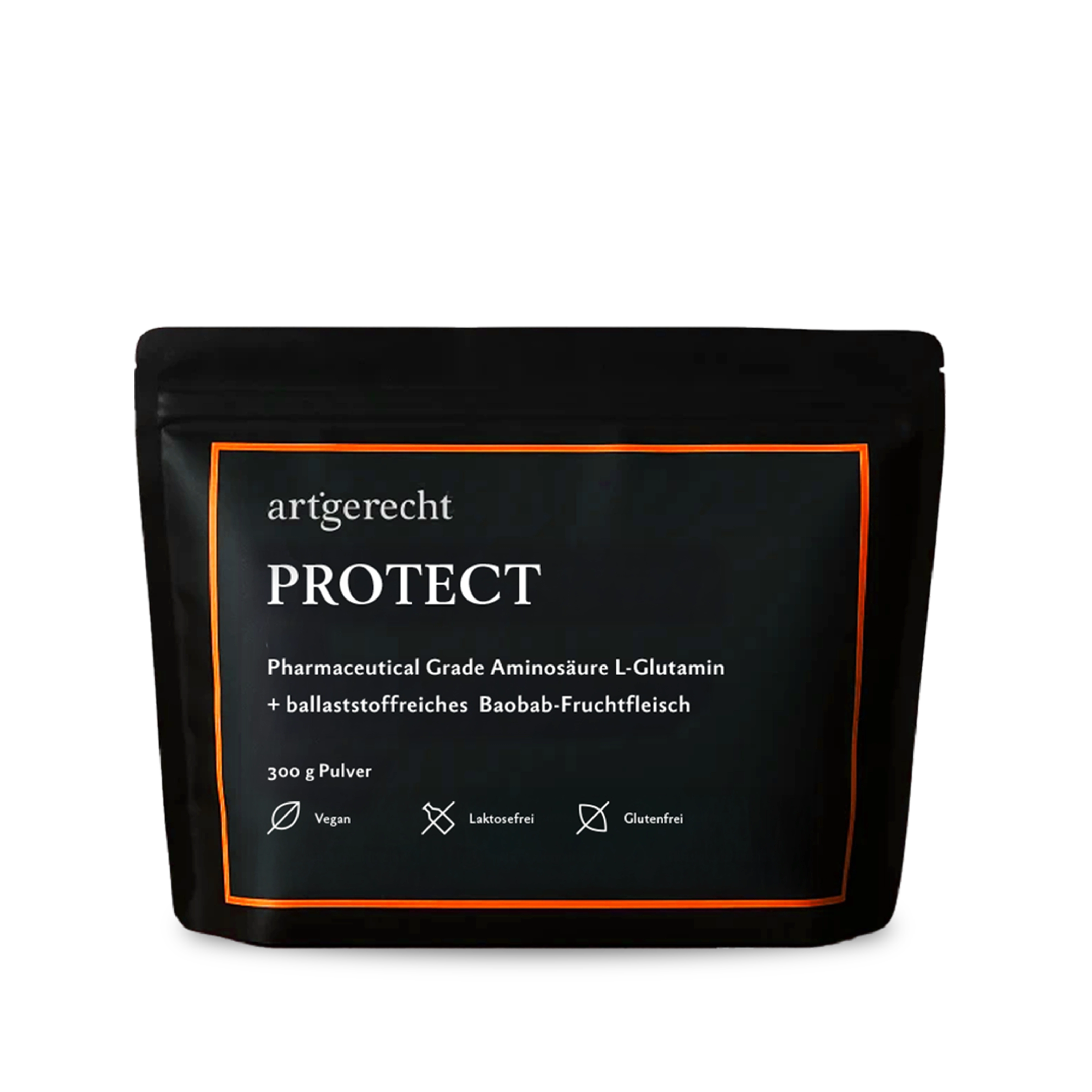
The packaging is a stand-up pouch with a matte black finish. It features a resealable top, allowing for easy access and storage. The front displays the product name 'PROTECT' in bold white font, along with additional product information in smaller text. The overall design is minimalist, emphasizing the brand's clean aesthetic.
The packaging consists of two folding cartons and one rigid container. The cartons are made of smooth, single-layer paperboard with clean edges and precise folds. The surface finish is matte with a slight sheen, featuring vibrant colors and geometric patterns. The rigid container is cylindrical, made of thick chipboard, with a glossy finish. Each carton has a tuck flap closure, ensuring secure packaging.
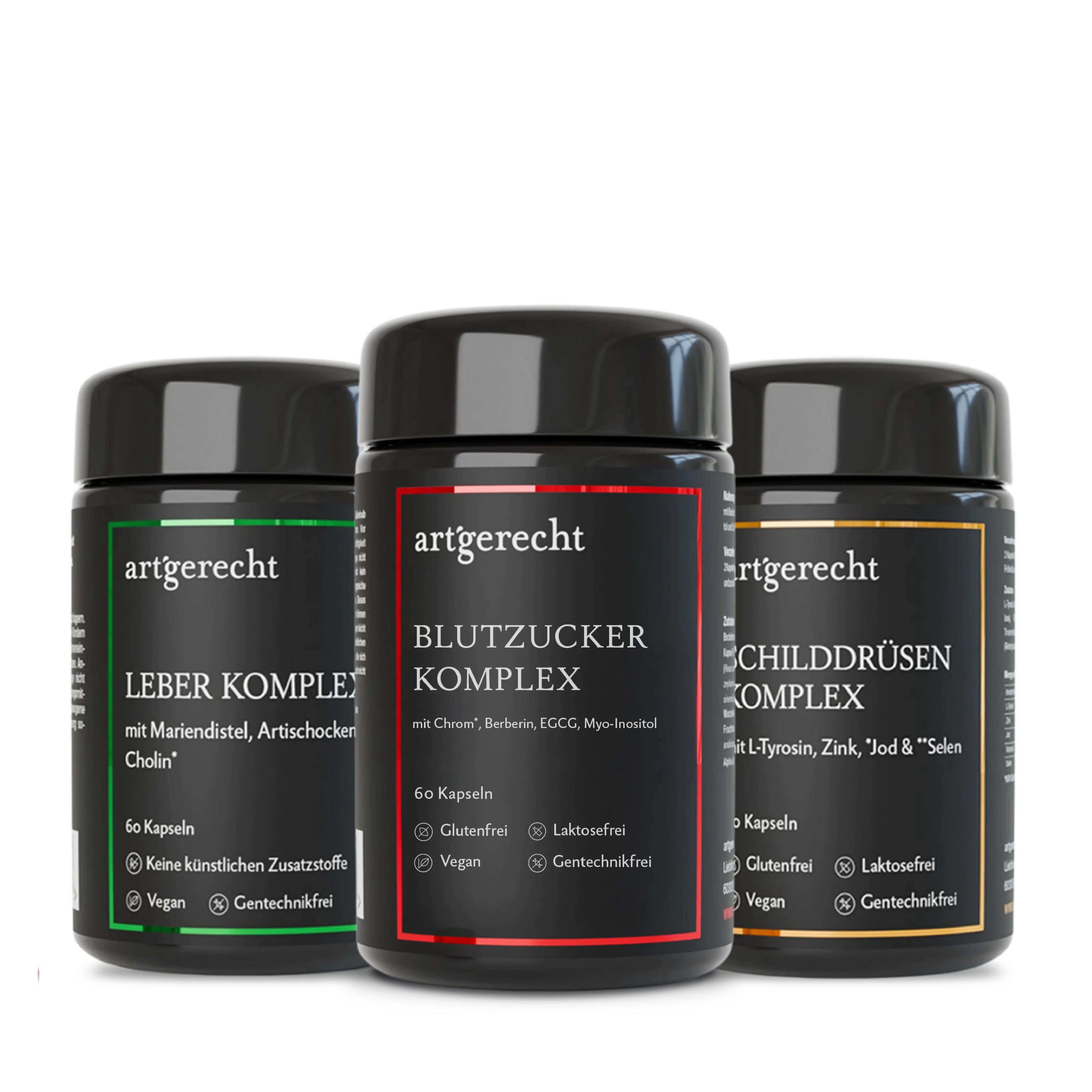
The packaging consists of three black jars with a matte finish, each featuring a screw-on lid. The jars are cylindrical in shape and have a thick, sturdy construction indicative of rigid packaging. The labels are applied smoothly around the jars, displaying product names and descriptions in contrasting colors.
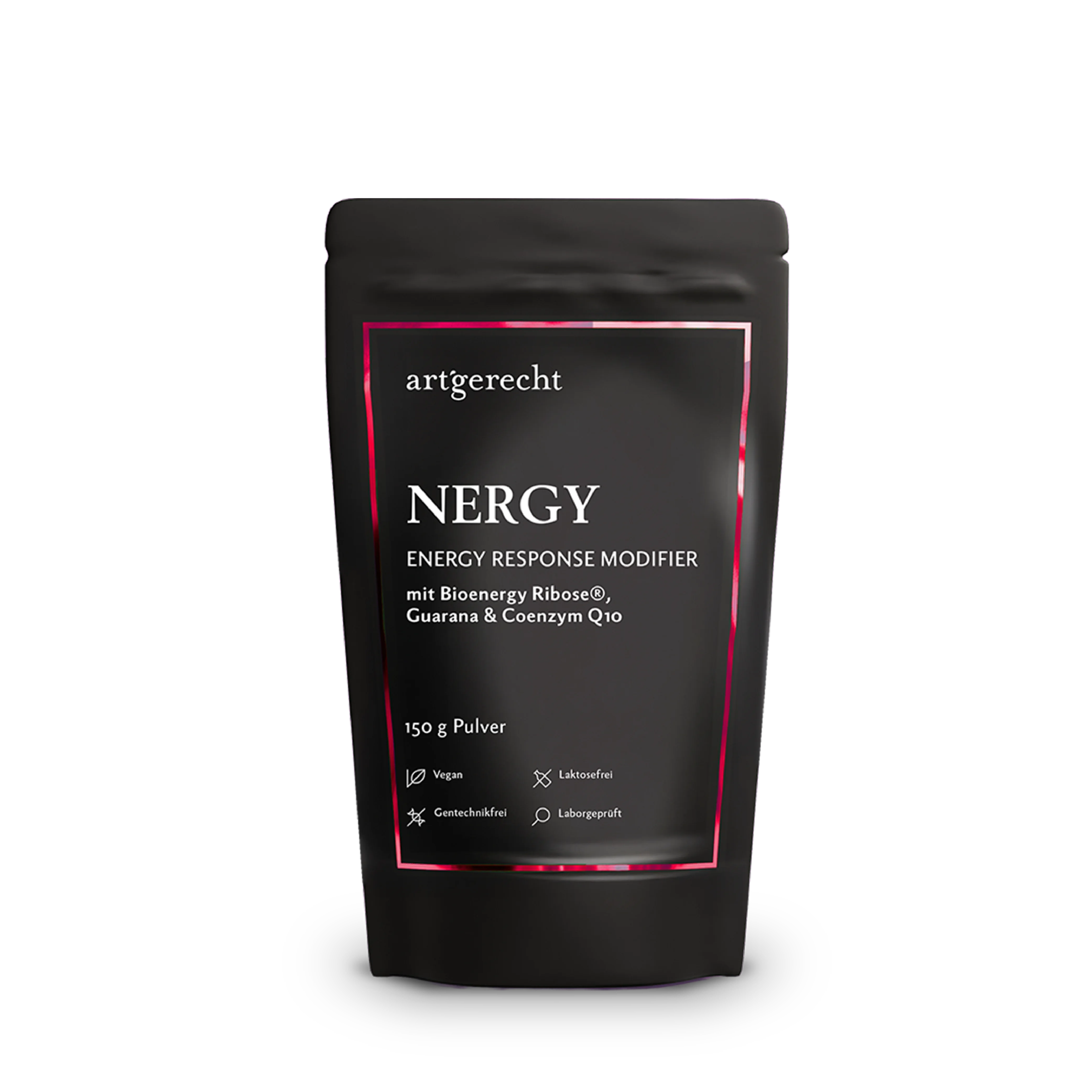
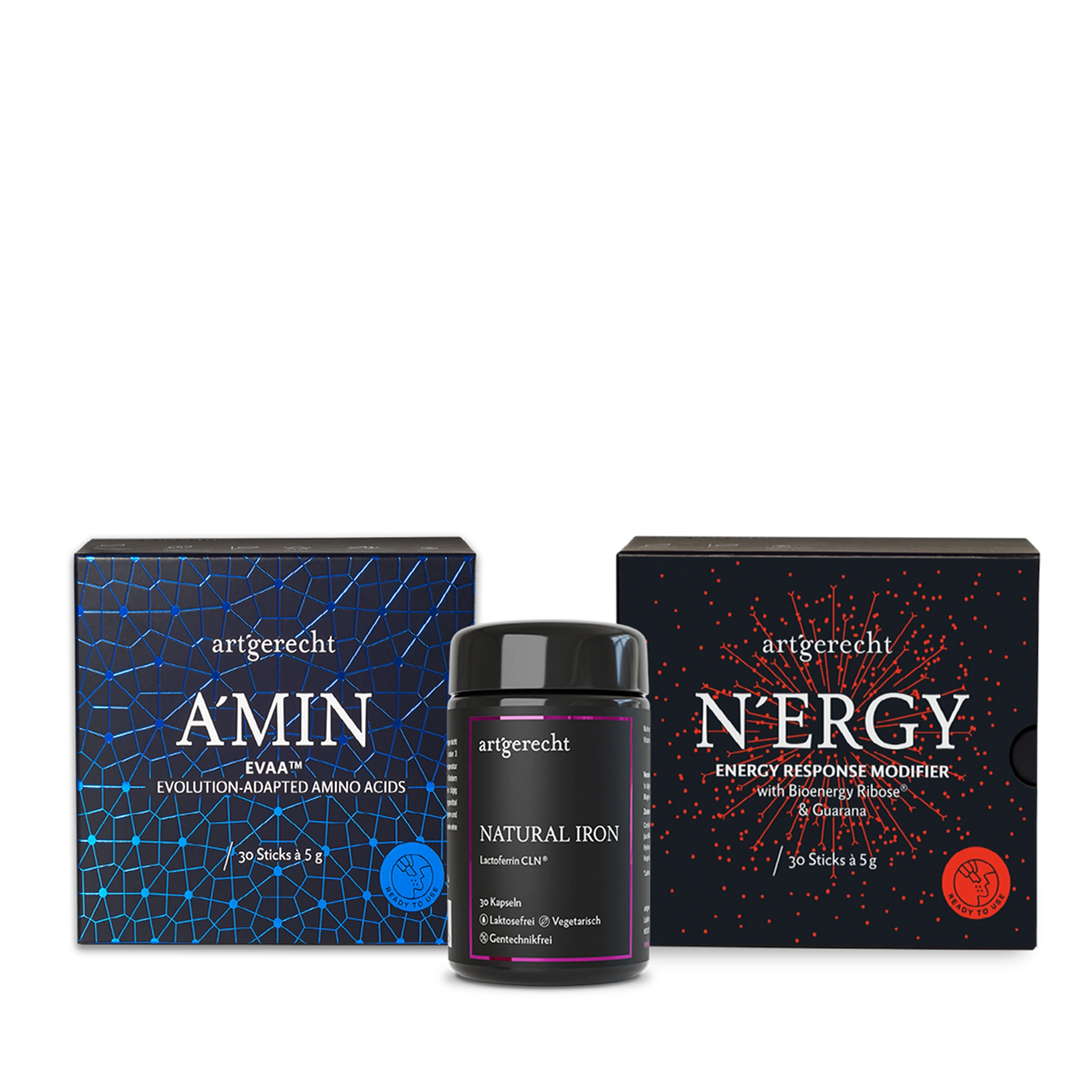
The packaging is a stand-up pouch made from a flexible material that allows it to maintain an upright position. The pouch has a matte black exterior with a glossy pink outline around the product name and information. The front features the product name 'NERGY' prominently displayed in white font, along with a description of the product as an 'ENERGY RESPONSE MODIFIER'. The back of the pouch likely contains additional product information and nutritional facts, although not visible in this image.
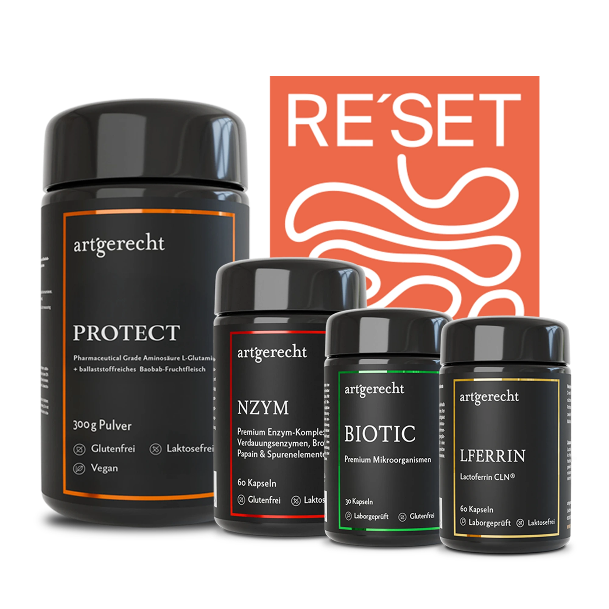
The image showcases a set of four cylindrical jars, each containing dietary supplements. The jars are made of thick, sturdy plastic with a matte finish, giving them a premium appearance. Each jar features a screw-on lid and a label that wraps around the body, displaying product information and branding. The labels are colorful and include various graphics and text elements that highlight the product benefits. The jars are arranged in a visually appealing manner, with the largest jar positioned prominently.
About the Brand
Artgerecht operates within the health and wellness sector, offering a range of nutritional supplements designed for various health needs. Their packaging strategy focuses on premium quality, using materials and formats that reflect the brand’s scientific and natural positioning.
The company’s packaging portfolio includes flexible stand-up pouches, rigid supplement jars, and custom carton boxes, all exhibiting high design consistency and functionality. Artgerecht integrates educational content and sustainable practices throughout their packaging lifecycle, aiming to balance product protection with environmental considerations. Packaging choices are tailored to optimize shelf appeal, logistics safety, and consumer engagement.
Key Differentiator: Distinctive use of minimalist, matte-finished packaging with a cohesive color palette and strong brand presence, combined with a transparent commitment to sustainability and consumer education.
Design System
Visual Style
Minimalist typography with modern sans-serif fonts, a predominantly matte black color palette complemented by accent colors for product differentiation, and a clean, uncluttered visual hierarchy.
Brand Identity
Consistent use of the Artgerecht logo, strategically placed product names, and uniform iconography across packaging. Visual consistency is maintained through standardized color usage, font selection, and placement of key information.
Packaging Design
Preference for flexible and rigid packaging structures that maximize protection and usability. Material choices prioritize recyclability and premium tactile finishes, with structural design focused on secure closures, stackability, and efficient storage.
User Experience
Packaging design enhances the customer journey by offering intuitive access, resealable features, and clear product labeling. The cohesive visual identity supports brand trust and delivers a distinctive unboxing experience aligned with the company’s wellness ethos.
Company Metrics
Business insights for Artgerecht based on available data
Market Positioning
Brand Values & Focus
Key Competitors
Target Market: Health-conscious consumers seeking premium, scientifically backed nutritional supplements, with a focus on sustainable and transparent product offerings across Germany and other Tier I European markets.
Packaging Assessment
Overall Grade
Visual appeal and presentation quality
Packaging durability and protection
Eco-friendliness and recyclable materials
Cost efficiency and value for money
Packaging assessment for Artgerecht based on industry standards and best practices
Frequently Asked Questions
What types of packaging materials does Artgerecht primarily use?
Artgerecht utilizes a combination of flexible stand-up pouches, rigid plastic jars, and folding carton boxes, selecting materials for both product protection and visual appeal.
How does Artgerecht address sustainability in its packaging?
The company emphasizes eco-friendly practices by selecting recyclable materials, optimizing packaging formats for reduced waste, and communicating environmental values through their design and branding.
How does Artgerecht’s packaging support the unboxing experience?
Artgerecht’s packaging features visually cohesive design, prominent branding, and functional structures, resulting in a premium unboxing experience that reinforces product quality and brand trust.
Discover other Health companies
Explore more companies in the health industry and their packaging strategies
Comvita
Health
Comvita is a New Zealand-based company specializing in high-quality Mānuka honey and natural health products. Established in 1974, it aims to connect people with the healing power of nature.
Bio-Synergy
Health
Bio-Synergy is a UK-based company specializing in health and fitness products, including nutritional supplements and DNA testing kits. Their mission is to support individuals in achieving their health and fitness goals through innovative products and personalized insights.
EVO Nutrition
Health
EVO Nutrition specializes in premium health supplements, providing a wide range of vitamins and nutritional products to support well-being.