Araku Coffee packaging
Araku Coffee is a specialty coffee brand focused on high-quality, organic products sourced from the Araku Valley in India. Their packaging strategy leverages visually impactful materials and structures designed to enhance product differentiation while supporting their sustainability commitments.
Packaging Portfolio
Araku Coffee employs a diverse range of packaging types tailored to product needs and positioning. Their portfolio includes folding carton boxes crafted from single-layer paperboard, flexible stand-up pouches with resealable features and one-way valves for coffee freshness, and premium rigid canisters with wooden lids for select blends. The designs consistently integrate vibrant geometric motifs and strong brand identifiers, while the material choices balance shelf appeal with functional protection and a commitment to sustainable practices.

The packaging is a stand-up pouch made of flexible material, featuring a smooth surface with a glossy finish. The bag is predominantly white with vibrant geometric patterns in shades of red, pink, and purple. The top of the bag has a resealable zip closure, and a one-way valve is visible, allowing gases to escape while preventing air from entering. The design includes the brand name 'araku' prominently displayed in a bold font, along with product details such as 'MICRO CLIMAT' and 'Café de spécialité torréfié à Paris'.

The image features two distinct packaging types: a coffee bag and a canister. The coffee bag is made of a smooth, white paper material with a flat construction, while the canister is a cylindrical metal container with a wooden lid. The bag has a clean, minimalistic design with a colorful geometric pattern and clear branding. The canister has a rustic appearance due to its wooden lid and features similar branding elements.

The image features two distinct packaging types: a coffee bag and a cylindrical container. The coffee bag is made of a smooth, flat paper material, likely a single-layer paperboard, with a matte finish. It has a clean, precise fold at the top and a resealable closure. The cylindrical container is made of rigid chipboard with a wooden lid, showcasing a premium appearance. Both packages prominently feature the brand name 'araku' in bold, modern typography, accompanied by colorful geometric patterns.

The packaging consists of two folding cartons stacked on top of each other. Each carton has a smooth, flat construction without any visible fluted layers, indicating they are made from single-layer paperboard. The cartons feature vibrant colors, with one being a deep red and the other a bright yellow, both adorned with abstract geometric patterns. The edges are clean and precise, and the overall appearance is lightweight yet sturdy, typical of retail packaging. Each carton has a front panel displaying the brand name 'araku' prominently in white, along with product names and additional details in a modern font. The design is visually striking and colorful, aimed at attracting consumer attention.

The image features two distinct packaging types: a stand-up pouch and a cylindrical canister. The stand-up pouch is made of a smooth, white paper-like material with a resealable top, while the canister is a round, rigid container with a wooden lid. Both packages prominently display the brand name 'araku' in bold, colorful typography, with geometric patterns in shades of red, orange, and yellow. The pouch has a matte finish, while the canister has a smooth surface with a natural wood texture on the lid.
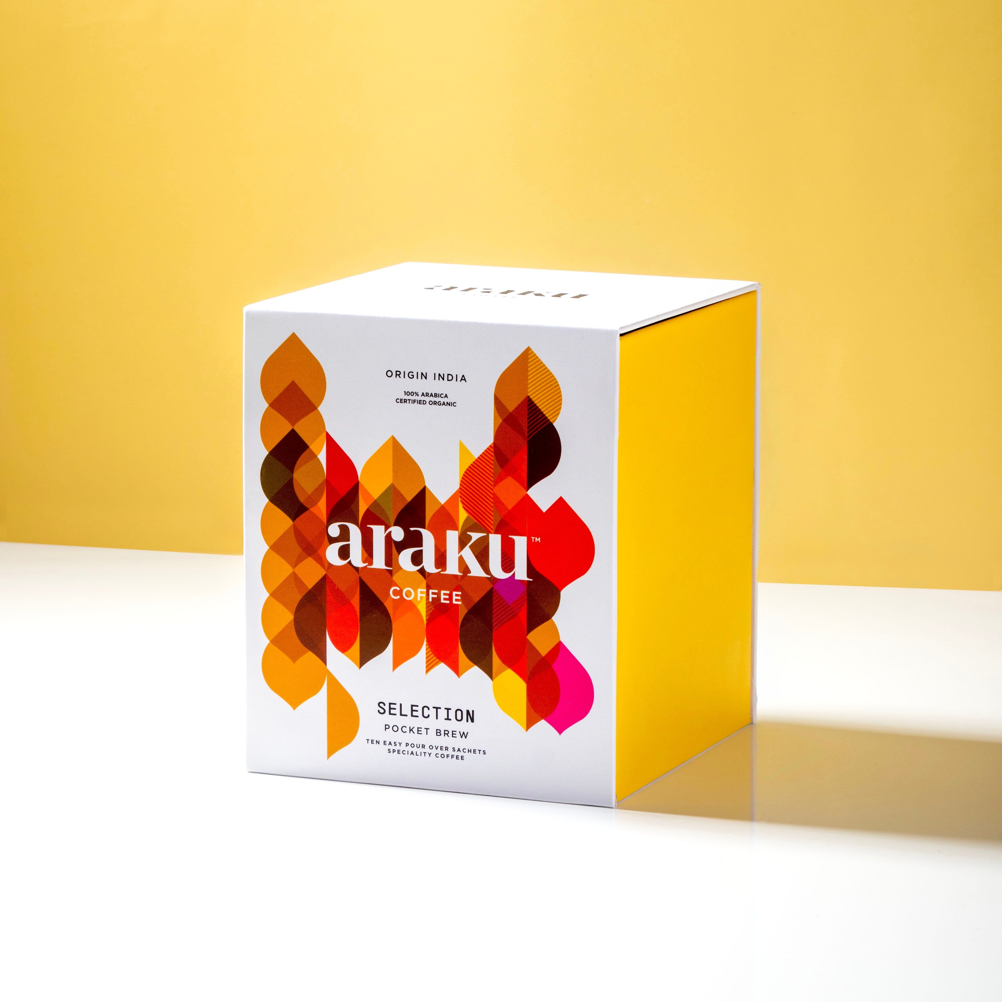
The packaging is a folding carton box with a smooth, flat construction. It features a predominantly white exterior with vibrant, colorful graphics that include geometric shapes in shades of red, orange, and yellow. The box has clean, precise edges and folds, indicating a well-constructed design. The top of the box is open, suggesting a tuck-in closure method. The overall shape is square, with dimensions that suggest it is designed to hold coffee products.
About the Brand
Araku Coffee operates at the intersection of specialty coffee and social responsibility, prioritizing regenerative agriculture and equitable trade. The company’s product offerings include premium coffee blends, brewing equipment, and serveware, each delivered in carefully designed packaging that aligns with their quality standards.
Founded in Bangalore, Araku Coffee integrates regenerative agriculture and fair trade principles throughout its operations. Packaging is a critical touchpoint in their direct-to-consumer (D2C) business model, acting as both a protective vessel and a brand ambassador. The use of bold graphics and sustainable materials reflects their dual emphasis on product quality and environmental stewardship.
Key Differentiator: Araku Coffee is distinguished by its terroir-mapped coffee, organic certification, and visually distinctive packaging that reinforces their commitment to ethical sourcing and sustainability.
Design System
Visual Style
Araku Coffee’s packaging utilizes modern sans-serif typography, a bold and saturated color palette (deep reds, yellows, oranges, and purples), and geometric abstract patterns. The approach is contemporary and attention-grabbing, supporting a premium, artisanal brand image.
Brand Identity
Consistent use of the 'araku' logo in prominent placement, reinforced by geometric iconography and clear product descriptors. Visual consistency is maintained across formats, supporting strong brand recall and differentiation in the specialty coffee segment.
Packaging Design
Material selection prioritizes recyclable paperboard, flexible laminates with barrier properties for coffee freshness, and reusable rigid canisters. Structural design emphasizes clean lines, ease of opening, and resealability, balancing product protection with an elevated consumer experience.
User Experience
The packaging is designed to create a memorable unboxing experience through tactile materials and vibrant visuals, with clear information architecture that guides the customer’s journey from purchase to preparation. Resealable closures and protective features ensure product integrity, supporting both convenience and brand trust.
Company Metrics
Business insights for Araku Coffee based on available data
Market Positioning
Brand Values & Focus
Key Competitors
Target Market: Araku Coffee targets urban, health-conscious consumers and specialty coffee enthusiasts in India and globally, with a strong appeal to eco-conscious buyers seeking premium, ethically sourced products.
Packaging Assessment
Overall Grade
Visual appeal and presentation quality
Packaging durability and protection
Eco-friendliness and recyclable materials
Cost efficiency and value for money
Packaging assessment for Araku Coffee based on industry standards and best practices
Frequently Asked Questions
What types of packaging does Araku Coffee use for its products?
Araku Coffee utilizes a mix of folding carton boxes, flexible stand-up pouches with resealable closures, rigid canisters with wooden lids, and single-layer paperboard bags. Each format is selected for its functional and branding benefits.
How does Araku Coffee address sustainability in its packaging?
The company incorporates recyclable materials and minimalistic structural designs, including paperboard cartons and reusable rigid canisters, to reduce environmental impact in alignment with their organic and regenerative values.
How does the packaging design support brand recognition?
Packaging consistently features the 'araku' brand name, geometric patterns, and a vibrant color palette, ensuring strong shelf presence and clear brand association throughout the customer journey.
Discover other Food & Drink companies
Explore more companies in the food & drink industry and their packaging strategies
ruf lebensmittelwerk kg
Food & Drink
RUF Lebensmittelwerk KG is a German food production company specializing in a variety of baking mixes and drink products. Founded in 1920, the company is known for its high-quality ingredients and innovative food solutions.
Thés de la Pagode
Food & Drink
Thés de la Pagode is a French company specializing in organic teas and infusions, focusing on health and well-being. Established in 1987, they prioritize sustainable practices and high-quality ingredients sourced through fair trade.
Terres de Café
Food & Drink
Terres de Café is a specialty coffee retailer based in Paris, France, known for its commitment to sustainability and high-quality coffee sourcing.