aquaPro2000 packaging
aquaPro2000 is a specialized retailer in the aquaristics sector, providing a diverse range of aquarium equipment, live fish, and pond supplies. Their packaging strategy emphasizes retail-ready carton formats with a focus on visual clarity, product information, and secure presentation for both e-commerce and in-store distribution.
Packaging Portfolio
aquaPro2000 employs a standardized approach centered on single-layer paperboard carton boxes with glossy finishes and printed graphics. Packaging solutions prioritize clear product identification, visibility, and branding consistency, frequently featuring transparent windows or product imagery. The use of color-coded graphics and detailed product instructions supports both shelf impact and consumer guidance. While the primary material is recyclable paperboard, the presence of gloss coatings may affect overall recyclability. Structural designs are optimized for both e-commerce shipping and retail presentation, balancing product security with visual marketability.
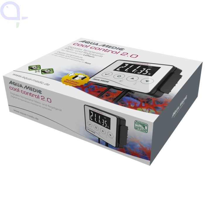
The packaging is a rectangular, flat construction made from single-layer paperboard. It features a smooth surface with clean edges and folds. The box is predominantly white with colorful graphics depicting the product and its features. The front displays a digital control panel image, with a clear display of temperature readings. The box has a glossy finish that enhances the visual appeal. The sides include additional product information and icons indicating features.
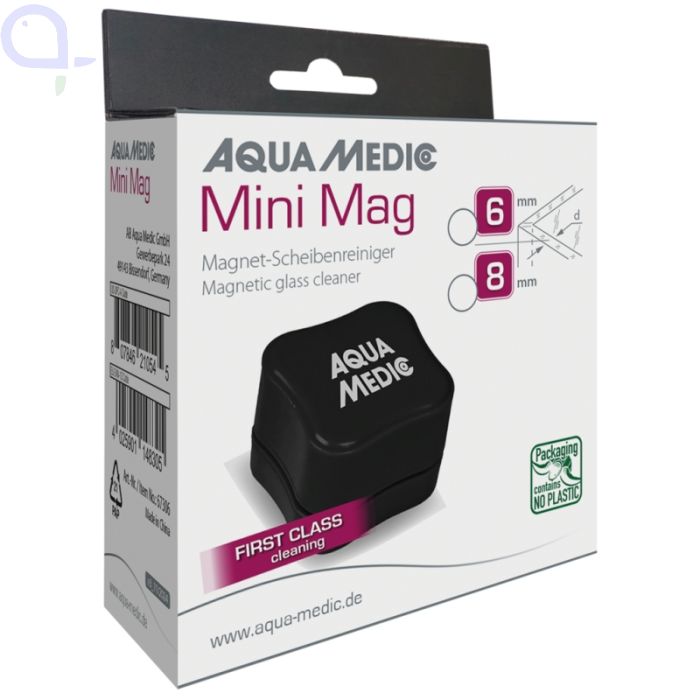
The packaging is a flat, smooth, single-layer carton box with clean edges and folds. It features a predominantly white exterior with colorful graphics and text. The box has a rectangular shape, designed to hold a magnetic glass cleaner. The front displays the product name 'Mini Mag' prominently, along with a description of the product and its dimensions. The back includes additional product information and branding elements.
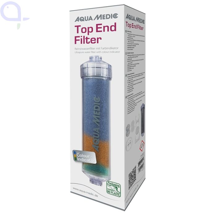
The packaging is a tall, rectangular box made from smooth, flat paperboard. It features a clean, precise construction with sharp edges and folds. The surface is predominantly white with colorful graphics showcasing the product inside. The box has a glossy finish, enhancing its visual appeal. The front displays the product name 'Top End Filter' in bold, prominent lettering, along with a color indicator graphic. The sides contain additional product information and usage instructions, printed in a clear font.
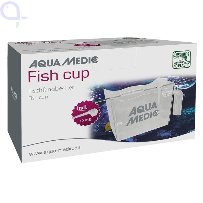
The packaging is a rectangular folding carton made from single-layer paperboard. It features a smooth, flat construction with clean edges and precise folds. The exterior is predominantly white with a glossy finish, showcasing colorful graphics related to the product. The front displays the product name 'Fish cup' prominently, along with a small volume indication of '5 ml'. The design includes a transparent window that allows visibility of the product inside. The sides of the box have additional printed information and branding elements.
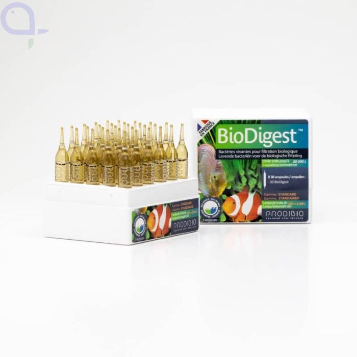
The packaging consists of a rectangular folding carton that is primarily white with colorful graphics. The box features a smooth, flat construction without any visible fluted layers, indicating it is made from single-layer paperboard. The edges are clean and precise, with a glossy finish that enhances the visual appeal. The front of the carton displays the product name 'BioDigest' prominently, along with images of fish and aquatic plants, suggesting its use for aquatic environments. The sides of the box include additional product information and instructions.
About the Brand
aquaPro2000 operates as a B2C e-commerce platform focused on the aquatics and pond care industry, offering products ranging from aquarium equipment to live aquatic animals. The company utilizes standardized carton packaging with strong visual branding and clear product information to support both online fulfillment and retail display requirements.
Founded in 1995, aquaPro2000 combines a curated product selection with a brand strategy centered on quality and customer support. Packaging choices highlight a preference for single-layer paperboard retail cartons, leveraging glossy finishes and high-contrast graphics to reinforce product identity and facilitate customer understanding. The packaging approach prioritizes product safety, visual appeal, and consistent brand presence across third-party and in-house brands.
Key Differentiator: Distinctive integration of branded packaging for both equipment and delicate live products, balancing presentation with logistics safety in the aquaristics niche.
Design System
Visual Style
Modern sans-serif typography, a predominantly white color palette accented with blues and greens, and high-contrast product imagery create a clean, aquatic-themed aesthetic. Glossy finishes enhance shelf presence and visual appeal.
Brand Identity
Consistent use of the Aqua Medic logo and product names across packaging, clear incorporation of branding elements, and frequent use of aquatic iconography promote strong brand association. Visual consistency is maintained across different product lines with standardized layouts and color schemes.
Packaging Design
Preference for single-layer paperboard materials, flat and rectangular carton structures, and die-cut windows where appropriate. Design philosophy emphasizes clarity, ease of handling, and protection, with a focus on informative graphics and product accessibility.
User Experience
Packaging is structured to facilitate intuitive product recognition, provide essential usage details, and ensure safe delivery. The combination of visual transparency, ergonomic carton formats, and clear branding supports a positive customer journey from online purchase to unboxing.
Company Metrics
Business insights for aquaPro2000 based on available data
Market Positioning
Brand Values & Focus
Key Competitors
Target Market: Aquarium hobbyists, aquatic plant and fish enthusiasts, and pond gardeners in Germany and the broader European market seeking quality aquaristics products and live aquatic life.
Packaging Assessment
Overall Grade
Visual appeal and presentation quality
Packaging durability and protection
Eco-friendliness and recyclable materials
Cost efficiency and value for money
Packaging assessment for aquaPro2000 based on industry standards and best practices
Frequently Asked Questions
How does aquaPro2000 ensure packaging integrity for live and fragile aquaristic products?
aquaPro2000 employs robust single-layer carton packaging with precise folding and clean edges to enhance product protection during transit. For live and fragile items, additional internal supports or cushioning may be utilized, though external branding remains consistent. This approach aims to minimize transit damage while maintaining a cohesive shelf presence.
What sustainability considerations are evident in aquaPro2000’s packaging?
The predominant use of paperboard cartons supports recyclability and moderate environmental impact. However, reliance on glossy finishes and single-use formats may limit overall eco-friendliness compared to fully compostable or recycled-content solutions commonly found in leading sustainable packaging strategies.
How does the packaging design support the customer experience?
Packaging features high-visibility branding, clear product names, and usage instructions, aiding product selection and reducing confusion for both novice and experienced aquarists. Transparent windows and product imagery on cartons further enhance the unboxing and purchase experience.
Discover other Pets & Animals companies
Explore more companies in the pets & animals industry and their packaging strategies
My Furbaby
Pets & Animals
My Furbaby provides premium, NZ-made dog food and pet essentials delivered directly to customers' doors, ensuring pets receive the best nutrition while supporting sustainability.
Zooper
Pets & Animals
Zooper is a retail company specializing in pet supplies and products, offering a wide range of items for both dogs and cats. Their online platform provides convenience for pet owners looking for quality goods at competitive prices.
PetsDiet
Pets & Animals
PetsDiet specializes in premium pet food and dietary supplements for dogs and cats, emphasizing quality and health. With a focus on natural ingredients, the company aims to improve the well-being of pets through tailored nutrition.