Antipodes packaging
Antipodes is a New Zealand-based natural skincare company specializing in scientifically validated, eco-conscious beauty products. Their packaging strategy emphasizes sustainable materials, premium presentation, and cohesive branding to align with their luxury, nature-driven ethos.
Packaging Portfolio
Antipodes leverages a portfolio of folding carton boxes, rigid glass jars, and premium paperboard retailers for product presentation and protection. The carton formats feature single-layer, recyclable paperboard with matte or glossy finishes and botanical-themed graphics. Rigid glass jars are used for creams and masks, providing both a premium tactile experience and enhanced product preservation. Packaging structures are optimized for retail display and e-commerce durability, while design choices support both sustainability and luxury branding objectives.

The packaging consists of a small, rectangular box made of smooth, single-layer paperboard. The box features a clean, flat construction with precise edges and folds. The exterior is predominantly a light brown color with a glossy finish, showcasing vibrant graphics and text. The front displays the brand name 'ANTIPODES' prominently in a bold font, along with product names and descriptions. The box is designed to hold two smaller products, with visible cutouts on the top flaps allowing for easy access. The overall design is visually appealing and aligns with retail packaging standards.

The packaging consists of a small, square retail carton that houses a jar. The carton is made of smooth, flat paperboard with clean edges and folds. It features a glossy finish with vibrant colors and graphics. The jar is made of dark glass with a black lid, and it is placed on a decorative tray. The carton displays a prominent logo and product information, while the jar has a label that includes the brand name.

The packaging is a folding carton box featuring a smooth, flat construction without visible fluted layers. It is predominantly green with botanical illustrations and product information prominently displayed. The edges are clean and precise, indicating a well-constructed retail package. The box is designed to hold multiple beauty products, including tubes and a jar, and has a cohesive design that aligns with the brand's aesthetic.
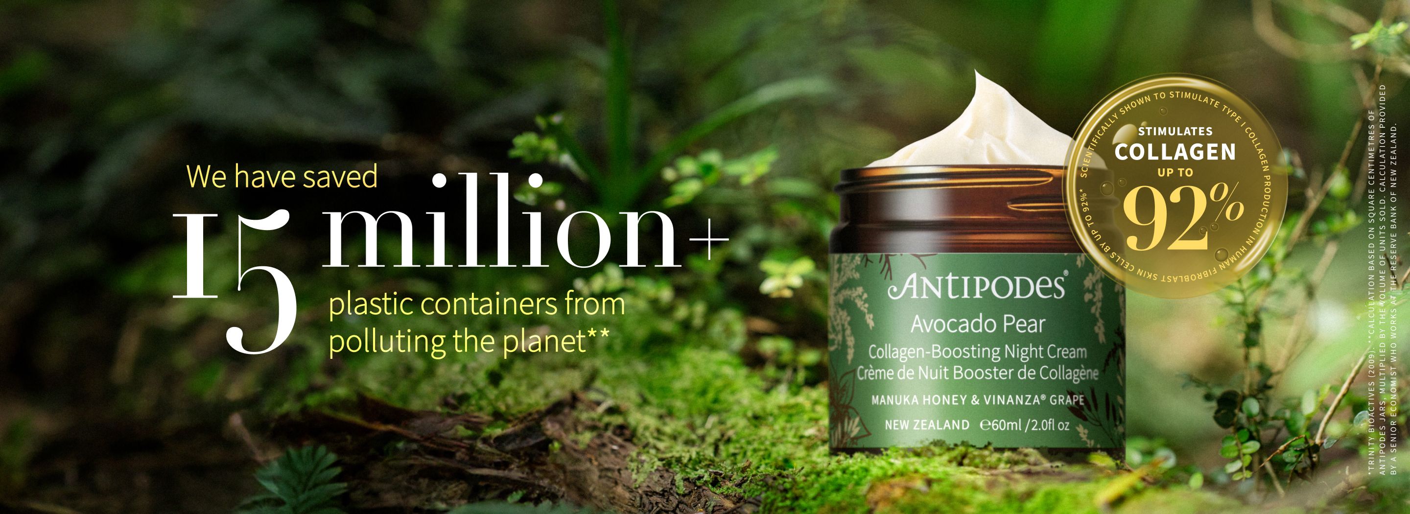
The packaging features a luxurious green jar with a metallic gold lid. The jar has a smooth, glossy finish, indicative of high-quality materials. The label on the jar is detailed, showcasing product information and branding elements. The overall design is elegant, with a focus on sustainability, as indicated by the text regarding plastic container savings.

The packaging consists of two small, square folding cartons made of smooth, single-layer paperboard. Each box features clean, precise edges and folds, with a predominantly blue color scheme and white text. The surface appears to have a matte finish, giving it a premium look. The boxes are adorned with intricate graphics, including a floral pattern and product information. The top flaps are folded down neatly, and the boxes do not show any visible signs of wear or damage.
About the Brand
Antipodes delivers high-performance skincare with a strong emphasis on natural ingredients and environmental sustainability. The brand’s packaging approach combines premium carton boxes and rigid jars to communicate product efficacy and eco-friendly values while ensuring product protection.
Founded in 2006 and headquartered in Wellington, Antipodes has established itself as a leader in the natural skincare sector. Their packaging strategy is closely integrated with their brand identity—prioritizing recyclable materials, botanical motifs, and robust structural design for both retail and e-commerce channels. Consistency in color palette and typography reinforces their luxury positioning, while messaging often highlights sustainability commitments.
Key Differentiator: Antipodes stands out for its comprehensive use of recyclable packaging and visually distinctive, botanically themed designs that reflect both New Zealand heritage and scientific credibility.
Design System
Visual Style
Antipodes employs serif and clean sans-serif typography, with a signature green-dominated color palette accented by gold and natural tones. Visuals are botanical-themed, combining modern minimalism with detailed illustrations.
Brand Identity
The Antipodes logo is consistently featured on all packaging, with clear hierarchy for product names and scientific claims. Iconography is minimal, relying on botanical motifs and restrained graphic elements to reinforce brand recognition and visual consistency.
Packaging Design
Material selection prioritizes recyclable paperboard and glass, with structural formats including folding cartons and rigid jars. Design philosophy emphasizes clarity, durability, and minimal excess material, with an overarching commitment to eco-friendly practices.
User Experience
Packaging is designed to create a positive unboxing experience with tactile finishes and cohesive visuals, guiding the customer through product discovery. Sustainability messaging and premium cues are integrated to reinforce trust and support Antipodes' brand promise throughout the customer journey.
Company Metrics
Business insights for Antipodes based on available data
Market Positioning
Brand Values & Focus
Key Competitors
Target Market: Environmentally conscious consumers seeking high-performance, luxury skincare solutions with a focus on natural ingredients and sustainable practices.
Packaging Assessment
Overall Grade
Visual appeal and presentation quality
Packaging durability and protection
Eco-friendliness and recyclable materials
Cost efficiency and value for money
Packaging assessment for Antipodes based on industry standards and best practices
Frequently Asked Questions
What types of packaging does Antipodes use for its skincare products?
Antipodes primarily utilizes folding carton boxes made of paperboard for outer packaging and rigid glass or plastic jars for creams and masks. These formats are selected for their protective qualities, retail shelf appeal, and alignment with sustainability objectives.
How does Antipodes address sustainability in its packaging?
The brand employs recyclable materials for most packaging components, integrates sustainability messaging on pack, and leverages minimalist yet premium design to reduce excess materials while maintaining a luxury perception.
How effective is Antipodes packaging in protecting products during shipping?
Antipodes packaging demonstrates strong structural integrity and fit, with robust carton construction and secure closures designed to minimize transit damage and preserve product integrity.
Discover other Beauty & Fitness companies
Explore more companies in the beauty & fitness industry and their packaging strategies
Pure Altitude
Beauty & Fitness
Pure Altitude specializes in high-quality beauty and skincare products that leverage the expertise of spa treatments to enhance daily routines. The brand offers a diverse range of products tailored for both facial and body care.
Orris Paris
Beauty & Fitness
Orris Paris specializes in creating artisanal skincare products that combine potent botanical ingredients with modern cleansing rituals. The company emphasizes natural, holistic practices in its formulations.
Cultiv Cosmetique
Beauty & Fitness
Cultiv Cosmetique is a French skincare brand that provides organic and eco-friendly beauty products inspired by nature. They focus on effective skincare solutions for various skin concerns.