AGO Supplements packaging
AGO Supplements specializes in fertility and health supplements, utilizing science-backed formulations to support reproductive wellness. Their packaging strategy emphasizes shelf-ready carton boxes and rigid bottles, designed for both retail display and brand identity consistency.
Packaging Portfolio
AGO Supplements employs a combination of single-layer paperboard carton boxes and rigid bottles (plastic and glass) for its product packaging. Carton boxes are designed for retail display and feature high-quality printing, clean folds, and vibrant branding. Rigid bottles, used as primary packaging for supplements, provide product stability, child-resistant closures, and protection against moisture and light. The overall portfolio demonstrates a balance between shelf impact, regulatory compliance, and user convenience, though primary reliance on plastics moderates the sustainability profile.

The packaging consists of a smooth, flat construction with clean edges and folds. The box is primarily black with red and white accents, featuring a glossy finish. The front displays the product name 'AGO DAD' prominently, along with a brief commitment statement regarding quality. The sides contain additional product information and a list of ingredients. The box is designed to hold a bottle of tablets, which is visible through a cut-out section on the front.
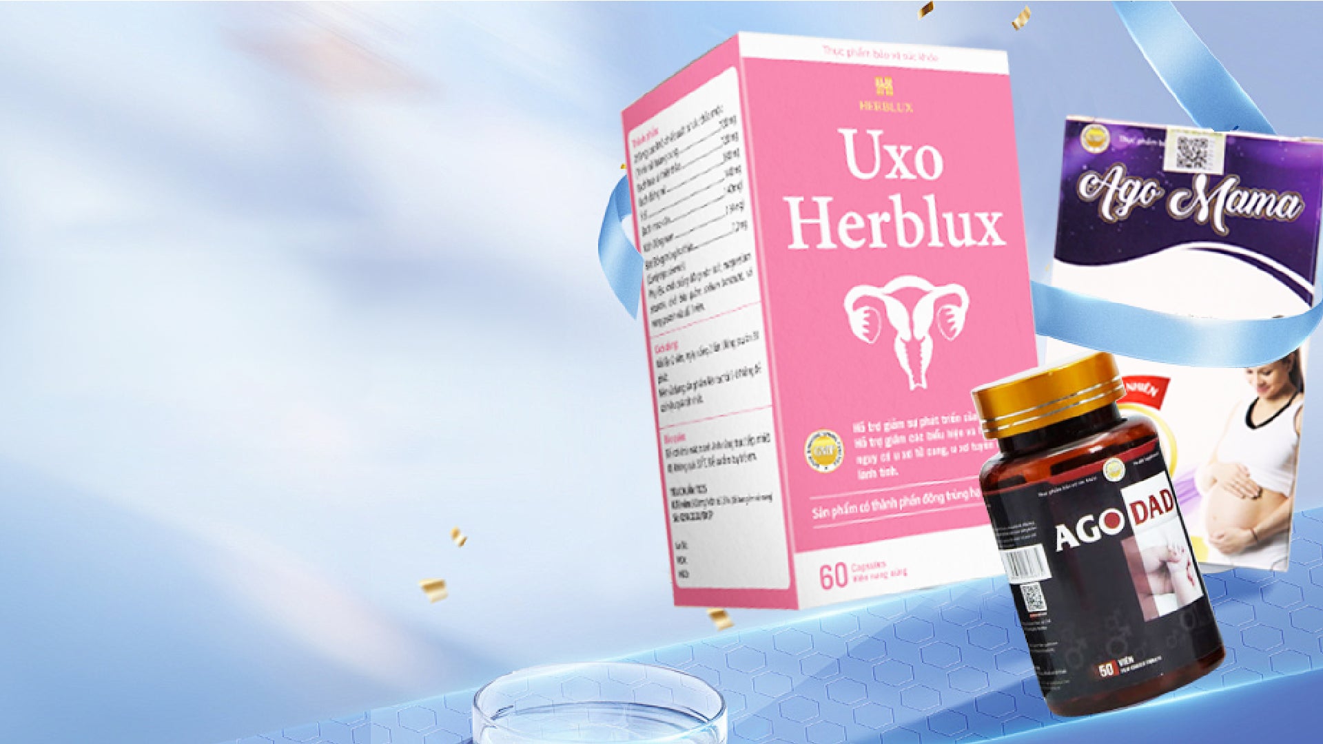
The packaging consists of a smooth, flat construction without visible fluted layers, indicating it is made from single-layer paperboard. The box features a pink exterior with white and gold accents, and the design includes images and text related to the product. The edges are clean and precise, typical of retail packaging. The box appears to be designed for shelf display, likely for health or supplement products.

The packaging is a folding carton made from single-layer paperboard. It features a smooth, flat construction with clean edges and folds. The carton is predominantly white with colorful graphics, including a purple background and images of the product. The front displays the product name and key ingredients in a clear, legible font. The sides contain additional information about the product, including usage instructions and storage details.
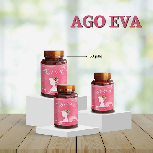
The packaging consists of three cylindrical bottles made of thick, sturdy plastic with a glossy finish. Each bottle has a wide mouth with a screw-on cap, and they are presented on a white pedestal against a soft pink background. The labels feature floral designs and vibrant colors, enhancing the visual appeal. The bottles are arranged in a staggered manner, showcasing different sizes.
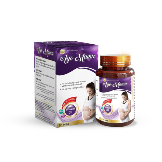
The packaging consists of a folding carton box that houses a bottle of dietary supplements. The box features a smooth, flat construction without any visible fluted layers, indicating it is made from single-layer paperboard. The exterior has a glossy finish with vibrant colors, predominantly white with purple and yellow accents. The front displays the product name 'Ago Mama' prominently, along with a graphic of a pregnant woman, suggesting the product's target demographic. The box has clean, precise edges and folds, typical of retail packaging. The sides contain additional product information and nutritional details in smaller text. The bottle inside is dark amber, indicating it is made of glass or a similar material, and has a screw-on cap.
About the Brand
AGO Supplements operates in the health sector, focusing on fertility and nutritional supplements sold primarily through a direct-to-consumer (D2C) model. Their packaging system is tailored for retail and e-commerce, prioritizing brand visibility and protection of sensitive health products.
The company adopts a multi-format packaging approach, deploying paperboard carton boxes for outer packaging and rigid plastic or glass bottles for product containment. Emphasis is placed on clean, precise structures with prominent branding, and packaging design that aligns with both consumer expectations and regulatory requirements for supplements. Third-party testing and sustainability claims further inform their packaging narrative.
Key Differentiator: AGO Supplements distinguishes itself through design consistency, science-forward branding, and a focus on user experience, particularly in the fertility supplement niche.
Design System
Visual Style
Typography is clean and modern, with bold sans-serif fonts for product names and key information. The color palette features soft pinks, whites, golds, and dark accents for differentiation by product. Visuals use high-contrast layouts and clear iconography for ingredient highlights.
Brand Identity
Consistent use of the AGO logo, prominent product names, and supportive graphics (floral and health-related imagery). Branding is cohesive across product lines, with each SKU maintaining individual color coding while adhering to overall brand standards.
Packaging Design
Material choices prioritize smooth, single-layer paperboard for outer cartons and rigid, glossy plastic or amber glass for bottles. Structural design emphasizes retail readiness and product safety, with folding carton formats and secure closures.
User Experience
Packaging design supports the customer journey with clear communication of benefits, easy-to-read ingredient lists, and a visually appealing unboxing presentation. The design aims to instill trust and reinforce the premium, science-based positioning of the brand.
Company Metrics
Business insights for AGO Supplements based on available data
Market Positioning
Brand Values & Focus
Key Competitors
Target Market: Health-conscious individuals and couples seeking fertility and nutritional supplements, primarily in the UK and broader English-speaking markets.
Packaging Assessment
Overall Grade
Visual appeal and presentation quality
Packaging durability and protection
Eco-friendliness and recyclable materials
Cost efficiency and value for money
Packaging assessment for AGO Supplements based on industry standards and best practices
Frequently Asked Questions
What types of materials are used in AGO Supplements' packaging?
AGO Supplements primarily utilizes single-layer paperboard for carton boxes and sturdy plastic or glass for supplement bottles, balancing visual appeal, protection, and brand communication.
How does AGO Supplements address sustainability in its packaging?
The brand sources materials responsibly and uses recyclable paperboard cartons, though reliance on rigid plastics for bottles limits overall environmental performance.
What ensures the safety of products during shipping?
The use of rigid bottles housed within durable carton boxes provides a dual-layer of protection, minimizing risk of damage during transit.
Discover other Health companies
Explore more companies in the health industry and their packaging strategies
Doctor Seaweed
Health
Doctor Seaweed specializes in natural, plant-based nutritional supplements derived from seaweed, aimed at promoting overall wellness.
EVO Nutrition
Health
EVO Nutrition specializes in premium health supplements, providing a wide range of vitamins and nutritional products to support well-being.
Bio-Synergy
Health
Bio-Synergy is a UK-based company specializing in health and fitness products, including nutritional supplements and DNA testing kits. Their mission is to support individuals in achieving their health and fitness goals through innovative products and personalized insights.