Wowtamins packaging
Wowtamins develops vitamin and nutritional supplements for children and teens, emphasizing health, taste, and bioavailability. Their packaging approach utilizes playful, brand-consistent designs and robust materials to ensure product safety and consumer engagement.
Packaging Portfolio
Wowtamins’ packaging portfolio is centered on rigid plastic and glass bottles equipped with secure screw-on lids for product integrity and child safety. Labels leverage glossy finishes and vivid graphics, often featuring cartoon characters to enhance shelf appeal and consumer recognition. Supplementary folding carton boxes are used for retail display, constructed from single-layer paperboard with high-quality print and gloss finishes. The combination of sturdy containers and eye-catching, information-rich labels underscores a strategy focused on both product protection and brand differentiation within the children’s supplement segment.

The packaging consists of a dark, opaque bottle with a wide mouth and a screw-on cap. The bottle has a smooth surface and is made of sturdy plastic, giving it a premium feel. The label wraps around the bottle, featuring vibrant colors and images of lemons and gummy candies. The overall shape is cylindrical, with a slightly tapered neck leading to the cap. The label includes product information and branding elements prominently displayed.

The packaging consists of a cylindrical plastic bottle with a black screw-on lid. The bottle features a smooth surface with a glossy finish, predominantly in white with pink and green accents. The front label displays the product name 'WOWTAMINS WOMEN COMPLETE' in bold, modern typography, along with additional information such as '13 VITAMINE' and '4 MINERAL-STOFFE'. The label includes a vegan tag and a note about being sugar-free. The overall design is clean and contemporary, appealing to health-conscious consumers.
The packaging is a rigid bottle made of thick plastic, featuring a round shape with a wide mouth for easy access. The bottle has a smooth surface with a glossy finish, and the label wraps around the body of the bottle. The label is colorful and features playful graphics suitable for children's products.

The packaging is a folding carton designed for retail display. It features a smooth, flat construction without any visible fluted layers, indicating it is made from single-layer paperboard. The box has clean edges and folds, with a glossy finish that enhances its visual appeal. The front of the carton prominently displays the product name 'Vitamin D3 + Vitamin K2 Gummies' along with a playful illustration of a raccoon, which adds a friendly and inviting touch. The color scheme includes bright yellows and whites, making it eye-catching.

The packaging is a cylindrical bottle with a dark amber glass material. The bottle has a smooth surface with a rounded neck and a black screw-on cap. The label wraps around the body of the bottle, featuring a light pastel color scheme with a cartoon raccoon illustration. The label includes product information, nutritional details, and branding elements.

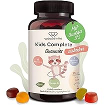
The packaging consists of a clear plastic bottle with a black lid. The bottle is cylindrical in shape and contains gummy supplements. The label is colorful, featuring a cartoon character, and includes product information such as the name 'Vitamin D3 Gummies + Vitamin K2' and the quantity '60 Gummies'. There is also a green tag attached to the neck of the bottle indicating 'VEGAN'. The overall design is playful and appealing, aimed at a younger audience.
About the Brand
Wowtamins specializes in direct-to-consumer gummy vitamins and nutritional supplements designed for younger demographics. The company leverages bold, colorful packaging to appeal to children and parents while ensuring product integrity through durable bottle formats.
Operating within the German health market, Wowtamins focuses on delivering high-quality, bioavailable supplements in playful, easy-to-consume forms. Their packaging strategy employs rigid plastic and glass bottles, as well as retail folding cartons, to balance shelf presence, product safety, and user experience. Brand consistency is maintained through distinct iconography, child-friendly graphics, and prominent labeling, all of which reinforce their mission to make supplementation engaging and trustworthy.
Key Differentiator: Wowtamins' unique positioning lies in their integration of playful, youth-oriented packaging design with rigorous product protection and clear nutritional communication.
Design System
Visual Style
Typography is bold and modern, with playful sans-serif fonts used for product names and nutritional highlights. The color palette features bright primary and pastel tones (yellows, pinks, greens, whites) designed to attract children and reassure parents. Overall aesthetic is approachable and energetic, balancing fun with trustworthiness.
Brand Identity
Consistent logo placement, recurring use of cartoon mascots, and clear product naming drive brand recognition. Iconography emphasizes health cues (vegan, sugar-free) and nutritional benefits, while visual consistency is maintained across both bottles and cartons for cohesive shelf presence.
Packaging Design
Material choices center on thick, food-grade plastics and amber glass for bottles, prioritizing product stability and safety. Folding cartons use glossy, high-density paperboard for durability and print quality. Structural design is ergonomic, with wide-mouth bottles for ease of use and tamper-evident caps for safety compliance.
User Experience
Design supports the customer journey by offering clear, easy-to-read information and visually engaging graphics. The approachable style reduces friction for parents making purchase decisions, while playful elements encourage positive associations for children, creating a memorable unboxing and daily usage experience.
Company Metrics
Business insights for Wowtamins based on available data
Market Positioning
Brand Values & Focus
Key Competitors
Target Market: Parents of children and teenagers seeking nutritional supplements, with an emphasis on the German and broader EU direct-to-consumer health markets.
Packaging Assessment
Overall Grade
Visual appeal and presentation quality
Packaging durability and protection
Eco-friendliness and recyclable materials
Cost efficiency and value for money
Packaging assessment for Wowtamins based on industry standards and best practices
Frequently Asked Questions
What packaging materials does Wowtamins use for its supplements?
Wowtamins primarily utilizes rigid plastic and glass bottles for product containment, complemented by folding carton boxes for retail display. These materials are selected to ensure product protection, child safety, and compliance with industry standards.
How does Wowtamins ensure packaging aligns with its brand identity?
Packaging features consistent use of vibrant color palettes, playful character illustrations, and clear labeling, all of which reinforce the brand's health-focused and approachable image targeted toward families.
Is Wowtamins' packaging environmentally sustainable?
Wowtamins incorporates glass bottles and recyclable paperboard cartons in parts of their portfolio. However, the use of plastic bottles suggests moderate sustainability practices, with potential for further eco-friendly improvements.
Discover other Health companies
Explore more companies in the health industry and their packaging strategies
Doctor Seaweed
Health
Doctor Seaweed specializes in natural, plant-based nutritional supplements derived from seaweed, aimed at promoting overall wellness.
Smart Protein
Health
Smart Protein is dedicated to transforming nutrition by providing a range of health and wellness products focused on protein supplements and vitamins.
Lily & Loaf
Health
Lily & Loaf specializes in high-quality health and nutrition products, offering a range of supplements and vitamins aimed at supporting an active lifestyle. The company focuses on providing natural solutions for health and beauty.