Workshop Gymnasium packaging
Workshop Gymnasium specializes in personalized fitness programs and all-natural nutritional supplements, targeting long-term health outcomes. Their packaging strategy employs minimalist, premium materials to reinforce a clean and science-driven brand identity.
Packaging Portfolio
Workshop Gymnasium employs rigid chipboard cylinders, screw-top plastic containers, and custom carton boxes for its nutritional supplements range. The packaging features matte and gloss finishes, with structural emphasis on durability and secure closures to preserve product integrity. Labels utilize high-contrast, minimalist designs for rapid identification and clear communication of product attributes. This system supports both retail display and direct-to-consumer logistics while reflecting the brand’s commitment to quality and science-based wellness.
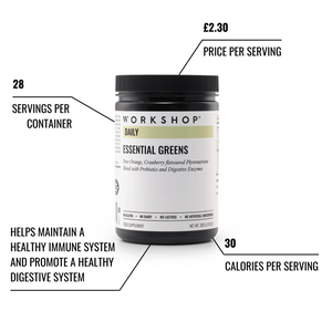
The packaging is a cylindrical container with a black matte finish. The lid is also black and appears to be screw-on. The label is predominantly white with black text and colorful accents. The label includes nutritional information and product details, with a clean, modern design. The overall shape is tall and slender, typical for supplement containers.
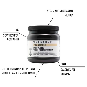
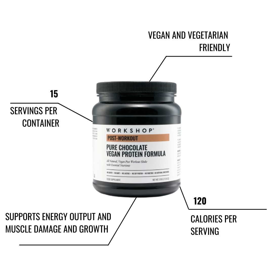
The packaging is a cylindrical container with a black exterior and a wide mouth. The lid is also black and appears to be screw-on. The container features a label that provides product information, including the flavor, serving size, and nutritional benefits. The label has a clean design with a white background and black text, making it easy to read.
The packaging consists of two cylindrical containers made of thick, sturdy chipboard. Both containers have a premium appearance with a matte black finish and white labeling. The labels are neatly applied and feature clean edges. The containers are designed for retail display, showcasing the product names and descriptions prominently. The overall shape is round, and the lids fit securely on top of the containers.

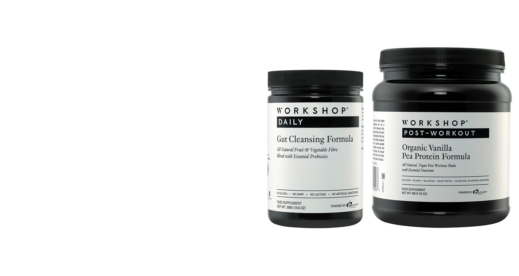
The packaging consists of two cylindrical containers, one white and one black, with a smooth surface. The containers have a wide mouth opening and a screw-on lid. The white container features a clean design with a matte finish, while the black container has a slightly glossy finish. Both containers are labeled with product information, including the name, flavor, and nutritional details. The labels are printed with bold fonts and contrasting colors for visibility.
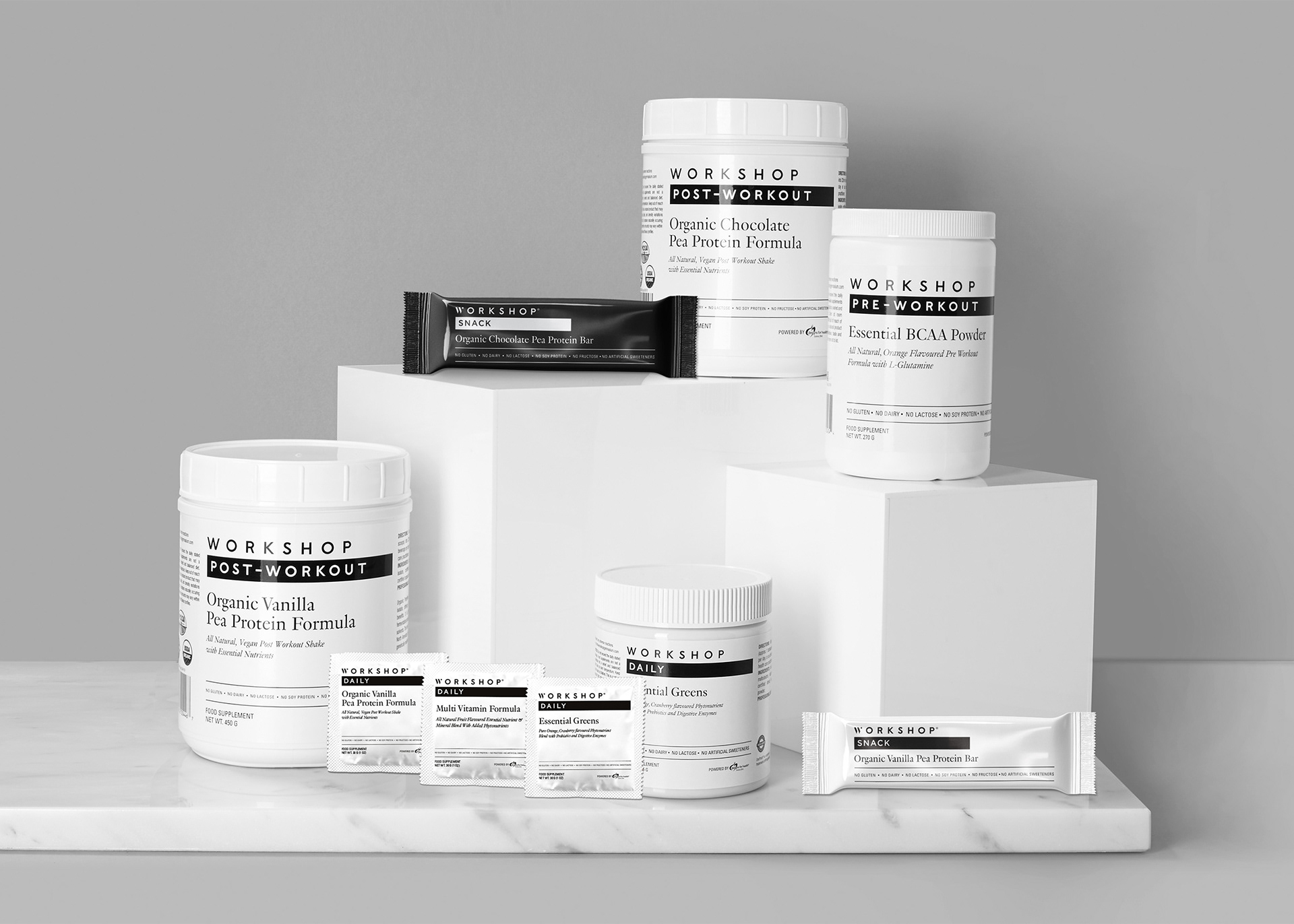
The image features a variety of packaging types for dietary supplements, including cylindrical containers and small sachets. The cylindrical containers are white with a matte finish, showcasing clean, precise edges and folds. The smaller sachets are flat, with a smooth construction and a glossy finish. All items are prominently labeled with clear product information.
The packaging is a cylindrical container made of thick, sturdy chipboard with a premium finish. The container features a black matte exterior with white text and graphics. The lid is also made of the same material, providing a secure closure. The design includes clear labeling with product information and nutritional details, and the overall appearance is sleek and professional.
About the Brand
Workshop Gymnasium delivers tailored fitness solutions and vegan-friendly supplements, leveraging bespoke packaging that aligns with a health-focused, premium market position. Their approach integrates robust cylindrical containers and carton formats for supplements, emphasizing product integrity and brand cohesion.
The brand's packaging system features rigid chipboard tubes and custom cartons, prioritizing structural durability and shelf appeal. Consistent use of monochrome color schemes and direct labeling supports rapid product recognition and aligns with consumer expectations in the wellness sector. The brand's operational scale and direct-to-consumer model influence moderate customization in packaging, balancing presentation with cost efficiency.
Key Differentiator: Distinctive use of minimalist, matte-finished cylindrical containers paired with clear, science-based labeling differentiates Workshop Gymnasium in the competitive wellness supplements segment.
Design System
Visual Style
Minimalist typography (sans-serif), monochrome color palette dominated by black and white with occasional accent colors, and a clean, uncluttered layout that emphasizes scientific and health-focused cues.
Brand Identity
Consistent usage of the WORKSHOP logo, direct product naming, and restrained iconography. Branding is applied prominently on all containers and cartons, maintaining visual coherence and reinforcing trust.
Packaging Design
Preference for rigid chipboard, recyclable plastics, and cartonboard; cylindrical shapes dominate for supplements, supporting both shelf impact and logistical protection. Design philosophy prioritizes clean lines, secure closures, and material robustness.
User Experience
Design facilitates intuitive unboxing, with clear labeling and premium tactile finishes enhancing perceived value. Packaging supports the brand promise of quality and transparency, aiding both first-time and repeat customers through consistent presentation.
Company Metrics
Business insights for Workshop Gymnasium based on available data
Market Positioning
Brand Values & Focus
Key Competitors
Target Market: Health-conscious consumers in the UK and EU seeking premium, all-natural supplements and personalized fitness solutions.
Packaging Assessment
Overall Grade
Visual appeal and presentation quality
Packaging durability and protection
Eco-friendliness and recyclable materials
Cost efficiency and value for money
Packaging assessment for Workshop Gymnasium based on industry standards and best practices
Frequently Asked Questions
How does Workshop Gymnasium’s packaging support product quality?
Their use of rigid chipboard tubes and secure screw-on containers enhances protection against environmental factors, maintaining product freshness and ensuring a premium unboxing experience for health-conscious consumers.
What sustainability practices are evident in Workshop Gymnasium’s packaging?
The packaging portfolio emphasizes recyclable materials and minimalist construction, though detailed disclosures on material sourcing and end-of-life recyclability are limited.
How does the packaging design align with the brand’s market positioning?
Minimalist design, monochrome palettes, and clear labeling foster a sense of scientific credibility and premium positioning, directly appealing to the brand’s health-oriented target market.
Discover other Beauty & Fitness companies
Explore more companies in the beauty & fitness industry and their packaging strategies
Orris Paris
Beauty & Fitness
Orris Paris specializes in creating artisanal skincare products that combine potent botanical ingredients with modern cleansing rituals. The company emphasizes natural, holistic practices in its formulations.
Owari
Beauty & Fitness
Owari specializes in 100% natural beauty and fitness products, designed to enhance health and wellness. The company proudly offers its products made in France, emphasizing quick delivery and customer support.
Cultiv Cosmetique
Beauty & Fitness
Cultiv Cosmetique is a French skincare brand that provides organic and eco-friendly beauty products inspired by nature. They focus on effective skincare solutions for various skin concerns.