Wellgevity packaging
Wellgevity specializes in integrative health and personalized wellbeing services, utilizing data-driven diagnostics and holistic strategies. Their packaging approach emphasizes professional presentation and secure delivery, reflecting their scientific and modern brand ethos.
Packaging Portfolio
Wellgevity’s packaging portfolio predominantly features folding carton boxes constructed from smooth, flat paperboard with matte or glossy finishes, as well as cylindrical plastic containers for powdered products. Structural designs prioritize retail shelf presence and secure containment for supplements and diagnostic kits. The color palette is dominated by clinical whites and muted greens, accented with blue, gold, and natural imagery to communicate wellness and scientific transparency. Iconography such as dietary badges (vegan, gluten-free) and supplement facts is consistently leveraged for clarity and regulatory compliance.
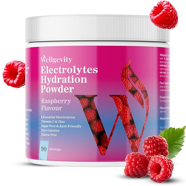
The packaging is a cylindrical container with a wide mouth, typically used for powdered drink mixes. The container features a plastic lid that screws on securely. The exterior is predominantly white with vibrant pink and purple graphics, prominently displaying the product name and flavor. The design includes images of raspberries, enhancing the visual appeal. The container has a clean, modern look with a glossy finish.

The packaging consists of a cylindrical bottle with a white plastic cap. The bottle is primarily white with a green label that features botanical illustrations. The label has a matte finish and includes detailed product information and graphics. The overall design is clean and modern, with a focus on wellness.
The packaging consists of several white paperboard cartons, each containing a bottle of dietary supplements. The cartons are smooth and flat, with clean edges and folds. They feature a glossy finish, enhancing their visual appeal. The design includes a hexagonal logo and product information printed in blue and gold accents. The cartons are designed to hold the bottles securely and are likely stacked for retail display.

The packaging is a flat, rectangular box made of single-layer paperboard. It features a smooth surface with clean edges and folds. The color scheme includes dark green with vibrant yellow and white accents. The front displays a large, stylized 'W' logo, along with product information and graphics of leaves, suggesting a natural theme. The box is designed to be lightweight and easy to handle, typical of retail packaging for dietary supplements.

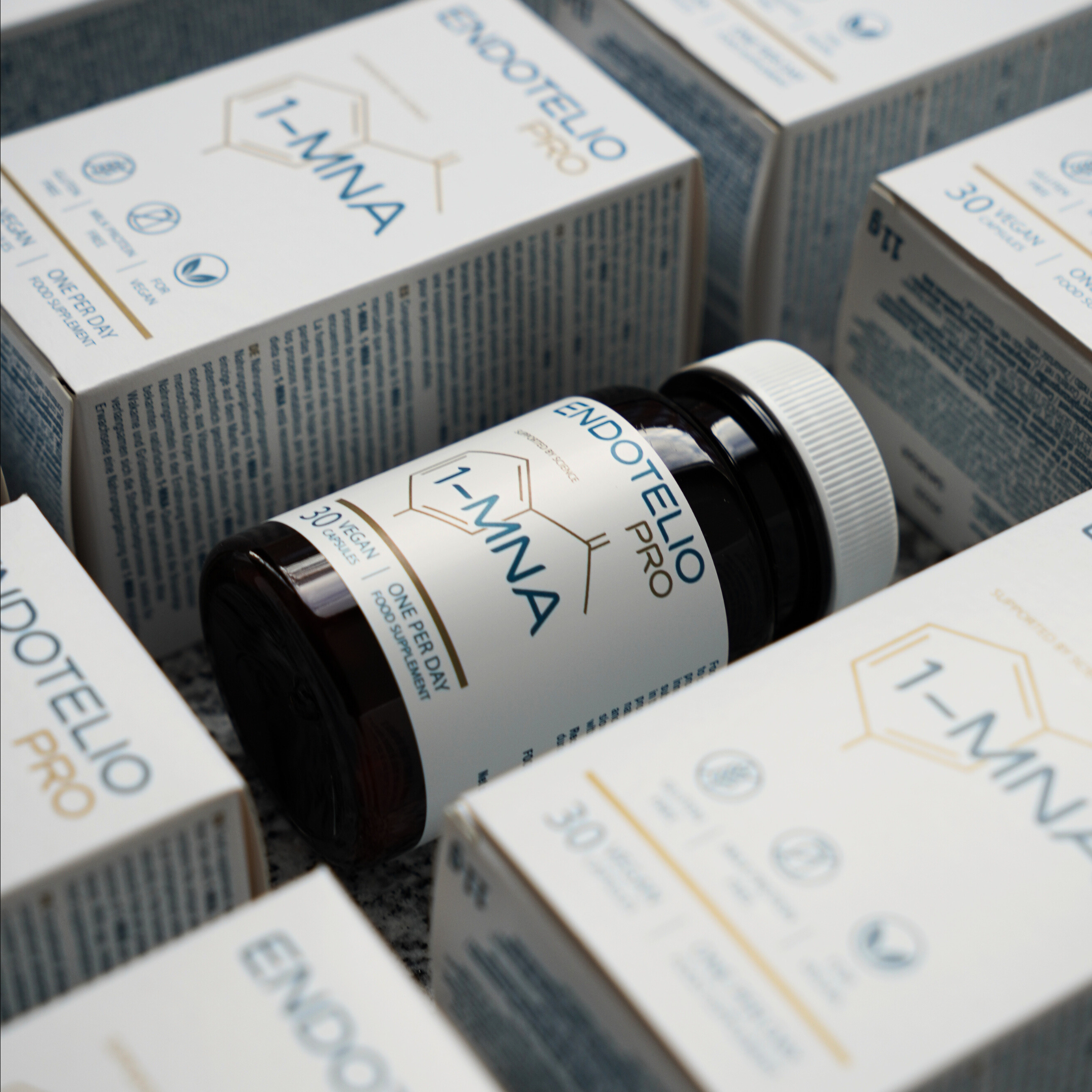
The packaging is a folding carton made of smooth, flat paperboard. It features a clean, precise construction with sharp edges and folds. The exterior is predominantly white with a matte finish, accented by blue and gold graphics. The front displays the product name 'ENDOTELIO PRO' prominently, along with the ingredient '1-MNA'. The sides include icons indicating dietary attributes such as 'Gluten Free', 'Milk Protein Free', and 'Vegan'. The overall design is modern and professional, suitable for retail display.
About the Brand
Wellgevity delivers personalized health solutions supported by advanced diagnostics, focusing on holistic wellbeing. Packaging choices prioritize a clean, clinical appearance and clear communication of product features, targeting health-conscious consumers.
The packaging consistently uses white and muted tones with modern accent colors, reinforcing a scientific and trustworthy brand image. Information-rich designs, including dietary icons and supplement facts, support transparency and consumer trust. Structural elements are chosen for both visual appeal and product integrity.
Key Differentiator: Wellgevity’s unique integration of scientific diagnostics and holistic health is mirrored in packaging that balances premium aesthetics with clear, factual product communication.
Design System
Visual Style
Typography favors modern sans-serif fonts for legibility, paired with a color palette of clinical white, blue, green, and gold accents. The overall aesthetic is clean, minimal, and science-driven.
Brand Identity
Consistent logo placement, use of hexagonal and botanical iconography, and clear product naming reinforce a cohesive brand identity. Visual elements maintain trust and professional credibility.
Packaging Design
Material choices focus on recyclable paperboard and durable plastics, with an emphasis on protective structures and tamper-evident closures. Designs balance retail appeal with practical product safeguarding.
User Experience
Packaging supports the customer journey by providing clear, accessible information and an unboxing experience that reinforces quality and trust, aligning with Wellgevity’s holistic, personalized service ethos.
Company Metrics
Business insights for Wellgevity based on available data
Market Positioning
Brand Values & Focus
Key Competitors
Target Market: Health-conscious individuals seeking premium, personalized wellness solutions, including general consumers and athletes.
Packaging Assessment
Overall Grade
Visual appeal and presentation quality
Packaging durability and protection
Eco-friendliness and recyclable materials
Cost efficiency and value for money
Packaging assessment for Wellgevity based on industry standards and best practices
Frequently Asked Questions
How does Wellgevity’s packaging support its brand positioning?
Wellgevity’s packaging leverages clean design, scientific iconography, and high-quality materials to align with its premium, health-focused brand, ensuring consistency across customer touchpoints.
What types of packaging formats does Wellgevity use for its products?
Wellgevity employs folding carton boxes for supplements and cylindrical containers for powdered mixes, selected for durability, retail appeal, and clarity of information.
Discover other Health companies
Explore more companies in the health industry and their packaging strategies
Comvita
Health
Comvita is a New Zealand-based company specializing in high-quality Mānuka honey and natural health products. Established in 1974, it aims to connect people with the healing power of nature.
Bio-Synergy
Health
Bio-Synergy is a UK-based company specializing in health and fitness products, including nutritional supplements and DNA testing kits. Their mission is to support individuals in achieving their health and fitness goals through innovative products and personalized insights.
Doctor Seaweed
Health
Doctor Seaweed specializes in natural, plant-based nutritional supplements derived from seaweed, aimed at promoting overall wellness.