Vitto Vitamins packaging
Vitto Vitamins specializes in premium nutritional supplements designed for day and night use, leveraging science-backed formulations to support wellness. Their packaging approach emphasizes luxury, protection, and a modern aesthetic that aligns with health-conscious consumer expectations.
Packaging Portfolio
Vitto Vitamins utilizes a diverse packaging portfolio composed of rigid boxes, folding cartons, and transparent plastic jars with metal lids. Rigid boxes are employed for premium product sets, offering structural integrity and a visually compelling unboxing moment. Folding cartons with gloss finishes and die-cut windows enhance shelf presence and brand storytelling, while transparent jars allow for instant product recognition and color differentiation between day and night formulations. The overall approach prioritizes consumer engagement, product safety, and brand consistency.
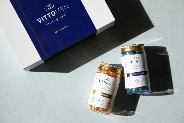
The packaging consists of a sturdy, thick-walled box with a premium appearance. The box is primarily white with a dark blue band across the center. The top features the brand name 'VITTO MEN' in a bold, modern font, with a subtle glossy finish that enhances its luxury feel. The edges are clean and precise, indicating high-quality construction. The box is designed to open from the top, revealing two glass jars inside, which are neatly arranged.

The packaging is a rigid box with a sturdy construction, featuring a clean, smooth exterior. The box is predominantly white with a light blue accent, displaying a modern and elegant design. The top has a subtle gloss finish, enhancing its premium appearance. The box opens from the top, revealing two clear jars inside, each containing colorful capsules. The jars are labeled with distinct colors and fonts, contributing to the overall aesthetic.
The packaging consists of a smooth, flat construction with clean edges and folds, typical of a folding carton. It features a glossy finish, enhancing its visual appeal. The carton is predominantly white with colorful graphics, likely designed to attract attention on retail shelves. The design includes a clear window showcasing the product inside, which is a bottle of vitamins. The overall shape is rectangular, fitting the product snugly.
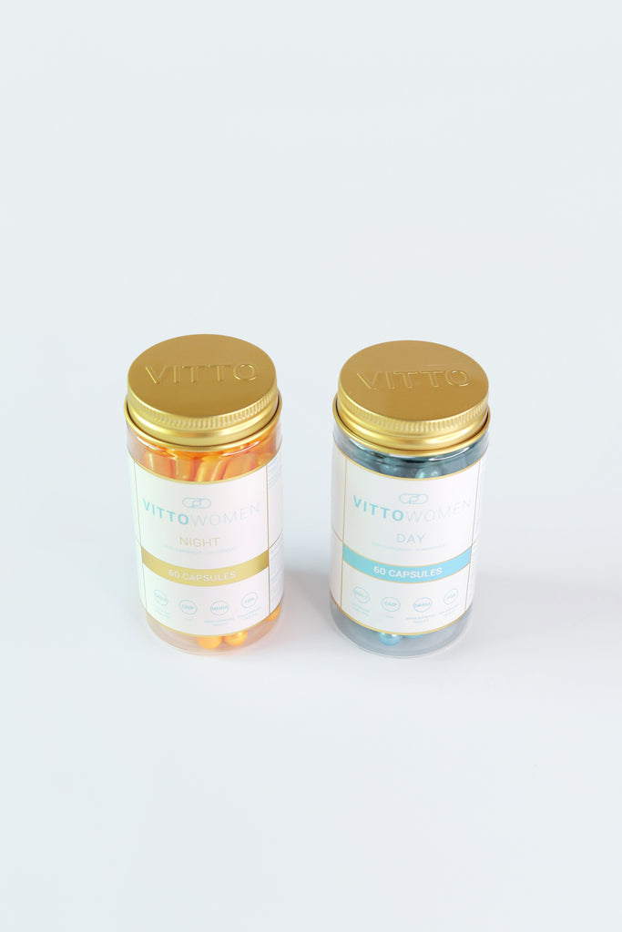
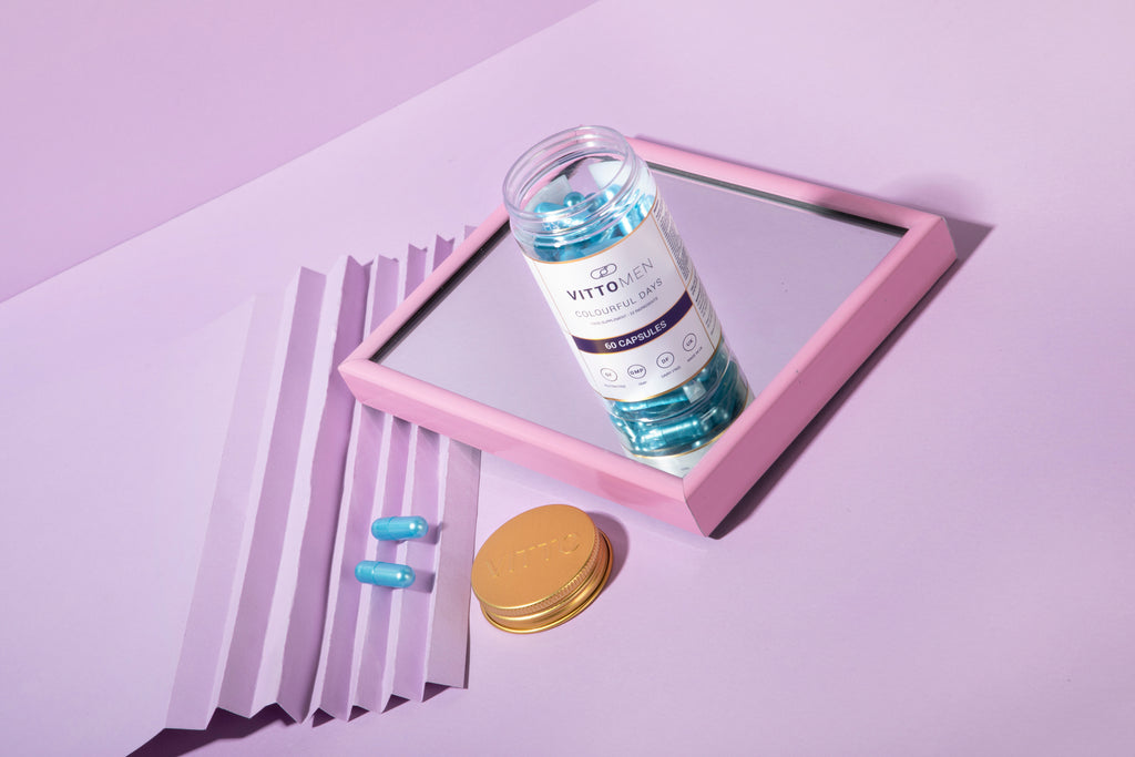
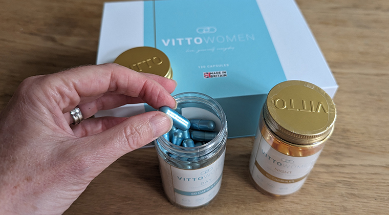
The packaging consists of two transparent plastic jars with gold metal lids. The jars are cylindrical in shape and contain capsules of different colors, one orange and one blue. Each jar has a label that includes product information and branding elements. The labels are predominantly white with colored accents corresponding to the capsule colors. The jars are designed for retail display, showcasing the contents clearly.

The packaging consists of a smooth, flat construction without any visible fluted layers. The boxes are primarily white with a dark blue accent, featuring clean, precise edges and folds. The design includes a logo and product information printed on the front, with a glossy finish that enhances the visual appeal. The boxes are designed to hold bottles of vitamins, which are visible in the image.
The packaging consists of a sturdy, thick-walled box with a premium appearance. The box is primarily white with a light blue accent, featuring a clean and elegant design. The lid is a separate piece that fits snugly over the base, showcasing a smooth surface with a matte finish. The interior is likely designed to hold the product securely, possibly with inserts for the bottles.
About the Brand
Vitto Vitamins delivers high-quality, science-driven multivitamins through a direct-to-consumer model, targeting health-focused individuals seeking tailored nutritional support. The company’s packaging strategy integrates premium materials and distinctive presentation to reinforce their luxury positioning within the supplement sector.
The brand utilizes a mix of rigid boxes, carton packaging, and transparent jars, each chosen for functional protection and elevated shelf appeal. Packaging consistently features clean lines, glossy finishes, and prominent branding, supporting both product integrity and a premium unboxing experience. Their focus on circadian-based formulations is visually echoed in dual-compartmentalized packaging, aligning with their day-night product architecture.
Key Differentiator: Vitto Vitamins sets itself apart through its dual-phase day and night supplement packaging, combining pharmaceutical-grade protection with a luxury retail aesthetic for a distinct consumer experience.
Design System
Visual Style
The visual design employs a clean, modern sans-serif typography paired with a predominantly white color palette, accented by deep blues and subtle metallics to convey scientific credibility and luxury. High-gloss and matte finishes are strategically used for visual contrast and tactile feedback.
Brand Identity
Brand logos and product names are prominently displayed on all packaging forms, with consistent iconography and color coding to distinguish day versus night formulations. Visual consistency is maintained across all SKUs to reinforce brand recognition.
Packaging Design
Material selection favors rigid board and high-grade folding carton for outer packaging, complemented by clear PET or glass jars with metal lids. The design philosophy centers on premium feel, secure containment, and ease of use, with compartmentalized interiors for dual-phase (day & night) sets.
User Experience
Packaging is designed for an elevated unboxing journey, guiding consumers through clear labeling, color cues, and tactile finishes. The structure supports both retail display and direct shipment, ensuring product integrity from fulfillment to consumer, and reinforcing the premium positioning at every touchpoint.
Company Metrics
Business insights for Vitto Vitamins based on available data
Market Positioning
Brand Values & Focus
Key Competitors
Target Market: Health-conscious consumers seeking scientifically formulated, premium nutritional supplements, with a focus on personalized wellness and luxury presentation.
Packaging Assessment
Overall Grade
Visual appeal and presentation quality
Packaging durability and protection
Eco-friendliness and recyclable materials
Cost efficiency and value for money
Packaging assessment for Vitto Vitamins based on industry standards and best practices
Frequently Asked Questions
What types of packaging does Vitto Vitamins use for their supplements?
Vitto Vitamins employs a combination of rigid boxes, folding cartons, and transparent jars. This multi-format approach provides structural protection, visual clarity of contents, and a premium presentation, tailored to support product differentiation and consumer engagement.
How does Vitto Vitamins address sustainability in its packaging?
While the brand uses recyclable rigid boxes and cartons, the presence of plastic and metal-lidded jars indicates a moderate approach to sustainability. There is room for improvement through increased use of recycled materials or further reduction of plastic components.
Does the packaging design contribute to the brand’s identity?
Yes, packaging design consistently integrates brand logos, color palettes, and visual motifs that reinforce Vitto Vitamins’ luxury and science-driven positioning, enhancing recognizability in a competitive supplements market.
Discover other Health companies
Explore more companies in the health industry and their packaging strategies
Doctor Seaweed
Health
Doctor Seaweed specializes in natural, plant-based nutritional supplements derived from seaweed, aimed at promoting overall wellness.
Smart Protein
Health
Smart Protein is dedicated to transforming nutrition by providing a range of health and wellness products focused on protein supplements and vitamins.
Lily & Loaf
Health
Lily & Loaf specializes in high-quality health and nutrition products, offering a range of supplements and vitamins aimed at supporting an active lifestyle. The company focuses on providing natural solutions for health and beauty.