Vanish packaging
Vanish specializes in stain removal and fabric care solutions for home and laundry applications. Their packaging strategy utilizes bold, brand-centric visuals and practical formats designed for consumer convenience and product longevity.
Packaging Portfolio
Vanish’s packaging portfolio is anchored by flexible stand-up pouches and rigid cylindrical containers, both leveraging plastic substrates for moisture resistance and product protection. The pouches feature resealable zippers to maintain freshness and minimize spillage, while containers use screw-on lids for secure storage and repeated access. Structural choices focus on durability and shelf impact, with a high-gloss finish and vibrant color application to reinforce brand presence. Visual communication is prioritized through large-format logos, clear product names, and usage instructions, supporting both in-store recognition and effective at-home use.
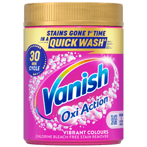
The packaging is a cylindrical container with a screw-top lid. The body is predominantly pink with a glossy finish, featuring vibrant graphics and text. The front displays the product name 'Vanish Oxi Action' prominently in white and blue, surrounded by bubbles, indicating its cleaning properties. The container has a smooth surface with no visible fluted layers, suggesting it is made from a single-layer material.
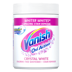
The packaging is a cylindrical plastic container with a screw-on lid. The container is predominantly white with a glossy finish, featuring a colorful label that wraps around the body. The label includes vibrant colors such as pink and blue, with bubbles illustrated to emphasize the product's cleaning properties. The text is bold and easy to read, with the product name prominently displayed.
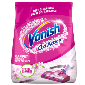
The packaging is a flexible pouch made of a thin, smooth material that appears to be plastic or a plastic composite. It features a vibrant pink color with white and blue accents. The front displays the brand name 'Vanish' prominently in a bold, blue font, along with the product name 'Oxi Action' in white text. There are floral graphics and a vacuum cleaner illustration, emphasizing the product's use for carpet cleaning. The back of the pouch likely contains additional product information, although it is not visible in the image.
.png)
The packaging is a stand-up pouch made of a flexible material, featuring a vibrant pink background with bubbles and a vacuum cleaner graphic. The top of the pouch has a resealable zipper, and the bottom is flat, allowing it to stand upright. The front displays product information prominently, including the brand name 'Vanish' in bold letters.
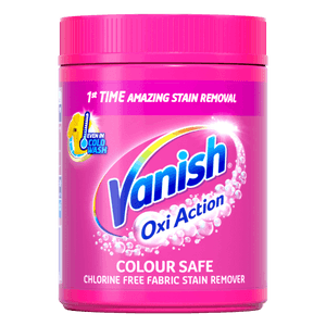
The packaging is a cylindrical plastic container with a screw-on lid. The container is predominantly pink with a glossy finish, featuring a label that wraps around its circumference. The label includes vibrant graphics and text, prominently displaying the product name and key features.
About the Brand
Vanish operates in the home and garden sector, delivering a range of cleaning products that address stain removal, fabric whitening, and textile care. The company employs packaging that emphasizes shelf visibility and consumer usability, aligning its visual identity closely with brand recognition.
Packaging formats include flexible stand-up pouches and cylindrical plastic containers, both of which are optimized for storage efficiency and ease of use. The visual strategy relies heavily on a signature pink palette, bold logo placement, and clear product communication. This reinforces consumer trust and ensures immediate product identification in retail and digital channels. Vanish’s approach integrates practical features such as resealable closures and robust containers, supporting repeat use and minimizing product loss.
Key Differentiator: Vanish differentiates itself through a strong combination of visual brand consistency, educational marketing, and packaging formats that facilitate both usability and prominent shelf presence.
Design System
Visual Style
Typography utilizes bold, sans-serif fonts for high legibility. The color palette is dominated by a signature bright pink complemented by white and blue accents, delivering high impact and strong differentiation. The overall aesthetic is clean, modern, and functional.
Brand Identity
Branding is consistent across all packaging, with the Vanish logo prominently displayed. Iconography is limited but effective, using simple graphics (e.g., bubbles, vacuum imagery) to reinforce product benefits. Visual consistency is maintained across SKUs, supporting strong brand recall.
Packaging Design
Material selection prioritizes plastic for its barrier and protective qualities. Structural design emphasizes user convenience—stand-up pouches for flexible storage and cylindrical containers for durability and resealability. The design philosophy is practical, focusing on product safety, ease of use, and visual shelf impact.
User Experience
Design choices support an intuitive customer journey, with clear labeling, usage guidance, and resealable features that facilitate repeated product use. The packaging experience is functional, supporting brand reliability and customer trust rather than premium or luxury unboxing moments.
Company Metrics
Business insights for Vanish based on available data
Market Positioning
Brand Values & Focus
Key Competitors
Target Market: B2C consumers seeking reliable stain removal and fabric care solutions, with a focus on households prioritizing textile longevity and practical cleaning products.
Packaging Assessment
Overall Grade
Visual appeal and presentation quality
Packaging durability and protection
Eco-friendliness and recyclable materials
Cost efficiency and value for money
Packaging assessment for Vanish based on industry standards and best practices
Frequently Asked Questions
What types of packaging does Vanish use for its products?
Vanish primarily utilizes flexible stand-up pouches and rigid cylindrical plastic containers with screw-top lids. These structures are chosen for their durability, resealability, and brand visibility.
How does Vanish address sustainability in its packaging?
While Vanish emphasizes extending product life and reducing textile waste, its packaging relies mainly on plastic-based materials. There is limited evidence of advanced sustainable materials or high recyclability in the current portfolio.
What impact does Vanish’s packaging have on the unboxing experience?
Vanish’s packaging delivers a visually consistent and recognizable unboxing experience through bold colors and prominent logo display. However, the emotional impact is functional rather than experiential, prioritizing clarity and utility.
Discover other Home & Garden companies
Explore more companies in the home & garden industry and their packaging strategies
Grillfürst GmbH
Home & Garden
Grillfürst GmbH specializes in retailing a wide range of grilling equipment and outdoor cooking solutions. They offer both products for grilling enthusiasts and associated accessories, catering to varied outdoor cooking needs.
Top Buxus
Home & Garden
Top Buxus specializes in providing premium care products for boxwood plants, ensuring their optimal growth and protection against pests.
Birdo
Home & Garden
Birdo is a retailer specializing in a wide range of paints and related products for home and garden use. They offer both in-store pick-up and delivery options to enhance customer convenience.