Update Fitness packaging
Update Fitness operates a network of fitness centers across Switzerland, offering memberships, personal training, and nutritional products. Their packaging strategy centers on flexible, stand-up pouches designed for protein and supplement products, reflecting a modern, health-focused brand identity.
Packaging Portfolio
Update Fitness’s packaging portfolio is dominated by flexible, stand-up pouches constructed from composite plastic and foil materials. These pouches feature matte finishes, resealable zipper closures, and gusseted bottoms for product stability. The packaging structure prioritizes durability and product freshness while leveraging bold branding elements—such as geometric motifs and high-contrast typography—to enhance shelf impact and consumer recognition. The design strategy aligns with best practices in the sports nutrition sector, focusing on both functionality and strong brand visibility.
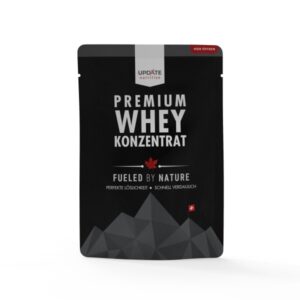
The packaging is a stand-up pouch made from a flexible material, likely a composite of plastic and foil. It features a black background with a matte finish, accented by a glossy logo and text. The top of the pouch has a resealable zipper, and the bottom is gusseted to allow it to stand upright. The front displays the product name prominently, with a mountain graphic at the bottom.
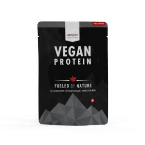
The packaging is a stand-up pouch made from flexible materials, featuring a matte black surface with a glossy finish for the logo and product name. The front displays the product name 'VEGAN PROTEIN' prominently in white text, while the tagline 'FUELED BY NATURE' is in smaller font. There are graphical elements including a maple leaf and mountain silhouette at the bottom, enhancing the natural theme. The top has a resealable zipper closure, allowing for easy access and storage.

The packaging is a stand-up pouch made from a flexible material, likely a composite of plastic and foil. The pouch features a matte black exterior with a glossy finish on certain design elements. The front displays the product name 'NIGHT PROTEIN' prominently in white text, with a geometric pattern in lighter shades of gray. The top has a resealable zipper closure, allowing for easy access and storage. The back of the pouch likely contains nutritional information and usage instructions, although this is not visible in the image.
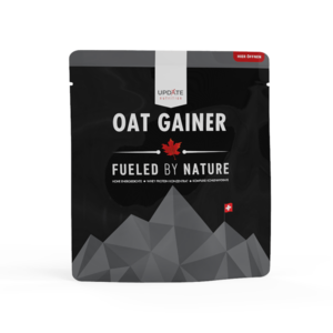
The packaging is a stand-up pouch made from a flexible material. It features a matte black background with a geometric mountain design in gray tones. The front prominently displays the product name 'OAT GAINER' in bold white letters, along with the tagline 'FUELED BY NATURE' in smaller text. The design includes a red maple leaf symbol, indicating a connection to Canada, and a small Swiss flag, suggesting quality or origin. The pouch has a resealable top, typical for flexible packaging, and appears to be designed for retail display.
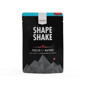
The packaging is a stand-up pouch made from a flexible material, featuring a flat bottom that allows it to stand upright. The surface is predominantly black with a matte finish, accented by a vibrant blue strip at the top. The front displays a geometric mountain design in a lighter gray tone, contributing to a modern aesthetic. The product name 'SHAPE SHAKE' is prominently featured in bold white text, with additional information about the product printed in smaller fonts below.
About the Brand
Update Fitness delivers comprehensive fitness solutions, including gym memberships, online training, and nutritional supplements, targeting a diverse customer base across Switzerland. Their packaging approach for nutrition products utilizes premium flexible pouches that prioritize resealability, product protection, and visual branding.
The brand’s packaging aligns with industry trends toward matte finishes, bold typography, and clear branding, integrating both functional and aesthetic elements. With an emphasis on resealable, stand-up pouches, Update Fitness optimizes shelf presence and product freshness while maintaining visual consistency across product lines. The packaging design leverages natural and fitness-related motifs, supporting the brand’s positioning as a leader in holistic health services.
Key Differentiator: Distinctive use of flexible, resealable pouches with strong brand visuals and a cohesive design language sets Update Fitness apart in the fitness and supplement sector.
Design System
Visual Style
Clean, modern typography (bold sans-serif), with a matte black and gray color palette accented by white and occasional blue/red highlights. Aesthetic emphasizes geometric shapes and minimalistic graphics for a contemporary fitness appeal.
Brand Identity
Consistent logo usage across all packaging fronts, integration of fitness- and nature-inspired iconography (mountain silhouettes, maple leaf, Swiss flag), and standardized layout for product names and taglines. Visual consistency achieved through unified color schemes and design motifs.
Packaging Design
Primary use of composite flexible materials for stand-up pouches, with resealable zipper closures and gusseted bottoms. Structural design prioritizes product protection, ease of use, and retail display effectiveness, reflecting current industry standards.
User Experience
Packaging is designed for convenient access and storage, supporting the customer journey from purchase to consumption. Resealability and robust structure enhance the user experience, while clear branding and product information foster brand trust and repeat engagement.
Company Metrics
Business insights for Update Fitness based on available data
Market Positioning
Brand Values & Focus
Key Competitors
Target Market: Swiss consumers seeking comprehensive fitness solutions, including in-person and online training, as well as health supplements.
Packaging Assessment
Overall Grade
Visual appeal and presentation quality
Packaging durability and protection
Eco-friendliness and recyclable materials
Cost efficiency and value for money
Packaging assessment for Update Fitness based on industry standards and best practices
Frequently Asked Questions
What types of packaging does Update Fitness primarily use for its products?
Update Fitness predominantly utilizes flexible, stand-up pouches for its nutritional supplements, prioritizing resealability, durability, and impactful shelf presentation.
How sustainable are Update Fitness’s packaging solutions?
While flexible pouches reduce material use and shipping weight, recyclability is limited compared to mono-material alternatives. The packaging emphasizes modern aesthetics, but further improvements in eco-friendly materials could enhance overall sustainability.
What is the visual design approach of Update Fitness’s packaging?
The packaging adopts a matte black palette with bold white typography, geometric graphics, and consistent logo placement, reflecting a modern, fitness-oriented brand image.
Discover other Beauty & Fitness companies
Explore more companies in the beauty & fitness industry and their packaging strategies
Cultiv Cosmetique
Beauty & Fitness
Cultiv Cosmetique is a French skincare brand that provides organic and eco-friendly beauty products inspired by nature. They focus on effective skincare solutions for various skin concerns.
Orris Paris
Beauty & Fitness
Orris Paris specializes in creating artisanal skincare products that combine potent botanical ingredients with modern cleansing rituals. The company emphasizes natural, holistic practices in its formulations.
Owari
Beauty & Fitness
Owari specializes in 100% natural beauty and fitness products, designed to enhance health and wellness. The company proudly offers its products made in France, emphasizing quick delivery and customer support.