UND GRETEL packaging
UND GRETEL is a Berlin-based beauty brand specializing in certified natural cosmetics with a strong focus on sustainability. Their packaging strategy emphasizes minimalism, premium material choices, and eco-friendly formats tailored for both retail and direct-to-consumer distribution.
Packaging Portfolio
UND GRETEL’s packaging portfolio is comprised of recyclable folding cartons, rigid luxury boxes, and flexible sample sachets. The brand leverages single-layer paperboard for retail cartons, rigid board for gift sets, and flexible film for samples. Packaging designs are characterized by minimalistic layouts, matte and smooth finishes, and vibrant yet restrained graphics. The use of structural reinforcements in rigid boxes ensures product protection, while refillable packaging options and eco-friendly substrates align with sustainability targets. Each format is tailored for both shelf appeal and e-commerce logistics.

The packaging consists of smooth, flat construction with clean edges and folds, indicative of a folding carton. The boxes are primarily white with a green accent, featuring a matte finish. Each box has a rectangular shape, designed to hold a shampoo bar securely. The design includes a logo and product name prominently displayed on the front, with additional product information on the sides.

The packaging is a square-shaped box with thick walls, indicative of a luxury gift box. It has a smooth, matte white finish, giving it a premium appearance. The box features a black ribbon handle on top for easy carrying. The front displays the brand name 'UND GRETEL' in elegant black script, emphasizing its luxury appeal. A colorful tag is attached to the ribbon, adding a decorative element.

The packaging is a tall, rectangular folding carton made of smooth, single-layer paperboard. It features a clean, flat construction with precise edges and folds. The surface is predominantly white with colorful circular graphics in blue and yellow. The front displays the product name 'REINE' prominently at the top, along with the product description 'NATURAL DEEP CLEANSING OIL' beneath it. The brand name 'und gretel' is styled in a cursive font, adding a touch of elegance. The overall design is modern and minimalistic, appealing to a contemporary audience.
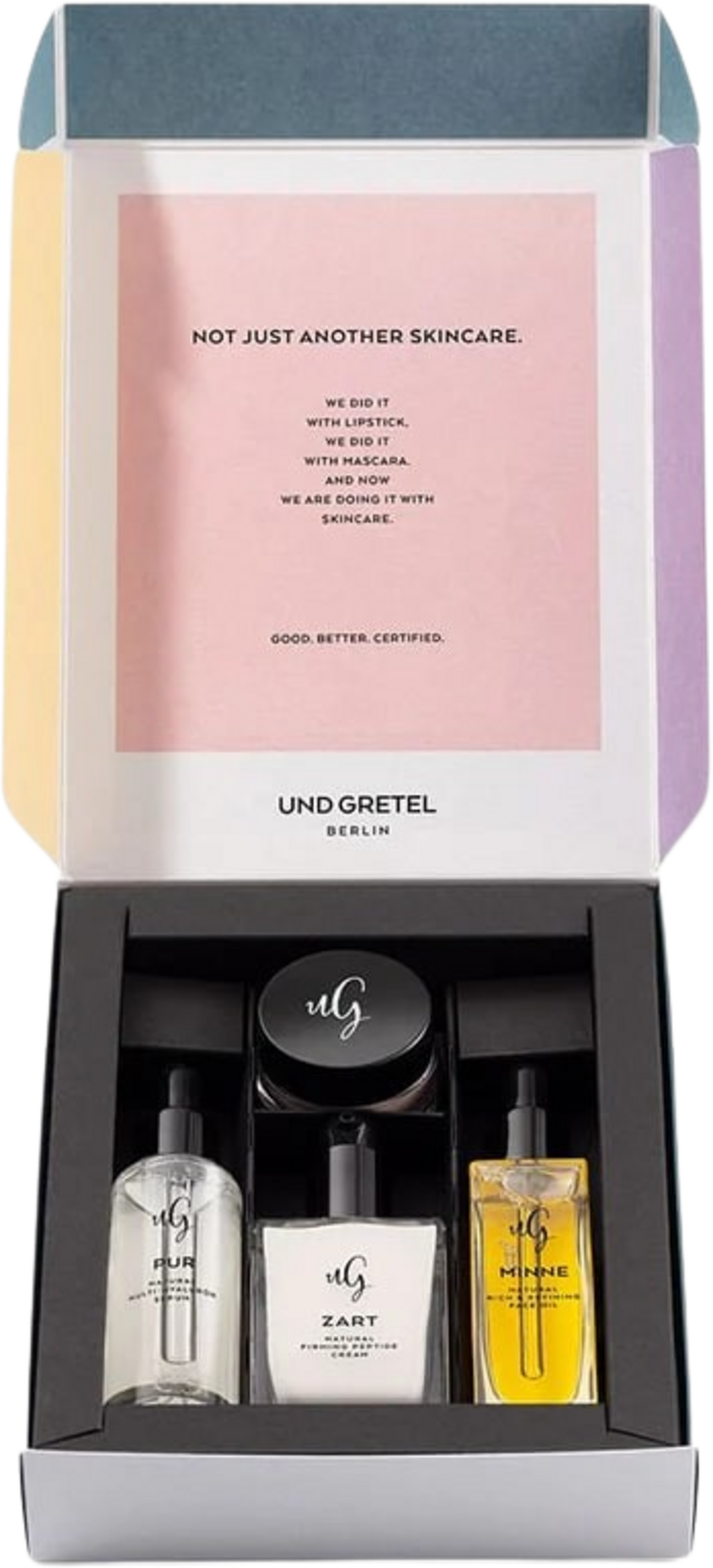
The packaging is a rigid box with a sturdy, thick construction. It features a multi-colored exterior with a predominantly pastel color scheme. The lid opens to reveal a black interior that holds three skincare products securely in place. The box has a premium feel, with clean edges and a smooth finish. The inner lid displays a printed message in a modern font, while the products are arranged neatly with a foam insert for protection.

The packaging consists of small, flat sachets made from a flexible material. Each sachet is sealed on all sides with a smooth, glossy finish. The sachets are white with black printed text, featuring the brand name 'UND GRETEL' prominently displayed along with a stylized 'uG' logo. The edges of the sachets are clean and precise, indicating a well-manufactured product. There are no visible flaps or structural elements typical of boxes or cartons.

The packaging is a folding carton with a smooth, flat construction made from single-layer paperboard. It features clean, precise edges and folds, indicative of a retail packaging style. The exterior is adorned with a vibrant, multi-colored geometric design, incorporating various shapes and colors, giving it a modern and artistic appearance. The overall shape is rectangular, designed to hold cosmetic products.
About the Brand
UND GRETEL delivers high-performance, vegan beauty and skincare products with a clear commitment to environmental responsibility. Packaging is integral to their brand narrative, combining visual sophistication with sustainability goals.
Founded in 2015, the company applies a holistic approach to packaging, leveraging recyclable materials, refillable options, and carefully curated design elements that reinforce its urban, eco-conscious image. The use of folding cartons, rigid gift boxes, and flexible sachets reflects a balance between protection, aesthetics, and environmental impact. Their packaging is closely aligned with international certifications and consumer preferences in the natural cosmetics sector.
Key Differentiator: UND GRETEL stands out through its consistent use of certified natural, vegan ingredients and a packaging system that prioritizes both refillability and premium unboxing experiences.
Design System
Visual Style
Clean, modern typography with sans-serif fonts; primary color palette of white, black, and pastel accents (blue, yellow, green); overall visual approach is minimalist, emphasizing negative space and geometric motifs.
Brand Identity
Consistent logo placement (script and monogram variants), cohesive use of iconography, and strict adherence to visual hierarchy. Branding elements are prominent but not intrusive, supporting both product differentiation and brand recall.
Packaging Design
Material selection prioritizes recyclable paperboard and rigid board, with a preference for mono-materials to facilitate recycling. Structural designs focus on clean lines, precise folds, and secure closures to balance aesthetics with protection. Refillable and sample formats reflect an emphasis on reducing single-use waste.
User Experience
The design system is optimized for a premium unboxing journey, supporting tactile engagement and visual anticipation. Packaging features such as matte finishes, ribbon handles, and vibrant accents enhance emotional resonance, while clear labeling and intuitive formats streamline the customer’s product interaction.
Company Metrics
Business insights for UND GRETEL based on available data
Market Positioning
Brand Values & Focus
Key Competitors
Target Market: Environmentally conscious beauty consumers, urban professionals, and eco-aware D2C shoppers seeking premium, sustainable cosmetics solutions.
Packaging Assessment
Overall Grade
Visual appeal and presentation quality
Packaging durability and protection
Eco-friendliness and recyclable materials
Cost efficiency and value for money
Packaging assessment for UND GRETEL based on industry standards and best practices
Frequently Asked Questions
What types of packaging does UND GRETEL utilize for its products?
UND GRETEL employs a mix of carton boxes, rigid luxury boxes, and flexible sachets, each selected for its specific product category and sustainability profile. Materials are primarily recyclable paperboard and rigid board, with emphasis on minimalistic, visually engaging design.
How does UND GRETEL address sustainability in packaging?
The brand incorporates recyclable materials, refillable product formats, and minimalistic structural designs to reduce environmental impact, aligning with its Cosmos Organic and PETA certifications.
What is the average unboxing experience for UND GRETEL products?
UND GRETEL’s packaging delivers a visually striking and tactile unboxing experience, using matte finishes, precise folds, and curated graphic elements to enhance perceived value and emotional engagement.
Discover other Beauty & Fitness companies
Explore more companies in the beauty & fitness industry and their packaging strategies
Owari
Beauty & Fitness
Owari specializes in 100% natural beauty and fitness products, designed to enhance health and wellness. The company proudly offers its products made in France, emphasizing quick delivery and customer support.
Cultiv Cosmetique
Beauty & Fitness
Cultiv Cosmetique is a French skincare brand that provides organic and eco-friendly beauty products inspired by nature. They focus on effective skincare solutions for various skin concerns.
Orris Paris
Beauty & Fitness
Orris Paris specializes in creating artisanal skincare products that combine potent botanical ingredients with modern cleansing rituals. The company emphasizes natural, holistic practices in its formulations.