TORQ Ltd packaging
TORQ Ltd is a UK-based performance nutrition company specializing in products for athletes and fitness enthusiasts. Their packaging strategy utilizes functional retail display boxes and flexible pouches, designed to enhance shelf visibility and product usability while supporting brand identity.
Packaging Portfolio
TORQ Ltd's packaging portfolio features a dominant use of single-layer paperboard display cartons for energy gels, jellies, and hydration mixes, providing strong retail shelf presence and easy product selection. Flexible spouted pouches are utilized for single-serve products, balancing portability with user convenience. Specialty lines, such as coffee, employ cylindrical canisters and kraft paper bags with glossy labels, reflecting a blend of premium positioning and functional storage. The consistent use of bold color coding and clear product labeling enhances SKU differentiation and brand recall across the portfolio.

The image displays a variety of flexible packaging pouches, each containing energy gels. The pouches have a smooth surface with a glossy finish, showcasing vibrant colors and graphics. Each pouch is designed with a tear notch for easy opening and features a spout for dispensing the gel. The overall shape is elongated and narrow, typical for single-serving gel packs.
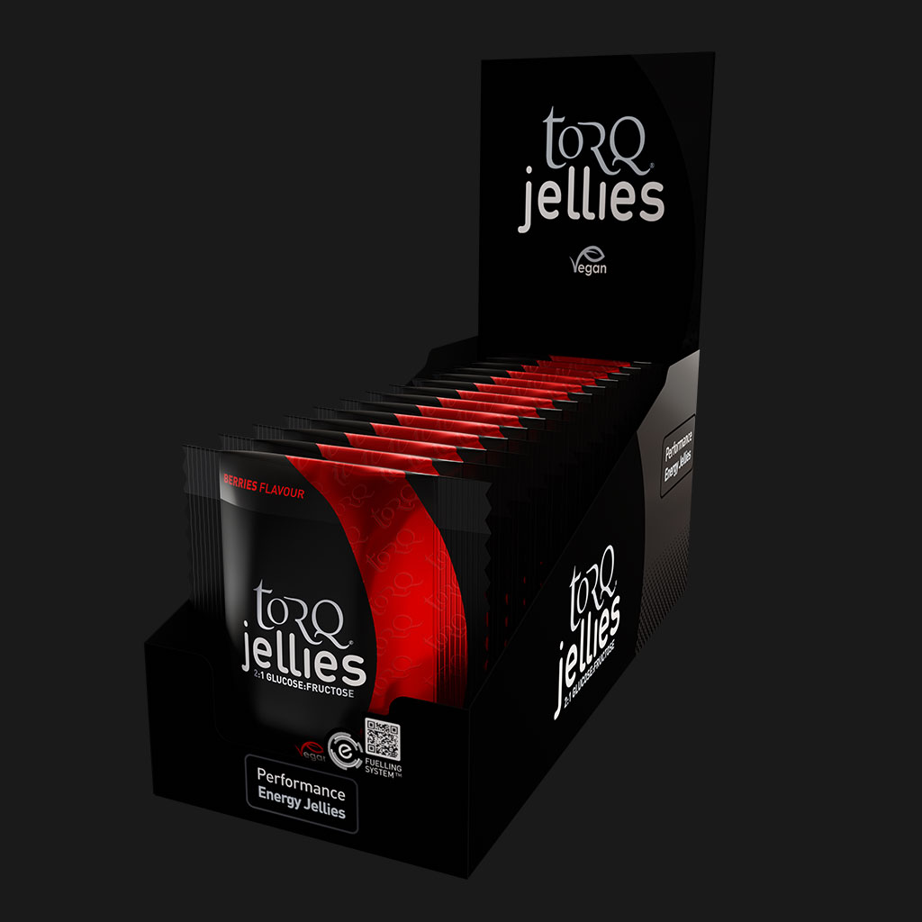
The packaging is a retail display box designed to hold multiple individual packets of energy jellies. The box is constructed from smooth, flat paperboard with clean edges and folds. The exterior features a predominantly black background with vibrant red accents, showcasing the product name 'torq jellies' prominently on the front. The box is designed to be opened from the top, allowing easy access to the jellies inside. The overall shape is rectangular, with a slight upward slope at the back for display purposes.
The packaging is a retail display box designed to hold multiple energy gel packets. It features a smooth, flat construction without visible fluted layers, indicating it is made from single-layer paperboard. The box has a black exterior with vibrant colors on the gel packets visible from the top, showcasing a variety of flavors. The edges are clean and precise, with a foldable design that allows for easy assembly. The front of the box has a cut-out section that displays the gel packets prominently.
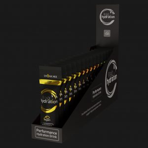
The packaging is a retail display box designed to hold multiple hydration drink mix packets. It features a smooth, flat construction typical of single-layer paperboard. The box is predominantly black with vibrant yellow and white graphics. The front displays the product name 'hydration' prominently, along with descriptors like 'Performance Hydration Drink' and 'Vegan'. The edges are clean and precise, indicating a well-constructed folding carton. The box has an open top for easy access to the packets inside, which are arranged in a row. There are no visible flaps or closures as it is intended for display rather than shipping.
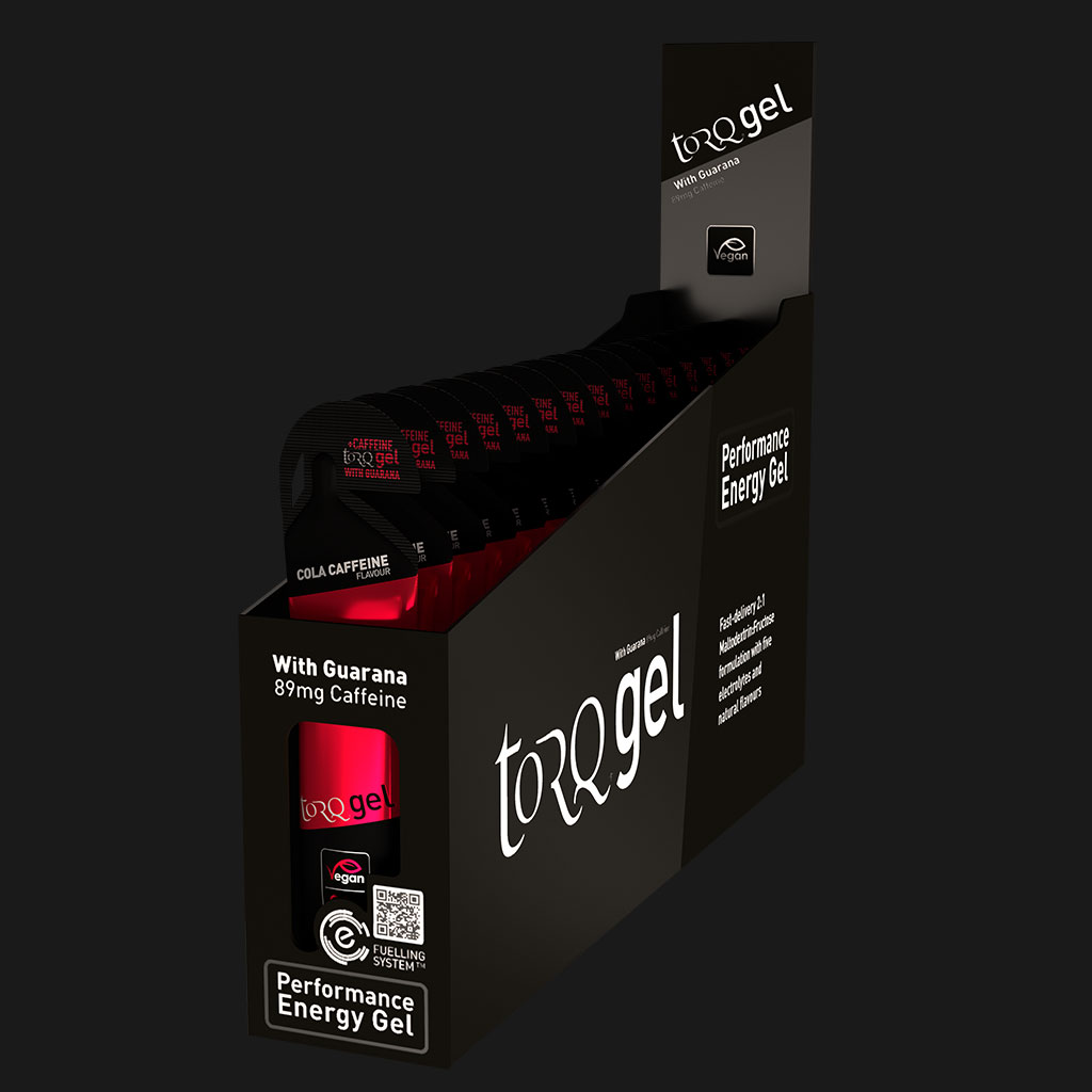
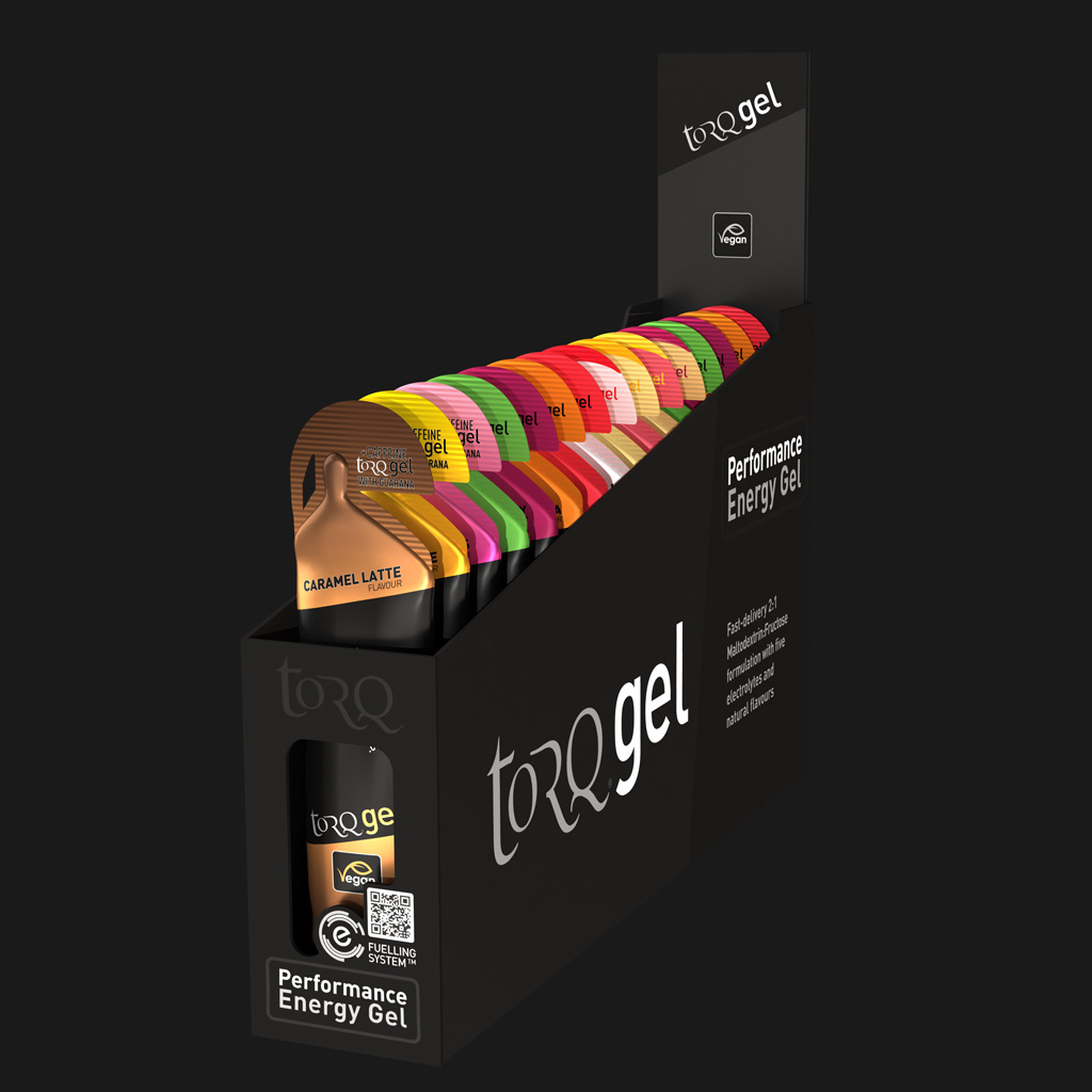
The packaging is a retail display box designed to hold multiple energy gel packets. It features a smooth, flat construction without any visible fluted layers, indicating it is made from single-layer paperboard. The box has a black exterior with vibrant red and white graphics, showcasing the product name 'torqgel' prominently on the front. The edges are clean and precise, with a foldable design that allows for easy assembly. The top of the box is open, allowing for easy access to the gel packets inside, which are arranged in a row. The overall shape is rectangular, designed to sit on a shelf or countertop.
About the Brand
TORQ Ltd delivers specialized performance nutrition products, including energy gels, recovery supplements, and hydration solutions, with a strong emphasis on education and athlete support. Their packaging approach balances product protection, on-shelf appeal, and clear brand communication.
The company's packaging portfolio is primarily comprised of single-layer paperboard display cartons and flexible spouted pouches, optimized for both retail display and direct-to-consumer distribution. While the visual design is modern and consistent, there is a clear focus on usability, with functional features such as easy-open tear notches and organized carton layouts. Sustainability is a recurring theme, with organic ingredients and responsibly sourced materials, although not all packaging formats demonstrate advanced eco-design.
Key Differentiator: TORQ Ltd's unique differentiator is its integration of detailed educational content with high-visibility, functional packaging formats tailored for the sports nutrition sector.
Design System
Visual Style
TORQ Ltd leverages modern sans-serif typography, a dark base color palette (primarily black) accentuated with bold, vibrant colors such as red and yellow for product segmentation. The overall aesthetic is sleek, high-contrast, and visually impactful, aligning with sports and performance themes.
Brand Identity
Branding is highly consistent with prominent logo placement, uniform application of the TORQ logo and product names, and a standardized use of icons and flavor indicators. Visual hierarchy is maintained through clear typography and color blocking.
Packaging Design
Material choices prioritize single-layer paperboard for cartons and flexible multi-layer plastic for pouches, focusing on lightweight durability and product protection. Structural design emphasizes retail display functionality and ease of access, with open-top cartons and spouted pouches engineered for single-use convenience.
User Experience
Packaging is designed to support a seamless customer journey, from clear on-shelf identification to easy opening and dispensing. The visual system and ergonomic structures reinforce brand trust, aid product selection, and contribute to a positive unboxing and usage experience.
Company Metrics
Business insights for TORQ Ltd based on available data
Market Positioning
Brand Values & Focus
Key Competitors
Target Market: Endurance athletes, fitness enthusiasts, and sports professionals in the UK and Europe seeking high-quality, specialized nutrition products.
Packaging Assessment
Overall Grade
Visual appeal and presentation quality
Packaging durability and protection
Eco-friendliness and recyclable materials
Cost efficiency and value for money
Packaging assessment for TORQ Ltd based on industry standards and best practices
Frequently Asked Questions
What types of packaging does TORQ Ltd use for its products?
TORQ Ltd primarily uses single-layer paperboard retail display boxes for energy gels, hydration mixes, and jellies, alongside flexible spouted pouches for single-serve products. Specialty items like coffee are packaged in cylindrical canisters and flat-bottom bags.
How does TORQ Ltd's packaging support sustainability?
TORQ Ltd employs recyclable paperboard for most retail cartons and selects responsibly sourced materials for some product lines. However, flexible packaging in the form of gel pouches may present recycling challenges, indicating partial sustainability alignment.
Is the packaging optimized for logistics and e-commerce?
Yes, the structural integrity of display cartons and the compactness of flexible pouches support safe transit and efficient e-commerce fulfillment, though secondary shipping protection may be necessary for B2C orders.
Discover other Health companies
Explore more companies in the health industry and their packaging strategies
Comvita
Health
Comvita is a New Zealand-based company specializing in high-quality Mānuka honey and natural health products. Established in 1974, it aims to connect people with the healing power of nature.
Bio-Synergy
Health
Bio-Synergy is a UK-based company specializing in health and fitness products, including nutritional supplements and DNA testing kits. Their mission is to support individuals in achieving their health and fitness goals through innovative products and personalized insights.
Doctor Seaweed
Health
Doctor Seaweed specializes in natural, plant-based nutritional supplements derived from seaweed, aimed at promoting overall wellness.