Tom Oliver Nutrition packaging
Tom Oliver Nutrition is a UK-based health supplement brand specializing in vegan-friendly, UK-made dietary products. Their packaging strategy emphasizes sustainability and brand consistency across a portfolio of bottles and jars designed for optimal product protection and consumer appeal.
Packaging Portfolio
Tom Oliver Nutrition's packaging portfolio centers on the use of dark amber glass and PET plastic bottles, both selected for their protective properties and recyclability. The cylindrical bottles with screw-on caps provide tamper resistance, light protection, and dosage stability—crucial for preserving supplement efficacy. Color-coded, full-wrap labels support product differentiation and comply with regulatory requirements, while the consistent sizing streamlines storage and distribution. The brand's approach offers a balance between visual impact, logistics efficiency, and sustainability.

The packaging is a dark amber glass bottle with a rounded body and a wide neck. The bottle is capped with a black, screw-on lid. The label wraps around the body of the bottle, featuring a clean and modern design. The front label prominently displays the product name 'VITAMIN D+K2' in bold white font, with the brand name 'TOM OLIVER NUTRITION' above it in smaller text. Below the product name, there is a description stating 'Suitable for Vegans - Small & Easy to Swallow - 1-A-DAY Formula'. The label has a yellow and black color scheme with a wavy yellow line at the bottom, adding a visual element. The overall appearance is sleek and professional, suitable for a health supplement.

The image shows a series of dark-colored plastic bottles lined up on a reflective surface. Each bottle has a black screw-on cap and a label that wraps around the body. The labels are colorful and feature various colors for different products, with clear text indicating the product names and descriptions. The bottles are uniform in shape, cylindrical, and have a glossy finish that reflects light.
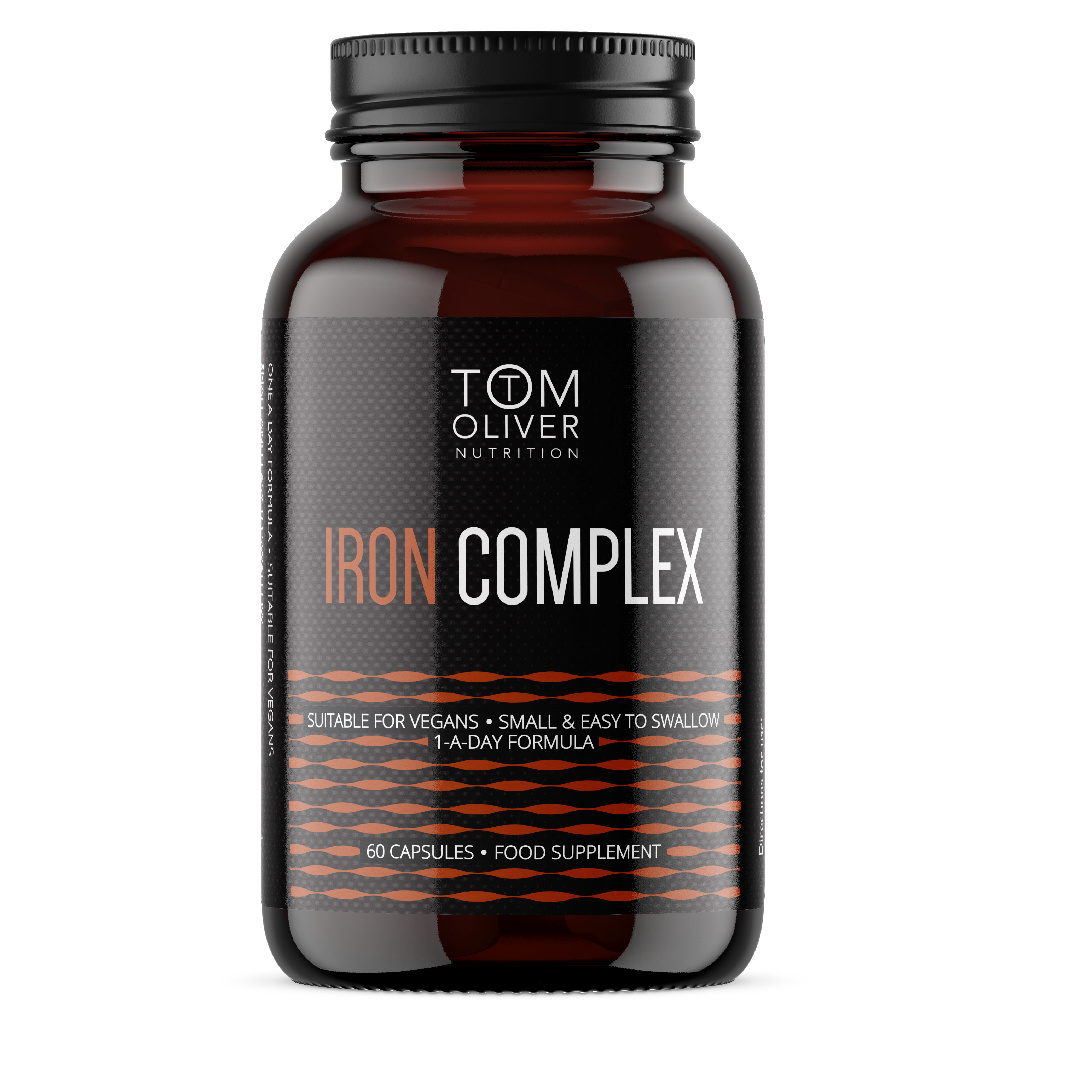
The packaging is a dark amber plastic bottle with a rounded shape, typically used for dietary supplements. The bottle features a wide mouth for easy access to the capsules inside. The label wraps around the bottle, displaying product information prominently. The surface has a glossy finish, enhancing the visual appeal and making it suitable for retail display.
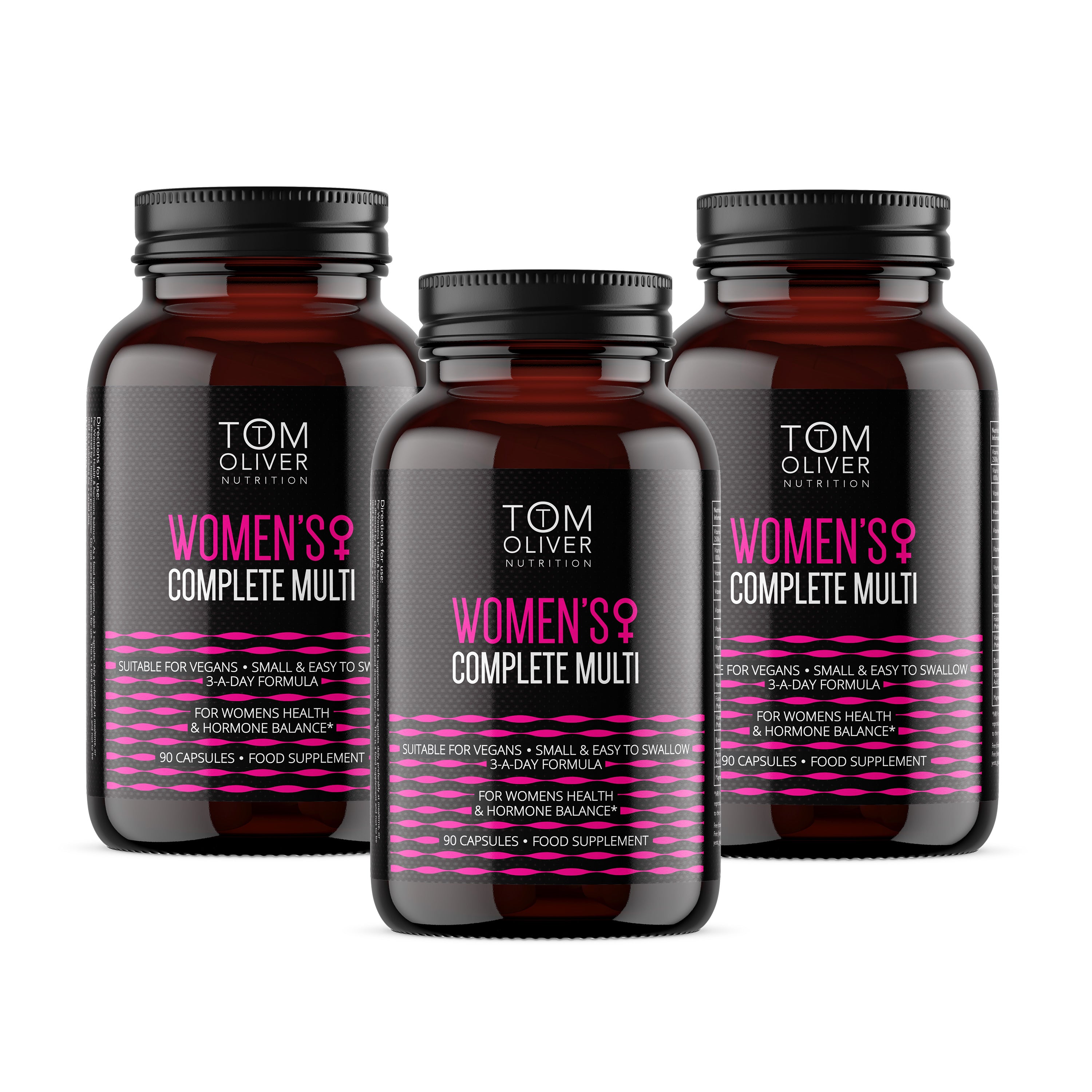
The packaging consists of three dark amber glass bottles with black screw-on lids. Each bottle is cylindrical with a smooth surface and a glossy finish. The labels are prominently displayed on the front, featuring bold typography and vibrant colors. The primary color scheme includes pink and black, with white text detailing the product name and benefits. The labels are printed with high-quality graphics, including a logo and product information.
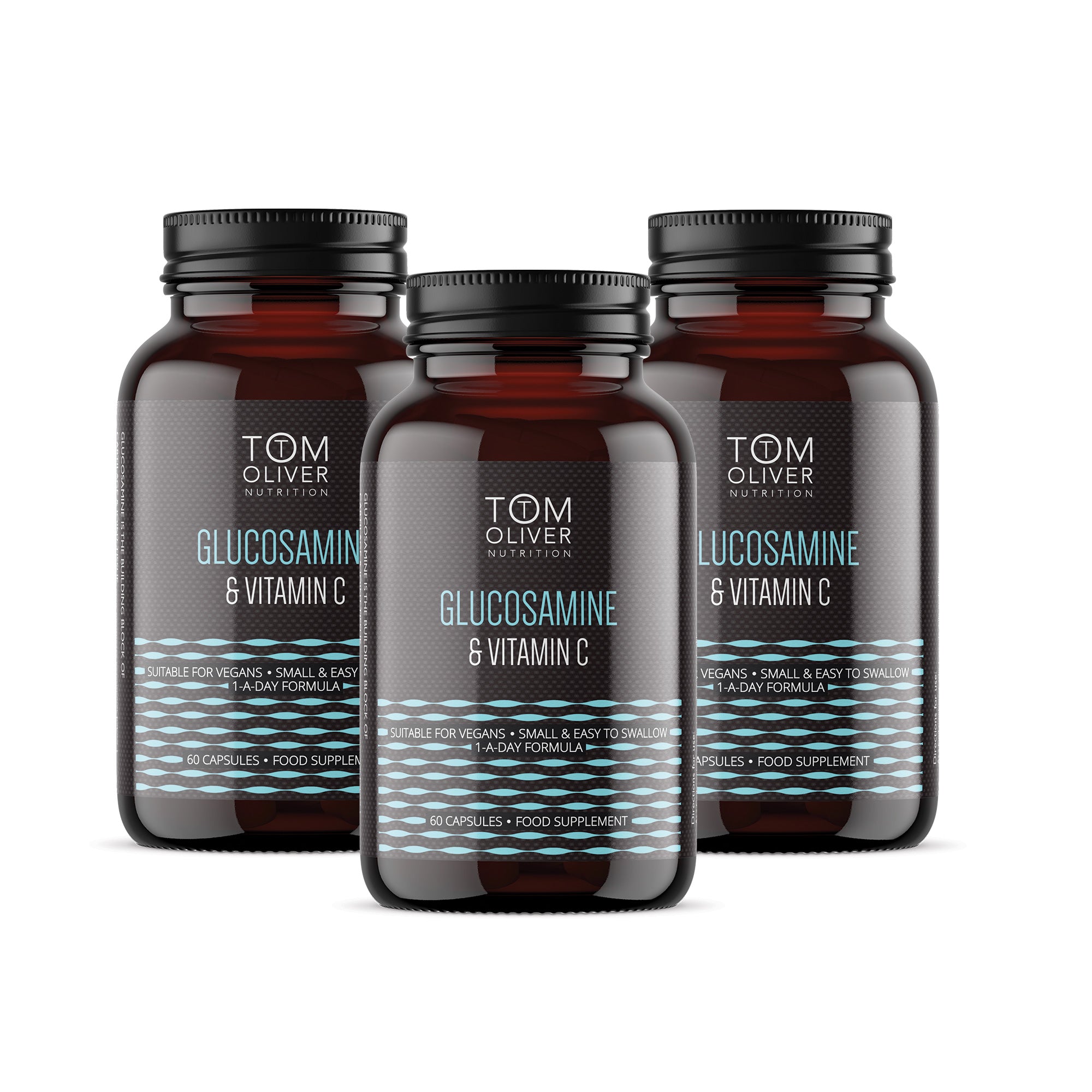
The packaging consists of three dark amber glass bottles, each containing capsules. The bottles have a rounded shape with a wide neck and a screw-on cap. The labels feature a clean design with a white background and blue accents, displaying product information clearly. Each bottle is labeled with 'GLUCOSAMINE & VITAMIN C' prominently, along with dosage instructions and a vegan-friendly note.
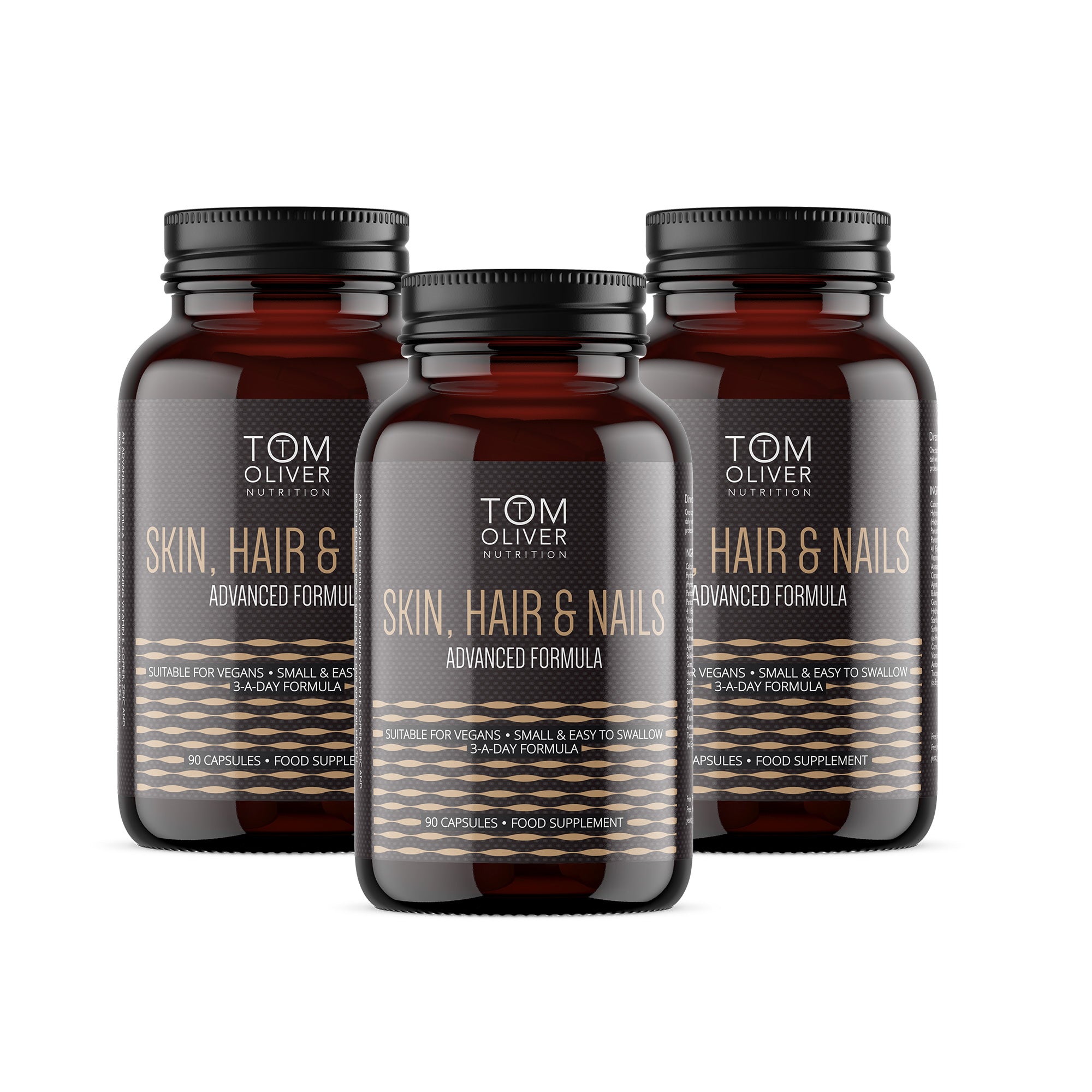
The packaging consists of three identical dark amber glass bottles, each containing capsules. The bottles have a rounded shape with a slightly wider base and a narrow neck. The caps are black and have a ribbed texture for grip. Each bottle features a label that wraps around the body, displaying product information and branding elements.
About the Brand
Tom Oliver Nutrition delivers a diverse range of nutritional supplements with a direct-to-consumer model, focusing on health-conscious and sustainability-driven consumers. Their packaging approach integrates eco-friendly materials and uniform design to support both brand visibility and product integrity.
The company prioritizes recyclable packaging formats, utilizing primarily amber glass and plastic bottles with secure closures to ensure product stability and minimize contamination risks. Labels are highly legible, color-coded by product type, and consistently carry vegan suitability statements and clear branding. This approach supports logistics efficiency while reinforcing the brand’s health and eco-conscious positioning.
Key Differentiator: Consistently vegan-friendly offerings and a clear commitment to sustainable packaging distinguish Tom Oliver Nutrition within the health supplement sector.
Design System
Visual Style
Modern sans-serif typography, high-contrast bold color palette (yellows, blues, pinks, blacks), and a clean, minimalistic layout emphasizing clarity and health appeal.
Brand Identity
Consistent use of the Tom Oliver Nutrition wordmark logo, clear product naming, and vegan suitability icons. Visual consistency is maintained across all SKUs, enhancing shelf recognition and trust.
Packaging Design
Preference for recyclable amber glass and PET plastic bottles; labels are designed for high legibility and compliance, with a focus on modularity and efficiency in structure.
User Experience
Packaging is designed for easy handling, clear communication of health benefits, and a uniform unboxing experience that reinforces trust and aligns with customer expectations for quality and sustainability.
Company Metrics
Business insights for Tom Oliver Nutrition based on available data
Market Positioning
Brand Values & Focus
Key Competitors
Target Market: Health-conscious consumers seeking vegan, sustainable, and high-quality nutritional supplements in the UK and broader European e-commerce market.
Packaging Assessment
Overall Grade
Visual appeal and presentation quality
Packaging durability and protection
Eco-friendliness and recyclable materials
Cost efficiency and value for money
Packaging assessment for Tom Oliver Nutrition based on industry standards and best practices
Frequently Asked Questions
What types of packaging materials does Tom Oliver Nutrition use?
Tom Oliver Nutrition primarily utilizes amber glass and plastic bottles for their supplements. These materials are selected for product safety, protection from light, and recyclability, supporting both product quality and sustainability objectives.
How does Tom Oliver Nutrition address sustainability in its packaging?
The brand employs recyclable materials, such as glass and select plastics, and emphasizes eco-friendly design choices. They also communicate vegan suitability and sustainability directly on product labels, reinforcing their commitment to environmental responsibility.
What impact does the packaging design have on the customer experience?
The uniformity in bottle design, modern label graphics, and color-coding by product type create a cohesive and recognizable brand experience, supporting both shelf presence and an informative unboxing experience.
Discover other Health companies
Explore more companies in the health industry and their packaging strategies
Bio-Synergy
Health
Bio-Synergy is a UK-based company specializing in health and fitness products, including nutritional supplements and DNA testing kits. Their mission is to support individuals in achieving their health and fitness goals through innovative products and personalized insights.
Comvita
Health
Comvita is a New Zealand-based company specializing in high-quality Mānuka honey and natural health products. Established in 1974, it aims to connect people with the healing power of nature.
Doctor Seaweed
Health
Doctor Seaweed specializes in natural, plant-based nutritional supplements derived from seaweed, aimed at promoting overall wellness.