Tailwind Nutrition packaging
Tailwind Nutrition delivers athlete-focused hydration and nutrition products, utilizing flexible pouches and carton boxes engineered for convenience and shelf presence. Their packaging strategy prioritizes vibrant branding, resealable features, and practical designs aligned with endurance and recovery use cases.
Packaging Portfolio
Tailwind Nutrition’s packaging portfolio is centered on flexible, stand-up pouches with resealable zippers, constructed from multilayer laminated films for barrier protection and portability. These pouches are optimized for single- and multi-use scenarios, supporting both direct-to-consumer and retail distribution. Carton boxes, crafted from single-layer paperboard with cut-out fronts, serve as retail caddies for individual packets, maximizing shelf visibility and product accessibility. The overall packaging structure emphasizes visual differentiation, ease of use, and logistical efficiency.
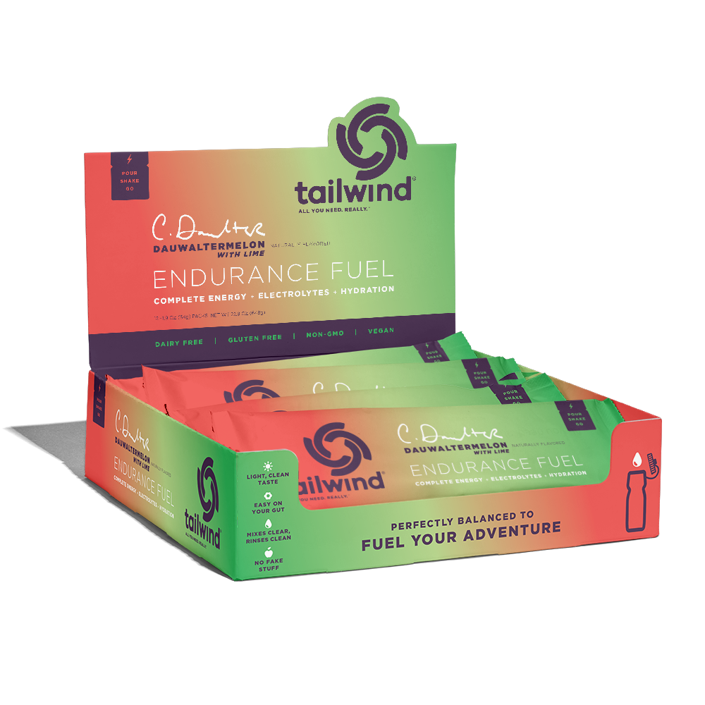
The packaging is a retail display box made of smooth, single-layer paperboard. It features a vibrant gradient color scheme transitioning from orange to green, with a glossy finish. The box is designed to hold multiple product packets, with a cut-out front for visibility. The edges are clean and precise, and the box is folded at the seams for assembly. The top flaps are open, allowing easy access to the products inside.

The packaging consists of multiple flexible pouches arranged in a group. Each pouch has a smooth, flat construction without any visible fluted layers, indicating it is made from a single layer of flexible material. The pouches feature a gradient color scheme transitioning from white at the top to green at the bottom. The surface appears to have a matte finish, giving it a clean and modern look. Each pouch is sealed at the top with a zipper closure, allowing for easy access to the contents. The front of each pouch prominently displays the product name and flavor, with a logo at the top.
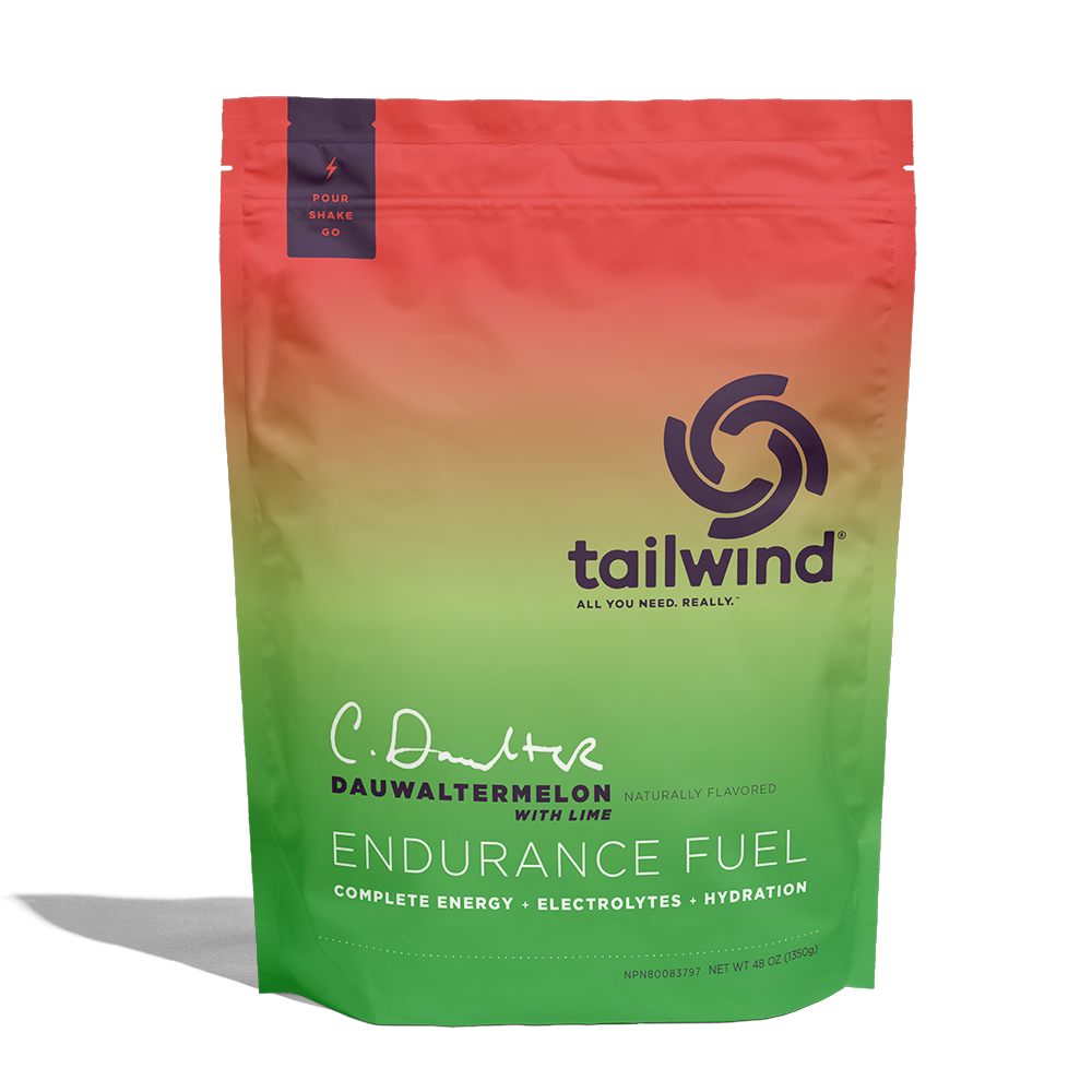
The packaging is a stand-up pouch made from a flexible material that allows it to maintain an upright position. The pouch features a gradient color scheme transitioning from green at the bottom to a vibrant red at the top. The front of the pouch includes a large logo of 'tailwind' prominently displayed at the center, with the tagline 'ALL YOU NEED. REALLY.' The product name 'ENDURANCE FUEL' is also clearly visible, along with the flavor 'DAUWATERMELON WITH LIME' in a contrasting font. The top of the pouch has a resealable zipper, and there is a small tear notch for easy opening.
The packaging consists of multiple stand-up pouches made from a flexible material, each featuring a resealable top. The pouches have vibrant colors, with a glossy finish that enhances the visual appeal. They are designed to stand upright on shelves, showcasing the product inside. Each pouch has a clear window that allows visibility of the contents, and they are labeled with product names and branding elements prominently displayed.

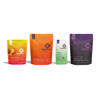
The image displays various packaging types for Tailwind Nutrition products. The pouches are made of a smooth, flat paper-like material with vibrant colors, while the carton box has a clean, flat construction with precise edges. The pouches feature a matte finish, while the carton box has a glossy appearance. The pouches are orange and white with bold text, while the carton box is predominantly white with colorful accents.
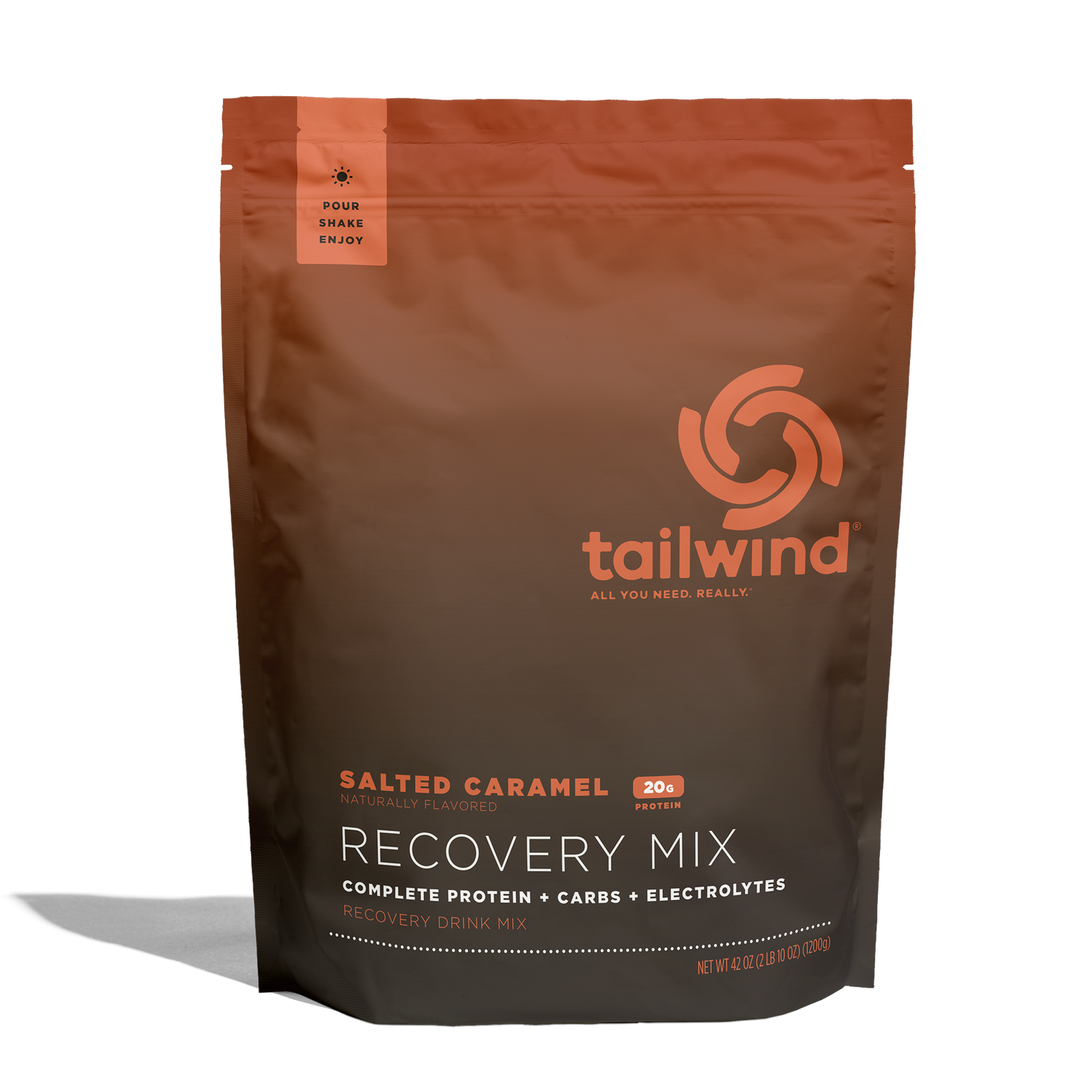
The packaging is a stand-up pouch made from a flexible material that allows it to maintain an upright position. It features a smooth surface with a matte finish, primarily in shades of brown and orange. The front displays a large logo in white, along with product information in contrasting colors. The top of the pouch has a resealable zipper for convenience.
About the Brand
Tailwind Nutrition specializes in sports nutrition, offering hydration, recovery, and endurance mixes primarily for athletes. Their packaging leverages stand-up flexible pouches and paperboard carton boxes, each tailored for portability, resealability, and on-the-go usability. Brand presentation is prioritized, with strong logo placement and consistent color schemes across all formats.
The company’s packaging approach is characterized by high-impact visuals, functional resealable zippers, and stand-up structures that facilitate both retail display and consumer convenience. Carton display boxes are used for multi-packet retail environments, while flexible pouches enable direct-to-consumer shipment with minimized materials. All packaging maintains a cohesive visual system for brand recognition and differentiation in the competitive sports nutrition market.
Key Differentiator: Tailwind Nutrition’s packaging stands out for its athlete-centric convenience, design uniformity, and the integration of resealable, portable formats that align with the needs of endurance sports consumers.
Design System
Visual Style
The visual design employs bold, high-contrast typography with sans-serif fonts for clarity and readability. A vibrant color palette—featuring gradients from green to red, orange, and brown—reinforces flavor differentiation and shelf impact. Surfaces are split between glossy and matte finishes to balance tactile feedback and visual appeal.
Brand Identity
Tailwind Nutrition maintains strong logo prominence, consistent placement of brand marks, and uniform use of iconography across all SKUs. Visual consistency is achieved through repeated color schemes, product naming conventions, and the strategic use of taglines. Packaging layouts are designed for instant brand recognition in both retail and online settings.
Packaging Design
Material selection prioritizes lightweight, flexible laminates for pouches and recyclable paperboard for carton caddies. The structural philosophy emphasizes resealability, upright storage, and single-handed access. Design principles focus on balancing product protection, efficient shipping, and branding needs.
User Experience
The packaging is tailored for athlete convenience, enabling easy opening, resealing, and transport during training or competition. Clear labeling, visible product windows (where applicable), and flavor-specific color codes streamline the consumer journey from purchase to consumption. The overall design supports brand engagement and repeat use.
Company Metrics
Business insights for Tailwind Nutrition based on available data
Market Positioning
Brand Values & Focus
Key Competitors
Target Market: Endurance athletes, fitness enthusiasts, and health-conscious consumers seeking convenient, reliable sports nutrition solutions.
Packaging Assessment
Overall Grade
Visual appeal and presentation quality
Packaging durability and protection
Eco-friendliness and recyclable materials
Cost efficiency and value for money
Packaging assessment for Tailwind Nutrition based on industry standards and best practices
Frequently Asked Questions
What types of packaging formats does Tailwind Nutrition use?
Tailwind Nutrition employs flexible stand-up pouches with resealable closures for most products and paperboard carton boxes for multi-unit retail display. These formats are designed for portability, product freshness, and shelf impact.
How does Tailwind Nutrition ensure packaging durability during shipping?
The use of multi-layer flexible materials and sturdy carton boxes provides adequate protection against moisture, impact, and transit stress, supporting product integrity during direct-to-consumer fulfillment.
Is Tailwind Nutrition’s packaging sustainable?
While the packaging uses lightweight materials to reduce waste, the current formats are not fully recyclable or compostable, reflecting industry-standard practices but leaving room for improvement in eco-friendly material adoption.
Discover other Health companies
Explore more companies in the health industry and their packaging strategies
Comvita
Health
Comvita is a New Zealand-based company specializing in high-quality Mānuka honey and natural health products. Established in 1974, it aims to connect people with the healing power of nature.
Smart Protein
Health
Smart Protein is dedicated to transforming nutrition by providing a range of health and wellness products focused on protein supplements and vitamins.
Doctor Seaweed
Health
Doctor Seaweed specializes in natural, plant-based nutritional supplements derived from seaweed, aimed at promoting overall wellness.