Supreme packaging
Supreme is a leading streetwear brand recognized for its direct-to-consumer model and distinctive branding. The company employs a strategic packaging approach that emphasizes brand visibility, limited-edition appeal, and customer engagement through high-impact unboxing experiences.
Packaging Portfolio
Supreme’s packaging portfolio features a strategic mix of carton boxes, rigid luxury boxes, branded poly mailers, and high-visibility retail bags. The use of gloss-finished paperboard and chipboard in their carton and rigid boxes delivers premium tactile and visual qualities, while custom inserts provide secure product presentation for high-value items. Poly mailers and retail bags are employed for efficient e-commerce fulfillment and in-store purchases, both prominently displaying the iconic Supreme logo for immediate brand recognition. The portfolio demonstrates a balance between protective functionality and strong brand expression, tailored for both retail display and direct-to-consumer shipments.

The packaging consists of multiple white plastic bags featuring a prominent red logo. Each bag has a simple design with a cut-out handle for easy carrying. The surface is smooth and glossy, indicating a plastic material that is lightweight yet durable. The bags are folded and stacked, showcasing their flat construction. The red logo is bold and centered on each bag, creating a striking contrast against the white background.
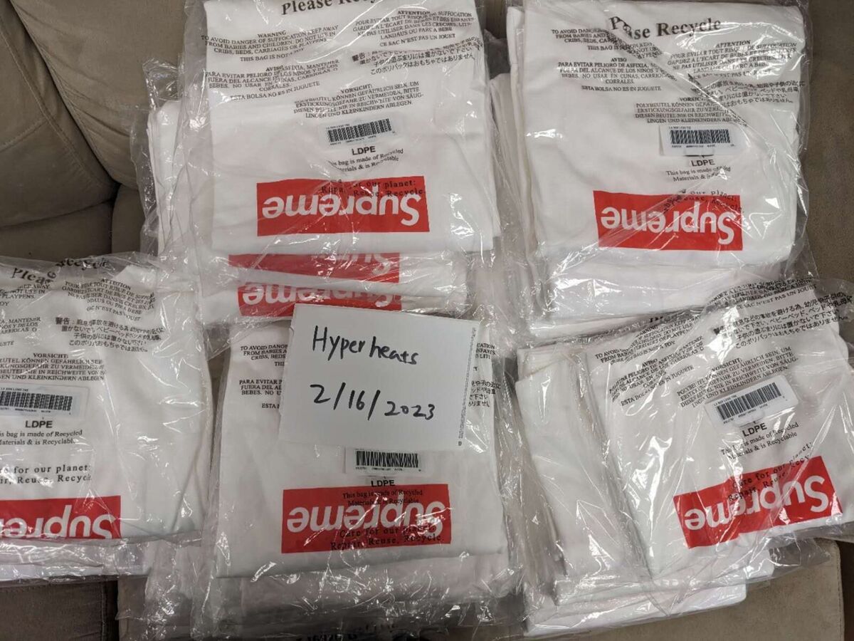
The packaging consists of multiple white plastic poly mailer bags, each containing a folded item. The bags are transparent enough to see the contents inside, which appear to be clothing items. The bags are sealed at the top and have a smooth surface without any visible fluted layers or rigid construction. They are lightweight and flexible, typical of poly mailers used for shipping apparel.
The packaging consists of a sturdy, thick-walled box with a premium appearance. It features a white exterior with a red interior and a red printed pattern on the inner lid. The box has a clean, precise construction with sharp edges and folds, indicative of high-quality chipboard material. The overall design is elegant and sophisticated, suitable for luxury items.

The packaging is a white, smooth, flat construction without fluted layers, indicative of a carton box. It features clean, precise edges and folds, with a glossy finish that enhances its visual appeal. The front displays a prominent red logo with the word 'Supreme' in a bold, sans-serif font, which is characteristic of the brand's design language. The overall shape is rectangular, designed to hold multiple volumes, suggesting a retail packaging purpose.

The packaging is a rigid box with a premium appearance, featuring a sturdy construction that holds three items: a bottle, a spray, and a tube. The box is white with a clean, smooth surface and a glossy finish, enhancing its luxury feel. The interior is likely designed to securely hold the products in place, possibly with custom inserts.

The packaging consists of smooth, flat construction made from a single layer of paperboard. It features clean, precise edges and folds, indicative of a folding carton design. The overall appearance is lightweight and retail-oriented, suitable for consumer products. The cartons are primarily kraft brown in color, with a glossy white band around the center displaying the brand name.
About the Brand
Supreme is a New York-based streetwear label with global influence, specializing in apparel, accessories, and skateboarding gear. The brand's packaging strategy aligns closely with its exclusivity-driven product releases, focusing on bold visual identity and premium presentation across retail and e-commerce channels.
Founded in 1994, Supreme has cultivated a strong cult following through scarcity marketing and high-profile collaborations. Its packaging choices reflect the brand’s commitment to reinforcing status and authenticity, using custom designs and high-quality materials to create memorable consumer touchpoints. Packaging solutions are deployed across both retail and online fulfillment, supporting seasonal drops and limited-edition launches.
Key Differentiator: Supreme’s unique value lies in its integration of packaging as an extension of brand storytelling, leveraging distinctive design elements and limited-run variants to drive desirability and enhance the collector experience.
Design System
Visual Style
Supreme utilizes bold, sans-serif typography and a minimalist approach, centering its signature red and white color palette. The overall aesthetic is clean, high-contrast, and instantly recognizable, with an emphasis on visual clarity and modern streetwear sensibilities.
Brand Identity
Brand identity is anchored by consistent logo placement—typically the red box logo—across all packaging types. Iconography is minimal, prioritizing logo dominance and eliminating visual clutter to reinforce authenticity and exclusivity. Visual elements are tightly regulated for consistency across retail, e-commerce, and collaborative releases.
Packaging Design
Material choices favor high-quality, rigid chipboard and gloss-finished paperboard for premium boxes, while functional plastic and poly mailers address shipping needs. Structural design prioritizes protection for high-value items and efficient handling for apparel, balancing shelf impact with logistical efficiency.
User Experience
Packaging is designed to enhance the customer journey, delivering strong emotional impact through memorable unboxing and tactile quality. Branded elements serve as authentication cues, supporting both the collector mindset and everyday user, and reinforcing Supreme’s status-driven brand experience throughout the purchase lifecycle.
Company Metrics
Business insights for Supreme based on available data
Market Positioning
Brand Values & Focus
Key Competitors
Target Market: Supreme targets trend-driven urban youth, streetwear enthusiasts, and collectors, with a global reach focused on premium, limited-edition apparel and accessories.
Packaging Assessment
Overall Grade
Visual appeal and presentation quality
Packaging durability and protection
Eco-friendliness and recyclable materials
Cost efficiency and value for money
Packaging assessment for Supreme based on industry standards and best practices
Frequently Asked Questions
How does Supreme’s packaging support its brand strategy?
Supreme’s packaging is designed to reinforce brand exclusivity and recognition, utilizing bold logo placement, consistent color schemes, and high-quality materials that reflect the premium positioning of its products. This approach amplifies the perceived value and authenticity of each item, particularly for limited-edition releases.
What materials and formats does Supreme use for packaging?
Supreme employs a mix of carton boxes, rigid boxes, branded poly mailers, and retail bags, with a focus on structural integrity and visual impact. Materials are selected for durability and presentation quality, with a predominant use of gloss-finished paperboard, chipboard, and branded plastics.
How sustainable is Supreme’s packaging?
While Supreme’s packaging emphasizes quality and brand aesthetics, the use of plastic bags and poly mailers suggests moderate sustainability efforts. There is limited evidence of recycled content or eco-friendly innovation, though the use of recyclable carton and rigid boxes partially mitigates environmental impact.
Discover other Apparel companies
Explore more companies in the apparel industry and their packaging strategies
Compressport International
Apparel
Compressport International specializes in high-end compression garments and sports accessories designed for athletes. Founded in 2008 and based in Geneva, Switzerland, the company caters to the needs of trail runners, triathletes, and other fitness enthusiasts.
Menswear Online
Apparel
Menswear Online is a UK-based e-commerce retailer specializing in stylish men's clothing and accessories. The company offers a wide selection of premium brands, including Armani Exchange and Lacoste.
Alexander Shorokhoff
Apparel
Alexander Shorokhoff is a luxury watch manufacturer that specializes in creating unique and artistic timepieces. Their products blend traditional craftsmanship with modern designs, appealing to discerning customers worldwide.