SuperSelf packaging
SuperSelf specializes in health supplements with a direct-to-consumer model, delivering nutraceuticals in premium, visually distinctive packaging. Their approach emphasizes brand consistency, combining flexible stand-up pouches and rigid supplement bottles to reinforce product quality and customer trust.
Packaging Portfolio
SuperSelf employs a dual-format packaging portfolio, leveraging both flexible stand-up pouches and rigid cylindrical bottles to address varying product needs. The pouches, constructed from multi-layer flexible materials with resealable zippers, support powder and bulk supplements, while rigid PET or HDPE bottles with tamper-evident caps are used for capsules and tablets. Both formats feature matte or glossy black finishes with metallic gold accents, emphasizing premium positioning. The structural design choices prioritize product protection, resealability, and efficient shipping, reflecting industry best practices for nutraceutical e-commerce.

The packaging is a stand-up pouch made from a flexible material, featuring a black background with gold accents. The front displays the product name 'LION'S MANE MUSHROOM POWDER' in bold, elegant typography. The pouch has a resealable top and a flat bottom that allows it to stand upright. The surface is smooth with a matte finish, giving it a premium look. The design includes a graphic of mushroom illustrations in a contrasting style, enhancing visual appeal.

The packaging consists of two rigid bottles, each with a thick, sturdy construction. The bottles are cylindrical with a glossy black finish and gold accents. The labels are smooth and feature intricate geometric designs along with product information. The caps are also gold, contributing to a premium appearance.

The image features a collection of supplement bottles arranged in a stacked formation. Each bottle has a sleek, cylindrical shape with a glossy black finish. The labels are predominantly black with gold accents, showcasing the product names and branding elements. The tops of the bottles appear to have standard screw-on caps. The overall arrangement is visually appealing, with a modern aesthetic.
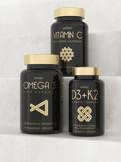
The packaging consists of three distinct bottles, each with a cylindrical shape and a glossy black finish. The bottles have gold accents, including the caps and decorative elements. Each bottle features a label with white text and graphics, indicating the product name and details. The overall appearance is sleek and modern, suggesting a premium product.

The packaging is a stand-up pouch made of a flexible material with a matte black finish. The front features a large, gold-foiled graphic of swirling patterns, indicative of the product's natural and organic qualities. The text is prominently displayed with 'LION'S MANE' in a bold font, and additional product information is present in smaller text below. The top has a resealable zipper closure, and the overall shape is rectangular with a slightly wider base for stability.
About the Brand
SuperSelf operates in the health supplement sector, providing a wide range of vitamins and dietary products targeting wellness-conscious consumers. Their packaging strategy centers on premium aesthetics, product protection, and clear communication of health benefits. The use of resealable flexible pouches and robust, black-and-gold supplement bottles aligns with industry trends for high-end nutraceuticals.
With a focus on quality and transparency, SuperSelf leverages packaging formats that balance shelf appeal and logistics efficiency. The brand's consistent use of black, gold, and minimalist label designs reinforces a premium market position while supporting clear consumer navigation across product categories. The packaging system is designed to withstand e-commerce shipping and visually differentiate the brand in a competitive online market.
Key Differentiator: SuperSelf's unique differentiator lies in its integration of premium packaging aesthetics with functional features such as resealability and strong product protection, tailored for both direct-to-consumer logistics and retail shelf presence.
Design System
Visual Style
Typography centers on bold, sans-serif fonts for product names with secondary, smaller text for details. Color palette is dominated by black and gold, balanced with white for legibility. The overall aesthetic conveys modernity and scientific credibility.
Brand Identity
Consistent logo placement across all packaging, clear brand name visibility, and use of gold-foil or metallic elements as visual signifiers. Iconography is minimal, focusing on clarity and category differentiation.
Packaging Design
Material choices include durable, food-safe PET or HDPE for bottles, and laminated flexible film for pouches. Design philosophy emphasizes protection, resealability, and premium shelf presence without excessive ornamentation.
User Experience
Customer journey is enhanced by intuitive labeling, clear health claims, and resealable features for ongoing product freshness. Visual consistency across SKUs aids brand recognition and simplifies the purchase experience for repeat buyers.
Company Metrics
Business insights for SuperSelf based on available data
Market Positioning
Brand Values & Focus
Key Competitors
Target Market: Health-conscious consumers in the UK and Europe seeking premium, reliable, and visually distinct dietary supplements via direct-to-consumer channels.
Packaging Assessment
Overall Grade
Visual appeal and presentation quality
Packaging durability and protection
Eco-friendliness and recyclable materials
Cost efficiency and value for money
Packaging assessment for SuperSelf based on industry standards and best practices
Frequently Asked Questions
What types of packaging does SuperSelf use for its supplements?
SuperSelf uses a combination of stand-up flexible pouches and rigid cylindrical bottles, both utilizing matte and glossy finishes with gold accents to communicate product quality and reinforce brand identity.
How does SuperSelf's packaging support product safety during shipping?
The rigid supplement bottles provide strong impact resistance and protection against contamination, while flexible pouches feature resealable closures and stable bases, minimizing risk of spillage or damage in transit.
Does SuperSelf use sustainable packaging materials?
While SuperSelf’s packaging aligns with the industry’s shift toward premium and recyclable materials, there is limited public information on the use of recycled content or fully biodegradable options. The brand may benefit from increased transparency regarding material sourcing and recyclability.
Discover other Health companies
Explore more companies in the health industry and their packaging strategies
Comvita
Health
Comvita is a New Zealand-based company specializing in high-quality Mānuka honey and natural health products. Established in 1974, it aims to connect people with the healing power of nature.
Smart Protein
Health
Smart Protein is dedicated to transforming nutrition by providing a range of health and wellness products focused on protein supplements and vitamins.
Doctor Seaweed
Health
Doctor Seaweed specializes in natural, plant-based nutritional supplements derived from seaweed, aimed at promoting overall wellness.