Super Botanic packaging
Super Botanic is a health-focused brand delivering natural supplements, with a packaging strategy centered on glass bottles and eco-conscious materials. Their approach emphasizes clear branding, structured presentation, and a blend of functional and sustainable packaging formats.
Packaging Portfolio
Super Botanic’s packaging portfolio consists predominantly of amber and clear glass supplement bottles with metallic or plastic screw-on lids, paired with flexible stand-up pouches for select product lines. The glass bottle format enhances product protection against moisture, light, and oxygen, which is critical for supplements. Stand-up pouches are used for larger or powdered products, offering resealability and reduced shipping weight. All packaging formats are enhanced by consistent, brand-forward labeling that prioritizes regulatory compliance and consumer information. The combination of these materials and structures balances visual shelf appeal, logistics efficiency, and moderate sustainability.
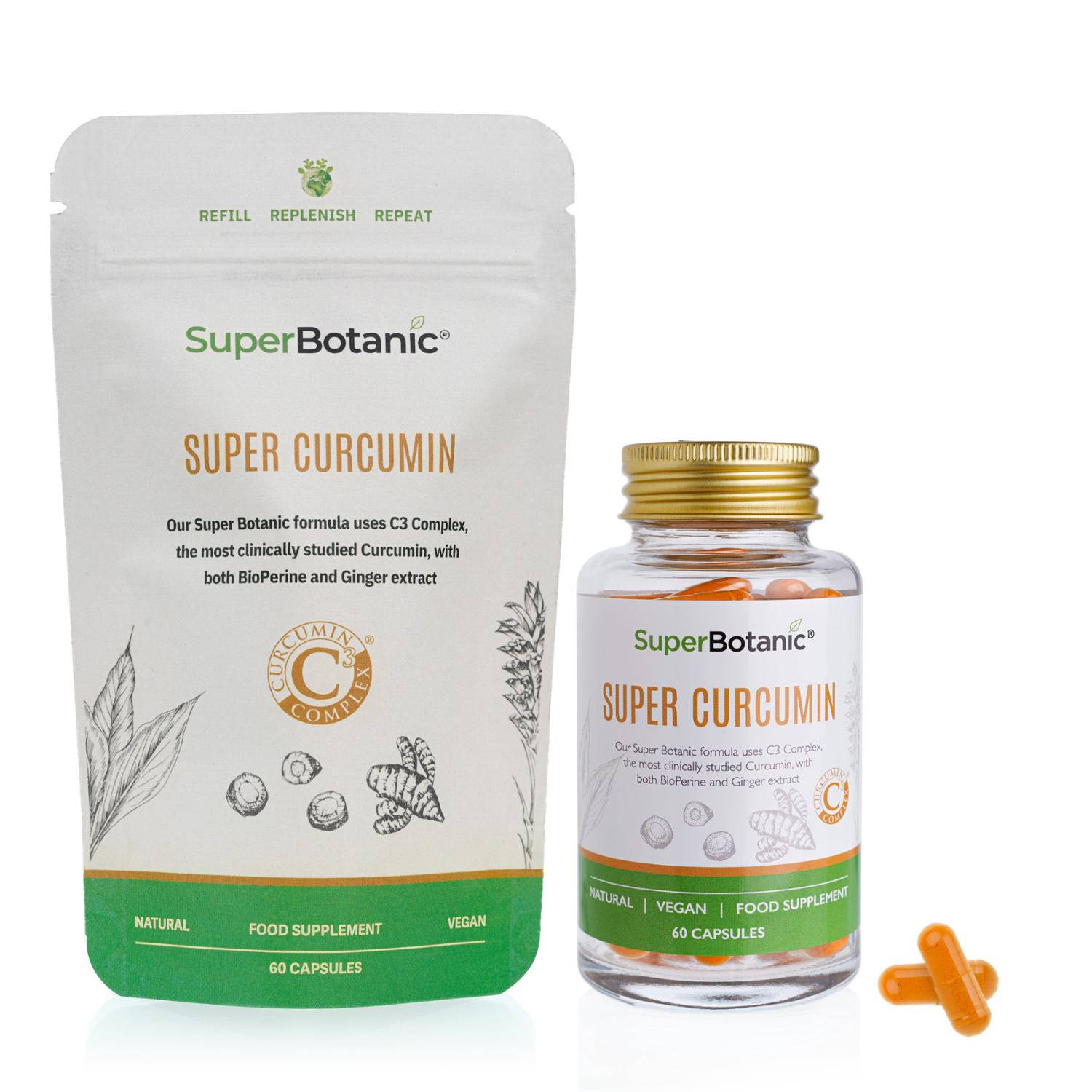
The image features two distinct packaging types: a stand-up pouch and a glass bottle. The stand-up pouch is made of flexible material with a resealable top, displaying a matte finish with botanical illustrations and product information. The glass bottle is clear with a gold-colored lid, containing capsules and labeled with product details. Both packaging types prominently feature branding elements.
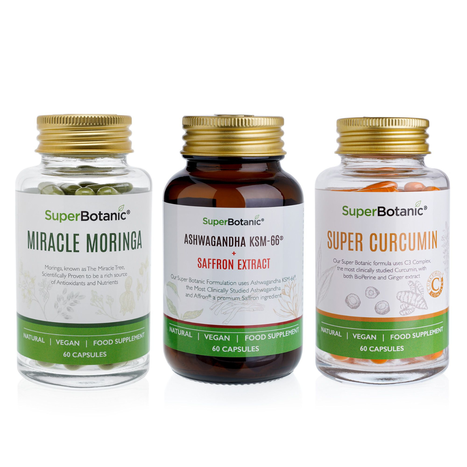
The packaging consists of three glass bottles, each containing dietary supplements. The bottles are cylindrical with a smooth surface and a metallic gold or bronze screw-on lid. The labels on the bottles are predominantly white with colorful accents and feature product names, ingredients, and branding elements. The labels have a clean design with clear fonts and icons indicating natural and vegan attributes.
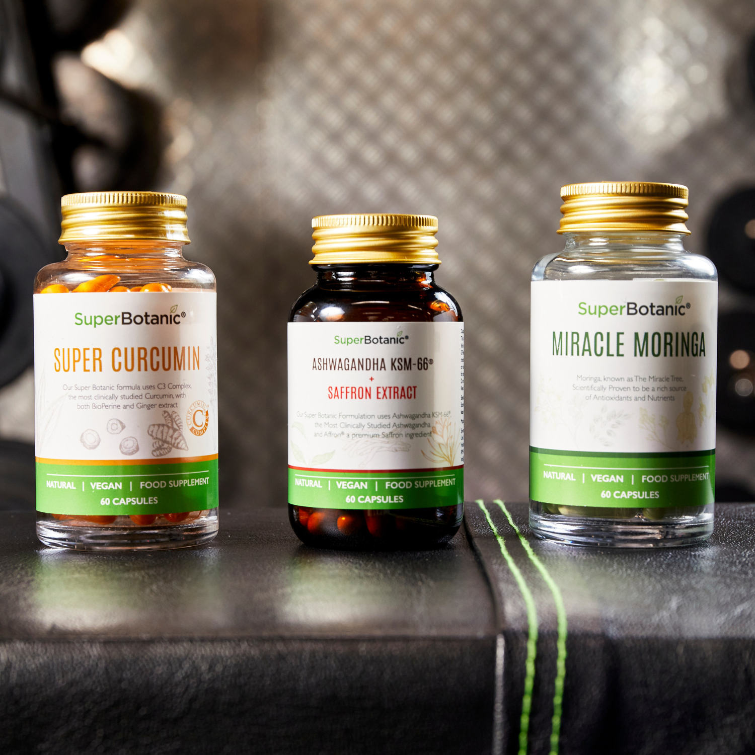
The image features three bottles of dietary supplements. Each bottle has a distinct shape, typically cylindrical, with a screw-on lid. The labels are prominently displayed on the front, showcasing the product name and key information. The bottles are made of clear or amber glass, allowing the contents to be visible. The labels are designed with a clean layout, featuring a combination of white and green colors, with some using a glossy finish. The text is bold and easy to read, indicating the product type and benefits. The overall appearance is professional and appealing, suitable for retail display.
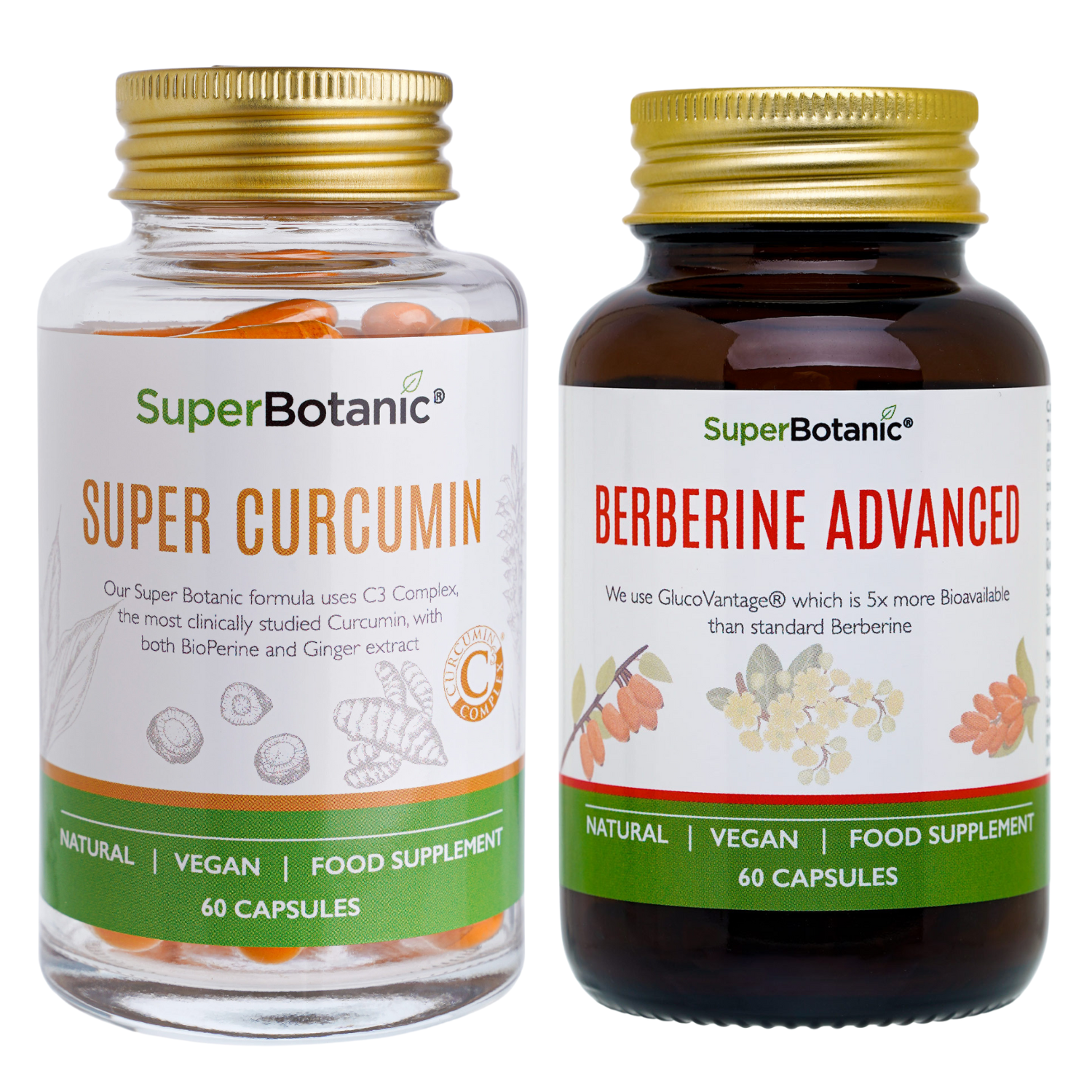
The image features two glass bottles with screw-on lids, each containing dietary supplements. The bottles are cylindrical with a clear or amber finish, showcasing the contents inside. The labels are prominently displayed, featuring colorful graphics and text. The label for 'Super Curcumin' is white with vibrant colors, while 'Berberine Advanced' has a darker, amber background. Both labels include product names, descriptions, and nutritional information in a clear, readable font.
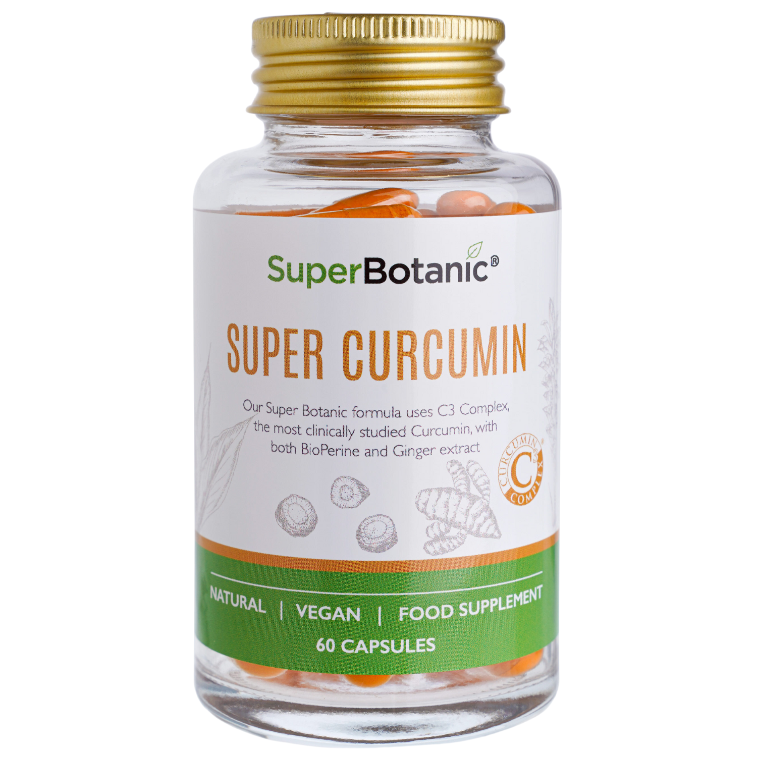
The packaging is a clear glass bottle with a plastic screw-on cap. The bottle is cylindrical in shape, showcasing the contents, which are orange capsules. The label wraps around the bottle, featuring a white background with colorful graphics of herbs and a prominent brand name. The label includes product information, such as the name 'SUPER CURCUMIN', and highlights key features like 'NATURAL', 'VEGAN', and 'FOOD SUPPLEMENT'.

The packaging consists of a cylindrical glass bottle with a metallic gold screw-on cap. The bottle is dark in color, likely amber, to protect the contents from light. The label is prominently displayed on the front, featuring a clean design with a white background and colorful floral illustrations. The text is clear and easy to read, indicating the product name and key features. The label wraps around the bottle, adhering smoothly without any visible bubbles or imperfections.
About the Brand
Super Botanic operates in the health supplement sector, offering a range of natural, vegan-friendly products. The company's packaging leverages glass bottles and resealable pouches, reflecting a commitment to product integrity and sustainable practices.
With a direct-to-consumer model, Super Botanic prioritizes packaging that both protects sensitive supplements and aligns with the brand’s environmental values. The use of amber and clear glass bottles, coupled with flexible stand-up pouches, optimizes shelf presence and consumer convenience while reinforcing product quality. Branding elements such as bold typography, botanical illustrations, and clear labeling are consistently applied across all packaging SKUs.
Key Differentiator: Distinctive use of glass packaging, strong brand-consistent visuals, and an explicit focus on sustainability set Super Botanic apart in the health supplement market.
Design System
Visual Style
Clean sans-serif typography, high-contrast color palettes with white backgrounds and botanical accent colors (greens, golds, and earth tones), and illustrative graphics for a modern, natural aesthetic.
Brand Identity
Frequent and prominent logo placement, consistent use of iconography to indicate vegan and natural claims, and uniform layout across product labels drive strong brand recognition.
Packaging Design
Emphasis on glass bottles for durability and premium perception; flexible pouches for efficiency; labels feature matte or semi-gloss finishes, ensuring both durability and clear readability.
User Experience
Packaging is designed for straightforward unboxing and product identification, with clear product claims and benefits on the front label. The tactile quality of glass bottles and resealable features on pouches enhance customer perception of quality, while visual cues support trust and repeat purchase behavior.
Company Metrics
Business insights for Super Botanic based on available data
Market Positioning
Brand Values & Focus
Key Competitors
Target Market: Health-conscious consumers seeking natural, vegan, and ethically sourced supplements, primarily in the UK and broader European markets.
Packaging Assessment
Overall Grade
Visual appeal and presentation quality
Packaging durability and protection
Eco-friendliness and recyclable materials
Cost efficiency and value for money
Packaging assessment for Super Botanic based on industry standards and best practices
Frequently Asked Questions
What types of packaging materials does Super Botanic use?
Super Botanic primarily uses glass bottles with screw-on lids and flexible stand-up pouches, both selected for their protective qualities and recyclability.
How sustainable is Super Botanic's packaging?
The brand demonstrates a moderate to high sustainability profile, utilizing recyclable glass and flexible pouches while emphasizing vegan and ethically sourced claims. However, the use of plastic lids and pouch laminates may still present areas for further improvement.
What is the main visual style of Super Botanic's packaging?
Packaging features clean layouts, vibrant colors, botanical illustrations, and prominent, legible product information, all contributing to a cohesive and recognizable brand identity.
Discover other Health companies
Explore more companies in the health industry and their packaging strategies
Bio-Synergy
Health
Bio-Synergy is a UK-based company specializing in health and fitness products, including nutritional supplements and DNA testing kits. Their mission is to support individuals in achieving their health and fitness goals through innovative products and personalized insights.
Lily & Loaf
Health
Lily & Loaf specializes in high-quality health and nutrition products, offering a range of supplements and vitamins aimed at supporting an active lifestyle. The company focuses on providing natural solutions for health and beauty.
Comvita
Health
Comvita is a New Zealand-based company specializing in high-quality Mānuka honey and natural health products. Established in 1974, it aims to connect people with the healing power of nature.