Springfield Nutraceuticals packaging
Springfield Nutraceuticals specializes in health and nutrition products, utilizing a mix of rigid and carton packaging to ensure product integrity and brand consistency. Their packaging approach reflects a focus on safety, regulatory compliance, and customer trust within the nutraceutical segment.
Packaging Portfolio
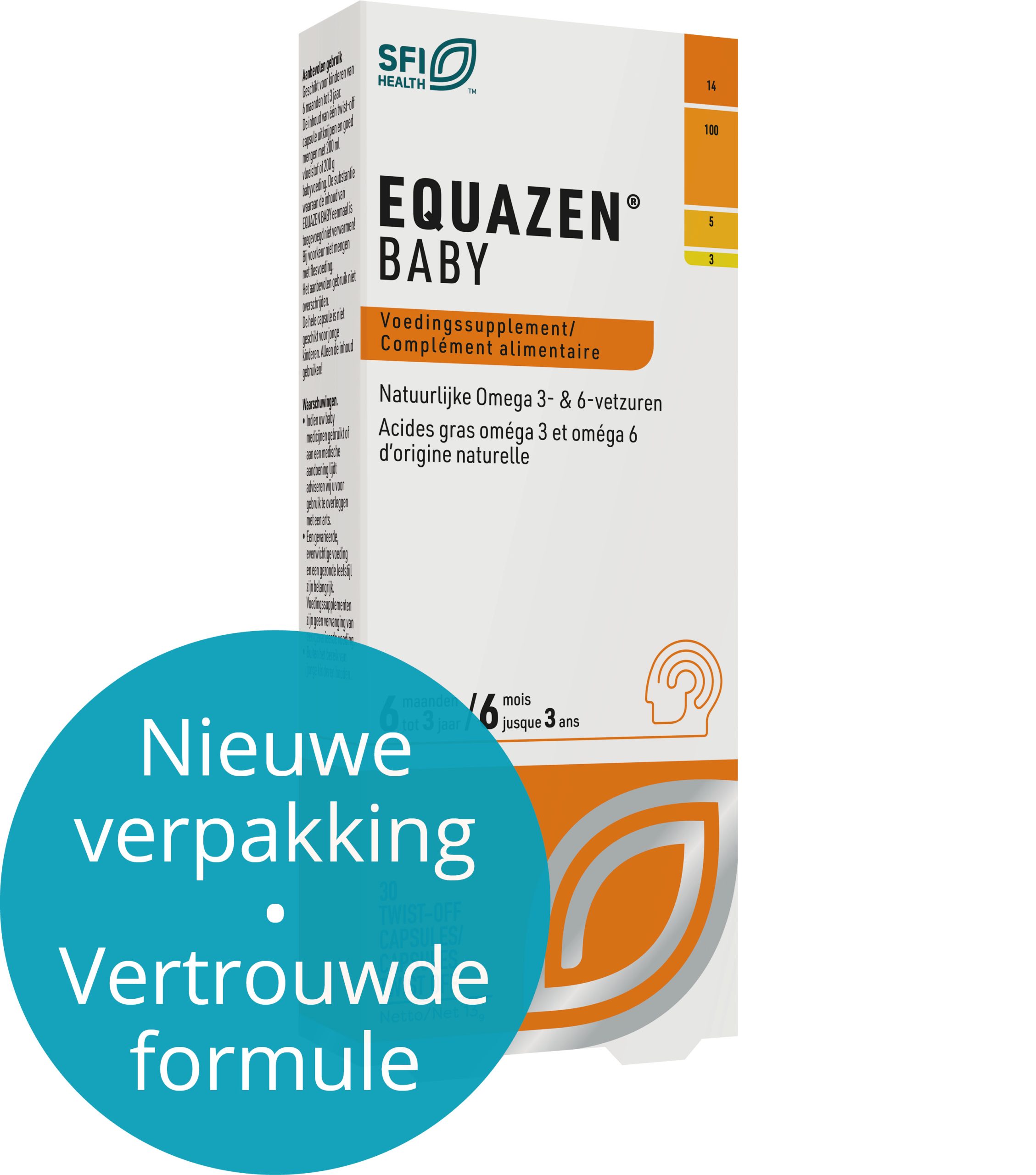
Springfield Nutraceuticals employs a dual packaging strategy utilizing rigid plastic bottles and cylindrical containers for supplement protection, complemented by folding carton boxes for secondary packaging. Material choices include thick chipboard for rigidity and high-quality paperboard for cartons, both featuring matte or glossy finishes to enhance shelf appeal. The structural designs prioritize tamper resistance, product protection, and clear communication of supplement information. Visual branding and regulatory icons are consistently applied across all packaging, supporting both consumer trust and retail compliance.
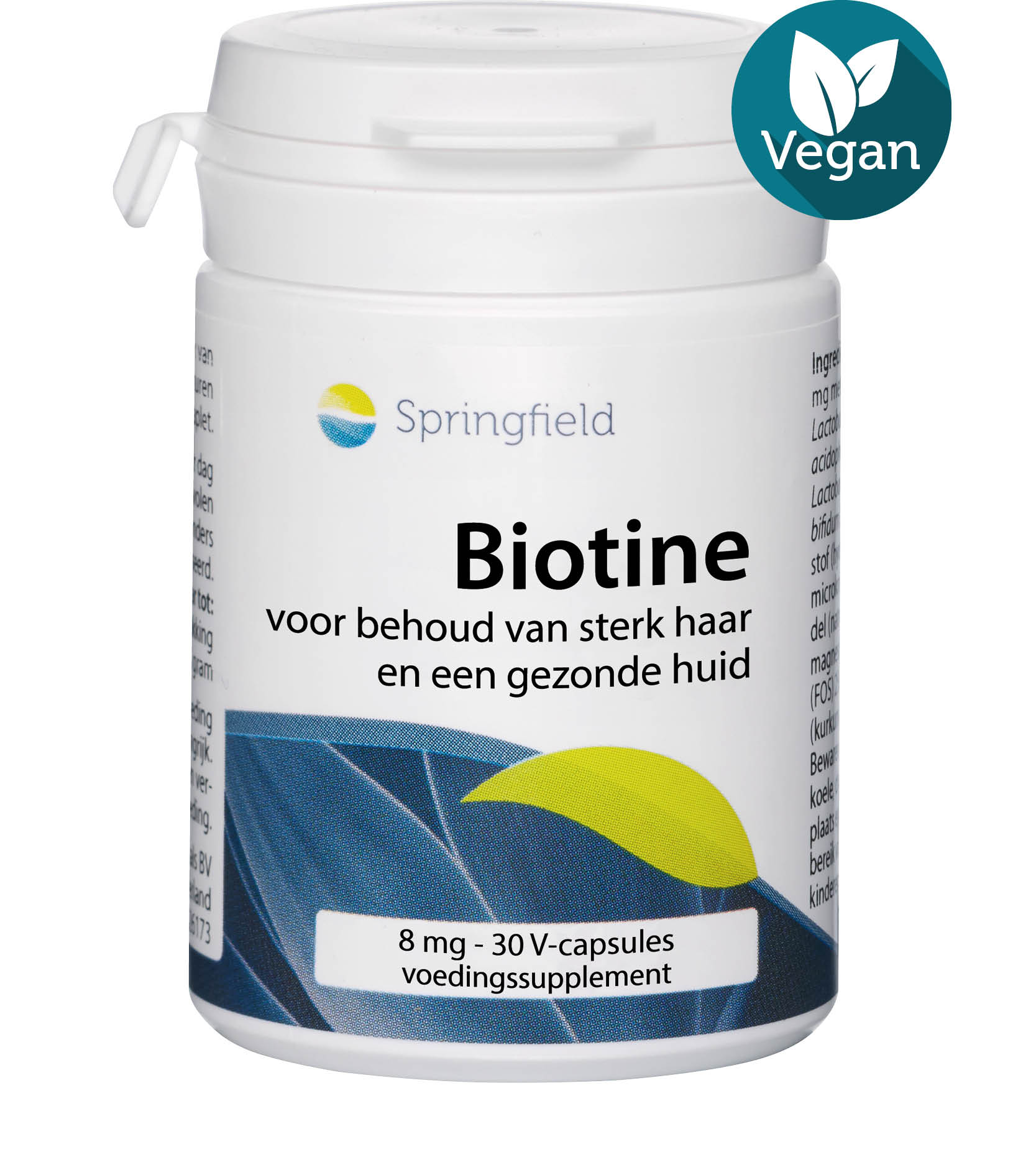
The packaging is a cylindrical container with a sturdy construction, typically made from thick chipboard. The surface is smooth with a matte finish, featuring a white base color. The container has a screw-on lid, which is common for supplement packaging, ensuring a secure closure. The overall shape is tall and cylindrical, designed to hold capsules. The graphics include a prominent brand logo at the top, with product information and nutritional details printed around the body in clear, legible fonts.
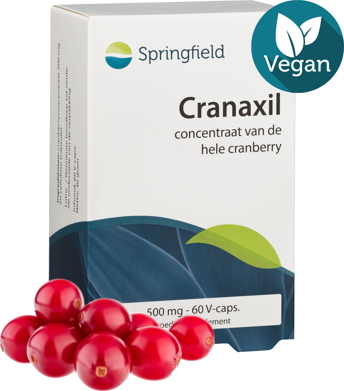
The packaging is a folding carton made of smooth, flat paperboard. It features a clean, rectangular shape with precise edges and folds. The exterior is predominantly white with a matte finish, accented by a vibrant green stripe and a circular vegan logo in the top right corner. The front displays the product name 'Cranaxil' prominently in a modern font, along with a description of the product's contents and benefits.
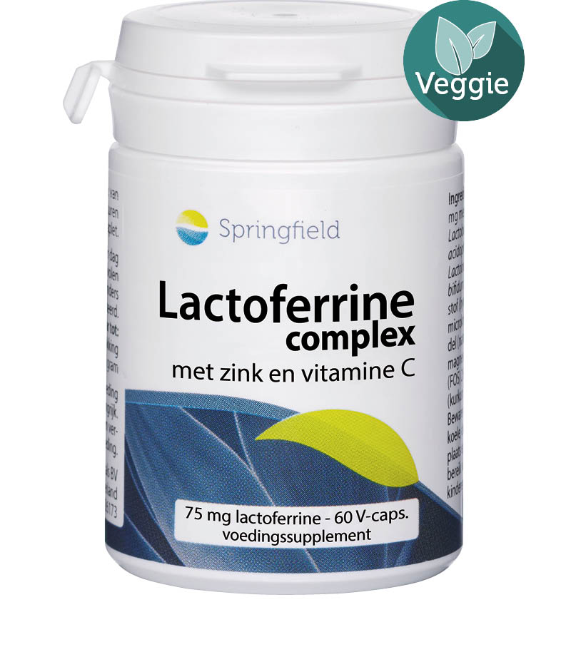
The packaging is a cylindrical container with a white plastic body and a secure, screw-on lid. The container is primarily white with a colorful label that features blue and green tones. The label includes product information and branding elements. The lid has a small green leaf icon indicating a 'Veggie' designation.
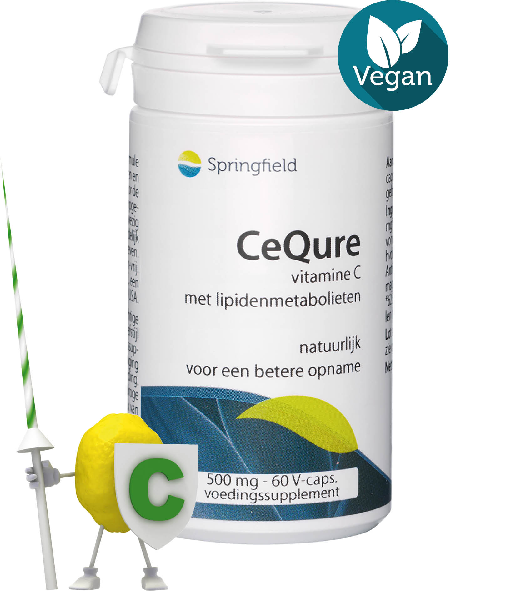
The packaging is a cylindrical bottle made of sturdy plastic with a white base color. It features a screw-on lid and a label that wraps around the body of the bottle. The label has a smooth finish and includes various colors, primarily white and blue, with green accents. The text is printed in clear, legible fonts, and there are graphics that suggest a focus on health and wellness.
The packaging is a tall, slender carton with a smooth, flat construction. It features clean edges and precise folds, indicative of a folding carton. The exterior is predominantly white with colorful accents, and it has a glossy finish that enhances its visual appeal. The front displays a prominent logo and product name, with additional text and graphics on the sides and back, providing product information and usage instructions. The overall design is modern and appealing, aimed at attracting consumers in a retail environment.

The packaging is a cylindrical container made of thick chipboard with a smooth, matte finish. It features a white exterior with colorful branding elements. The top is sealed with a plastic cap, and the body is adorned with printed graphics that include product information and branding. The container is sturdy and designed for retail display.
About the Brand
Springfield Nutraceuticals operates in the health and supplement sector, offering a portfolio of vitamins and dietary supplements with an emphasis on product quality and efficacy. The brand’s packaging strategy is characterized by the use of robust rigid bottles and folding cartons, aligning with standards for safety, branding, and consumer information.
The company’s packaging solutions demonstrate a blend of functional protection and modern branding, ensuring compliance with industry regulations and enhancing shelf presence. Visual uniformity across product lines is maintained through a consistent color palette, clear typography, and the inclusion of certification icons such as vegan and non-GMO labels. The strategic use of both rigid containers and folding cartons enables Springfield to accommodate diverse supplement formats while optimizing logistics and retail compatibility.
Key Differentiator: Springfield’s integration of regulatory iconography and standardized visual identity across varied packaging formats provides both credibility and consumer reassurance in the health and nutraceutical market.
Design System
Visual Style
The visual style features sans-serif typography for clarity, a predominantly white base color with green and blue accents, and a minimalist, clinical aesthetic that reinforces a sense of health and reliability.
Brand Identity
Consistent use of the Springfield logo, product-specific branding, and certification iconography (e.g., vegan, non-GMO) ensures strong visual recognition. The design system maintains uniformity in label layouts, color schemes, and the placement of key informational elements.
Packaging Design
Material selection emphasizes sturdy plastics and chipboard for primary containers, paired with recyclable paperboard for outer cartons. The design philosophy prioritizes product safety, regulatory compliance, and clear communication of nutritional information.
User Experience
Packaging is structured for easy readability and secure handling, supporting a positive customer journey from unboxing to daily use. Iconography and information hierarchy facilitate quick identification of product benefits and certifications, enhancing consumer confidence.
Company Metrics
Business insights for Springfield Nutraceuticals based on available data
Market Positioning
Brand Values & Focus
Key Competitors
Target Market: Health-conscious consumers seeking reliable, high-quality nutritional supplements within the B2C nutraceutical segment, predominantly in the Netherlands and broader European markets.
Packaging Assessment
Overall Grade
Visual appeal and presentation quality
Packaging durability and protection
Eco-friendliness and recyclable materials
Cost efficiency and value for money
Packaging assessment for Springfield Nutraceuticals based on industry standards and best practices
Frequently Asked Questions
What packaging materials does Springfield Nutraceuticals primarily use?
Springfield Nutraceuticals primarily utilizes rigid plastic and chipboard containers for supplements, as well as folding carton boxes for outer packaging, emphasizing both product protection and brand consistency.
How does Springfield’s packaging support product safety during logistics?
The use of sturdy rigid containers with secure screw-on lids and well-constructed folding cartons ensures a high level of product protection against physical impact, contamination, and tampering throughout the supply chain.
Is Springfield Nutraceuticals’ packaging eco-friendly?
While the company demonstrates some eco-conscious decisions—such as recyclable paperboard and clear labeling—there is limited evidence of advanced sustainability practices beyond standard industry benchmarks.
Discover other Health companies
Explore more companies in the health industry and their packaging strategies
Comvita
Health
Comvita is a New Zealand-based company specializing in high-quality Mānuka honey and natural health products. Established in 1974, it aims to connect people with the healing power of nature.
Smart Protein
Health
Smart Protein is dedicated to transforming nutrition by providing a range of health and wellness products focused on protein supplements and vitamins.
Bio-Synergy
Health
Bio-Synergy is a UK-based company specializing in health and fitness products, including nutritional supplements and DNA testing kits. Their mission is to support individuals in achieving their health and fitness goals through innovative products and personalized insights.