Spitfire Audio packaging
Spitfire Audio delivers premium virtual instruments and sample libraries for composers, utilizing high-end carton and rigid box packaging to reinforce their brand's artistic and professional positioning. Their packaging prioritizes both visual impact and product protection, aligning with the expectations of a discerning creative audience.
Packaging Portfolio
Spitfire Audio’s packaging portfolio centers on rigid boxes and folding carton formats, utilizing high-grade chipboard, matte and glossy finishes, and custom inserts to secure contents. The packaging design demonstrates attention to structural integrity and presentation, including precise edge work and premium tactile elements such as felt linings and embossing. Branding is consistently applied through logo placement and product-specific imagery, supporting both logistics efficiency and shelf appeal. These solutions are tailored for limited physical releases and collector’s editions, where product protection and brand perception are critical.

The packaging is a smooth, flat construction with clean edges and folds, indicative of a folding carton. It features a predominantly white exterior with a glossy finish, showcasing high-quality graphics and images. The front displays a close-up of a brass instrument, likely a French horn, with a dark background that enhances the visual appeal. The brand name 'SPITFIRE AUDIO' is prominently featured at the top in bold, uppercase letters. The overall design is sleek and modern, aimed at attracting attention in a retail setting.
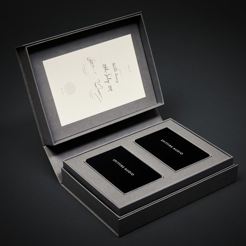
The packaging is a sturdy, thick-walled box with a premium appearance. It features a smooth, matte finish in a dark gray color. The interior is lined with a lighter gray material, providing a contrast to the exterior. The box opens like a book, revealing two compartments for the contents, which are likely audio-related products. The overall construction is clean and precise, with no visible seams or flaps.
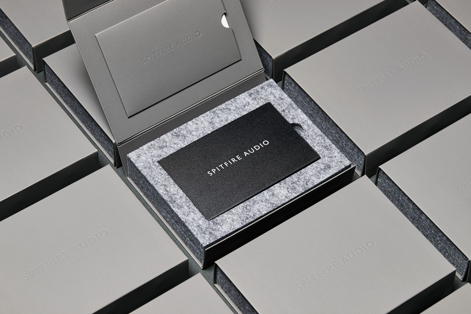
The packaging consists of a thick, sturdy chipboard box with a premium finish. The exterior is a matte gray color, while the interior features a soft, felt-like material that provides a luxurious feel. The box has a clean, rectangular shape with precise edges and corners. Inside, there is a smaller card or booklet that is also black, contrasting with the gray of the box. The overall appearance is elegant and sophisticated, suitable for high-end products.

The packaging appears as a smooth, flat, and rigid box with clean edges and folds. It features a predominantly dark exterior with an image of a violin, suggesting a connection to music or orchestral themes. The box has a matte finish, giving it a premium look. The top face displays the brand name 'SPITFIRE AUDIO' prominently, along with additional branding elements and product information on the sides.
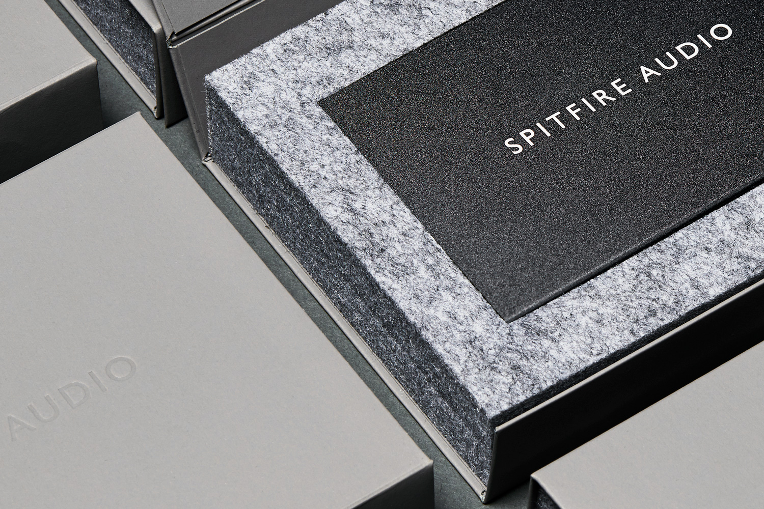
The packaging features a thick, sturdy construction with a premium appearance. The exterior is covered in a smooth, matte finish, predominantly in shades of gray. The top of the box has a contrasting black panel with the brand name 'SPITFIRE AUDIO' embossed in white, providing a striking visual contrast. The edges of the box are cleanly finished, and the overall shape is rectangular, indicating a high-quality design. The interior is lined with a soft, gray felt material, enhancing the luxurious feel.
About the Brand
Spitfire Audio is a leader in the development of innovative audio solutions for musicians and composers, with a focus on authenticity and emotional depth. Their packaging strategy leverages premium materials and minimalist design to create a cohesive and immersive brand experience.
The company’s packaging portfolio consists primarily of rigid and carton boxes that reflect a high standard of visual design and structural integrity. Branding is consistently executed across all formats, with clear logo placement and a restrained, modern color palette. This approach not only supports safe product delivery, especially for physical editions and special releases, but also enhances the perceived value and professionalism of the brand.
Key Differentiator: Spitfire Audio's packaging is distinguished by its alignment with the brand’s artistic identity, utilizing luxury materials and modern design principles to enhance the unboxing experience for a niche creative market.
Design System
Visual Style
Typography is modern and sans-serif, with bold, uppercase styles for brand names and clean, legible layouts. The color palette emphasizes monochromatic tones—primarily blacks, whites, and grays—accented with photographic imagery of musical instruments, contributing to a sleek, contemporary aesthetic.
Brand Identity
Consistent logo application on both exterior and interior surfaces, restrained iconography, and a focus on minimalist visual motifs ensure strong brand recognition. Branding elements are integrated into packaging through embossing, high-resolution imagery, and uniform type treatments.
Packaging Design
Material selection prioritizes rigid chipboard and premium folding cartons, supporting both structural durability and a luxury tactile experience. Structural design favors rectangular, magnetic closure, and collapsible formats, reflecting a philosophy of functional elegance and collector value.
User Experience
Packaging is designed to create a premium unboxing moment, guiding the user through a visually and tactically engaging sequence. Clear branding and product information facilitate trust and ease of use, while the overall presentation enhances excitement and perceived product quality.
Company Metrics
Business insights for Spitfire Audio based on available data
Market Positioning
Brand Values & Focus
Key Competitors
Target Market: Professional and aspiring composers, musicians, and audio producers seeking premium virtual instruments and sound libraries, with an emphasis on high production values and artistic presentation.
Packaging Assessment
Overall Grade
Visual appeal and presentation quality
Packaging durability and protection
Eco-friendliness and recyclable materials
Cost efficiency and value for money
Packaging assessment for Spitfire Audio based on industry standards and best practices
Frequently Asked Questions
What types of packaging does Spitfire Audio use for its products?
Spitfire Audio primarily utilizes rigid boxes and high-quality carton boxes, featuring matte finishes, premium chipboard, and custom inserts for special editions and physical releases.
How does Spitfire Audio ensure product protection during shipping?
The company’s focus on rigid and well-constructed carton packaging provides substantial protection against transit damage, minimizing the risk of product impact or moisture exposure.
Is Spitfire Audio’s packaging environmentally sustainable?
While premium materials are used, there is limited evidence of explicit eco-friendly certifications or recycled content, though the structural choices allow for potential recyclability and reuse.
How does packaging contribute to Spitfire Audio’s brand identity?
Packaging design is tightly integrated with the brand’s minimalist and modern aesthetic, utilizing clear logo application, a consistent color palette, and visual motifs associated with music and artistry.
Discover other Arts & Entertainment companies
Explore more companies in the arts & entertainment industry and their packaging strategies
Mosaic Art Studio USA
Arts & Entertainment
Mosaic Art Studio USA offers immersive workshops focused on traditional art forms like Turkish mosaic making, Ebru marbling, and ceramic painting. Participants can create unique pieces while enjoying a cultural experience in a welcoming environment.
Derwent Art
Arts & Entertainment
Derwent Art specializes in high-quality art supplies, particularly colored pencils, paints, and accessories for artists of all skill levels. The company has a rich heritage dating back to 1832, emphasizing quality and creativity in its product offerings.
Sculpd
Arts & Entertainment
Sculpd is a creative retail company specializing in pottery and arts and crafts kits for home use. They offer a variety of products aimed at enhancing creativity and providing enjoyable experiences for individuals and groups.