Solgar packaging
Solgar is a longstanding leader in the nutritional supplements sector, specializing in vitamins, minerals, and specialty health products. Their packaging approach emphasizes premium presentation and robust protection, leveraging branded carton formats to support both shelf presence and product integrity.
Packaging Portfolio
Solgar’s packaging portfolio is characterized by the extensive use of folding carton boxes manufactured from single-layer paperboard—often with a glossy, retail-grade finish—and paired with dark amber glass bottles for product containment. The structural integrity of the cartons ensures secure storage and transportation, while the glass bottles offer product stability for sensitive formulations. Consistent branding and color schemes are present across the portfolio, supporting regulatory requirements and maximizing shelf visibility. This approach demonstrates a balance between aesthetic presentation and the practical demands of supplement packaging, with a moderate integration of sustainable, recyclable materials.
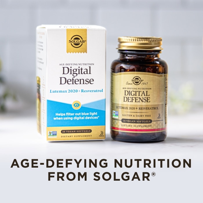
The packaging is a folding carton made from single-layer paperboard. It features a smooth, flat construction with clean edges and folds. The exterior is predominantly white with colorful accents, including blue and gold elements. The front displays the product name 'Digital Defense' prominently, along with a description of its benefits. The carton has a glossy finish that enhances its visual appeal. The sides contain additional product information and nutritional details, printed in a clear, readable font.

The packaging consists of a folding carton box that houses a glass bottle of dietary supplements. The carton is made of smooth, flat paperboard with clean edges and folds. It features a primarily white exterior with colorful graphics and text. The box has a front-facing panel displaying the product name 'Joint Ease' prominently, along with a supporting tagline. The bottle inside is dark amber glass with a screw-on lid, showcasing the product's contents. The overall design is clean and professional, suitable for retail display.

The packaging consists of a folding carton made of smooth, flat paperboard. It features clean edges and folds, with a predominantly white exterior and green accents. The front displays the product name 'Memory Support' prominently, along with a description of its benefits. The sides contain additional information about the product. The packaging has a glossy finish, enhancing its visual appeal.
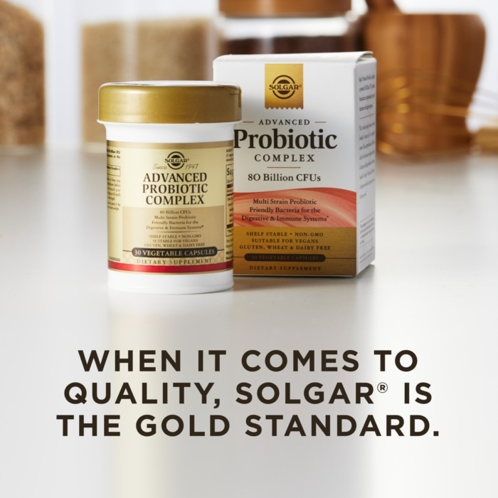
The packaging consists of a folding carton box that is smooth and flat, made from single-layer paperboard. The box features a clean, precise construction with sharp edges and folds. It has a glossy finish, showcasing vibrant colors and clear graphics. The front displays the product name 'Advanced Probiotic Complex' prominently, along with the quantity of '80 Billion CFUs'. The design includes a combination of white and gold colors, with black text for contrast. The overall appearance is professional and appealing for retail display.

The packaging consists of a folding carton and a glass bottle. The carton is primarily white with colorful graphics, featuring a smooth, flat construction without fluted layers. It has clean edges and folds, typical of retail packaging. The bottle is dark amber glass with a screw-on cap, containing dietary supplements. The overall design is modern and appealing, suitable for retail display.

The packaging consists of a smooth, flat construction made from single-layer paperboard. The box is predominantly white with colorful graphics featuring the product name 'Women’s Balancing Formula' prominently displayed. The edges are clean and precise, indicating a well-constructed folding carton. The front features a decorative image of the product's ingredients, and the overall design is appealing and informative.
About the Brand
Solgar operates as a direct-to-consumer provider of nutritional supplements, focusing on quality, research-driven formulations, and consumer trust. Their packaging consistently uses carton boxes and glass bottles, engineered for durability, clear branding, and regulatory compliance within the health sector.
The company’s packaging strategy reflects a blend of premium branding and functional design, with material choices such as single-layer paperboard cartons and amber glass bottles that optimize both product protection and consumer perception. Solgar’s approach includes small-batch production to ensure consistency and quality, aligning packaging formats with the evolving needs of health-conscious consumers. Sustainability considerations are evident in the use of recyclable materials and alignment with non-GMO, vegan, and gluten-free product claims.
Key Differentiator: Solgar differentiates itself through the combination of small-batch manufacturing, clinically-backed product development, and consistently branded, retail-ready packaging that enhances both product appeal and perceived quality.
Design System
Visual Style
Clean, modern typography with high legibility is paired with a predominantly white color palette accented by gold, green, blue, and other vibrant hues. The aesthetic is professional and scientific, reflecting trust and premium positioning.
Brand Identity
Logo is consistently placed on carton fronts, accompanied by the company name and product identifiers. Iconography is minimal and used to reinforce health claims or ingredient highlights. Visual consistency is maintained through uniform color blocking and precise alignment of graphic elements.
Packaging Design
Material selection favors single-layer paperboard for folding cartons, optimizing for both print quality and recyclability. Glass bottles are used for product protection, especially for sensitive compounds. Structural design prioritizes clean folds, sharp edges, and tamper-evident seals where necessary.
User Experience
Packaging design is oriented toward clarity and ease of use, with prominent product information and branding on primary panels. The unboxing process is straightforward yet engaging, supporting both in-store and direct-to-consumer channels. The design facilitates trust and encourages repeat purchase by reinforcing product quality and brand reliability.
Company Metrics
Business insights for Solgar based on available data
Market Positioning
Brand Values & Focus
Key Competitors
Target Market: Health-conscious consumers seeking premium, research-backed nutritional supplements across North America and other Tier I markets.
Packaging Assessment
Overall Grade
Visual appeal and presentation quality
Packaging durability and protection
Eco-friendliness and recyclable materials
Cost efficiency and value for money
Packaging assessment for Solgar based on industry standards and best practices
Frequently Asked Questions
What packaging materials does Solgar primarily use?
Solgar primarily uses single-layer paperboard folding cartons for outer packaging and dark amber glass bottles with screw-on caps for product containment, balancing shelf appeal with product protection.
How does Solgar address sustainability in its packaging?
Solgar integrates sustainability by utilizing recyclable paperboard for cartons and glass for bottles, and aligns with non-GMO, vegan, and gluten-free product positioning, although full life-cycle sustainability metrics are not publicly disclosed.
What is the focus of Solgar’s packaging design strategy?
Solgar’s packaging design emphasizes clarity, regulatory compliance, and strong brand identity, leveraging consistent color palettes, clear typography, and prominent logo placement.
Discover other Health companies
Explore more companies in the health industry and their packaging strategies
Comvita
Health
Comvita is a New Zealand-based company specializing in high-quality Mānuka honey and natural health products. Established in 1974, it aims to connect people with the healing power of nature.
Doctor Seaweed
Health
Doctor Seaweed specializes in natural, plant-based nutritional supplements derived from seaweed, aimed at promoting overall wellness.
Bio-Synergy
Health
Bio-Synergy is a UK-based company specializing in health and fitness products, including nutritional supplements and DNA testing kits. Their mission is to support individuals in achieving their health and fitness goals through innovative products and personalized insights.