So Body Co. packaging
So Body Co. specializes in collagen supplements and meal replacement shakes targeting age-related health and wellness concerns. The company utilizes visually distinctive, resealable pouch packaging and branded corrugated boxes to ensure strong shelf presence and secure delivery.
Packaging Portfolio
So Body Co.'s packaging portfolio centers on flexible, resealable stand-up pouches constructed from laminated plastics with both matte and glossy finishes. These pouches frequently incorporate transparent windows for product visibility and bold, high-contrast graphics for shelf differentiation. For shipping and larger sets, branded corrugated boxes are used, ensuring product security and reinforcing brand identity throughout the fulfillment process. This combination of lightweight flexible packaging and sturdy corrugated secondary packaging addresses both e-commerce logistics and consumer convenience.

The packaging consists of a corrugated box that is primarily brown in color, featuring a smooth exterior. Inside, there are multiple pouches of product and a recipe book. The box has visible fluted edges when viewed from the side, indicating its corrugated construction. The interior is designed to hold the products securely, with some cushioning provided by the box itself.

The packaging is a stand-up pouch made of a flexible material that allows it to maintain an upright position. It features a smooth, matte finish with a prominent pink and white color scheme. The front of the pouch displays the brand name 'SO BODY CO' in bold, large font, with the word 'SO' being particularly emphasized. The text is printed in white against a pink background, creating a striking contrast. There are additional details about the product, including '100% Natural' and 'Supports: Skin, Joints, Nails, Hair, Gut' in smaller font beneath the brand name. The back of the pouch likely contains nutritional information and usage instructions, although this is not visible in the image. The top of the pouch has a resealable zipper closure, which is a functional feature that allows for easy access and storage.
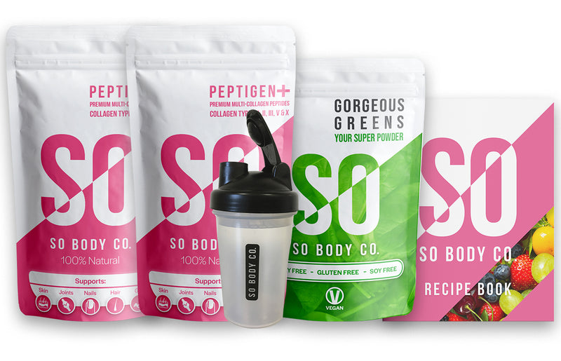
The image features multiple retail pouches and a shaker bottle. The pouches are made of a flexible material, likely a type of plastic or foil, with a matte finish. Each pouch has a resealable top and is designed for easy storage. The shaker bottle is transparent with a black lid and a mixing ball inside. The overall design is vibrant and colorful, with bold graphics and text.

The packaging is a stand-up pouch made of a flexible material, featuring a smooth surface with a matte finish. The front displays bold, pink lettering with the brand name 'SO BODY CO' prominently featured. The background is a lighter shade, creating a contrast that enhances readability. The pouch has a resealable top, which is common in flexible packaging, and a clear window at the bottom that allows visibility of the product inside.
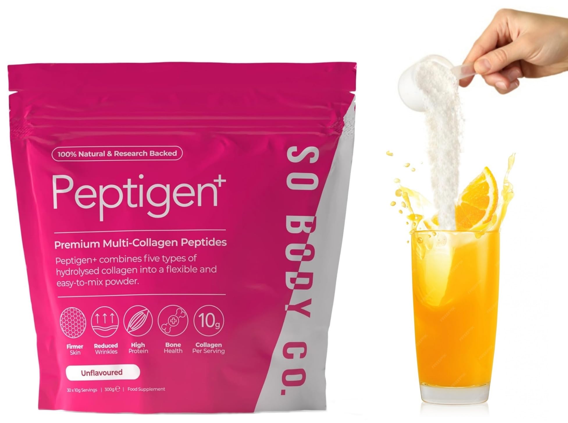
The packaging is a flexible pouch with a vibrant pink color, featuring a glossy finish. It has a resealable top and a clear window that showcases the product inside. The front displays the product name 'Peptigen+' prominently, along with key benefits and nutritional information. The edges are smooth and the construction appears to be heat-sealed.
About the Brand
So Body Co. operates in the UK health supplement sector, focusing on direct-to-consumer collagen-based products. Their packaging portfolio emphasizes vibrant branding, functional resealability, and a cohesive unboxing experience aligned with health and beauty positioning.
The company’s packaging approach leverages flexible stand-up pouches with matte and glossy finishes, as well as branded corrugated shipping boxes. These solutions provide product protection, ease of use, and strong visual identity, supporting both e-commerce fulfillment and in-home user experience. The brand prioritizes clear labeling, transparent product windows, and consistent color palettes to enhance consumer trust and perceived quality.
Key Differentiator: So Body Co. differentiates through cohesive branding and community-driven messaging, consistently reflected in their packaging choices and customer experience focus.
Design System
Visual Style
The visual design employs bold sans-serif typography, a vibrant pink and white color palette, and large, high-contrast text for key product benefits. The overall aesthetic is modern, energetic, and wellness-oriented.
Brand Identity
Brand identity is reinforced with prominent logo placement, consistent use of the 'SO BODY CO.' name, and the integration of health-focused iconography. Visual consistency extends across all packaging formats, maintaining uniform color schemes and design motifs.
Packaging Design
Material choices favor flexible, resealable pouches for primary packaging and corrugated board for shipping. The structural design prioritizes ease of use, resealability, and durability, with occasional inclusion of transparent windows to enhance product visibility and trust.
User Experience
Design decisions facilitate a user-friendly journey, from first unboxing to daily use. Resealable closures, clear labeling, and visually distinct branding support both functional needs and a positive emotional connection, enhancing customer retention and brand loyalty.
Company Metrics
Business insights for So Body Co. based on available data
Market Positioning
Brand Values & Focus
Key Competitors
Target Market: Health-conscious adults seeking age-defying supplements, with a focus on UK-based direct-to-consumer buyers interested in wellness, beauty, and community engagement.
Packaging Assessment
Overall Grade
Visual appeal and presentation quality
Packaging durability and protection
Eco-friendliness and recyclable materials
Cost efficiency and value for money
Packaging assessment for So Body Co. based on industry standards and best practices
Frequently Asked Questions
What types of packaging does So Body Co. use for its products?
So Body Co. primarily utilizes flexible, resealable stand-up pouches for supplements, complemented by branded corrugated boxes for shipping and presentation. These formats balance product protection, ease of storage, and strong visual branding.
How does So Body Co. address sustainability in its packaging?
While the packaging uses flexible plastics and corrugated fiberboard, the presence of resealable features and minimal over-packaging supports some waste reduction. However, the use of mixed materials may limit full recyclability.
How does the packaging support the customer experience?
Packaging is designed for both visual impact and usability, with resealable closures, clear product windows, and consistent branding enhancing both the initial unboxing and ongoing product use.
Discover other Health companies
Explore more companies in the health industry and their packaging strategies
Comvita
Health
Comvita is a New Zealand-based company specializing in high-quality Mānuka honey and natural health products. Established in 1974, it aims to connect people with the healing power of nature.
Lily & Loaf
Health
Lily & Loaf specializes in high-quality health and nutrition products, offering a range of supplements and vitamins aimed at supporting an active lifestyle. The company focuses on providing natural solutions for health and beauty.
Doctor Seaweed
Health
Doctor Seaweed specializes in natural, plant-based nutritional supplements derived from seaweed, aimed at promoting overall wellness.