SISSEL packaging
SISSEL specializes in ergonomic and wellness products for health-conscious consumers, utilizing branded carton packaging with a focus on product protection and retail presentation. Their packaging approach prioritizes clean design, material quality, and consistent brand messaging across a diverse product portfolio.
Packaging Portfolio
SISSEL’s packaging portfolio is centered around custom-printed, single-layer folding carton boxes tailored for retail and e-commerce channels. The primary material is recyclable paperboard, with both kraft and coated finishes to differentiate product lines. Packaging structures include flat rectangular cartons, display boxes with inner compartments, and retail cartons featuring transparent windows for product visibility. Design elements emphasize product imagery, multilingual labeling, and robust edge construction for product security during handling and shipping.
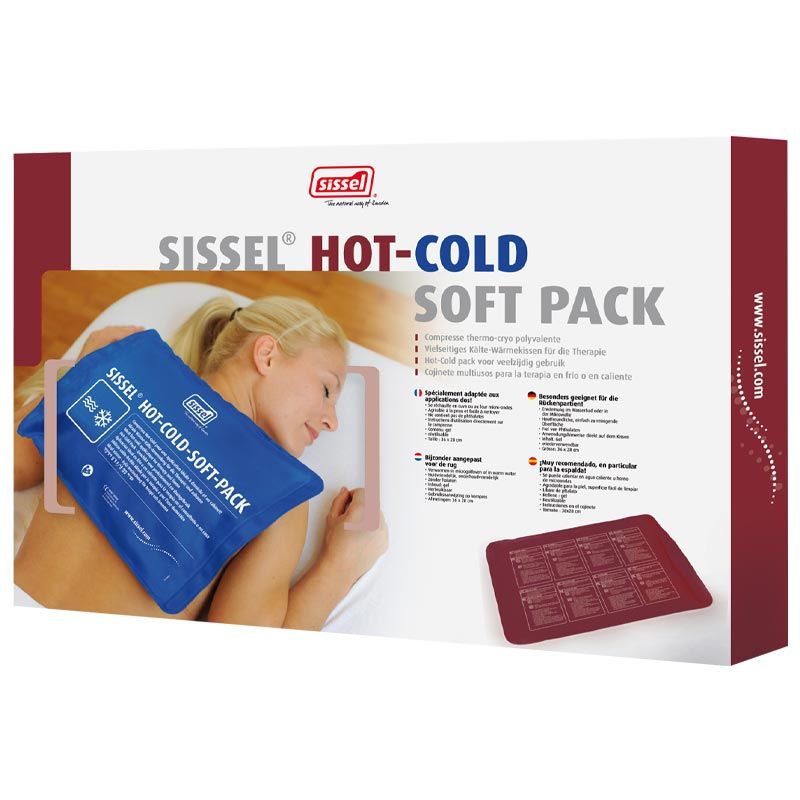
The packaging is a flat, rectangular folding carton with a smooth, single-layer paperboard construction. It features a predominantly white exterior with a vibrant red and blue design. The front displays a large image of the product in use, along with the product name 'SISSEL® HOT-COLD SOFT PACK' prominently featured in bold typography. The edges are clean and precise, and the carton has a glossy finish that enhances the visual appeal. The back includes product details and instructions in multiple languages, printed in a smaller font. The overall design is professional and aligns with retail packaging standards.
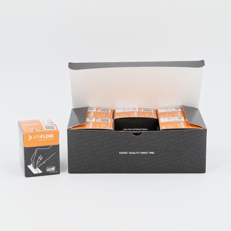
The packaging consists of a larger folding carton box that is primarily black with a glossy finish. The box has a lid that opens at the top, revealing smaller inner boxes. The inner boxes are orange with a white label design. The outer box features a clean, modern design with a subtle texture and a logo printed on the front. The edges are sharp and well-defined, indicating precise construction.
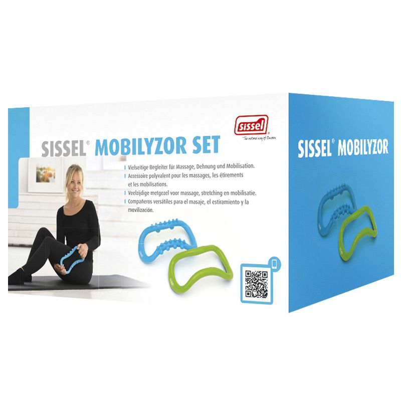
The packaging is a folding carton made of single-layer paperboard, featuring a smooth, flat construction without fluted layers. The box is predominantly blue with white accents, showcasing a clean and modern design. The edges are precise, and the folds are well-defined, indicating quality manufacturing. The front displays an image of a woman using the product, along with the product name and branding elements. The overall appearance is lightweight and suitable for retail display.

The packaging is a rectangular folding carton made from a single layer of paperboard. It features a smooth, flat surface with clean edges and precise folds. The exterior is predominantly kraft brown, giving it a natural look, while the front has a blue panel with product information. The design includes a white outline of a product, enhancing visual appeal.
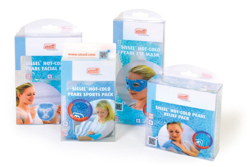
The packaging consists of several folding cartons made of smooth, flat paperboard. Each box has clean, precise edges and folds, with a glossy finish that enhances visual appeal. The boxes are predominantly white with colorful graphics and images related to the product. They feature a clear plastic top, allowing visibility of the contents inside. The design includes various product images and usage instructions, making it suitable for retail display.
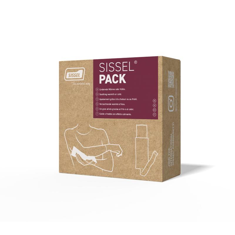
The packaging is a flat, rectangular box made of a single layer of paperboard. It features a smooth, brown kraft exterior with clean edges and precise folds. The front displays a large, bold logo and product name in white and maroon colors, with additional text and graphics on the sides. The box has a lightweight appearance and is designed for retail display.
About the Brand
SISSEL delivers a range of health and wellness products, including ergonomic furniture, sleep aids, and therapeutic devices, designed to enhance physical comfort and wellbeing. The company employs tailored carton packaging solutions optimized for both consumer appeal and functional protection.
With a business model centered on B2C e-commerce, SISSEL targets consumers seeking premium wellness solutions and professionals in the health sector. The brand leverages high-quality materials and detailed product information on packaging to support informed purchasing decisions. Their packaging reflects a balance between cost efficiency, visual branding, and logistics resilience, aligning with industry best practices for health-related goods.
Key Differentiator: SISSEL stands out for its cohesive brand identity and strong educational content, integrating product demonstration and customer engagement directly into its packaging and digital channels.
Design System
Visual Style
Clean sans-serif typography, a color palette prioritizing white, blue, maroon, and kraft brown, with a mix of glossy and matte finishes for shelf impact. Visual layouts are structured and image-forward, supporting product clarity.
Brand Identity
Consistent deployment of the SISSEL logo on all packaging, reinforced by standardized iconography and prominent product naming. Visual consistency is maintained through recurring color schemes and uniform placement of branding elements.
Packaging Design
Material selection favors lightweight, recyclable paperboard with precise construction for durability. Structural design prioritizes flat folding cartons optimized for protection, efficient stacking, and minimal material waste.
User Experience
Packaging is designed for intuitive unboxing, clear product identification, and immediate access to usage instructions. Visual hierarchy and branding enhance trust, while clear windows and product imagery improve consumer engagement and purchasing confidence.
Company Metrics
Business insights for SISSEL based on available data
Market Positioning
Brand Values & Focus
Key Competitors
Target Market: Health-conscious consumers, physical therapy professionals, and wellness retailers seeking ergonomic and therapeutic solutions.
Packaging Assessment
Overall Grade
Visual appeal and presentation quality
Packaging durability and protection
Eco-friendliness and recyclable materials
Cost efficiency and value for money
Packaging assessment for SISSEL based on industry standards and best practices
Frequently Asked Questions
What types of packaging does SISSEL use for its products?
SISSEL primarily uses single-layer, folding paperboard cartons with custom printing, incorporating both glossy and matte finishes. Their packaging is designed for retail display and includes product imagery, multilingual instructions, and prominent branding.
How does SISSEL address sustainability in its packaging?
SISSEL utilizes recyclable paperboard materials for most cartons, minimizing plastic elements and favoring designs that reduce excess material use. However, some use of glossy coatings and clear plastic windows is noted, which may impact overall recyclability.
What are the main considerations for SISSEL's packaging design?
Key considerations include product protection during transit, clear brand communication, retail display visibility, and ease of use for consumers. Packaging often features consistent color schemes, bold logos, and informative graphics.
Discover other Health companies
Explore more companies in the health industry and their packaging strategies
Comvita
Health
Comvita is a New Zealand-based company specializing in high-quality Mānuka honey and natural health products. Established in 1974, it aims to connect people with the healing power of nature.
Bio-Synergy
Health
Bio-Synergy is a UK-based company specializing in health and fitness products, including nutritional supplements and DNA testing kits. Their mission is to support individuals in achieving their health and fitness goals through innovative products and personalized insights.
Doctor Seaweed
Health
Doctor Seaweed specializes in natural, plant-based nutritional supplements derived from seaweed, aimed at promoting overall wellness.