Schuessler Tissue Salts packaging
Schuessler Tissue Salts, an Australian health brand, delivers natural mineral-based wellness products supported by over 150 years of experience. Their packaging strategy centers on retail-ready carton boxes and durable bottles, prioritizing clear brand communication and consumer trust.
Packaging Portfolio
Schuessler Tissue Salts employs a packaging portfolio centered on single-layer, folding carton boxes for solid and liquid supplements, complemented by rigid plastic bottles with child-resistant closures. The material selection—primarily paperboard and HDPE/PET—allows for high-quality printing, brand color accuracy, and regulatory labeling. Cartons are structurally designed for shelf stability and retail presentation, while bottles are optimized for product safety and dosage control. The consistent use of glossy finishes, clear typography, and standardized brand elements supports both visual differentiation and ease of consumer navigation in the health product space.
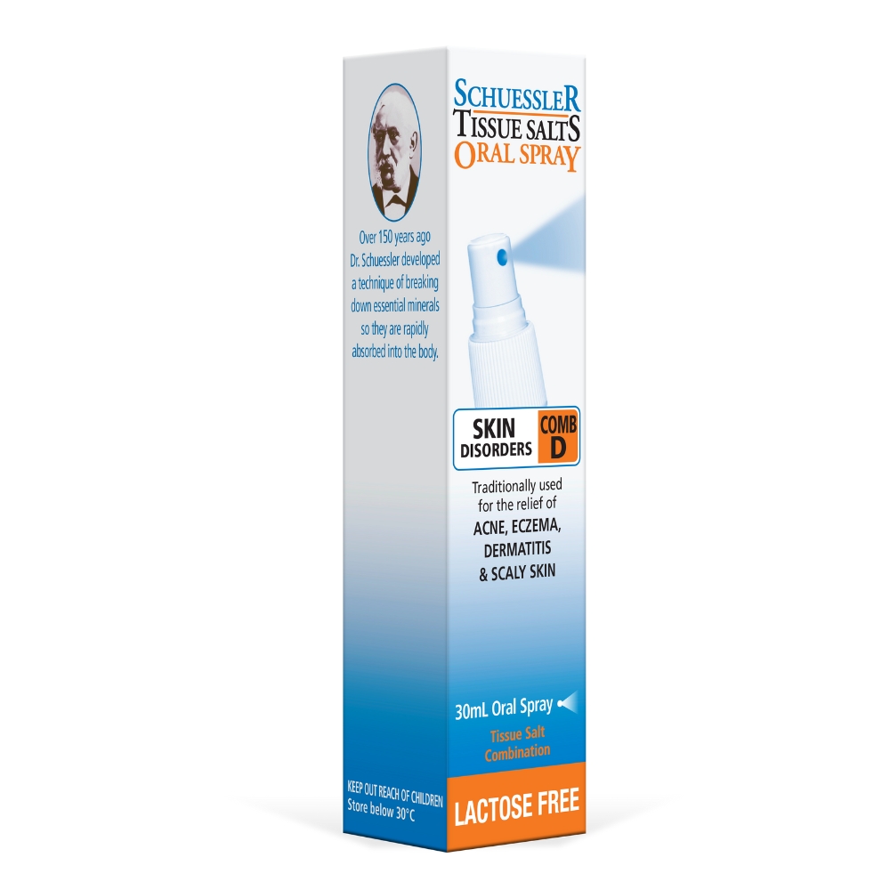
The packaging is a tall, slender carton with a smooth, flat construction. It features a white base color with a glossy finish. The front displays a prominent image of a spray nozzle and includes text indicating the product type and volume. The edges are clean and precise, with no visible fluted layers, confirming it is made from single-layer paperboard. The design includes a blue gradient at the top and bottom, with a contrasting orange stripe. The back contains additional product information and instructions.
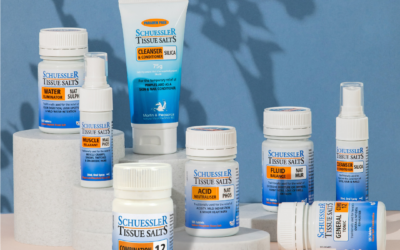
The packaging consists of various small, cylindrical containers and tubes, all made from smooth, flat paperboard. Each container has clean, precise edges and folds, indicative of a folding carton design. The colors are predominantly white with blue and orange accents, featuring a glossy finish that enhances visual appeal. The containers are labeled with product names and descriptions, utilizing clear, legible fonts. The overall arrangement suggests a retail display, emphasizing product visibility and accessibility.
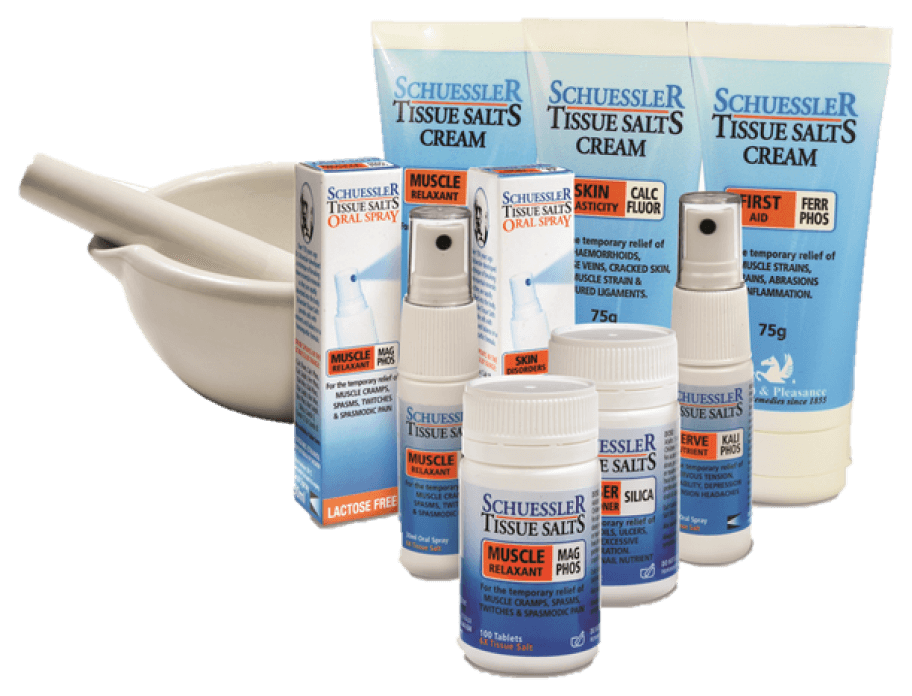
The image features several retail cartons and bottles for Schuessler Tissue Salts products. The cartons are made of smooth, flat paperboard with clean edges and folds, showcasing a glossy finish. Each carton is predominantly white with colorful graphics and text. The bottles are made of plastic, featuring a sleek design with a pump or spray nozzle. The overall arrangement suggests a retail display, with a mortar and pestle in the background, indicating a pharmacy or health-related context.
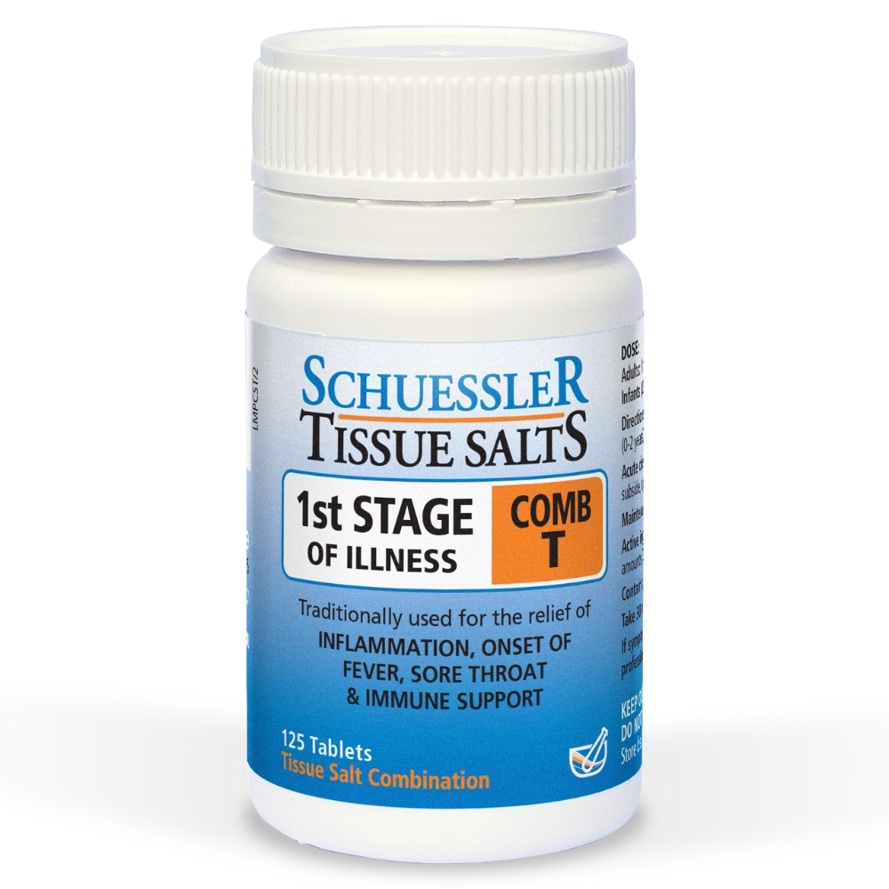
The packaging is a small, cylindrical bottle with a white plastic cap. The bottle is primarily white with a clear label that features colorful graphics. The label includes product information, dosage instructions, and branding elements. The cap has a child-resistant design, indicating a secure closure. The overall shape is compact, suitable for retail display.

The packaging is a tall, slender box designed for retail display, made from a single layer of paperboard. It features a smooth, flat construction without any visible fluted layers, indicating it is a carton box. The exterior is primarily white with colorful graphics and text. The box has clean edges and precise folds, typical of retail packaging. The front displays product information prominently, while the sides may include additional details or instructions.
About the Brand
Schuessler Tissue Salts specializes in homeopathically prepared mineral salt products for holistic health, focusing on tablets, oral sprays, creams, and children's formulations. The brand maintains a direct-to-consumer model, emphasizing Australian manufacturing and strict quality control. Packaging is engineered to balance product safety, regulatory compliance, and retail presentation.
With a compact team and a history rooted in traditional wellness, Schuessler Tissue Salts leverages folding carton boxes and child-resistant plastic bottles, each tailored to the product’s format and usage requirements. Their packaging consistently employs white substrates with blue and orange accents, optimizing shelf visibility and reinforcing brand identity. The combination of informative labeling and robust structural design aligns with the expectations of health-conscious consumers seeking transparency and assurance regarding product integrity.
Key Differentiator: Schuessler Tissue Salts distinguishes itself through its heritage in mineral salt therapy, Australian-made credentials, and a packaging system that prioritizes both regulatory compliance and end-user confidence.
Design System
Visual Style
The visual design leverages a clean, clinical aesthetic with a predominantly white background, accented by blue and orange hues. Typography is clear and modern, favoring high legibility for ingredient and dosage information. The overall presentation is professional, aligning with industry expectations for health and wellness brands.
Brand Identity
Logo and company name are consistently placed on all primary and secondary packaging. Iconography is minimal, focusing on clarity and compliance. Visual consistency is maintained through standardized color usage and uniform font choices across product lines.
Packaging Design
Material selection prioritizes lightweight, recyclable paperboard for exterior cartons and robust plastics for primary containers. Structural design focuses on secure closures, tamper evidence, and optimized retail display, with an emphasis on information clarity and accessibility.
User Experience
Packaging is designed to support a straightforward consumer journey, from easy identification on shelves to clear instructions for use. The combination of intuitive structures and detailed labeling enhances trust and usability, reinforcing the brand's reputation for reliability in the health sector.
Company Metrics
Business insights for Schuessler Tissue Salts based on available data
Market Positioning
Brand Values & Focus
Key Competitors
Target Market: Health-conscious consumers in Australia seeking natural remedies and mineral-based supplements, including families and individuals interested in holistic wellness.
Packaging Assessment
Overall Grade
Visual appeal and presentation quality
Packaging durability and protection
Eco-friendliness and recyclable materials
Cost efficiency and value for money
Packaging assessment for Schuessler Tissue Salts based on industry standards and best practices
Frequently Asked Questions
What types of packaging does Schuessler Tissue Salts use for its products?
The brand utilizes single-layer folding carton boxes for tablets, oral sprays, and creams, alongside child-resistant plastic bottles and tubes designed for secure closure and product preservation.
How does Schuessler Tissue Salts address sustainability in packaging?
Paperboard cartons are generally recyclable, and the use of minimal, single-material structures supports eco-friendly disposal, though plastic components may limit overall recyclability.
What is the primary focus of the brand's packaging design?
The design emphasizes clear labeling, consistent branding, and practical formats that enhance both retail display and consumer usability.
Discover other Health companies
Explore more companies in the health industry and their packaging strategies
Smart Protein
Health
Smart Protein is dedicated to transforming nutrition by providing a range of health and wellness products focused on protein supplements and vitamins.
Doctor Seaweed
Health
Doctor Seaweed specializes in natural, plant-based nutritional supplements derived from seaweed, aimed at promoting overall wellness.
Lily & Loaf
Health
Lily & Loaf specializes in high-quality health and nutrition products, offering a range of supplements and vitamins aimed at supporting an active lifestyle. The company focuses on providing natural solutions for health and beauty.