Santarome Bio packaging
Santarome Bio is a Paris-based health supplement company specializing in organic dietary products. Their packaging strategy emphasizes retail-ready carton formats, combining strong brand visibility with eco-conscious material choices.
Packaging Portfolio
Santarome Bio utilizes single-layer, recyclable paperboard folding cartons as the primary packaging format across its product lines. These retail cartons are engineered for high shelf impact, featuring precise edges, clean folds, and vibrant, health-centric graphics. Select products incorporate secondary packaging, such as opaque plastic bottles, particularly for gummies. The packaging consistently includes organic certification badges, vegan claims, and product-specific imagery, ensuring regulatory compliance and clear consumer communication.

The packaging consists of a folding carton box for the Griffonia Rhodiola product and a plastic bottle for the Somnifor gummies. The carton box features a smooth, flat construction with clean edges and folds, primarily in a colorful design with images of the plant and product information. The bottle is made of opaque plastic with a screw-on cap, displaying a label with branding and product details.

The packaging is a folding carton made of single-layer paperboard, featuring a smooth, flat construction. It has a rectangular shape with clean, precise edges and folds. The exterior is predominantly white with vibrant colors depicting flowers and herbal elements, indicative of the product's natural ingredients. The front displays the product name 'DÉTOX BIO' prominently, along with a visual representation of the herbs used. The packaging has a matte finish, giving it a soft touch.

The packaging consists of three distinct retail cartons, each featuring a smooth, flat construction typical of single-layer paperboard. The cartons are predominantly white with colorful graphics and text. Each carton has clean, precise edges and folds, indicating a well-constructed design. The front of each carton displays vibrant colors, with the brand name 'Santarôme BIO' prominently featured. The design includes various icons and text that highlight the product's features, such as '100% PURE' and 'BIO'. The overall appearance is clean and professional, suitable for retail display.

The packaging is a folding carton made from single-layer paperboard. It features a smooth, flat construction with clean edges and folds. The box is predominantly colored with a vibrant blue background, accented by various floral graphics and product information. The front displays the product name 'SOMNIFOR' prominently, along with a badge indicating 'MEILLEUR PRODUIT PHARMA 2025'. The overall design is visually appealing, aimed at retail presentation.

The packaging consists of three individual folding cartons, each made from smooth, flat paperboard. The boxes are primarily white with vibrant green accents and feature clean, precise edges and folds. Each box has a glossy finish, enhancing the visual appeal. The front of each box prominently displays the product name, along with colorful images of ingredients, and a small logo indicating organic certification. The back and sides contain additional product information and usage instructions. The boxes are lightweight and designed for retail display.
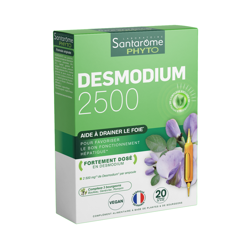
The packaging is a folding carton made of smooth, single-layer paperboard. It features a rectangular shape with clean, precise edges and folds. The exterior is predominantly white with vibrant green accents, and the front displays the product name prominently. The overall appearance is lightweight and retail-friendly, suitable for shelf display.
About the Brand
Santarome Bio produces a diverse range of natural health supplements, focusing on organic ingredients and direct-to-consumer distribution. Their packaging approach centers on folding carton boxes designed for shelf presence and consumer trust.
The company leverages consistent branding across its product portfolio, utilizing recyclable paperboard cartons and clear visual cues to communicate product benefits and organic certifications. Packaging is engineered for both logistical efficiency and consumer engagement, reflecting the brand’s commitment to sustainability and transparency.
Key Differentiator: Santarome Bio’s key differentiator is the integration of organic certification, high-impact brand visuals, and recyclable materials, aligning their packaging with both regulatory expectations and evolving consumer preferences for sustainability.
Design System
Visual Style
Typography prioritizes legibility with clean, sans-serif fonts; the color palette employs white backgrounds accented by greens, blues, and vibrant botanicals to signal natural and organic qualities. Overall, the aesthetic is modern, crisp, and health-focused.
Brand Identity
Logo is always prominently placed on the front panel, accompanied by consistent iconography for certifications and product benefits. Visual consistency is maintained through uniform placement of brand elements, color usage, and imagery across all SKU packaging.
Packaging Design
Material selection favors recyclable single-layer paperboard, optimized for lightweight shipping and retail stacking. Structural design emphasizes rectangular folding cartons with matte or glossy finishes and clear demarcation of product information, reflecting a balance between cost-efficiency and shelf appeal.
User Experience
Packaging is designed for straightforward opening and clear information access, enhancing the customer journey from shelf to unboxing. Colorful visuals and certification logos reinforce trust, while precise structure supports product protection and ease of use.
Company Metrics
Business insights for Santarome Bio based on available data
Market Positioning
Brand Values & Focus
Key Competitors
Target Market: Health-conscious consumers in France and Europe seeking organic, natural dietary supplements and wellness solutions.
Packaging Assessment
Overall Grade
Visual appeal and presentation quality
Packaging durability and protection
Eco-friendliness and recyclable materials
Cost efficiency and value for money
Packaging assessment for Santarome Bio based on industry standards and best practices
Frequently Asked Questions
What packaging materials does Santarome Bio primarily use?
Santarome Bio predominantly utilizes single-layer paperboard folding cartons for primary packaging, supplemented by plastic bottles for certain products like gummies. The cartons are designed to be lightweight, recyclable, and suitable for shelf display.
How does Santarome Bio ensure packaging sustainability?
The brand uses recyclable paperboard as its main packaging material and incorporates organic certification logos and eco-friendly messaging on pack, reflecting a commitment to reduced environmental impact.
How does the packaging support the unboxing experience?
Packaging features vibrant graphics, prominent branding, and clean structural design, resulting in a visually appealing and informative unboxing process.
Discover other Health companies
Explore more companies in the health industry and their packaging strategies
Comvita
Health
Comvita is a New Zealand-based company specializing in high-quality Mānuka honey and natural health products. Established in 1974, it aims to connect people with the healing power of nature.
Lily & Loaf
Health
Lily & Loaf specializes in high-quality health and nutrition products, offering a range of supplements and vitamins aimed at supporting an active lifestyle. The company focuses on providing natural solutions for health and beauty.
Bio-Synergy
Health
Bio-Synergy is a UK-based company specializing in health and fitness products, including nutritional supplements and DNA testing kits. Their mission is to support individuals in achieving their health and fitness goals through innovative products and personalized insights.