Ruka Hair packaging
Ruka Hair specializes in high-quality hair solutions, including half wigs and clip-ins, tailored for diverse hair types and preferences. Their packaging portfolio leverages minimalist, brand-forward designs and a mix of flexible pouches, carton boxes, and cosmetic jars to reinforce a premium, modern unboxing experience.
Packaging Portfolio
Ruka Hair’s packaging system comprises flexible pouches for sample and single-use products, retail folding cartons for core SKUs, and rigid chipboard jars for premium cosmetic items. All structures utilize single-layer paperboard or chipboard, favoring lightweight yet protective formats optimized for e-commerce fulfillment. Designs are predominantly minimalist, featuring white backgrounds, bold sans-serif typography, and strategic use of accent colors and graphics for differentiation. The mix of formats addresses both protection in transit and shelf impact, while the material selection balances print quality with moderate environmental sustainability.

The packaging consists of three individual pouches made from a thin, flexible material. Each pouch is rectangular with rounded corners and features a clean, smooth surface. The pouches are primarily white with a glossy finish, enhancing their visual appeal. The front of each pouch prominently displays the brand name 'Ruka' in bold, black sans-serif font, along with product information in smaller text. The overall design is minimalist, focusing on clarity and brand visibility.

The packaging consists of two folding cartons made from single-layer paperboard. Each box features a smooth, flat construction without any visible fluted layers. The boxes are predominantly white with colorful graphics printed on the sides. The edges are clean and precise, indicating a well-constructed design. The boxes are lightweight and have a retail-friendly appearance, suitable for display.
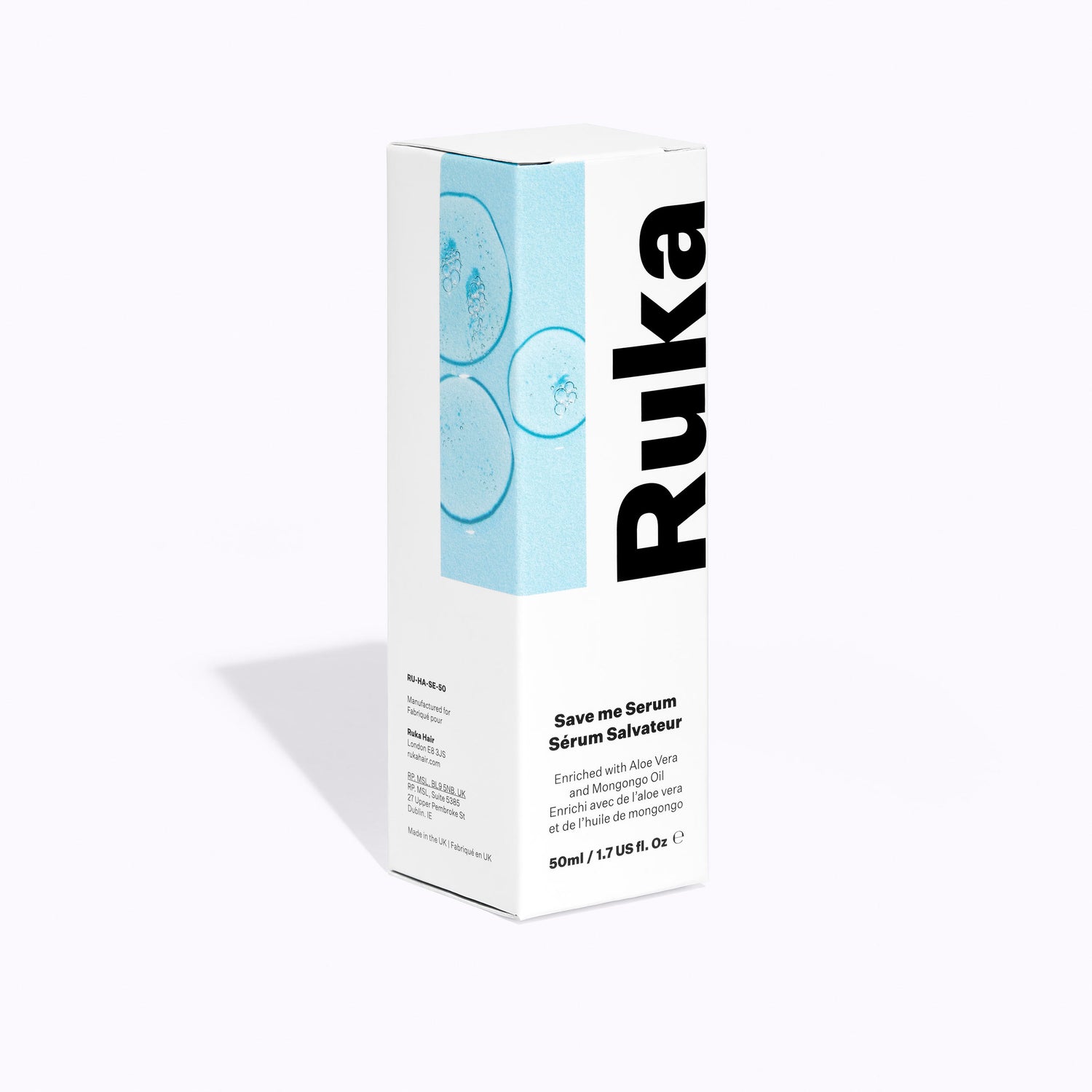
The packaging is a tall, rectangular box made of smooth, single-layer paperboard. It features a clean, flat construction with precise edges and folds. The box has a matte finish with a light blue background and a prominent black typography for the brand name 'Ruka'. The front showcases a graphic of circular elements, likely representing the product's ingredients, enhancing its visual appeal.
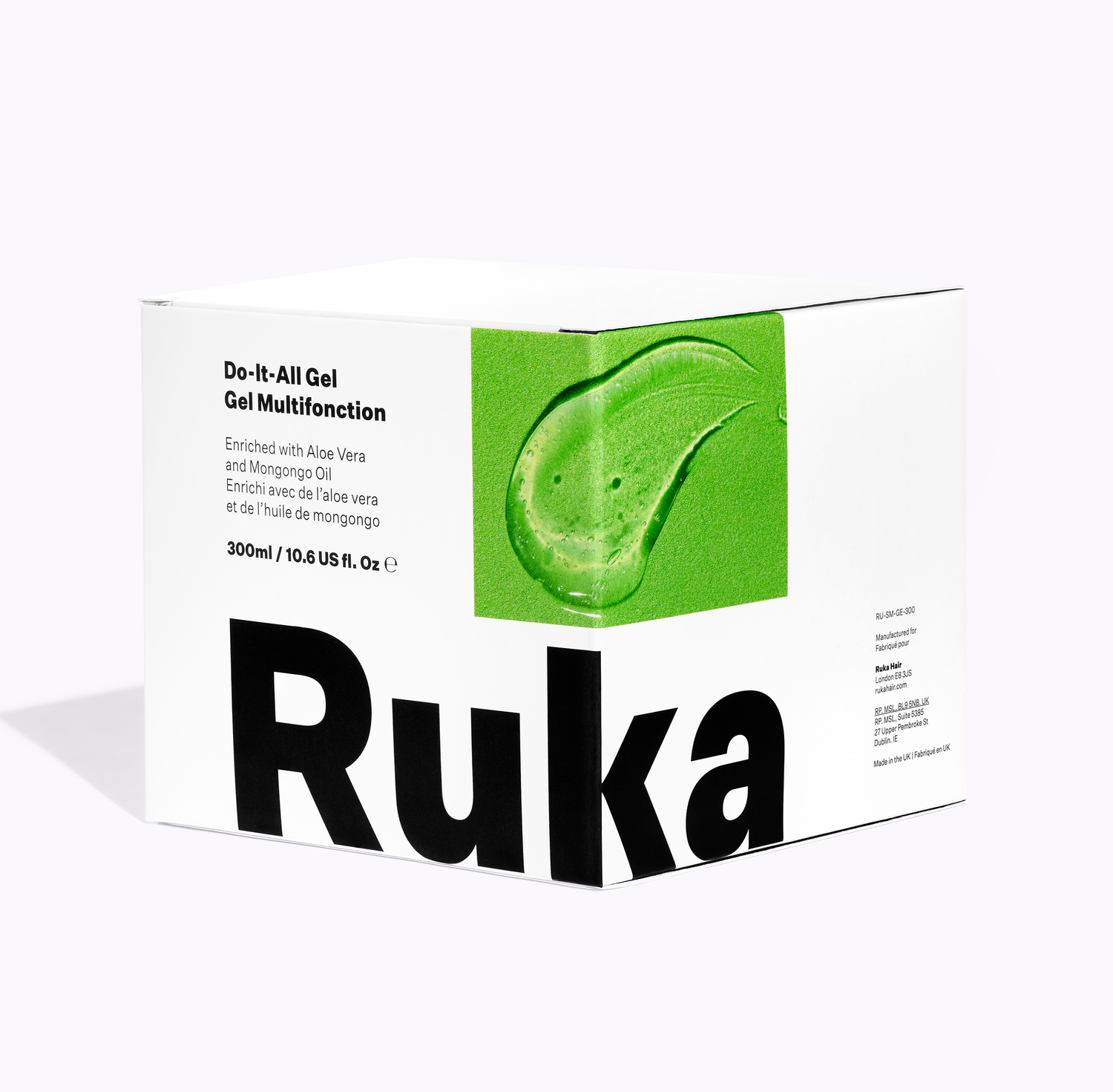
The packaging is a folding carton made from a single layer of paperboard. It features a smooth, flat construction with clean edges and folds. The exterior is predominantly white with a vibrant green graphic that resembles a gel droplet, which is likely a product representation. The brand name 'Ruka' is prominently displayed in large, bold black letters on one side. The overall design is modern and minimalistic, appealing to a contemporary audience.

The packaging is a cylindrical jar made of thick, sturdy chipboard with a smooth, matte finish. The jar has a clean, minimalist design with a white exterior and a black label featuring the brand name 'Ruka' in bold, sans-serif font. The lid is flush with the top of the jar, indicating a secure closure. The overall appearance is sleek and modern, suitable for cosmetic products.
About the Brand
Ruka Hair is a direct-to-consumer beauty brand focused on innovative hair products, particularly half wigs and clip-ins, catering to a diverse audience. Their packaging approach emphasizes brand clarity and consistent visual identity, utilizing a combination of flexible pouches, retail cartons, and rigid jars. This ensures product integrity while aligning with contemporary beauty industry standards.
Operating primarily online, Ruka Hair delivers products in packaging that balances visual appeal, protection, and retail readiness. The brand prioritizes minimalist design, featuring bold typography and color accents that enhance shelf presence and customer recognition. Packaging selections are made to optimize the customer journey, from unboxing satisfaction to product usability, while also supporting logistics efficiency.
Key Differentiator: Ruka Hair’s packaging stands out for its blend of modern design minimalism, strong brand integration, and tailored material choices that support both product protection and a premium customer experience.
Design System
Visual Style
The visual design employs modern sans-serif typography, a clean white primary palette accented by black and vibrant secondary colors (green, blue), and a minimalist layout. The overall aesthetic is contemporary, with clear hierarchy and restrained graphic elements.
Brand Identity
Brand name 'Ruka' is consistently presented in bold, large font; logo usage is direct and highly visible. Iconography is minimal, relying on simple geometric forms and product-representative graphics. Visual consistency is maintained across packaging types through uniform color schemes and typographic treatments.
Packaging Design
Material choices include recyclable single-layer paperboard for cartons and chipboard for jars, with some flexible plastic pouches for select SKUs. Structural design prioritizes clean folds, secure closures, and flat, printable surfaces to maximize branding. The philosophy centers on balancing protection, shelf appeal, and sustainability.
User Experience
Packaging is designed to support a seamless customer journey, from first impression through unboxing. Clear labeling and straightforward opening mechanisms enhance usability, while the premium, consistent design fosters brand trust and encourages repeat engagement.
Company Metrics
Business insights for Ruka Hair based on available data
Market Positioning
Brand Values & Focus
Key Competitors
Target Market: Ruka Hair targets beauty-conscious consumers seeking premium, versatile hair solutions, with a focus on women aged 18-40 who prioritize high-quality, aesthetically pleasing products and value a strong brand community.
Packaging Assessment
Overall Grade
Visual appeal and presentation quality
Packaging durability and protection
Eco-friendliness and recyclable materials
Cost efficiency and value for money
Packaging assessment for Ruka Hair based on industry standards and best practices
Frequently Asked Questions
What types of packaging does Ruka Hair use for its products?
Ruka Hair utilizes flexible packaging (such as individual pouches), folding carton boxes for retail display, and rigid cosmetic jars. All formats are designed with a minimalist aesthetic and emphasize brand visibility.
How does Ruka Hair's packaging enhance the customer experience?
The packaging is crafted to deliver a visually appealing and consistent unboxing experience, with attention to clear branding, modern design, and practical structures that protect products during transit.
Is Ruka Hair’s packaging environmentally friendly?
Ruka Hair primarily uses recyclable paperboard and chipboard materials, offering moderate sustainability. However, the use of flexible plastic pouches may limit overall eco-friendliness compared to fully compostable or recycled options.
Discover other Beauty & Fitness companies
Explore more companies in the beauty & fitness industry and their packaging strategies
Orris Paris
Beauty & Fitness
Orris Paris specializes in creating artisanal skincare products that combine potent botanical ingredients with modern cleansing rituals. The company emphasizes natural, holistic practices in its formulations.
Institut Karité Paris
Beauty & Fitness
Institut Karité Paris specializes in luxury beauty products made with natural Shea Butter, offering a wide range of skincare and body care solutions. The brand combines Parisian heritage with a commitment to quality and creativity in its offerings.
Cultiv Cosmetique
Beauty & Fitness
Cultiv Cosmetique is a French skincare brand that provides organic and eco-friendly beauty products inspired by nature. They focus on effective skincare solutions for various skin concerns.