Revive Active packaging
Revive Active specializes in premium nutritional supplements, leveraging scientifically formulated ingredients for health and wellness. Their packaging strategy utilizes visually engaging, branded carton boxes designed for both shelf impact and consumer convenience.
Packaging Portfolio
Revive Active's packaging portfolio centers on single-layer, glossy paperboard carton boxes engineered for retail display and e-commerce shipment. The cartons feature vibrant, brand-consistent color schemes, clean structural folds, and precise edge finishes. Each box is tailored to product variants and often houses individual sachets, optimizing portion control and reducing contamination risk. While the cartons are recyclable, there is currently limited evidence of advanced eco-design elements beyond standard material selection.
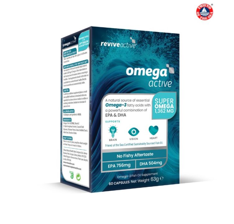
The packaging is a rectangular folding carton made from smooth, flat paperboard. It features a predominantly blue and white color scheme with vibrant graphics depicting waves, which aligns with the product's theme of omega-3 supplements. The edges are clean and precise, with no visible fluted layers, indicating it is not corrugated. The box has a glossy finish that enhances the visual appeal. The front displays the product name 'omega active' prominently, along with key benefits and a nutritional breakdown. The sides contain additional product information and usage instructions.

The packaging is a folding carton made from single-layer paperboard. It has a smooth, flat construction with clean edges and folds. The exterior features a vibrant green color with a glossy finish, prominently displaying the brand name 'revive active' in white text. The design includes a burst graphic in the background, suggesting energy and vitality. The box is rectangular with a top flap that folds down, and the sides are neatly folded and glued. There are no visible signs of wear or damage, indicating it is in new condition.

The packaging is a folding carton made from a single layer of paperboard, featuring a smooth, flat construction. The box is predominantly green with vibrant orange and white accents, showcasing a clean design with precise edges and folds. The front displays the product name 'revive active' prominently, along with a description of the product and its flavor. The sides and back contain additional product information and nutritional details, printed in a clear, readable font.

The packaging consists of a flat, smooth construction with clean edges and folds, indicative of a single-layer paperboard carton. The exterior features a glossy finish with vibrant green and white colors, prominently displaying the brand name 'revive active' along with product information and promotional text. The boxes are designed to stand upright, showcasing the front and side panels effectively.

The packaging consists of two retail cartons, both made from smooth, single-layer paperboard. The cartons have clean, precise edges and folds, with a glossy finish. The front of each carton prominently features the brand name 'revive active' in bold, white lettering against a vibrant green and blue background, respectively. The design includes additional text describing the product benefits and flavor, with colorful graphics enhancing the visual appeal.
About the Brand
Revive Active delivers a diverse portfolio of health supplements aimed at consumers seeking energy, immunity, cognitive, and general wellness benefits. Their direct-to-consumer model enables tailored product offerings and streamlined logistics. Packaging is a key touchpoint, with a focus on clear branding and ease of use.
The brand's product range includes energy boosters, vitamins, and cognitive enhancers, each packaged in compact, single-layer paperboard cartons. These structures support both shelf presence and efficient distribution, with an emphasis on bold color palettes and clear typography to reinforce brand identity. Packaging is designed for practicality, frequently using sachets for single-serve dosing.
Key Differentiator: Revive Active differentiates itself through specialized, super-absorbable powdered supplement formats and highly recognizable, consistent carton packaging that aligns with its science-led wellness positioning.
Design System
Visual Style
The design employs bold, sans-serif typography for clarity, a bright color palette dominated by greens, blues, and whites, and a glossy finish to enhance shelf appeal. Graphics include dynamic bursts and wave motifs to reinforce energy and vitality themes.
Brand Identity
Logo is always prominently displayed on the front panel, paired with clear product descriptors. Iconography is minimal but consistent, supporting rapid recognition. Visual hierarchy is maintained with strong contrast and legible text.
Packaging Design
Material choices prioritize single-layer paperboard for cost efficiency and recyclability. Structural designs are standardized folding cartons, selected for ease of stacking, shipping, and in-store presentation. Form factors are optimized for secondary packaging and retail requirements.
User Experience
Packaging supports the customer journey with easy-to-open flaps, intuitive product information placement, and single-serve sachets for convenience. The overall design communicates health benefits and brand trust, enhancing user engagement from unboxing through product use.
Company Metrics
Business insights for Revive Active based on available data
Market Positioning
Brand Values & Focus
Key Competitors
Target Market: Health-conscious consumers across multiple age groups, including children, teens, and adults seeking premium nutritional supplements.
Packaging Assessment
Overall Grade
Visual appeal and presentation quality
Packaging durability and protection
Eco-friendliness and recyclable materials
Cost efficiency and value for money
Packaging assessment for Revive Active based on industry standards and best practices
Frequently Asked Questions
What types of packaging does Revive Active use for its supplements?
Revive Active primarily utilizes single-layer paperboard carton boxes for retail packaging, often containing sachets for individual servings. Cartons are designed for visual consistency and easy storage.
How does Revive Active ensure product safety during shipping?
The use of rigid, well-constructed carton packaging provides moderate protection for products during transit, helping to minimize damage and preserve product integrity.
Is Revive Active's packaging environmentally sustainable?
The cartons are generally recyclable, but there is limited evidence of advanced sustainability features such as compostable materials or reduced ink usage.
Discover other Health companies
Explore more companies in the health industry and their packaging strategies
Comvita
Health
Comvita is a New Zealand-based company specializing in high-quality Mānuka honey and natural health products. Established in 1974, it aims to connect people with the healing power of nature.
Bio-Synergy
Health
Bio-Synergy is a UK-based company specializing in health and fitness products, including nutritional supplements and DNA testing kits. Their mission is to support individuals in achieving their health and fitness goals through innovative products and personalized insights.
Lily & Loaf
Health
Lily & Loaf specializes in high-quality health and nutrition products, offering a range of supplements and vitamins aimed at supporting an active lifestyle. The company focuses on providing natural solutions for health and beauty.