retrosuperfuture® packaging
Retrosuperfuture® is a Milan-based eyewear brand recognized for its design-forward approach and premium product lines. Their packaging strategy integrates minimalist visual elements and robust structural formats to reinforce a luxury unboxing experience while supporting brand visibility.
Packaging Portfolio
Retrosuperfuture® employs a diverse packaging mix tailored to luxury eyewear, prioritizing rigid boxes with matte finishes and high structural integrity for product protection and brand elevation. Folding cartons are used for selected retail lines, often incorporating vibrant graphics and precision folds indicative of automated production. Across both formats, branding remains prominent through bold typographic treatments and logo application, while packaging inserts—such as cloths and informational cards—add functional and sensory value. The selection of high-quality paperboard and rigid substrates demonstrates a clear alignment with premium retail standards.
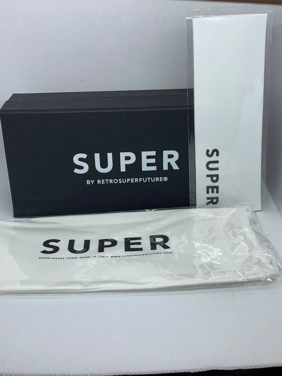
The packaging consists of a thick, sturdy black box with a matte finish, featuring a clean, minimalist design. The box has a rectangular shape with a lid that fits snugly over the base. The exterior is adorned with bold white text that reads 'SUPER' prominently on the front, along with 'BY RETROSUPERFUTURE®' in smaller text. Inside, there is a white protective cloth or sleeve that also displays the word 'SUPER' in black, suggesting a premium presentation for sunglasses. The overall aesthetic is sleek and modern, indicative of high-end product packaging.
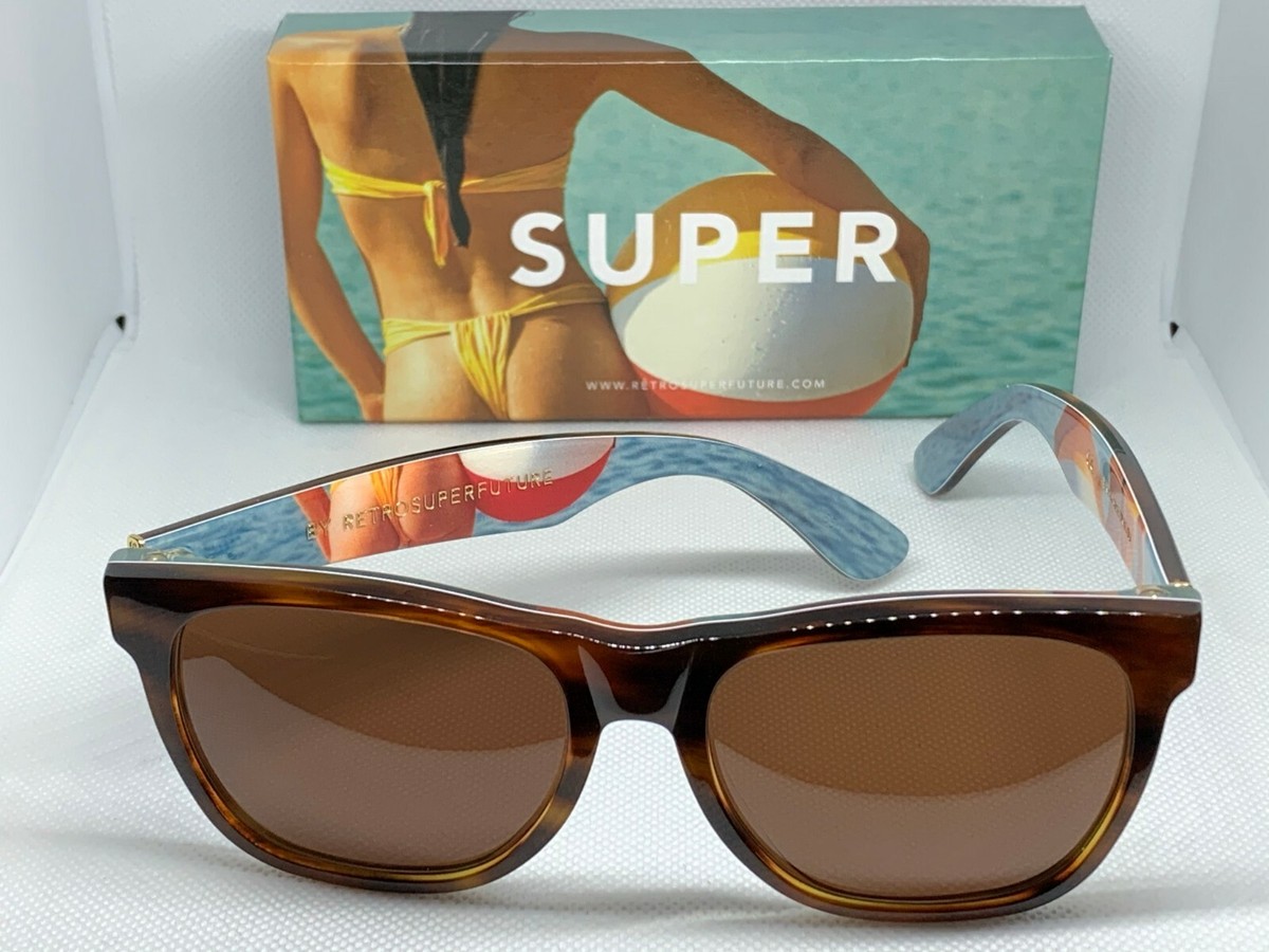
The packaging is a sturdy, rectangular box featuring a high-quality finish. The exterior is predominantly a soft matte texture with a vibrant image of a model in swimwear, suggesting a summer or beach theme. The box has clean edges and a luxurious appearance, indicative of premium eyewear packaging. The interior is likely designed to securely hold the sunglasses, providing protection and an upscale presentation.

The packaging consists of two distinct boxes: one is a rectangular rigid box with a smooth, matte finish in a light beige color, while the other is a smaller, cylindrical box in a dark gray color with a textured surface. Both boxes feature clean, precise edges and folds, indicative of high-quality construction. The larger box has a flat lid that fits snugly over the base, while the smaller box is rolled and secured, resembling a pouch.

The packaging consists of a sturdy, thick-walled box with a premium appearance. The box is rectangular and features a clean, white exterior with a matte finish. The top of the box prominently displays the word 'SUPER' in bold, black letters, suggesting a luxury brand. The interior is likely designed to securely hold sunglasses, with a snug fit to prevent movement. There are also additional items such as cleaning cloths and informational cards included, indicating thoughtful packaging design.

The packaging is a rectangular, flat carton with smooth, flat construction. It features clean, precise edges and folds, indicative of a folding carton design. The exterior is a muted gray color with a matte finish, giving it a sophisticated appearance. The front displays the brand name 'RETROSUPERFUTURE' prominently in a bold, orange font, along with the word 'AS PESI' in a smaller font. The overall design is minimalistic and modern, aligning with contemporary retail aesthetics.
About the Brand
Retrosuperfuture® specializes in contemporary eyewear and apparel, leveraging a direct-to-consumer model to deliver products globally. The brand’s packaging approach emphasizes high-quality materials and precise construction, aligning with its focus on craftsmanship and innovation.
Operating out of Milan, Retrosuperfuture® applies a disciplined packaging strategy characterized by minimalist rigid boxes and folding cartons, each designed to enhance the premium positioning of its eyewear. Packaging consistently features bold typography, matte finishes, and clear brand identifiers, ensuring visual alignment with modern luxury standards. While prioritizing aesthetics and protection, the company’s packaging choices also reflect a moderate commitment to sustainability, balancing high-end presentation with practical logistics.
Key Differentiator: The brand distinguishes itself through a cohesive, visually striking packaging system that leverages minimalist design principles and robust structures to amplify the customer’s unboxing experience and reinforce brand recall.
Design System
Visual Style
The visual style is defined by minimalist typography, predominantly sans-serif fonts, and a restrained color palette centered on monochrome tones with occasional bold accents (e.g., orange, black, white, beige). Matte finishes and clean, geometric layouts reinforce a contemporary, high-end aesthetic.
Brand Identity
Consistent use of the 'RETROSUPERFUTURE' and 'SUPER' logos across all packaging surfaces, supported by straightforward iconography and clear, legible text. Visual consistency is maintained through uniform placement and scale of branding elements, ensuring strong recognition across product lines.
Packaging Design
Material selection centers on rigid boxes and premium folding cartons, emphasizing durability and tactile quality. Structural designs are minimalist, with an emphasis on clean edges, snug-fitting lids, and protective interiors tailored for eyewear. Packaging reflects a philosophy of understated luxury and functional protection.
User Experience
Packaging is designed to heighten customer anticipation and satisfaction through high-quality materials, secure product placement, and a seamless unboxing sequence. Visual coherence and tactile finishes enhance perceived value, supporting the brand’s positioning in the premium eyewear segment.
Company Metrics
Business insights for retrosuperfuture® based on available data
Market Positioning
Brand Values & Focus
Key Competitors
Target Market: Fashion-conscious consumers seeking premium eyewear with a focus on design, quality, and brand prestige, predominantly in Europe and North America.
Packaging Assessment
Overall Grade
Visual appeal and presentation quality
Packaging durability and protection
Eco-friendliness and recyclable materials
Cost efficiency and value for money
Packaging assessment for retrosuperfuture® based on industry standards and best practices
Frequently Asked Questions
What types of packaging does retrosuperfuture® use for its eyewear products?
Retrosuperfuture® utilizes a combination of rigid boxes and folding cartons, featuring minimalist graphics, matte finishes, and structural reinforcement to ensure product safety and a luxury presentation. Packaging is consistently branded and designed for both in-store and e-commerce contexts.
How does retrosuperfuture®'s packaging contribute to the customer experience?
Packaging is engineered to deliver a premium unboxing experience, using clean lines, bold typography, and protective inserts to create a sense of anticipation and reinforce the brand’s image as a trendsetter in fashion eyewear.
Is sustainability a focus in retrosuperfuture®'s packaging strategy?
While the brand’s packaging emphasizes quality and aesthetics, its commitment to sustainability is moderate, with some use of recyclable materials but limited evidence of advanced eco-friendly initiatives.
Discover other Apparel companies
Explore more companies in the apparel industry and their packaging strategies
Alexander Shorokhoff
Apparel
Alexander Shorokhoff is a luxury watch manufacturer that specializes in creating unique and artistic timepieces. Their products blend traditional craftsmanship with modern designs, appealing to discerning customers worldwide.
Sneakers ER
Apparel
Sneakers ER is a retailer specializing in premium sneaker care products, including cleaners and protectors. They offer a variety of products designed to maintain and enhance the longevity of sneakers.
SUICOKE JAPAN
Apparel
SUICOKE specializes in high-quality footwear and apparel, focusing on unique designs and comfort. The brand is recognized for its innovative sandals and commitment to quality craftsmanship.