Real Roots packaging
Real Roots delivers natural health supplements, foods, and wellness e-books through a direct-to-consumer model, emphasizing clean, modern packaging that aligns with industry standards for health products. Their packaging approach integrates eco-friendly materials and a minimalist aesthetic to enhance product appeal and reinforce brand credibility.
Packaging Portfolio
Real Roots employs a packaging mix centered on rigid plastic supplement bottles, glass or high-grade plastic jars, and reusable textile tote bags. All primary packaging features clean, matte-finish labels with clear branding and nutritional information, supporting regulatory compliance and enhancing product transparency. The use of durable structures ensures product protection during transit, while eco-conscious materials such as reusable bags demonstrate a commitment to sustainability. This approach balances shelf appeal, protection, and user convenience, reflecting best practices in health product packaging.
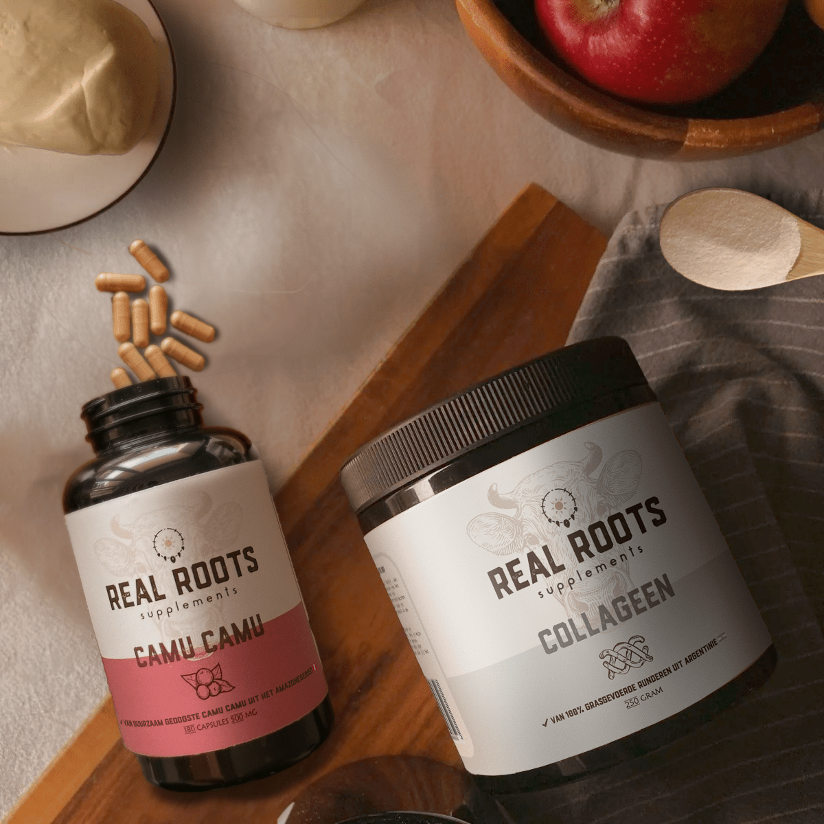
The packaging consists of two distinct containers: a bottle and a jar. The bottle is cylindrical with a black cap and features a label that is predominantly white with pink accents. The label includes the product name 'Camu Camu' and the brand name 'REAL ROOTS supplements'. The jar is also cylindrical, with a black lid and a label that is primarily white, displaying the product name 'COLLAGEN' in bold lettering. Both containers have a clean and modern design, emphasizing the brand's focus on health supplements.

The packaging consists of a black plastic bottle with a white label. The bottle is cylindrical with a screw-on cap. The label features a clean design with a circular logo at the top, product name 'REAL ROOTS APPLE PEARL LEVER' prominently displayed in bold font, and additional text below. The overall appearance is sleek and modern, suitable for health supplements.

The packaging is a black tote bag with two sturdy handles. It appears to be made of a durable fabric material, likely cotton or a similar textile, allowing for flexibility and reusability. The bag has a simple, clean design with a prominent logo printed on the front. The surface is smooth with a matte finish, and the handles are sewn securely to the bag, providing strength for carrying items.

The packaging is a rigid jar with a thick, sturdy construction, typically made of glass or high-quality plastic. The jar has a wide mouth and a screw-on lid, providing a secure closure. The surface is smooth with a glossy finish, showcasing the product inside. The label wraps around the jar, featuring a clean design with a white background and colored accents.

The image features several supplement bottles with a premium appearance. Each bottle is cylindrical, made of opaque plastic, and has a thick, sturdy construction that suggests durability. The labels are cleanly applied, with a matte finish that enhances the overall luxury feel. The bottles are arranged on a surface with some capsules spilled around them, indicating their contents. The color scheme is primarily white with black text, contributing to a minimalist aesthetic.
About the Brand
Real Roots operates within the health sector, offering a curated selection of natural supplements, foods, and lifestyle products via an online platform. The brand’s packaging strategy is characterized by the use of rigid boxes, supplement bottles, and reusable bags, prioritizing both product protection and consumer perception.
The packaging consistently employs high-quality plastics and rigid containers, complemented by reusable textile bags for eco-conscious consumers. Visual design choices favor a minimalist, modern aesthetic with clear labeling and subtle color accents, ensuring compliance with health industry regulations and enhancing shelf presence. Real Roots' brand identity is reinforced through consistent logo placement, label design, and material selection tailored for both functional and emotional impact.
Key Differentiator: Real Roots distinguishes itself through clean, premium packaging that fuses eco-friendly materials with a strong, health-focused brand identity.
Design System
Visual Style
Typography leans toward modern sans-serif fonts for clarity and readability, paired with a neutral-to-earthy color palette (white, black, cream, and natural accent colors). The overall aesthetic is minimalist, supporting a premium health and wellness positioning.
Brand Identity
Brand visuals prioritize the Real Roots logo and company name on all packaging, with consistent use of iconography and a restrained color scheme for instant recognition. Labels are designed for legibility, featuring product names in bold type and subtle graphic elements to differentiate categories.
Packaging Design
Material selection favors recyclable plastics and glass for rigidity, paired with textile for reusable bags. Structural design emphasizes secure closures, durability, and ease of use, with a focus on protection and tamper evidence for supplements.
User Experience
Packaging supports the customer journey from online purchase to unboxing, offering both visual appeal and functional assurance. Clear labeling and ergonomic structures improve usability and reinforce trust, while eco-friendly options cater to the values of the target market.
Company Metrics
Business insights for Real Roots based on available data
Market Positioning
Brand Values & Focus
Key Competitors
Target Market: Health-conscious consumers in the Netherlands and broader EU seeking reliable, natural supplements and eco-friendly lifestyle products via direct online purchasing.
Packaging Assessment
Overall Grade
Visual appeal and presentation quality
Packaging durability and protection
Eco-friendliness and recyclable materials
Cost efficiency and value for money
Packaging assessment for Real Roots based on industry standards and best practices
Frequently Asked Questions
What types of packaging formats does Real Roots use for its products?
Real Roots utilizes rigid plastic supplement bottles, glass or plastic jars, and reusable textile tote bags, each designed to optimize product safety, brand consistency, and sustainability.
How does Real Roots ensure its packaging aligns with sustainability goals?
The company incorporates reusable bags and prioritizes recyclable materials for many product containers, aiming to reduce environmental impact while maintaining product integrity.
Does the packaging design contribute to the customer experience?
Yes, the minimalist and modern design enhances both the visual unboxing experience and reinforces confidence in product quality, supporting positive customer interaction.
Discover other Health companies
Explore more companies in the health industry and their packaging strategies
Smart Protein
Health
Smart Protein is dedicated to transforming nutrition by providing a range of health and wellness products focused on protein supplements and vitamins.
Lily & Loaf
Health
Lily & Loaf specializes in high-quality health and nutrition products, offering a range of supplements and vitamins aimed at supporting an active lifestyle. The company focuses on providing natural solutions for health and beauty.
Bio-Synergy
Health
Bio-Synergy is a UK-based company specializing in health and fitness products, including nutritional supplements and DNA testing kits. Their mission is to support individuals in achieving their health and fitness goals through innovative products and personalized insights.