Puresport packaging
Puresport delivers high-performance nutritional supplements targeted at athletes and fitness enthusiasts, utilizing a direct-to-consumer model. Their packaging strategy emphasizes clean, minimalistic visual branding and a mix of flexible sachets, rigid jars, and carton boxes engineered for both product protection and shelf appeal.
Packaging Portfolio
Puresport’s packaging portfolio consists primarily of flexible single-serve sachets, rigid glass jars with matte-finish lids, and single-layer carton boxes. Flexible sachets are used for individual supplement doses, optimizing convenience and portion control while supporting on-the-go usage. Rigid jars, often glass, provide enhanced product protection and a premium feel, while carton boxes are utilized for bundled products and retail display. The materials and structures are chosen for visual clarity, product integrity, and alignment with a minimalist, health-focused brand identity.
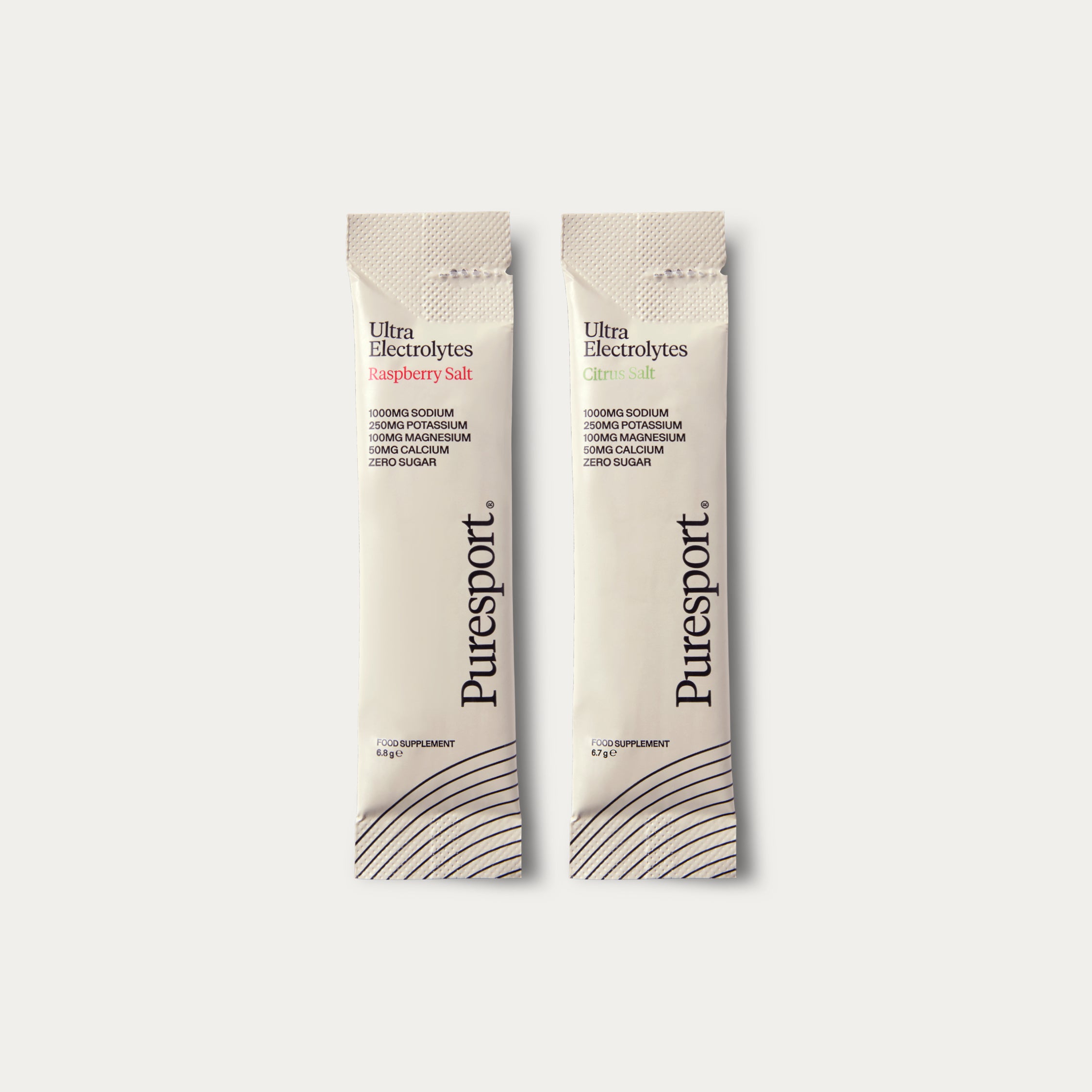
The packaging consists of two individual sachets, each containing a powdered supplement. The sachets are elongated and have a smooth, flat construction. They feature a white background with a matte finish, and the edges are cleanly sealed. The design includes a simple, modern aesthetic with a focus on readability.

The packaging is a narrow, elongated sachet designed for single-use. It features a smooth, flat construction without any visible fluted layers, indicating it is made from flexible materials. The sachet is primarily white with a matte finish, giving it a clean and modern appearance. The top edge is slightly crimped, suggesting a heat-sealed closure. The overall shape is rectangular, with rounded corners, and it appears lightweight and easy to handle.
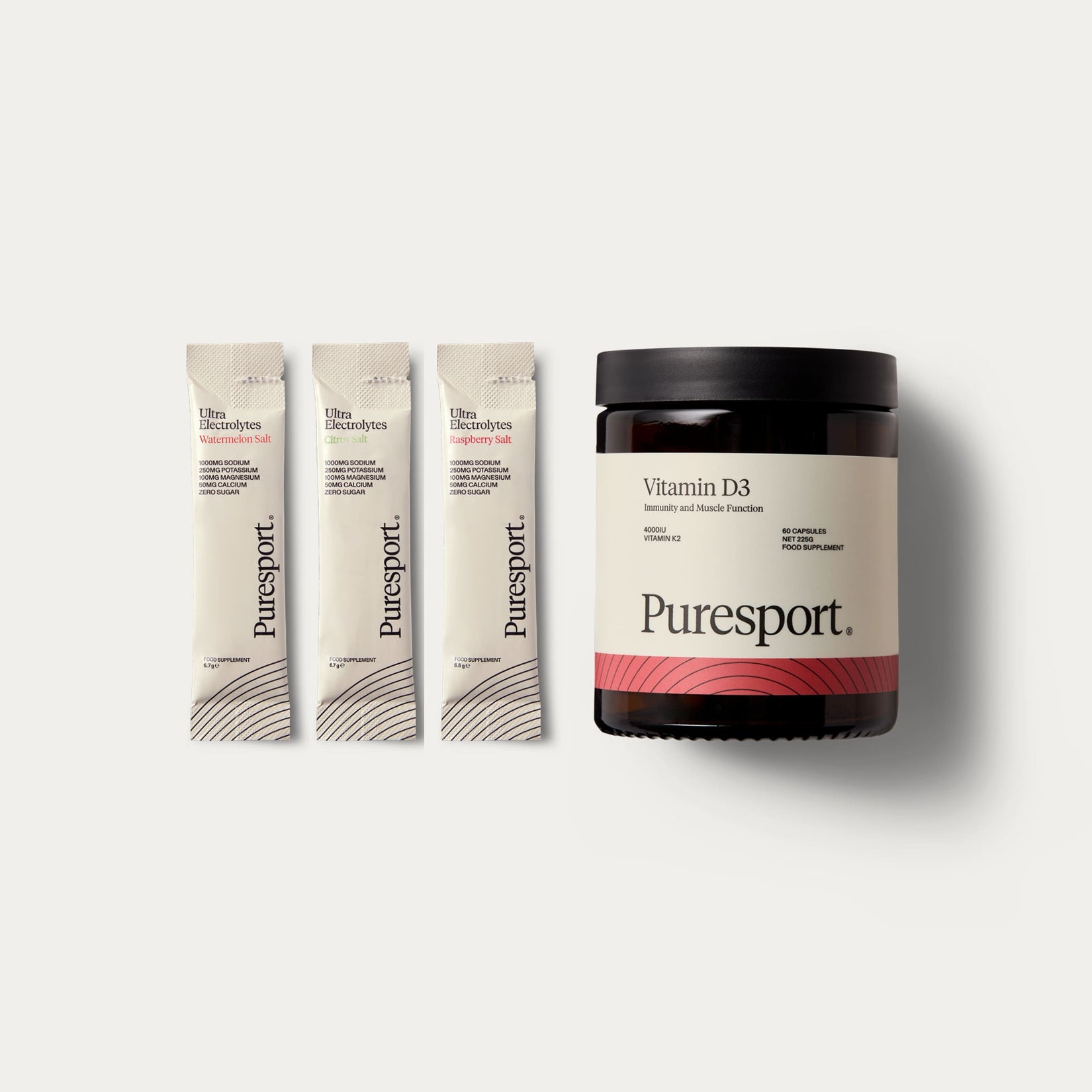
The packaging consists of a dark, round jar made of glass or a similar rigid material, featuring a matte black lid. The jar is labeled with a clean, minimalist design that includes the product name 'Vitamin D3' and the brand name 'Puresport' prominently displayed. Next to the jar are three individual sachets, each containing a powdered supplement. The sachets are slim and rectangular, with a smooth surface and a simple design that includes the brand's logo and product information. The overall presentation is sleek and modern, appealing to health-conscious consumers.

The packaging consists of four individual folding cartons, each with a smooth, flat construction. The boxes are predominantly white with colored bases that feature horizontal stripes in varying colors (orange, purple, blue, and yellow). Each box has a clean, precise edge and fold, indicative of a single-layer paperboard construction. The overall design is minimalistic, with a focus on typography and color contrast.

The packaging consists of two dark glass jars with black lids. Each jar has a label that wraps around its circumference, displaying product names and branding elements. The jars have a smooth, glossy finish, and the labels feature a clean design with contrasting colors. The overall shape is cylindrical, and the jars are designed to hold dietary supplements.
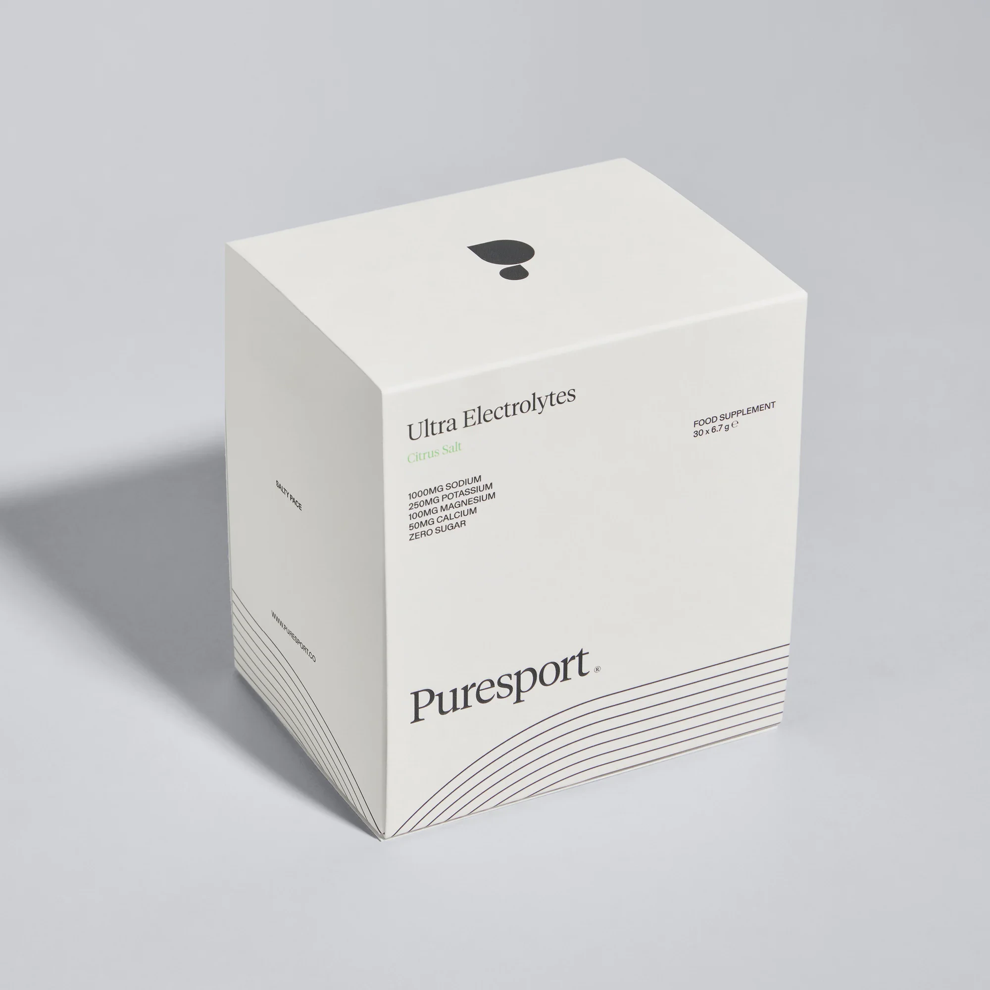
The packaging is a smooth, flat, single-layer carton box with clean edges and precise folds. It features a predominantly white exterior with minimalistic design elements. The box has a square shape and is designed for retail display. The surface is matte with a smooth finish, giving it a modern look.
About the Brand
Puresport specializes in scientifically-formulated supplements for hydration, recovery, and cognitive performance, catering to individuals seeking long-term health benefits. The brand's packaging reflects a dedication to quality and modern aesthetics, employing a consistent minimalist approach across various formats to enhance both product integrity and user trust.
Operating from London, Puresport addresses the needs of both casual and competitive athletes with a diverse supplement portfolio. The company leverages customer engagement and feedback, integrating these insights into packaging choices that balance brand consistency, safety, and environmental considerations. Their packaging architecture prioritizes functionality and visual clarity, supporting a premium market positioning while enabling efficient logistics.
Key Differentiator: Puresport differentiates itself through a community-driven ethos and a steadfast commitment to high-performance, evidence-based formulations, reflected in its cohesive, minimalist packaging design and strong brand consistency.
Design System
Visual Style
Typography is set in clean, sans-serif fonts with high readability; the color palette features a dominant white base with accent colors (orange, purple, blue, yellow) and occasional dark, matte finishes. The overall aesthetic is contemporary minimalism, supporting a perception of clinical efficacy and trust.
Brand Identity
Logo usage is prominent yet restrained, with consistent placement across all SKUs. Iconography is minimal, focusing on essential product information. Visual consistency is maintained through uniform label layouts, color coding by product type, and strict adherence to a minimalist grid system.
Packaging Design
Material selection prioritizes glass and paperboard for recyclable, premium packaging, supplemented by flexible laminates for sachets. Structural design focuses on product security, ease of use, and shelf presence, with heat-sealed closures and tamper-evident features in select formats.
User Experience
Packaging is engineered for clarity and ease of access, enhancing the customer journey from unboxing to daily use. The minimalist design and clear labeling support trust and quick product identification, while premium tactile finishes reinforce the brand's high-performance positioning.
Company Metrics
Business insights for Puresport based on available data
Market Positioning
Brand Values & Focus
Key Competitors
Target Market: Health-conscious athletes and fitness enthusiasts seeking high-quality, science-backed supplements with an emphasis on hydration, recovery, and cognitive support.
Packaging Assessment
Overall Grade
Visual appeal and presentation quality
Packaging durability and protection
Eco-friendliness and recyclable materials
Cost efficiency and value for money
Packaging assessment for Puresport based on industry standards and best practices
Frequently Asked Questions
What types of packaging formats does Puresport use for its supplements?
Puresport utilizes a mix of flexible single-use sachets, rigid glass jars, and carton boxes, each selected for optimal product protection, shelf presence, and consumer convenience.
How does Puresport address sustainability in its packaging?
While the brand uses recyclable glass and paperboard materials for many products, there is limited public information on advanced eco-friendly initiatives or the use of compostable/biodegradable materials.
What visual design principles define Puresport’s packaging?
Puresport’s packaging features a minimalist design with clean typography, restrained color palettes, and prominent branding, supporting a premium and health-focused perception.
Discover other Health companies
Explore more companies in the health industry and their packaging strategies
Doctor Seaweed
Health
Doctor Seaweed specializes in natural, plant-based nutritional supplements derived from seaweed, aimed at promoting overall wellness.
Lily & Loaf
Health
Lily & Loaf specializes in high-quality health and nutrition products, offering a range of supplements and vitamins aimed at supporting an active lifestyle. The company focuses on providing natural solutions for health and beauty.
Bio-Synergy
Health
Bio-Synergy is a UK-based company specializing in health and fitness products, including nutritional supplements and DNA testing kits. Their mission is to support individuals in achieving their health and fitness goals through innovative products and personalized insights.