Pure & Care packaging
Pure & Care is a Danish beauty brand offering skincare solutions with a strong emphasis on natural ingredients and daily self-care. Their packaging approach leverages flexible pouches and carton boxes that reflect modern aesthetics, focusing on both product protection and brand identity.
Packaging Portfolio
Pure & Care’s packaging portfolio is built around flexible film pouches, retail sachets, and carton boxes, chosen for their lightweight structure and product protection. The flexible packaging often features heat-sealed edges and easy-open notches, supporting both convenience and product integrity. Carton boxes are employed for select items, providing additional rigidity and shelf presence. Material selection demonstrates a blend of cost-effective plastics and paperboard, with some movement toward biodegradable and recyclable substrates to meet sustainability benchmarks in the beauty industry.

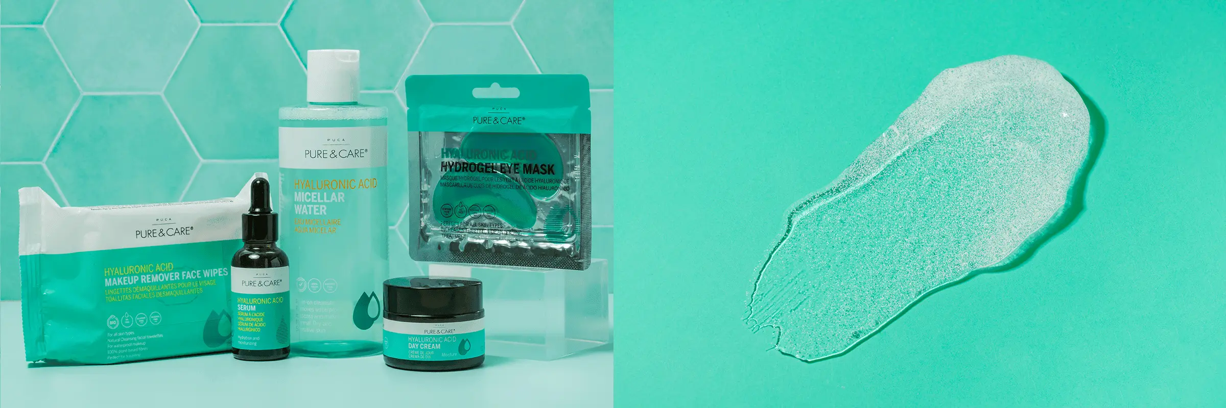
The image features multiple packaging types for skincare products. The main packaging includes a white rectangular carton with a smooth, flat construction, showcasing clean edges and folds. It has a glossy finish and is likely made of single-layer paperboard. The carton displays vibrant turquoise and black graphics with product information and branding elements prominently featured. Additionally, there is a flexible pouch for the micellar water, which has a matte finish and is designed for easy dispensing. The overall arrangement includes a glass dropper bottle and a jar, both with minimalistic designs that align with modern skincare aesthetics.

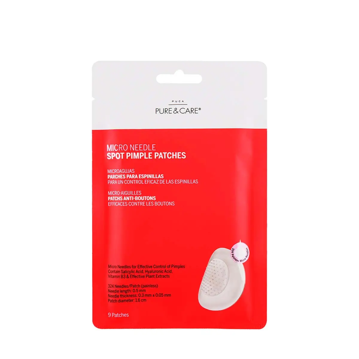
The packaging is a flat pouch made of a flexible material, likely a type of plastic or laminated film. It features a smooth surface with a glossy finish. The front displays a vibrant red background with white text, indicating product information. The design includes a clear window showing the product inside, enhancing visibility. The edges are sealed, and the top may have a notch for easy opening.

The image displays a variety of skincare products, including a sheet mask in a flat pouch, a bottle of cleansing water, a jar of cream, and makeup remover wipes. The sheet mask packaging is a flexible pouch with a smooth finish, while the cleansing water is in a cylindrical bottle with a pump. The jar has a twist-off lid, and the wipes are packaged in a resealable pouch. The overall color scheme is predominantly blue with white accents.

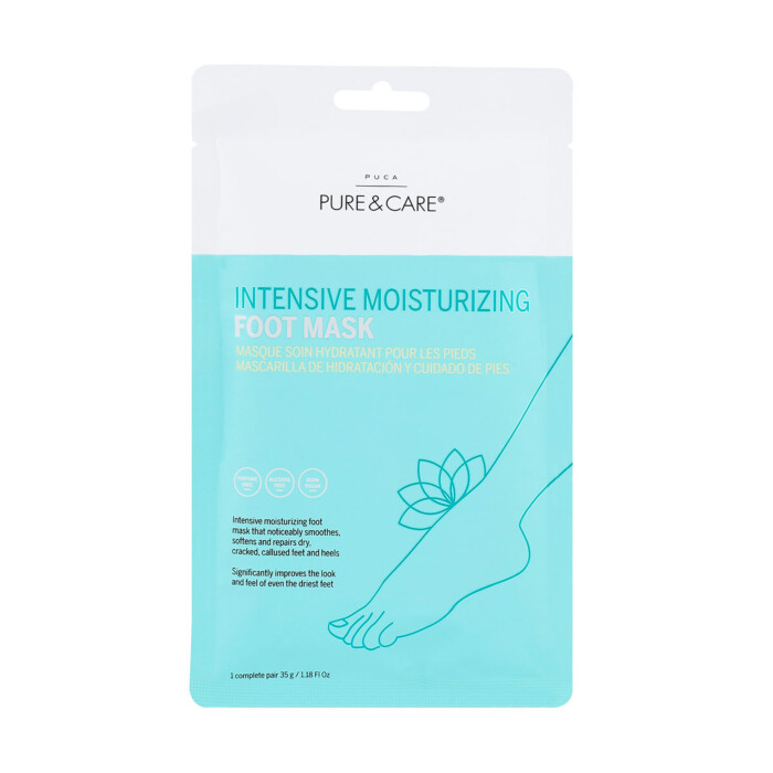
The packaging consists of a flat pouch made from a flexible material, likely a multi-layer film. The front features a prominent design with a light turquoise background and white text, showcasing the product name 'INTENSIVE MOISTURIZING FOOT MASK'. The design includes a graphic of a foot with a leaf, suggesting a natural or soothing aspect. The edges of the pouch are sealed, indicating a heat-sealed closure typical of flexible packaging. The back of the pouch likely contains product information and instructions, although this is not visible in the image.

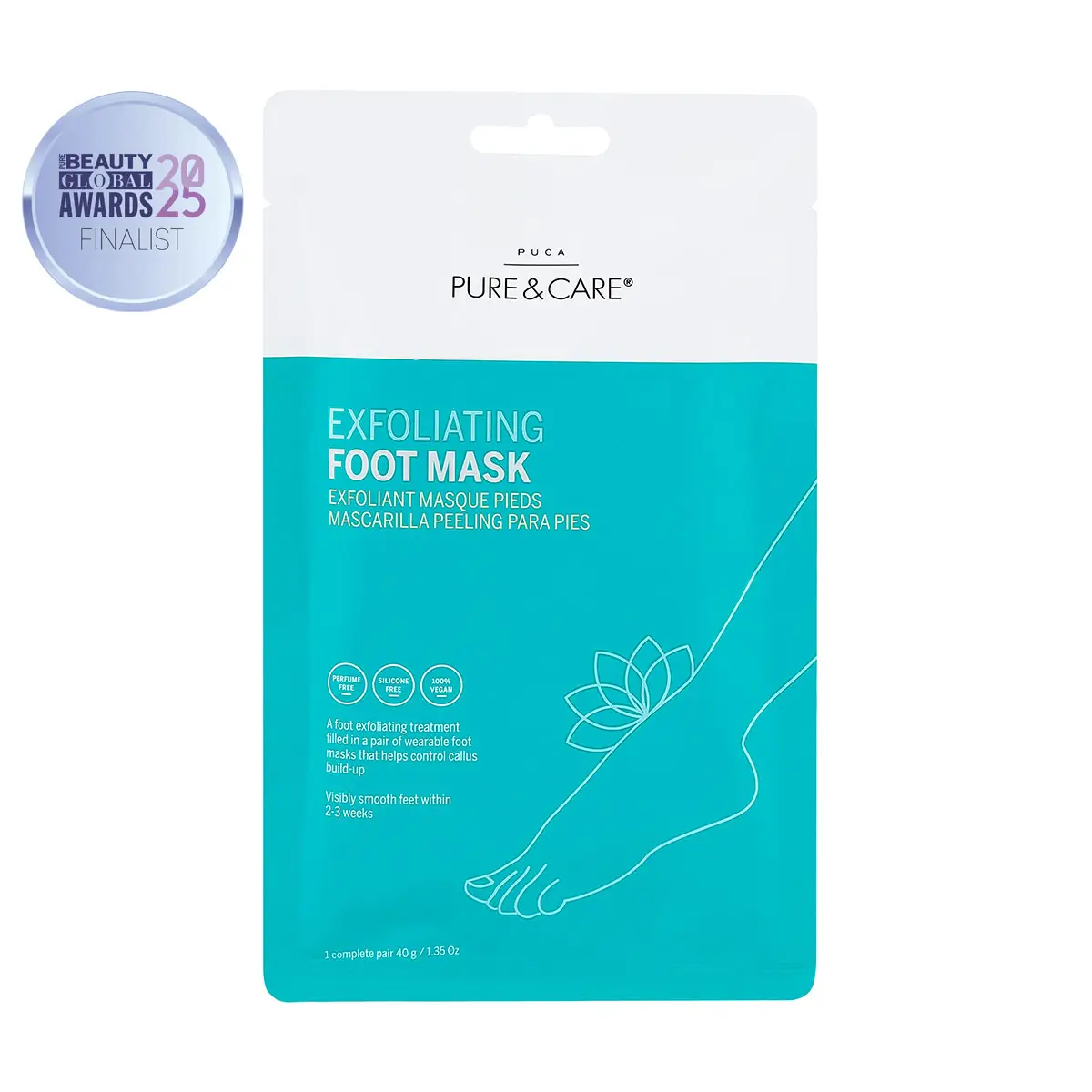
The packaging is a flat pouch made of a smooth, flexible material. It features a vibrant turquoise background with white text and graphics. The front displays the product name 'EXFOLIATING FOOT MASK' prominently, along with a decorative floral graphic. The edges are sealed, and the top has a notch for easy opening. The overall design is clean and modern, appealing to consumers looking for skincare products.

The packaging is a flat, flexible sachet designed for a foot mask product. It features a smooth, single-layer construction without any visible fluted layers, indicating it is made of a thin, flexible material. The front displays a light blue illustration of a foot with a lotus flower, set against a white background. The text is presented in a clean, modern font, with the product name prominently displayed. The overall design is minimalistic and appealing.
About the Brand
Pure & Care delivers a diverse portfolio of skincare products, including face care, body care, and nail care, with a focus on high-quality natural formulations. Packaging plays a strategic role in their direct-to-consumer model, balancing visual appeal, logistics, and sustainability considerations.
Operating primarily online, Pure & Care integrates contemporary flexible packaging formats—such as flat pouches and retail cartons—to ensure product freshness and secure transit. Their design language emphasizes clarity, ingredient transparency, and a calming color palette, creating a consistent customer experience from digital browsing through unboxing. The brand’s packaging strategy also incorporates eco-friendly elements, with selected biodegradable materials and recyclable options to address increasing consumer demand for sustainability in the beauty sector.
Key Differentiator: Pure & Care stands out for its use of flexible, visually distinctive packaging with high brand consistency, coupled with a measurable commitment to eco-conscious materials and customer education.
Design System
Visual Style
The visual design incorporates clean, modern typography with sans-serif fonts, a calming palette of turquoise, blues, and whites, and bold accent colors for differentiation across product lines. The aesthetic is minimalistic, ensuring ingredient and product information remains prominent.
Brand Identity
Consistent usage of the PURE & CARE logo, clear product naming, and ingredient-focused iconography support strong brand recognition. Visual elements are repeated across SKUs, maintaining identity cohesion and aiding shelf navigation.
Packaging Design
Packaging employs a mix of flexible multilayer films for pouches and single-layer paperboard for cartons. The design philosophy prioritizes functional, single-use applications for masks and wipes, while bottles and jars provide reusability where applicable. Material selection is guided by cost, protection, and environmental considerations.
User Experience
The design system supports a seamless customer journey by making product information accessible, ensuring packaging is intuitive to open, and delivering a visually appealing unboxing moment that reinforces the brand’s wellness positioning.
Company Metrics
Business insights for Pure & Care based on available data
Market Positioning
Brand Values & Focus
Key Competitors
Target Market: Eco-conscious skincare consumers in Denmark and the wider EU, prioritizing natural beauty products and premium unboxing experiences.
Packaging Assessment
Overall Grade
Visual appeal and presentation quality
Packaging durability and protection
Eco-friendliness and recyclable materials
Cost efficiency and value for money
Packaging assessment for Pure & Care based on industry standards and best practices
Frequently Asked Questions
What types of packaging formats does Pure & Care use for its skincare products?
Pure & Care primarily utilizes flexible pouches, sachets, and carton boxes, selected for their lightweight, protective properties and strong shelf appeal within the beauty industry.
How does Pure & Care address sustainability in its packaging choices?
The brand incorporates biodegradable and recyclable packaging materials where possible, aligning with eco-friendly consumer expectations in the beauty sector.
What are the main visual branding elements on Pure & Care’s packaging?
Packaging consistently features the PURE & CARE logo, a cohesive color palette, clear typography, and ingredient-focused graphics to reinforce brand recognition and product clarity.
Discover other Beauty & Fitness companies
Explore more companies in the beauty & fitness industry and their packaging strategies
Cultiv Cosmetique
Beauty & Fitness
Cultiv Cosmetique is a French skincare brand that provides organic and eco-friendly beauty products inspired by nature. They focus on effective skincare solutions for various skin concerns.
Institut Karité Paris
Beauty & Fitness
Institut Karité Paris specializes in luxury beauty products made with natural Shea Butter, offering a wide range of skincare and body care solutions. The brand combines Parisian heritage with a commitment to quality and creativity in its offerings.
Owari
Beauty & Fitness
Owari specializes in 100% natural beauty and fitness products, designed to enhance health and wellness. The company proudly offers its products made in France, emphasizing quick delivery and customer support.