Proceanis GmbH packaging
Proceanis GmbH develops premium health supplements and beverages focused on skin wellness, utilizing meticulously designed primary and secondary packaging to reinforce its natural, luxury positioning. Their packaging strategy emphasizes minimalist aesthetics, structural integrity, and brand consistency throughout the unboxing experience.
Packaging Portfolio
Proceanis GmbH employs a focused packaging mix, including rigid boxes and single-layer paperboard cartons, predominantly used for retail beverage products in glass bottles. The packaging emphasizes sturdy construction, precise folds, and high-quality finishes such as matte or subtle embossing, ensuring both visual appeal and product security during transit. Glass as a primary material enhances perceived value and aligns with the brand's sustainability goals, while the use of recyclable paperboard supports eco-conscious practices. The overall structure prioritizes shelf presence, unboxing impact, and logistics efficiency, reflecting a sophisticated, data-driven approach to packaging design.
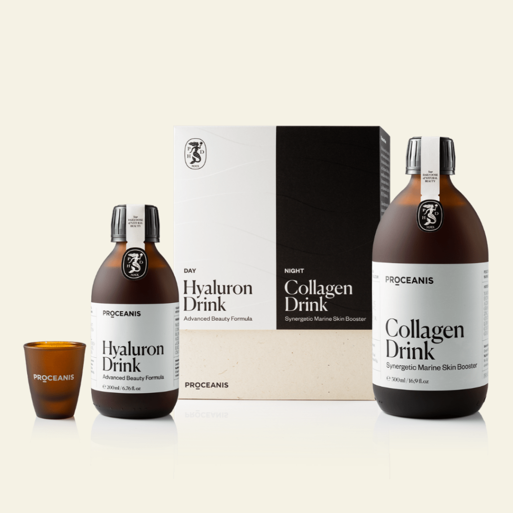
The packaging consists of a rigid box containing two glass bottles and a small cup. The box has a sturdy construction with thick walls and a premium feel. It features a clean, elegant design with a matte finish, predominantly in white with black accents. The box has a rectangular shape with precise edges and folds, providing a luxurious appearance. The bottles are dark glass with simple, elegant labels, and the small cup is also included in the packaging.
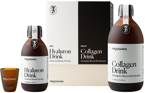
The packaging consists of a folding carton that houses two bottles and a glass. The carton features a smooth, flat construction without fluted layers, indicative of single-layer paperboard. The exterior is predominantly white with a clean design, showcasing the product name and branding prominently. The edges are precise, and the folds are sharp, typical of retail packaging. The bottles are cylindrical and made of glass, with a dark color, while the carton has a glossy finish that enhances its visual appeal.

The packaging consists of a smooth, flat construction made from single-layer paperboard. It features a light brown kraft color with a minimalist design. The front displays a large label with the product name 'Collagen Drink' in bold black font, accompanied by smaller text indicating its purpose as a 'Synergistic Marine Skin Booster.' The edges are clean and precise, with no visible fluting, indicating a lightweight appearance typical of carton boxes. The overall shape is rectangular, designed to hold two glass bottles securely.

The packaging consists of several white paperboard cartons, each with a smooth, flat construction. The cartons are designed for retail display and feature clean edges and precise folds. They have a matte finish with subtle embossed patterns and a minimalist aesthetic. The cartons are arranged around a central glass bottle, which has a label matching the design of the cartons.
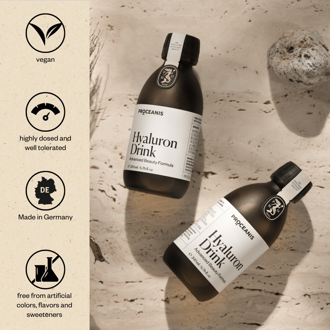
The packaging consists of two glass bottles of a beauty drink, each with a sleek, dark design. The bottles have a smooth, cylindrical shape with a narrow neck and a cap. The labels on the bottles are white with black text, featuring the product name 'Hyaluron Drink' prominently. The background is a textured surface that resembles natural stone, enhancing the premium feel of the product. The overall aesthetic is minimalistic and elegant.
About the Brand
Proceanis GmbH operates in the premium health supplement market, specializing in collagen and hyaluronic drinks aimed at promoting skin health from within. The company's packaging choices reflect its dedication to quality, premium presentation, and brand alignment, utilizing carton and rigid boxes for both protection and shelf appeal.
Founded in Hamburg, Germany, Proceanis positions itself at the intersection of natural beauty and nutritional science. Its packaging solutions are characterized by high-quality materials, precise structural engineering, and a minimalist visual language that elevates the perceived value of its products. The consistent use of glass bottles further enhances product integrity and consumer trust, while the secondary packaging maximizes both aesthetics and logistics safety.
Key Differentiator: Proceanis distinguishes itself through a combination of sustainability-driven packaging choices, minimalist premium design, and a focus on the holistic unboxing experience tailored for discerning, health-conscious consumers.
Design System
Visual Style
The brand utilizes minimalist typography, predominantly sans-serif fonts, and a restrained color palette centered on white, black, and kraft brown. Visual hierarchy is established through bold product names and subtle accent colors, reinforcing a clean, modern aesthetic.
Brand Identity
Logo and company name are consistently displayed on both primary and secondary packaging, with high standards for placement and sizing. Iconography is minimal, supporting a cohesive visual language that prioritizes clarity and elegance across all touchpoints.
Packaging Design
Material choices focus on glass for primary containers and rigid or carton boxes for secondary packaging. Structures are engineered for both durability and premium perception, with an emphasis on precise folds, clean edges, and minimal fluting to balance protection and presentation.
User Experience
Design elements support an elevated customer journey, from initial unboxing to product use, amplifying premium cues and reinforcing brand values. The tactile quality of materials and the visual coherence across packaging components enhance emotional engagement and brand recall.
Company Metrics
Business insights for Proceanis GmbH based on available data
Market Positioning
Brand Values & Focus
Key Competitors
Target Market: Health-conscious consumers seeking premium, scientifically backed beauty and wellness supplements, primarily in the DACH region with a focus on online and specialty retail channels.
Packaging Assessment
Overall Grade
Visual appeal and presentation quality
Packaging durability and protection
Eco-friendliness and recyclable materials
Cost efficiency and value for money
Packaging assessment for Proceanis GmbH based on industry standards and best practices
Frequently Asked Questions
What packaging formats does Proceanis GmbH primarily use?
Proceanis primarily utilizes rigid boxes and high-quality carton packaging to house glass bottles, emphasizing both product protection and a premium unboxing experience.
How does Proceanis address sustainability in its packaging?
The company uses recyclable paperboard and glass, favoring minimalist and eco-friendly designs that limit unnecessary material use while maintaining structural integrity.
What is the focus of Proceanis's packaging design philosophy?
Proceanis emphasizes a clean, minimalist aesthetic with consistent branding, prioritizing both functional protection and elevated shelf presence.
Discover other Food & Drink companies
Explore more companies in the food & drink industry and their packaging strategies
ruf lebensmittelwerk kg
Food & Drink
RUF Lebensmittelwerk KG is a German food production company specializing in a variety of baking mixes and drink products. Founded in 1920, the company is known for its high-quality ingredients and innovative food solutions.
Terres de Café
Food & Drink
Terres de Café is a specialty coffee retailer based in Paris, France, known for its commitment to sustainability and high-quality coffee sourcing.
Teegschwendner GmbH
Food & Drink
Teegschwendner GmbH is a specialty tea company based in Germany, offering a wide selection of high-quality teas and tea-related accessories. They focus on providing unique tea experiences through carefully sourced and curated products.