Polski Żłób packaging
Polski Żłób is an online retailer specializing in equine nutrition, offering horse feed, supplements, and related products. Their packaging strategy emphasizes visually distinctive, branded carton boxes designed for both product protection and retail shelf presence.
Packaging Portfolio
Polski Żłób employs folding carton boxes constructed from single-layer paperboard, optimized for both retail presentation and secure logistics. These cartons feature vibrant, brand-specific graphics—such as floral and geometric patterns—and employ tuck flap closures for easy opening and resealing. The consistent use of matte or semi-gloss finishes, coupled with precise die-cut edges, signals attention to detail and retail readiness. Packaging formats are tailored for various product sizes, supporting both bulk and specialty equine feeds, with clear product labeling and integrated branding for enhanced shelf differentiation.

The packaging is a folding carton with a smooth, flat construction. It features a vibrant design with floral patterns in yellow against a dark blue background. The front displays a circular logo with a horse silhouette, accompanied by the brand name 'POLSKI ŻŁÓB' and the text 'POLISH MANGER'. The edges are clean and precise, indicative of a well-constructed carton. The box has a rectangular shape with a tuck flap closure at the top.
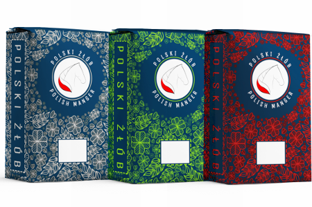
The packaging consists of three folding cartons, each featuring a smooth, flat construction without visible fluted layers. The boxes are predominantly colored, with floral patterns and a central logo. The edges are clean and precise, indicating a well-constructed design suitable for retail display. The overall appearance is lightweight yet sturdy, typical of paperboard packaging used for consumer goods.

The packaging consists of several folding cartons with a smooth, flat construction. The boxes feature a predominantly black background with geometric patterns in shades of gray and yellow accents. The edges are clean and precise, indicating a well-constructed design. Each box has a front panel that prominently displays the brand name 'POLSKI ŻŁÓB' and the product name 'COMPETITION BOX' in bold, modern typography. The overall appearance is sleek and professional, suitable for retail display.

The packaging is a folding carton made of single-layer paperboard, featuring a smooth surface with vibrant colors and intricate floral designs. The box has clean, precise edges and folds, indicative of retail packaging. The front displays a prominent logo and product name, while the sides may have additional graphics or information.

The packaging is a tall, rectangular box made from single-layer paperboard. It features a smooth, flat construction without any visible fluted layers. The exterior is predominantly dark blue with a floral pattern, and the surface appears to have a matte finish. The box has clean, precise edges and folds, typical of retail packaging. The front displays a prominent logo and product name, while the back includes product information and a barcode.

The packaging is a tall, rectangular box with a smooth, flat construction. It features a vibrant blue background adorned with intricate green floral patterns. The front prominently displays the brand name 'POLSKI ŻŁÓB' and 'POLISH MANGER' in bold white and red fonts, with a logo of a horse's head. The edges are clean and precise, indicating a well-constructed folding carton. The top has a tuck flap closure, typical for retail packaging, and there is a blank white area for product information.
About the Brand
Polski Żłób delivers a diverse range of horse feeds and supplements via a direct-to-consumer e-commerce platform, focusing on quality nutrition for equine health. The company leverages branded, retail-oriented carton packaging to reinforce its premium positioning while ensuring functional product containment.
Packaging at Polski Żłób is characterized by the consistent use of folding carton boxes featuring vibrant patterns, brand logos, and structured closure systems. This approach serves dual objectives: maintaining high visual standards on retail shelves and securing products during transit. The company integrates educational content and brand values into its customer journey, with packaging reinforcing these themes through cohesive visual identity.
Key Differentiator: Distinctive, highly branded carton packaging that prioritizes both shelf appeal and brand recognition, tailored specifically for the equine nutrition niche.
Design System
Visual Style
Typography emphasizes bold, sans-serif fonts with high readability; the color palette is dominated by deep blues, yellows, and greens, accentuated by intricate floral and geometric patterns for visual interest. The overall aesthetic is vibrant yet professional, balancing modern appeal with equestrian tradition.
Brand Identity
Brand logos and company names are prominently displayed on all packaging, ensuring immediate recognition. Iconography is consistent, typically featuring silhouette or stylized horse motifs, while visual elements such as color and layout are applied uniformly across SKUs for strong shelf presence.
Packaging Design
Material choices favor recyclable paperboard for folding cartons, prioritizing lightweight protection and ease of handling. Structural design is focused on clean lines, secure tuck flaps, and retail-friendly formats, supporting both product safety and high-impact display.
User Experience
Packaging is designed to deliver a positive customer journey, leveraging clear labeling, easy-open structures, and visually engaging graphics. The design supports the brand's educational and quality-driven ethos, reinforcing trust at the point of unboxing and throughout the customer lifecycle.
Company Metrics
Business insights for Polski Żłób based on available data
Market Positioning
Brand Values & Focus
Key Competitors
Target Market: Horse owners and equestrian professionals in Poland seeking premium, specialized equine nutrition products with an emphasis on quality and brand trust.
Packaging Assessment
Overall Grade
Visual appeal and presentation quality
Packaging durability and protection
Eco-friendliness and recyclable materials
Cost efficiency and value for money
Packaging assessment for Polski Żłób based on industry standards and best practices
Frequently Asked Questions
What types of packaging materials does Polski Żłób use?
Polski Żłób primarily utilizes single-layer folding carton boxes constructed from paperboard, designed for durability and visual appeal in both shipping and retail environments.
How does the packaging support product safety during shipping?
The packaging features precise structural construction and secure tuck flap closures, enhancing protection and minimizing the risk of product damage during logistics.
Is the packaging recyclable or environmentally friendly?
The carton boxes are made from recyclable paperboard, supporting eco-friendliness; however, the use of coatings and colored inks may impact overall sustainability.
How does the packaging contribute to the brand experience?
Distinctive visual design and consistent branding elements on the packaging enhance customer recognition and create a premium unboxing experience aligned with the company's educational and quality-driven positioning.
Discover other Pets & Animals companies
Explore more companies in the pets & animals industry and their packaging strategies
PetsDiet
Pets & Animals
PetsDiet specializes in premium pet food and dietary supplements for dogs and cats, emphasizing quality and health. With a focus on natural ingredients, the company aims to improve the well-being of pets through tailored nutrition.
Natural Trail
Pets & Animals
Natural Trail produces high-quality dry and wet food for dogs and cats, focusing on their natural dietary needs. The company is committed to providing pet owners with nutritious and delicious meal options made from carefully selected ingredients.
MisterMax
Pets & Animals
MisterMax specializes in textile care products and services, focusing on cleaning, stain removal, and odor control solutions for various fabrics and environments.