Pernaton packaging
Pernaton specializes in natural joint and muscle health products, utilizing folding cartons and tube packaging to deliver topical gels and creams. Their packaging strategy emphasizes brand visibility, consumer trust, and a health-oriented presentation while balancing cost efficiency and product safety.
Packaging Portfolio
Pernaton's packaging portfolio is anchored by folding carton boxes and flexible tubes with flip-top caps, supporting efficient retail display and robust product protection. Cartons are constructed from high-quality paperboard with glossy finishes and precise folds, while tubes utilize durable plastics for safe dispensing and minimal leakage risk. Branding is consistently applied across all formats, with clear product differentiation, benefit icons, and ingredient visuals, reinforcing trust and health-focused positioning. The structural design prioritizes ease of use, tamper evidence, and shelf appeal while maintaining cost-effectiveness and moderate recyclability.
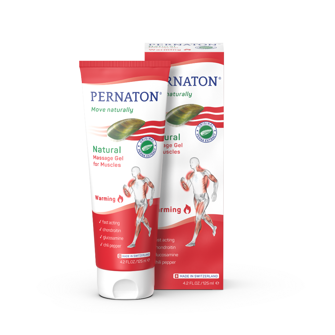
The packaging consists of a folding carton that houses a tube of massage gel. The carton features a smooth, flat construction with clean edges and folds. It is predominantly white with vibrant green and red graphics, showcasing the product's branding and usage instructions. The tube is cylindrical, made of flexible plastic, and has a flip-top cap for easy dispensing. The carton has a glossy finish, enhancing its visual appeal.
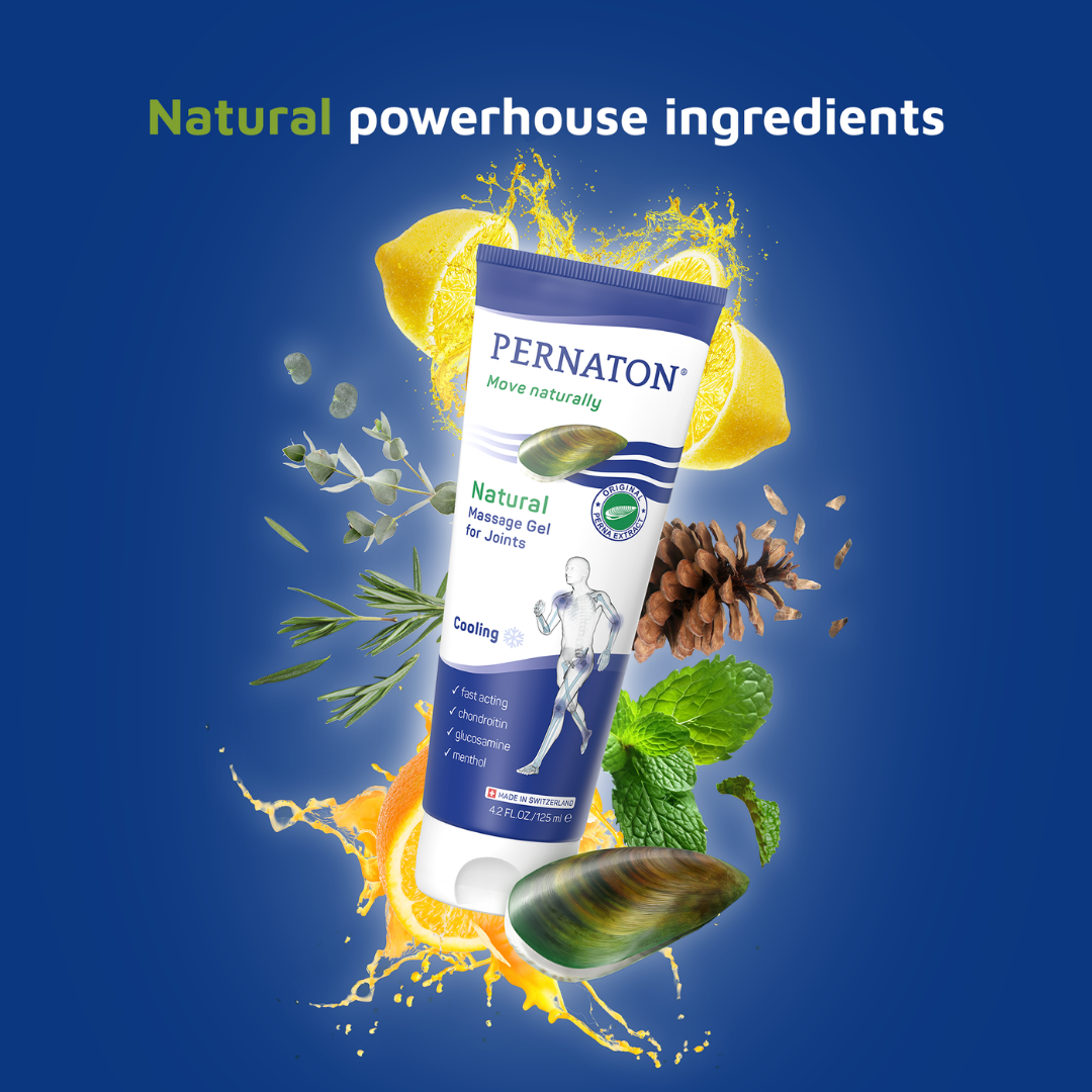
The packaging is a cylindrical tube with a flip-top cap. The tube is predominantly white with vibrant graphics featuring natural ingredients like lemon, mint, and pine. The design incorporates a blue background that enhances the visibility of the product name and key features. The text is clear and legible, with a focus on natural ingredients and benefits for joint care.
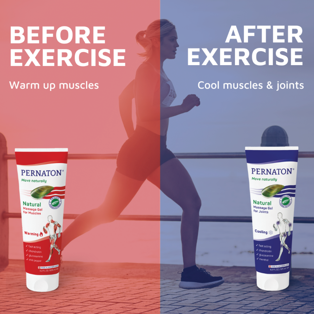
The packaging is a cylindrical tube with a flip-top cap, designed for dispensing a topical cream. The tube features a smooth, glossy surface with a predominantly white background. The front of the tube displays the brand name 'PERNATON' prominently in blue, along with descriptive text indicating its use before and after exercise. The design is divided into two sections, one labeled 'Before Exercise' with a warm-up muscle graphic, and the other 'After Exercise' with a cool muscles and joints graphic. The overall appearance is clean and modern, aimed at conveying a sense of health and wellness.
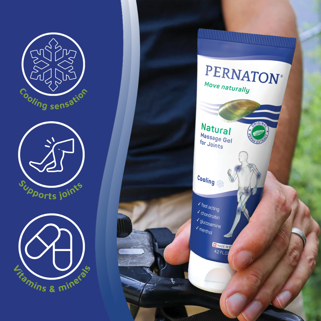
The packaging is a flexible tube designed for dispensing a topical gel. It features a cylindrical shape with a flip-top cap for easy access. The tube is predominantly white with a glossy finish, adorned with colorful graphics and text. The front displays the product name and key features, while the back contains usage instructions and ingredient information. The design includes a prominent logo and certification symbols.
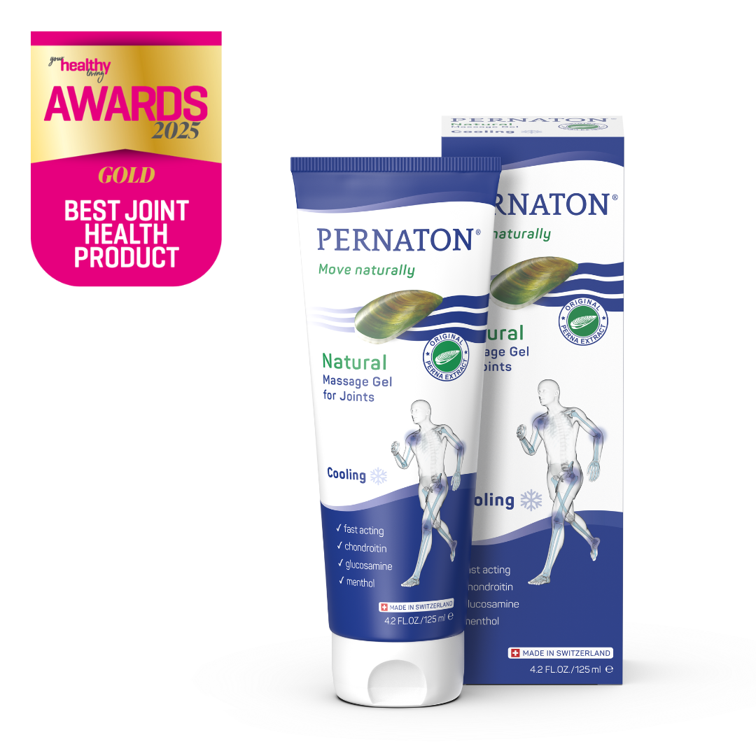
The packaging consists of a folding carton box that houses a tube of massage gel. The carton is primarily white with colorful graphics and branding. The front features a prominent logo and product name, with a glossy finish that enhances visual appeal. The edges are clean and precise, indicating high-quality printing. The box has a rectangular shape with a tuck-top closure.
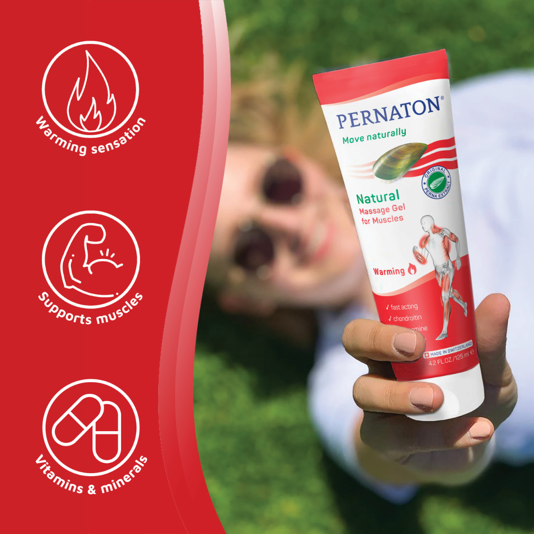
The packaging is a cylindrical tube designed for dispensing a topical gel. It features a smooth, glossy surface with a predominantly white body and red accents. The tube has a flip-top cap for easy dispensing and is designed to stand upright. The graphics include illustrations and icons that highlight the product's benefits, such as 'Warming sensation' and 'Supports muscles'. The overall design is clean and modern, aimed at conveying a sense of health and wellness.
About the Brand
Pernaton operates in the health sector, offering joint and muscle relief products formulated with natural Perna Extract. The company leverages branded carton boxes and flexible tube packaging to support a clean, clinical, and trustworthy image.
Their packaging portfolio demonstrates a consistent application of folding cartons and cylindrical tubes with flip-top caps, focusing on secure containment and ease of use. Visual elements reinforce the brand's emphasis on natural wellness, with prominent logos, benefit icons, and ingredient illustrations. The packaging is designed to appeal to health-conscious consumers, providing both shelf presence and functional utility.
Key Differentiator: Pernaton differentiates through its integration of clinical, consumer-friendly packaging with a focus on natural ingredients, and by delivering an educational, trust-building unboxing experience.
Design System
Visual Style
Utilizes clean sans-serif typography, a predominantly white color palette accented with green, blue, and red hues to signal product variants and natural ingredients. The aesthetic is clinical yet approachable, with glossy finishes for enhanced shelf presence.
Brand Identity
Logo is prominently displayed on all packaging, supported by consistent use of product names, badges, and benefit icons. Visual consistency is achieved through standardized layouts and color schemes tied to product function (e.g., blue for cooling, red for warming).
Packaging Design
Prefers recyclable paperboard for cartons and flexible plastics for tubes, focusing on structural integrity, tamper resistance, and ease of dispensing. Material choices reflect a balance between product safety, cost, and moderate environmental considerations.
User Experience
Packaging supports a straightforward customer journey with clear usage instructions, visible product benefits, and ergonomic design for at-home application. The unboxing and dispensing experience aligns with the brand’s values of trust, efficacy, and natural health.
Company Metrics
Business insights for Pernaton based on available data
Market Positioning
Brand Values & Focus
Key Competitors
Target Market: Health-conscious consumers seeking natural joint and muscle relief, including active individuals, older adults, and those with chronic musculoskeletal conditions.
Packaging Assessment
Overall Grade
Visual appeal and presentation quality
Packaging durability and protection
Eco-friendliness and recyclable materials
Cost efficiency and value for money
Packaging assessment for Pernaton based on industry standards and best practices
Frequently Asked Questions
What packaging formats does Pernaton utilize?
Pernaton primarily uses folding carton boxes to house flexible tubes for its topical gels and creams, optimizing for product protection, shelf visibility, and end-user convenience.
How does Pernaton approach sustainability in packaging?
While their packaging demonstrates recyclable potential through paperboard cartons and plastic tubes, there is limited evidence of advanced eco-design features such as compostable materials or minimized plastic content.
How does Pernaton ensure product safety during transit?
The combination of sturdy carton boxes and robust tube construction provides a high level of protection against leakage, breakage, and external contamination during logistics.
Discover other Health companies
Explore more companies in the health industry and their packaging strategies
Bio-Synergy
Health
Bio-Synergy is a UK-based company specializing in health and fitness products, including nutritional supplements and DNA testing kits. Their mission is to support individuals in achieving their health and fitness goals through innovative products and personalized insights.
Lily & Loaf
Health
Lily & Loaf specializes in high-quality health and nutrition products, offering a range of supplements and vitamins aimed at supporting an active lifestyle. The company focuses on providing natural solutions for health and beauty.
Comvita
Health
Comvita is a New Zealand-based company specializing in high-quality Mānuka honey and natural health products. Established in 1974, it aims to connect people with the healing power of nature.